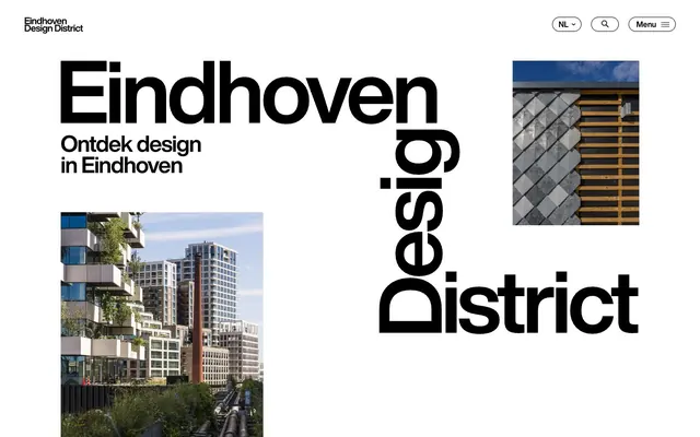
Preview image. Unlock full-res
Graphic Modernist Poster
Color palette
Content emphasis, such as article headings and decorative accents
Decorative background blocks for featured sections, adding a soft, yet vivid, accent
Decorative background blocks, providing a vibrant, high-energy counterpoint
Page backgrounds, card surfaces, ghost button backgrounds, and general UI where lightness is needed
Primary text, borders, icons, and as a stark background for hero sections or prominent display areas, creating high contrast against Canvas White
Secondary card surfaces, offering a subtle visual break from pure white
Fine lines, subtle borders, and less prominent text elements
Typography
- Weights
- 400, 600
- Sizes
- 14px, 16px, 18px, 19px, 23px, 35px, 46px, 50px
- Line height
- 0.93, 1, 1.15, 1.2, 1.31, 1.4, 1.47
- Letter spacing
- -0.05em at 50px, -0.03em at 46px, -0.024em at 35px, -0.02em at 23px, -0.017em at 19px, -0.004em at 18px, 0.005em at 16px, 0.015em at 14px
- Fallback
- Inter
The sole typeface, Helvetica Now, dictates the entire typographic voice. Its use at extreme sizes and with tight letter-spacing for headings creates a bold, almost architectural feel, making type itself a key visual component of the layout. For body text, its legibility supports a functional, direct communication style.
Spacing & shape
Components
Minimalist buttons with no background, Ink Black text, and a 1px Ink Black border, using 500px radius for a pill shape. Padding is compact: 1px vertical, 15px horizontal. The focus is on the border and text, emphasizing clickable areas without visual weight.
Filled buttons with Canvas White background, Ink Black text, and a 1px Ink Black border. Features generous padding (18px top, 21px bottom, 35px horizontal) and a 500px radius for a bold, approachable pill shape, conveying an important, but not aggressive, action.
Circular buttons with a Canvas White background and a 1px Ink Black border, using a 100% border-radius. No internal padding, designed to enclose a single icon, maintaining a clean, compact footprint typical of utility actions.
Simple text links with no background, border, or radius. The Ink Black text identifies it as an actionable element within sentences or lists, providing a low-hierarchy interactive element.
Cards with a transparent background and no borders or shadow, defining content regions purely by image and typography. Text is Ink Black.
Cards with an Ash Gray background, no borders or shadows. These cards provide a subtle elevation for content, making them stand out against the main Canvas White background without introducing strong visual separation.
Guidelines
- Use Ink Black (#000000) for all primary text and Canvas White (#ffffff) for all main backgrounds to achieve maximum contrast.
- Apply a 500px border-radius to all interactive buttons and tags for a consistent pill-shaped aesthetic.
- Reinforce design elements with 1px Ink Black (#000000) borders for definition, maintaining a very clean and sharp edge.
- Employ Helvetica Now as the sole typeface, varying weight and size to establish typographic hierarchy rather than introducing additional fonts.
- Utilize large display typography with tight letter-spacing (-0.05em at 50px, -0.03em at 46px) as a prominent graphic component in hero sections and headlines.
- Implement a spacious `elementGap` of 20px and a `sectionGap` of 35px to create ample negative space and visual breathing room between UI elements and content blocks.
- Integrate photographic imagery as contained rectangles with 0px border-radius, maintaining the overall rectilinear and stark aesthetic.
- Do not introduce mid-tone gray backgrounds or text colors beyond Ash Gray (#e8e8e8) or Silver Thread (#bfbfbf), as the system relies on stark black and white contrast.
- Avoid using drop shadows or complex elevation styles; the design emphasizes flat surfaces and clear planar separation.
- Do not deviate from the Helvetica Now typeface; its specific character and variable weights are central to the brand's typographic identity.
- Refrain from using gradients for backgrounds, text, or UI elements; the system prioritizes solid color blocks.
- Do not apply rounded corners to images or cards; maintain the strict rectilinear forms defined by '0px' border-radius.
- Avoid excessive use of vivid chromatic colors; they are reserved for controlled, decorative blocks and specific content emphasis, not general UI components.
- Do not use generic font icons or heavily stylized icons; prefer simple, monochrome, possibly outlined icons that maintain the graphical integrity.
About this system
ShowHide
Eindhoven Design District presents a high-contrast rectilinear system, built on stark black and white with an almost entire absence of grays, emphasizing clarity and bold forms. Type is a core visual element, with large, confident headlines often appearing as graphic elements. Imagery is integrated as clean, self-contained rectangles, maintaining the sharp visual rhythm. A playful use of occasional vivid color blocks acts as a punctuation rather than an integral part of the primary interface.
The page maintains a crisp, high-contrast layout, primarily favoring a max-width, center-aligned container for content, though the hero section breaks this to full-bleed. The hero often employs large, graphic typography interacting with contained rectangular images. Content sections have a consistent vertical rhythm (35px sectionGap) and use alternating single-column centered text blocks, 2-column text+image arrangements, and 3-column card grids for features and articles. The navigation is a minimalist top bar with utility icons and a hamburger menu.
This system primarily uses high-contrast photography, often featuring architectural details, urban landscapes, or candid people shots. Images are treated as clean, unmasked rectangular blocks, integrated directly into the layout without rounded corners or complex treatments. There are no illustrations or 3D renders; the visual language is grounded in photography. Icons are minimal, outlined, and monochromatic (Ink Black), serving purely functional roles.
Reminiscent of Architectural Digests, Monotype, Bauhaus Archive, Strelka Institute.
# Eindhoven Design District — Style Reference
> Graphic Modernist Poster

**Theme:** light

**Site:** https://www.eindhovendesigndistrict.com

Eindhoven Design District presents a high-contrast rectilinear system, built on stark black and white with an almost entire absence of grays, emphasizing clarity and bold forms. Type is a core visual element, with large, confident headlines often appearing as graphic elements. Imagery is integrated as clean, self-contained rectangles, maintaining the sharp visual rhythm. A playful use of occasional vivid color blocks acts as a punctuation rather than an integral part of the primary interface.

## Tokens — Colors

| Name | Value | Token | Role |
|------|------|------|------|
| Focus Red | `#ff0000` | `--color-focus-red` | Content emphasis, such as article headings and decorative accents |
| Blush Pink | `#ffc2eb` | `--color-blush-pink` | Decorative background blocks for featured sections, adding a soft, yet vivid, accent |
| Electric Blue | `#0f26ed` | `--color-electric-blue` | Decorative background blocks, providing a vibrant, high-energy counterpoint |
| Canvas White | `#ffffff` | `--color-canvas-white` | Page backgrounds, card surfaces, ghost button backgrounds, and general UI where lightness is needed |
| Ink Black | `#000000` | `--color-ink-black` | Primary text, borders, icons, and as a stark background for hero sections or prominent display areas, creating high contrast against Canvas White |
| Ash Gray | `#e8e8e8` | `--color-ash-gray` | Secondary card surfaces, offering a subtle visual break from pure white |
| Silver Thread | `#bfbfbf` | `--color-silver-thread` | Fine lines, subtle borders, and less prominent text elements |

## Tokens — Typography

### Helvetica Now
- **Substitute:** Inter
- **Weights:** 400, 600
- **Sizes:** 14px, 16px, 18px, 19px, 23px, 35px, 46px, 50px
- **Line height:** 0.93, 1, 1.15, 1.2, 1.31, 1.4, 1.47
- **Letter spacing:** -0.05em at 50px, -0.03em at 46px, -0.024em at 35px, -0.02em at 23px, -0.017em at 19px, -0.004em at 18px, 0.005em at 16px, 0.015em at 14px
- **Role:** The sole typeface, Helvetica Now, dictates the entire typographic voice. Its use at extreme sizes and with tight letter-spacing for headings creates a bold, almost architectural feel, making type itself a key visual component of the layout. For body text, its legibility supports a functional, direct communication style.

## Tokens — Type Scale

Major Third (1.25) from 16px base.

| Role | Size | Line height | Letter spacing |
|------|------|------|------|
| caption | 14px | 1.47 | 0.15px |
| body | 16px | 1.4 | 0.005em |
| subheading | 18px | 1.31 | -0.004em |
| heading | 23px | 1.15 | -0.02em |
| heading-lg | 35px | 1 | -0.024em |
| display | 46px | 0.93 | -0.03em |
| display-lg | 50px | 0.93 | -0.05em |

## Tokens — Spacing

- **Section gap:** 35px
- **Card padding:** 20px
- **Element gap:** 20px

## Tokens — Radius

- **Buttons:** 500px
- **Cards:** 0px

## Layout

The page maintains a crisp, high-contrast layout, primarily favoring a max-width, center-aligned container for content, though the hero section breaks this to full-bleed. The hero often employs large, graphic typography interacting with contained rectangular images. Content sections have a consistent vertical rhythm (35px sectionGap) and use alternating single-column centered text blocks, 2-column text+image arrangements, and 3-column card grids for features and articles. The navigation is a minimalist top bar with utility icons and a hamburger menu.

## Imagery

This system primarily uses high-contrast photography, often featuring architectural details, urban landscapes, or candid people shots. Images are treated as clean, unmasked rectangular blocks, integrated directly into the layout without rounded corners or complex treatments. There are no illustrations or 3D renders; the visual language is grounded in photography. Icons are minimal, outlined, and monochromatic (Ink Black), serving purely functional roles.

## Components

### Ghost Button
*Navigation, secondary actions, and inline links.*

Minimalist buttons with no background, Ink Black text, and a 1px Ink Black border, using 500px radius for a pill shape. Padding is compact: 1px vertical, 15px horizontal. The focus is on the border and text, emphasizing clickable areas without visual weight.

### Primary Action Button
*Key interactions and calls to action.*

Filled buttons with Canvas White background, Ink Black text, and a 1px Ink Black border. Features generous padding (18px top, 21px bottom, 35px horizontal) and a 500px radius for a bold, approachable pill shape, conveying an important, but not aggressive, action.

### Icon Button
*Standalone interactive icons, such as menu toggles or search.*

Circular buttons with a Canvas White background and a 1px Ink Black border, using a 100% border-radius. No internal padding, designed to enclose a single icon, maintaining a clean, compact footprint typical of utility actions.

### Plain Link Button
*Text-based actions that blend seamlessly with content.*

Simple text links with no background, border, or radius. The Ink Black text identifies it as an actionable element within sentences or lists, providing a low-hierarchy interactive element.

### Article Card
*Displaying content previews in grid layouts.*

Cards with a transparent background and no borders or shadow, defining content regions purely by image and typography. Text is Ink Black.

### Gray Background Card
*Highlighting distinct content blocks within a section.*

Cards with an Ash Gray background, no borders or shadows. These cards provide a subtle elevation for content, making them stand out against the main Canvas White background without introducing strong visual separation.

## Guidelines

### Do

- Use Ink Black (#000000) for all primary text and Canvas White (#ffffff) for all main backgrounds to achieve maximum contrast.
- Apply a 500px border-radius to all interactive buttons and tags for a consistent pill-shaped aesthetic.
- Reinforce design elements with 1px Ink Black (#000000) borders for definition, maintaining a very clean and sharp edge.
- Employ Helvetica Now as the sole typeface, varying weight and size to establish typographic hierarchy rather than introducing additional fonts.
- Utilize large display typography with tight letter-spacing (-0.05em at 50px, -0.03em at 46px) as a prominent graphic component in hero sections and headlines.
- Implement a spacious `elementGap` of 20px and a `sectionGap` of 35px to create ample negative space and visual breathing room between UI elements and content blocks.
- Integrate photographic imagery as contained rectangles with 0px border-radius, maintaining the overall rectilinear and stark aesthetic.

### Don't

- Do not introduce mid-tone gray backgrounds or text colors beyond Ash Gray (#e8e8e8) or Silver Thread (#bfbfbf), as the system relies on stark black and white contrast.
- Avoid using drop shadows or complex elevation styles; the design emphasizes flat surfaces and clear planar separation.
- Do not deviate from the Helvetica Now typeface; its specific character and variable weights are central to the brand's typographic identity.
- Refrain from using gradients for backgrounds, text, or UI elements; the system prioritizes solid color blocks.
- Do not apply rounded corners to images or cards; maintain the strict rectilinear forms defined by '0px' border-radius.
- Avoid excessive use of vivid chromatic colors; they are reserved for controlled, decorative blocks and specific content emphasis, not general UI components.
- Do not use generic font icons or heavily stylized icons; prefer simple, monochrome, possibly outlined icons that maintain the graphical integrity.

## Agent Prompt Guide

### Quick Color Reference
text: #000000
background: #ffffff
border: #000000
accent: #ff0000
primary action: no distinct CTA color

### 3-5 Example Component Prompts
1. Create a hero section: Canvas White background. Headline 'Ontdek design in Eindhoven' using Helvetica Now, weight 600, size 50px, Ink Black text, letter-spacing -0.05em. Include a rectangular image (0px border-radius) floating beside / below the text.
2. Create a 'Meer over Eindhoven Design District' button: Canvas White background, Ink Black text, 1px Ink Black border, 500px border-radius, padding 18px top, 21px bottom, 35px horizontal. Text is Helvetica Now weight 400, size 16px.
3. Create an article card: Ash Gray (#e8e8e8) background, 0px border-radius, no shadow, with an Ink Black (#000000) headline (Helvetica Now, weight 600, size 19px) and a smaller body text (Helvetica Now, weight 400, size 16px).
More like this









Keep what you find
A free account saves references to boards and can send you a weekly email of picks based on what you save.
To see every result, go Pro.