Preview image. Unlock full-res
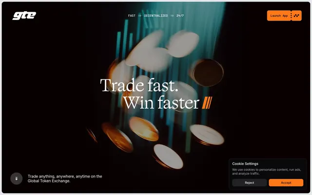
High-contrast digital trading floor.
Color palette
Primary call-to-action button background, interactive accents, and functional highlights. Its vivid presence signals action and importance
Deep background for dark sections, card surfaces, and primary text in light-on-dark contexts
Primary text color in light mode, prominent borders, and icons
Secondary dark card surfaces and subtle borders in dark mode
Primary page canvas for light sections, text on dark backgrounds, and active state highlights
Subtle light card surfaces and elevated sections in light mode
Secondary light card backgrounds and subtle divider fill colors
Muted helper text and subtle borders in light mode
Muted text, placeholder text, and inactive icon fills
Lightest background for dividers or subtle UI elements in light mode
Typography
- Weights
- 400
- Sizes
- 12px
- Line height
- 1.2
- Fallback
- Arial
Smallest UI labels and utility text, defaulting to system sans-serif for optimal legibility at compact sizes.
- Weights
- 300, 400
- Sizes
- 28px, 40px, 80px
- Line height
- 0.95, 1, 1.1, 1.2
- Letter spacing
- -0.02em
- Fallback
- serif system font
Display and large headings. The light weight and calligraphic features ('blwf', 'cv03', 'cv04', 'cv09', 'cv11') convey a refined, authoritative tone, balancing the technical subject matter with an artisanal feel.
- Weights
- 400
- Sizes
- 18px
- Line height
- 1.2
- Letter spacing
- -0.04em
- Fallback
- monospace system font
Subheadings, navigational links, and emphasized body text. Its monospaced nature evokes a programmatic, precise feel, reinforcing the core product identity.
- Weights
- 400, 500
- Sizes
- 12px, 14px, 16px, 18px
- Line height
- 1, 1.2, 1.3
- Letter spacing
- -0.0200em
- Fallback
- Inter
Body copy, input fields, and smaller informational text. Its clean, utilitarian nature ensures readability for dense information.
- Weights
- 400
- Sizes
- 14px, 16px
- Line height
- 1, 1.2, 1.4
- Letter spacing
- -0.04, -0.02
PP Supply Mono Regular — detected in extracted data but not described by AI
- Weights
- 400, 500
- Sizes
- 14px, 16px, 20px
- Line height
- 0.75, 1.1, 1.2, 1.4
- Letter spacing
- -0.04, -0.02
PP Supply Mono Medium — detected in extracted data but not described by AI
Spacing & shape
Components
Filled button with Turbo Orange background (#ff7817) and Midnight Ink text (#000000). Features 8px border-radius and 16px horizontal padding. Text uses Inter font at 16px, weight 400.
Uses Carbon (#09090b) as background, with 12px border-radius. Inset white shadow: rgba(255, 255, 255, 0.1) 0px 0px 0px 1px inset to denote interactivity/depth.
Uses Fog (#ebebeb) as background, with 12px border-radius. No distinct shadow for elevation; relies on background color contrast.
Uses Ash (#18181b) as background, with 24px border-radius. No distinct shadow for elevation; relies on background color contrast.
Large, dark surface using Carbon (#09090b) with a prominent 28px border-radius. Acts as a modal or persistent footer element.
Translucent background rgba(255, 255, 255, 0.1) with Polar White (#ffffff) text and border. Features 8px border-radius and 10px padding.
Uses Turbo Orange (#ff7817) background with Carbon (#09090b) text and border. Features 8px border-radius and 10px padding.
Parchment (#e5e7eb) background with 12px border-radius. Serves as a muted background for illustrative content or feature descriptions.
Guidelines
- Use Turbo Orange (#ff7817) exclusively for primary calls to action and critical interactive elements.
- Maintain a high contrast ratio between text and background, adhering to AAA accessibility standards where possible (e.g., Midnight Ink #000000 on Polar White #ffffff; Polar White #ffffff on Carbon #09090b).
- Apply 12px border-radius for most cards and default containers, with 8px for interactive elements like buttons and inputs, and 24px for visually distinct, larger cards.
- Utilize PP Supply Mono for headings and navigational elements to emphasize a technical, precise tone.
- Employ Polar White (#ffffff) and Carbon (#09090b) as dominant background colors, defining distinct light and dark sections or components.
- Keep element spacing consistent with increments of 10px and padding with 16px to maintain a compact yet readable density.
- Ensure large display headings use Ogg Text Light at weight 300 to create an atmosphere of restrained authority with unique typographic flourishes.
- Avoid using multiple chromatic colors; limit accents strictly to Turbo Orange (#ff7817) unless for semantic status (e.g., success/error not present in data).
- Do not introduce heavy shadows or gradients on surfaces; rely on distinct background colors and subtle inset shadows (rgba(255, 255, 255, 0.1) 0px 0px 0px 1px inset) for depth.
- Refrain from using overly decorative or illustrative elements that detract from the stark, functional UI.
- Do not deviate from the established type scale; maintain consistent font families, weights, and letter spacing for their defined roles.
- Avoid large amounts of whitespace around content sections; the design favors a 'compact' density.
- Do not use generic sans-serif fonts where Ogg Text Light, PP Supply Mono, or Inter are specified, as they define the brand's unique typographic voice.
- Do not apply large, rounded corners globally; save specific larger radii for distinct components like cookie banners (28px) or pill shapes (600px).
About this system
ShowHide
GTE embodies a stark, high-contrast digital trading floor: deep backgrounds meet bright surfaces and crisp typography. A single vibrant orange accent serves as the primary call to action, cutting through the monochrome with functional urgency. The design prioritizes clear information hierarchy and lightweight components, reflecting efficiency and speed without heavy ornamentation.
The page primarily uses a full-bleed structure for hero sections, which feature a large, centered headline over an immersive visual, then transitions to a max-width contained layout (implied around 1200px based on content blocks). Sections alternate between dark backgrounds (Carbon #09090b) and light backgrounds (Polar White #ffffff or Parchment #e5e7eb) to create distinct visual rhythm. Content often arranges in two-column layouts, frequently with text on one side and a product illustration or card on the other. Card grids are used for presenting features. The navigation is a sticky top bar, minimal in its presence, with a strong Turbo Orange button for 'Launch App'.
The visual language combines abstract 3D renders with illustrative product screenshots. Photography is absent. Abstract graphics feature metallic or coin-like objects with a warm, amber glow against dark backgrounds, suggesting value and motion. These visuals are primarily decorative and atmospheric, full-bleed in hero sections. Product screenshots are contained within light cards, using a monochromatic outlined style for UI elements. Icons are minimal, either solid or outlined, typically monochromatic, with PP Supply Mono font often integrated into their design. The overall density is image-heavy in hero sections, transitioning to text-dominant with illustrative support in feature sections.
Reminiscent of Stripe, Linear, Coinbase, Vercel.
# GTE — Style Reference
> High-contrast digital trading floor.

**Theme:** mixed

**Site:** https://www.gte.xyz

GTE embodies a stark, high-contrast digital trading floor: deep backgrounds meet bright surfaces and crisp typography. A single vibrant orange accent serves as the primary call to action, cutting through the monochrome with functional urgency. The design prioritizes clear information hierarchy and lightweight components, reflecting efficiency and speed without heavy ornamentation.

## Tokens — Colors

| Name | Value | Token | Role |
|------|------|------|------|
| Turbo Orange | `#ff7817` | `--color-turbo-orange` | Primary call-to-action button background, interactive accents, and functional highlights. Its vivid presence signals action and importance |
| Carbon | `#09090b` | `--color-carbon` | Deep background for dark sections, card surfaces, and primary text in light-on-dark contexts |
| Midnight Ink | `#000000` | `--color-midnight-ink` | Primary text color in light mode, prominent borders, and icons |
| Ash | `#18181b` | `--color-ash` | Secondary dark card surfaces and subtle borders in dark mode |
| Polar White | `#ffffff` | `--color-polar-white` | Primary page canvas for light sections, text on dark backgrounds, and active state highlights |
| Fog | `#ebebeb` | `--color-fog` | Subtle light card surfaces and elevated sections in light mode |
| Parchment | `#e5e7eb` | `--color-parchment` | Secondary light card backgrounds and subtle divider fill colors |
| Steel | `#71717a` | `--color-steel` | Muted helper text and subtle borders in light mode |
| Stone Grey | `#a1a1aa` | `--color-stone-grey` | Muted text, placeholder text, and inactive icon fills |
| Ghost | `#d4d4d8` | `--color-ghost` | Lightest background for dividers or subtle UI elements in light mode |

## Tokens — Typography

### sans-serif
- **Substitute:** Arial
- **Weights:** 400
- **Sizes:** 12px
- **Line height:** 1.2
- **Role:** Smallest UI labels and utility text, defaulting to system sans-serif for optimal legibility at compact sizes.

### Ogg Text Light
- **Substitute:** serif system font
- **Weights:** 300, 400
- **Sizes:** 28px, 40px, 80px
- **Line height:** 0.95, 1, 1.1, 1.2
- **Letter spacing:** -0.02em
- **Role:** Display and large headings. The light weight and calligraphic features ('blwf', 'cv03', 'cv04', 'cv09', 'cv11') convey a refined, authoritative tone, balancing the technical subject matter with an artisanal feel.

### PP Supply Mono
- **Substitute:** monospace system font
- **Weights:** 400
- **Sizes:** 18px
- **Line height:** 1.2
- **Letter spacing:** -0.04em
- **Role:** Subheadings, navigational links, and emphasized body text. Its monospaced nature evokes a programmatic, precise feel, reinforcing the core product identity.

### Inter
- **Substitute:** Inter
- **Weights:** 400, 500
- **Sizes:** 12px, 14px, 16px, 18px
- **Line height:** 1, 1.2, 1.3
- **Letter spacing:** -0.0200em
- **Role:** Body copy, input fields, and smaller informational text. Its clean, utilitarian nature ensures readability for dense information.

### PP Supply Mono Regular
- **Weights:** 400
- **Sizes:** 14px, 16px
- **Line height:** 1, 1.2, 1.4
- **Letter spacing:** -0.04, -0.02
- **Role:** PP Supply Mono Regular — detected in extracted data but not described by AI

### PP Supply Mono Medium
- **Weights:** 400, 500
- **Sizes:** 14px, 16px, 20px
- **Line height:** 0.75, 1.1, 1.2, 1.4
- **Letter spacing:** -0.04, -0.02
- **Role:** PP Supply Mono Medium — detected in extracted data but not described by AI

## Tokens — Type Scale

Perfect Fourth (1.333) from 16px base.

| Role | Size | Line height | Letter spacing |
|------|------|------|------|
| caption | 12px | 1.2 | — |
| body-sm | 14px | 1.2 | -0.48px |
| body | 16px | 1.2 | -0.32px |
| body-lg | 18px | 1.2 | -0.36px |
| subheading | 20px | 1.4 | -0.4px |
| heading | 28px | 1.2 | -0.56px |
| heading-lg | 40px | 1.1 | -0.8px |
| display | 80px | 0.95 | -1.6px |

## Tokens — Spacing

- **Section gap:** 40px
- **Card padding:** 16px
- **Element gap:** 10px

## Tokens — Radius

- **Default:** 12px
- **Buttons:** 8px
- **Inputs:** 8px
- **cookieBanner:** 28px
- **largerCards:** 24px
- **links:** 56px
- **pill:** 600px
- **small:** 4px

## Layout

The page primarily uses a full-bleed structure for hero sections, which feature a large, centered headline over an immersive visual, then transitions to a max-width contained layout (implied around 1200px based on content blocks). Sections alternate between dark backgrounds (Carbon #09090b) and light backgrounds (Polar White #ffffff or Parchment #e5e7eb) to create distinct visual rhythm. Content often arranges in two-column layouts, frequently with text on one side and a product illustration or card on the other. Card grids are used for presenting features. The navigation is a sticky top bar, minimal in its presence, with a strong Turbo Orange button for 'Launch App'.

## Imagery

The visual language combines abstract 3D renders with illustrative product screenshots. Photography is absent. Abstract graphics feature metallic or coin-like objects with a warm, amber glow against dark backgrounds, suggesting value and motion. These visuals are primarily decorative and atmospheric, full-bleed in hero sections. Product screenshots are contained within light cards, using a monochromatic outlined style for UI elements. Icons are minimal, either solid or outlined, typically monochromatic, with PP Supply Mono font often integrated into their design. The overall density is image-heavy in hero sections, transitioning to text-dominant with illustrative support in feature sections.

## Components

### Primary Action Button
*Call to action.*

Filled button with Turbo Orange background (#ff7817) and Midnight Ink text (#000000). Features 8px border-radius and 16px horizontal padding. Text uses Inter font at 16px, weight 400.

### Dark Card (Level 1)
*Container for content.*

Uses Carbon (#09090b) as background, with 12px border-radius. Inset white shadow: rgba(255, 255, 255, 0.1) 0px 0px 0px 1px inset to denote interactivity/depth.

### Light Card (Level 1)
*Container for content.*

Uses Fog (#ebebeb) as background, with 12px border-radius. No distinct shadow for elevation; relies on background color contrast.

### Dark Card (Level 2)
*Container for content, elevated.*

Uses Ash (#18181b) as background, with 24px border-radius. No distinct shadow for elevation; relies on background color contrast.

### Cookie Banner Card
*System feedback or disclaimer.*

Large, dark surface using Carbon (#09090b) with a prominent 28px border-radius. Acts as a modal or persistent footer element.

### Text Input (Dark)
*User input.*

Translucent background rgba(255, 255, 255, 0.1) with Polar White (#ffffff) text and border. Features 8px border-radius and 10px padding.

### Accent Input (Orange Fill)
*Submit or action input.*

Uses Turbo Orange (#ff7817) background with Carbon (#09090b) text and border. Features 8px border-radius and 10px padding.

### Feature Box (Light)
*Informational container.*

Parchment (#e5e7eb) background with 12px border-radius. Serves as a muted background for illustrative content or feature descriptions.

## Guidelines

### Do

- Use Turbo Orange (#ff7817) exclusively for primary calls to action and critical interactive elements.
- Maintain a high contrast ratio between text and background, adhering to AAA accessibility standards where possible (e.g., Midnight Ink #000000 on Polar White #ffffff; Polar White #ffffff on Carbon #09090b).
- Apply 12px border-radius for most cards and default containers, with 8px for interactive elements like buttons and inputs, and 24px for visually distinct, larger cards.
- Utilize PP Supply Mono for headings and navigational elements to emphasize a technical, precise tone.
- Employ Polar White (#ffffff) and Carbon (#09090b) as dominant background colors, defining distinct light and dark sections or components.
- Keep element spacing consistent with increments of 10px and padding with 16px to maintain a compact yet readable density.
- Ensure large display headings use Ogg Text Light at weight 300 to create an atmosphere of restrained authority with unique typographic flourishes.

### Don't

- Avoid using multiple chromatic colors; limit accents strictly to Turbo Orange (#ff7817) unless for semantic status (e.g., success/error not present in data).
- Do not introduce heavy shadows or gradients on surfaces; rely on distinct background colors and subtle inset shadows (rgba(255, 255, 255, 0.1) 0px 0px 0px 1px inset) for depth.
- Refrain from using overly decorative or illustrative elements that detract from the stark, functional UI.
- Do not deviate from the established type scale; maintain consistent font families, weights, and letter spacing for their defined roles.
- Avoid large amounts of whitespace around content sections; the design favors a 'compact' density.
- Do not use generic sans-serif fonts where Ogg Text Light, PP Supply Mono, or Inter are specified, as they define the brand's unique typographic voice.
- Do not apply large, rounded corners globally; save specific larger radii for distinct components like cookie banners (28px) or pill shapes (600px).

## Agent Prompt Guide

Quick Color Reference:
text: #000000
background: #ffffff
border: #18181b
accent: #ff7817
primary action: #ff7817 (filled action)

Example Component Prompts:
1. Create a hero section: full-bleed Carbon (#09090b) background. Headline 'Trade fast. Win faster ///' at 80px Ogg Text Light weight 300, Polar White (#ffffff), letter-spacing -1.6px. Place a 'Launch App' Primary Action Button (#ff7817 background, #000000 text, 8px radius, Inter 16px weight 400).
2. Create a feature card: Light Card (Level 1) with Parchment (#e5e7eb) background, 12px border-radius, 16px padding. Title 'Unlock the best possible prices.' using PP Supply Mono 20px weight 400, Midnight Ink (#000000). Body text Inter 16px weight 400, Midnight Ink (#000000).
3. Create a dark section: Carbon (#09090b) background. Subheading 'Key Features' with PP Supply Mono 20px weight 500, Polar White (#ffffff). Followed by two Dark Card (Level 1) components side-by-side (Carbon #09090b background, 12px radius, inset shadow), each with Polar White (#ffffff) body text (Inter 16px weight 400).
More like this







Keep what you find
A free account saves references to boards and can send you a weekly email of picks based on what you save.
To see every result, go Pro.