Preview image. Unlock full-res
Deep Slate Precision
Color palette
Primary action buttons, interactive highlights, navigational focus states, decorative accents. The sole vibrant color for signaling interaction and brand identity
Page backgrounds in light sections, active navigation indicators, key component backgrounds. Provides crisp contrast
Primary text, critical headings, dark section backgrounds, subtle dark borders. Near-black for sharp readability
Secondary text, muted links, subtle icon fills. Used for supporting information that recedes slightly
Helper text, tertiary information, soft borders. Further recedes compared to Pewter
Dark theme button backgrounds, primary navigation text on dark backgrounds. A slightly softer alternative to Ink Black
Card backgrounds in lighter sections, subtle background distinctions
Dominant background for dark themed sections and main content areas, creating a subtle contrast against white
Typography
- Weights
- 400, 450, 500
- Sizes
- 13px, 14px, 15px, 16px, 17px, 18px, 20px, 24px, 32px, 40px, 72px
- Line height
- 1
- Letter spacing
- -0.0500em at 72px, -0.0250em at 40px, -0.0100em at 18-24px, 0.0100em at 13px
Primary brand typeface for all headings, body text, and UI elements. The condensed 'ss07' variant provides a tight, technical feel, especially with the precise negative letter-spacing for larger sizes.
- Weights
- 400, 700
- Sizes
- 10px, 14px
- Line height
- 1.5
- Letter spacing
- -0.0060em
Secondary sans-serif font for small annotations, navigation items, and data labels where Aave Repro might be too condensed or its custom glyphs less suitable. Used sparingly to complement, not dominate.
Spacing & shape
Elevation
Components
Background: Cosmic Violet (#998eff). Text: White Canvas (#ffffff). Padding: 14px vertical, 24px horizontal. Radius: 1584px (large, pill-shaped) for a bold, approachable CTA. Font: Aave Repro, 16px, weight 450.
Background: transparent. Text: Obsidian (#0f0f10). Border: 1px solid Obsidian (#0f0f10). Padding: 9px vertical, 16px horizontal. Radius: 50px (rounded pill). Font: Aave Repro, 16px, weight 450.
Background: transparent. Text: Pewter (#636161). Border: 1px solid Pewter (#636161). Padding: 9px vertical, 16px horizontal. Radius: 50px (rounded pill). Font: Aave Repro, 16px, weight 450.
Background: transparent. Text: Ink Black (#221d1d). No border. Padding: 20px top, 12px bottom (larger vertical for visual emphasis). Radius: 0px. Font: Aave Repro, 16px, weight 400.
Background: White Canvas (#ffffff) with 3% alpha for subtle visual depth. Padding: 32px vertical, 24px horizontal. Radius: 20px. No border or shadow.
Background: Light Alabaster (#f6f7f4). Padding: 32px vertical, 24px horizontal. Radius: 24px. No border or shadow.
Background: Slate Dust (#858387). Padding: 32px vertical, 24px horizontal. Radius: 24px. No outer border or shadow.
Background: White Canvas (#ffffff). Text color: Ink Black (#221d1d). Border: 1px solid Ink Black (#221d1d). Padding: 10px vertical, 16px horizontal. Radius: 20px 6px 6px 20px (asymmetric for distinct visual). Font: Aave Repro.
Guidelines
- Use Aave Repro with negative letter spacing for larger headings (e.g., -0.0500em at 72px) to maintain a condensed, authoritative presence.
- Apply Cosmic Violet (#998eff) exclusively for primary calls to action, active states, and brand-critical highlights; avoid using it decoratively.
- Maintain a clear visual hierarchy by limiting card shadows to navigation elements only, favoring flat or subtle background color shifts for content grouping.
- Implement the 1584px 'pill' radius for primary buttons to create a softer, more inviting interactive target.
- Use Light Alabaster (#f6f7f4) or Slate Dust (#858387) for card backgrounds to generate depth without relying on shadows.
- Ensure all interactive elements have a focus state derived from Cosmic Violet or a subtle glow from the token --focus.
- Utilize the asymmetric 20px 6px 6px 20px border-radius for input fields to create a distinct, modern form element.
- Do not introduce additional saturated colors; Cosmic Violet (#998eff) is the sole accent color for branding.
- Avoid using drop shadows on cards or regular content blocks; rely on background color changes for surface differentiation.
- Do not deviate from the specified negative letter-spacing values for display and heading typography; it's critical to the brand's compact style.
- Do not use generic border radii; adhere to the specific values like 20px for buttons and 24px for cards.
- Do not use default browser link styles; all links should adopt the body text color with subtle hover states, or be explicitly styled as buttons.
- Do not introduce heavy iconography or overly decorative illustrations; align with the UI-focused, almost monochrome visual language.
- Avoid large hero imagery; product screens and minimal visuals paired with bold typography define the hero aesthetic.
About this system
ShowHide
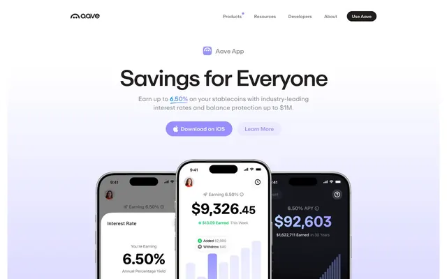
Aave employs a pragmatic, enterprise-grade aesthetic, balancing clear data presentation with subtle branding. The system uses a predominantly dark theme for content sections, contrasting with an initial bright hero. Typography is compact and precise, favoring confident, small text groups. Surfaces are flat or softly rounded, with elevation sparingly used to draw attention, and a singular luminous violet provides an interactive accent against the deep neutrals.
The page alternates between full-bleed and max-width contained sections. The initial hero pattern features a light background with a centered headline and buttons, overlaid on top of a product mockup cascade (mobile phones). Subsequent sections shift to a dark background, using a max-width centered container. Content arrangement often utilizes a centered stack for titles and calls to action, followed by multi-column grids (e.g., 3-column cards for features) within the contained sections. Vertical rhythm is consistent with large section gaps of approximately 48px, creating clear divisions. The navigation is a sticky top bar with global links and a prominent 'Use Aave' button.
This system primarily uses product-focused imagery, showcasing mobile app screens and sophisticated UI elements. Photography is absent, replaced by stylized product mockups (e.g., iPhones displaying the Aave app) that serve as content showcases. Icons are minimal, outlined, and monochromatic, used functionally rather than decoratively, maintaining a high density of information over large visual elements. Graphics are abstract and geometric, often subtle background elements, like the gradient in the hero section, to provide atmosphere. The overall density is high, with imagery embedded within textual descriptions to explain product features.
Reminiscent of Linear, Stripe, Coinbase, Figma.
# aave.com — Style Reference
> Deep Slate Precision

**Theme:** mixed

**Site:** https://aave.com

Aave employs a pragmatic, enterprise-grade aesthetic, balancing clear data presentation with subtle branding. The system uses a predominantly dark theme for content sections, contrasting with an initial bright hero. Typography is compact and precise, favoring confident, small text groups. Surfaces are flat or softly rounded, with elevation sparingly used to draw attention, and a singular luminous violet provides an interactive accent against the deep neutrals.

## Tokens — Colors

| Name | Value | Token | Role |
|------|------|------|------|
| Cosmic Violet | `#998eff` | `--color-cosmic-violet` | Primary action buttons, interactive highlights, navigational focus states, decorative accents. The sole vibrant color for signaling interaction and brand identity |
| White Canvas | `#ffffff` | `--color-white-canvas` | Page backgrounds in light sections, active navigation indicators, key component backgrounds. Provides crisp contrast |
| Ink Black | `#221d1d` | `--color-ink-black` | Primary text, critical headings, dark section backgrounds, subtle dark borders. Near-black for sharp readability |
| Pewter | `#636161` | `--color-pewter` | Secondary text, muted links, subtle icon fills. Used for supporting information that recedes slightly |
| Misty Gray | `#8f8e8e` | `--color-misty-gray` | Helper text, tertiary information, soft borders. Further recedes compared to Pewter |
| Obsidian | `#0f0f10` | `--color-obsidian` | Dark theme button backgrounds, primary navigation text on dark backgrounds. A slightly softer alternative to Ink Black |
| Light Alabaster | `#f6f7f4` | `--color-light-alabaster` | Card backgrounds in lighter sections, subtle background distinctions |
| Slate Dust | `#858387` | `--color-slate-dust` | Dominant background for dark themed sections and main content areas, creating a subtle contrast against white |

## Tokens — Typography

### Aave Repro
- **Weights:** 400, 450, 500
- **Sizes:** 13px, 14px, 15px, 16px, 17px, 18px, 20px, 24px, 32px, 40px, 72px
- **Line height:** 1
- **Letter spacing:** -0.0500em at 72px, -0.0250em at 40px, -0.0100em at 18-24px, 0.0100em at 13px
- **Role:** Primary brand typeface for all headings, body text, and UI elements. The condensed 'ss07' variant provides a tight, technical feel, especially with the precise negative letter-spacing for larger sizes.

### Inter
- **Weights:** 400, 700
- **Sizes:** 10px, 14px
- **Line height:** 1.5
- **Letter spacing:** -0.0060em
- **Role:** Secondary sans-serif font for small annotations, navigation items, and data labels where Aave Repro might be too condensed or its custom glyphs less suitable. Used sparingly to complement, not dominate.

## Tokens — Type Scale

Golden Ratio (1.618) from 10px base.

| Role | Size | Line height | Letter spacing |
|------|------|------|------|
| caption | 10px | 1.5 | -0.06em |
| subheading | 18px | 1.4 | -0.18px |
| heading-sm | 24px | 1.36 | -0.24px |
| heading | 40px | 1.1 | -1px |
| display | 72px | 0.9 | -3.6px |

## Tokens — Spacing

- **Section gap:** 48px
- **Card padding:** 24px
- **Element gap:** 8px

## Tokens — Radius

- **Buttons:** 20px
- **Cards:** 24px
- **input:** 20px
- **navItems:** 50px
- **pills:** 1584px

## Tokens — Elevation

- **Header Navigation:** `rgba(0, 0, 0, 0.05) 0px 6px 20px 0px, rgba(0, 0, 0, 0.06) 0px 0px 0px 1px`

## Layout

The page alternates between full-bleed and max-width contained sections. The initial hero pattern features a light background with a centered headline and buttons, overlaid on top of a product mockup cascade (mobile phones). Subsequent sections shift to a dark background, using a max-width centered container. Content arrangement often utilizes a centered stack for titles and calls to action, followed by multi-column grids (e.g., 3-column cards for features) within the contained sections. Vertical rhythm is consistent with large section gaps of approximately 48px, creating clear divisions. The navigation is a sticky top bar with global links and a prominent 'Use Aave' button.

## Imagery

This system primarily uses product-focused imagery, showcasing mobile app screens and sophisticated UI elements. Photography is absent, replaced by stylized product mockups (e.g., iPhones displaying the Aave app) that serve as content showcases. Icons are minimal, outlined, and monochromatic, used functionally rather than decoratively, maintaining a high density of information over large visual elements. Graphics are abstract and geometric, often subtle background elements, like the gradient in the hero section, to provide atmosphere. The overall density is high, with imagery embedded within textual descriptions to explain product features.

## Components

### Primary Call to Action Button
*Filled button indicating primary interaction.*

Background: Cosmic Violet (#998eff). Text: White Canvas (#ffffff). Padding: 14px vertical, 24px horizontal. Radius: 1584px (large, pill-shaped) for a bold, approachable CTA. Font: Aave Repro, 16px, weight 450.

### Ghost Button (Dark)
*Lightweight, secondary action on dark backgrounds.*

Background: transparent. Text: Obsidian (#0f0f10). Border: 1px solid Obsidian (#0f0f10). Padding: 9px vertical, 16px horizontal. Radius: 50px (rounded pill). Font: Aave Repro, 16px, weight 450.

### Ghost Button (Light)
*Lightweight, secondary action on light backgrounds.*

Background: transparent. Text: Pewter (#636161). Border: 1px solid Pewter (#636161). Padding: 9px vertical, 16px horizontal. Radius: 50px (rounded pill). Font: Aave Repro, 16px, weight 450.

### Navigation Link Button
*Header navigation items that act as buttons.*

Background: transparent. Text: Ink Black (#221d1d). No border. Padding: 20px top, 12px bottom (larger vertical for visual emphasis). Radius: 0px. Font: Aave Repro, 16px, weight 400.

### Card (White Canvas Background)
*Content container for features or data on white backgrounds.*

Background: White Canvas (#ffffff) with 3% alpha for subtle visual depth. Padding: 32px vertical, 24px horizontal. Radius: 20px. No border or shadow.

### Card (Light Alabaster Background)
*Content container for features or data on light alabaster backgrounds.*

Background: Light Alabaster (#f6f7f4). Padding: 32px vertical, 24px horizontal. Radius: 24px. No border or shadow.

### Card (Slate Dust Background)
*Content container for features or data on dark section backgrounds.*

Background: Slate Dust (#858387). Padding: 32px vertical, 24px horizontal. Radius: 24px. No outer border or shadow.

### Input Field
*User input text field.*

Background: White Canvas (#ffffff). Text color: Ink Black (#221d1d). Border: 1px solid Ink Black (#221d1d). Padding: 10px vertical, 16px horizontal. Radius: 20px 6px 6px 20px (asymmetric for distinct visual). Font: Aave Repro.

## Guidelines

### Do

- Use Aave Repro with negative letter spacing for larger headings (e.g., -0.0500em at 72px) to maintain a condensed, authoritative presence.
- Apply Cosmic Violet (#998eff) exclusively for primary calls to action, active states, and brand-critical highlights; avoid using it decoratively.
- Maintain a clear visual hierarchy by limiting card shadows to navigation elements only, favoring flat or subtle background color shifts for content grouping.
- Implement the 1584px 'pill' radius for primary buttons to create a softer, more inviting interactive target.
- Use Light Alabaster (#f6f7f4) or Slate Dust (#858387) for card backgrounds to generate depth without relying on shadows.
- Ensure all interactive elements have a focus state derived from Cosmic Violet or a subtle glow from the token --focus.
- Utilize the asymmetric 20px 6px 6px 20px border-radius for input fields to create a distinct, modern form element.

### Don't

- Do not introduce additional saturated colors; Cosmic Violet (#998eff) is the sole accent color for branding.
- Avoid using drop shadows on cards or regular content blocks; rely on background color changes for surface differentiation.
- Do not deviate from the specified negative letter-spacing values for display and heading typography; it's critical to the brand's compact style.
- Do not use generic border radii; adhere to the specific values like 20px for buttons and 24px for cards.
- Do not use default browser link styles; all links should adopt the body text color with subtle hover states, or be explicitly styled as buttons.
- Do not introduce heavy iconography or overly decorative illustrations; align with the UI-focused, almost monochrome visual language.
- Avoid large hero imagery; product screens and minimal visuals paired with bold typography define the hero aesthetic.

## Agent Prompt Guide

Quick Color Reference:
text: #221d1d
background: #ffffff (light theme), #858387 (dark theme)
border: #221d1d (dark), #636161 (medium), #8f8e8e (lightest)
accent: #998eff
primary action: #998eff (filled action)

Example Component Prompts:
Create a Primary Action Button: #998eff background, #000000 text, 9999px radius, compact pill padding. Use this filled treatment for the main CTA.

Create a feature card: Light Alabaster (#f6f7f4) background. Radius 24px. Padding 32px vertical, 24px horizontal. Headline 'General purpose' in Ink Black (#221d1d), Aave Repro, 24px, weight 500, letter-spacing -0.0100em. Body text in Pewter (#636161), Aave Repro, 16px, weight 400.

Create a secondary ghost button: 'Learn More' with transparent background, Obsidian (#0f0f10) text and 1px border. Padding 9px vertical, 16px horizontal. Radius 50px, Aave Repro, 16px, weight 450.

Create a dark-themed section: Slate Dust (#858387) background. Centered heading 'The Full Power of DeFi' in White Canvas (#ffffff), Aave Repro, 40px, weight 500, letter-spacing -0.0250em.

Create an input field: White Canvas (#ffffff) background, Ink Black (#221d1d) text, 1px solid Ink Black (#221d1d) border. Padding 10px vertical, 16px horizontal. Radius 20px 6px 6px 20px.
More like this






Keep what you find
A free account saves references to boards and can send you a weekly email of picks based on what you save.
To see every result, go Pro.