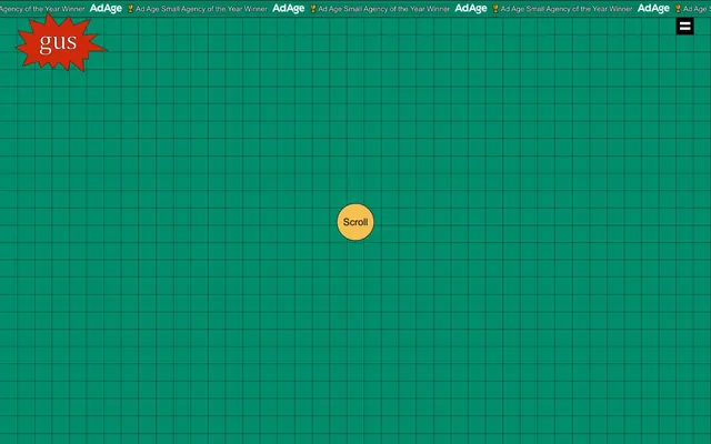
Preview image. Unlock full-res
Pixelated grid playground.
Color palette
Yellow wash for highlight backgrounds, decorative bands, and soft emphasis behind content. Do not promote it to the primary CTA color
Primary page background, underlying grid color
Subtle dark lines for the background grid pattern, primary body text, divider lines
Text color for primary content, icon outlines, button borders, default element outlines
Highlight text, link text on dark backgrounds, secondary element outlines
Typography
- Weights
- 400
- Sizes
- 16px
- Line height
- 1.2
- Letter spacing
- normal
- Fallback
- Times New Roman
Body text and standard informational content. Its serif nature provides a grounding contrast to the pixelated grid background.
- Weights
- 400, 700
- Sizes
- 13px, 15px, 20px, 28px
- Line height
- 1.2, 1.25, 1.5
- Letter spacing
- normal
- Fallback
- Helvetica Neue
UI labels, button text, and headings. Its clean sans-serif form ensures clarity in interactive elements and titles.
Spacing & shape
Components
Transparent background, #ffffff text on `Grid Canvas`, no padding or border, 0px radius. Used for top-level navigation items. Text uses Arial, weight 400.
Black square with two white horizontal lines, 0px radius. No discernible padding. Functions as a hamburger menu icon.
Circular button with a '#f5c04f' background and '#000000' text. 9999px radius to create a perfect circle. Arial, weight 400, size 15px. Text 'Scroll' is centered within. No padding visible.
A red starburst shape, '#ff0000', with the word 'gus' in white, '#ffffff'. This element acts as a distinctive and playful brand identifier. The edges are sharp; 0px radius.
Horizontal strip at the top. White text, '#ffffff', on the 'Grid Canvas' background '#008263'. Text '🏆 Ad Age Small Agency of the Year Winner'. Uses Times, weight 400, size 16px. No extra padding or borders.
Guidelines
- Prioritize '#008263' for large background areas, emphasizing the grid pattern with '#050000' lines.
- Use 'Times' for paragraph text and 'Arial' for all UI labels, headings, and buttons.
- Apply 9999px border-radius to perfect circular elements like the 'Scroll' button.
- Maintain a flat visual hierarchy with no shadows or complex gradients unless explicitly defined.
- Employ the starburst shape with '#ff0000' for key brand accents or playful callouts.
- Use '#000000' for primary text on light backgrounds and '#ffffff' on dark backgrounds or highlights.
- Ensure interactive elements like buttons and links use distinct accent colors or clear text-on-background contrast.
- Avoid using any form of drop shadows or box shadows, as the system relies on flat aesthetics.
- Do not introduce gradients; the visual system is strictly flat color.
- Do not deviate from the specified circular or sharp-edged radii; curved rects are not part of this system.
- Do not use generic system UI elements or styles that introduce elevation or depth.
- Avoid mixing primary and secondary fonts unnecessarily; adhere strictly to their defined roles.
- Do not use subtle color variations for interactive states; rely on direct background or text color changes.
About this system
ShowHide
The Gus design system evokes a playful, almost retro, digital workspace. A dominant, vibrant teal acts as the primary canvas, overlaid with a subtle grid pattern, giving the impression of an engineering blueprint or a pixel art canvas. Typography is minimal and pragmatic, with an emphasis on system fonts, contrasting sharply with occasional bursts of bright, primary accent colors that draw attention to key interactive elements. Visual treatments are flat with sharply defined shapes, avoiding shadows or complex gradients.
Reminiscent of Neocities, MS Paint, Command Line Interface (CLI) tools, Early web design (1990s).
# Gus — Style Reference
> Pixelated grid playground.

**Theme:** dark

**Site:** https://gus.biz

The Gus design system evokes a playful, almost retro, digital workspace. A dominant, vibrant teal acts as the primary canvas, overlaid with a subtle grid pattern, giving the impression of an engineering blueprint or a pixel art canvas. Typography is minimal and pragmatic, with an emphasis on system fonts, contrasting sharply with occasional bursts of bright, primary accent colors that draw attention to key interactive elements. Visual treatments are flat with sharply defined shapes, avoiding shadows or complex gradients.

## Tokens — Colors

| Name | Value | Token | Role |
|------|------|------|------|
| Scroll Highlight | `#f5c04f` | `--color-scroll-highlight` | Yellow wash for highlight backgrounds, decorative bands, and soft emphasis behind content. Do not promote it to the primary CTA color |
| Grid Canvas | `#008263` | `--color-grid-canvas` | Primary page background, underlying grid color |
| Grid Line | `#050000` | `--color-grid-line` | Subtle dark lines for the background grid pattern, primary body text, divider lines |
| Midnight Ink | `#000000` | `--color-midnight-ink` | Text color for primary content, icon outlines, button borders, default element outlines |
| Paper White | `#ffffff` | `--color-paper-white` | Highlight text, link text on dark backgrounds, secondary element outlines |

## Tokens — Typography

### Times
- **Substitute:** Times New Roman
- **Weights:** 400
- **Sizes:** 16px
- **Line height:** 1.2
- **Letter spacing:** normal
- **Role:** Body text and standard informational content. Its serif nature provides a grounding contrast to the pixelated grid background.

### Arial
- **Substitute:** Helvetica Neue
- **Weights:** 400, 700
- **Sizes:** 13px, 15px, 20px, 28px
- **Line height:** 1.2, 1.25, 1.5
- **Letter spacing:** normal
- **Role:** UI labels, button text, and headings. Its clean sans-serif form ensures clarity in interactive elements and titles.

## Tokens — Type Scale

| Role | Size | Line height | Letter spacing |
|------|------|------|------|
| caption | 13px | 1.25 | — |
| body-sm | 15px | 1.25 | — |
| body | 20px | 1.25 | — |
| body-lg | 28px | 1.25 | — |

## Tokens — Spacing

- **Card padding:** 0px
- **Element gap:** 0px

## Tokens — Radius

- **Buttons:** 9999px
- **scrollButton:** 9999px
- **starburst:** 0px

## Components

### Ghost Header Navigation Link
*Navigation element*

Transparent background, #ffffff text on `Grid Canvas`, no padding or border, 0px radius. Used for top-level navigation items. Text uses Arial, weight 400.

### Menu Toggle Button
*Toggle control*

Black square with two white horizontal lines, 0px radius. No discernible padding. Functions as a hamburger menu icon.

### Scroll Call to Action
*Interactive indicator*

Circular button with a '#f5c04f' background and '#000000' text. 9999px radius to create a perfect circle. Arial, weight 400, size 15px. Text 'Scroll' is centered within. No padding visible.

### Starburst Logo Placeholder
*Brand mark*

A red starburst shape, '#ff0000', with the word 'gus' in white, '#ffffff'. This element acts as a distinctive and playful brand identifier. The edges are sharp; 0px radius.

### AdAge Award Banner
*Informational banner*

Horizontal strip at the top. White text, '#ffffff', on the 'Grid Canvas' background '#008263'. Text '🏆 Ad Age Small Agency of the Year Winner'. Uses Times, weight 400, size 16px. No extra padding or borders.

## Guidelines

### Do

- Prioritize '#008263' for large background areas, emphasizing the grid pattern with '#050000' lines.
- Use 'Times' for paragraph text and 'Arial' for all UI labels, headings, and buttons.
- Apply 9999px border-radius to perfect circular elements like the 'Scroll' button.
- Maintain a flat visual hierarchy with no shadows or complex gradients unless explicitly defined.
- Employ the starburst shape with '#ff0000' for key brand accents or playful callouts.
- Use '#000000' for primary text on light backgrounds and '#ffffff' on dark backgrounds or highlights.
- Ensure interactive elements like buttons and links use distinct accent colors or clear text-on-background contrast.

### Don't

- Avoid using any form of drop shadows or box shadows, as the system relies on flat aesthetics.
- Do not introduce gradients; the visual system is strictly flat color.
- Do not deviate from the specified circular or sharp-edged radii; curved rects are not part of this system.
- Do not use generic system UI elements or styles that introduce elevation or depth.
- Avoid mixing primary and secondary fonts unnecessarily; adhere strictly to their defined roles.
- Do not use subtle color variations for interactive states; rely on direct background or text color changes.

## Agent Prompt Guide

### Quick Color Reference
text: #000000
background: #008263
border: #050000
accent: #f5c04f
primary action: no distinct CTA color

### 3-5 Example Component Prompts
1. Create a top banner section: background '#008263'. Text '🏆 Ad Age Small Agency of the Year Winner' color '#ffffff', font 'Times', weight 400, size 16px. Place a menu button on the right: '#000000' square with two '#ffffff' horizontal lines.
2. Design the brand logo area: a 'Starburst Logo Placeholder' with a '#ff0000' starburst and 'gus' text in '#ffffff'.
No distinct primary action color was observed; use the extracted neutral button treatments instead of inventing a filled CTA color.
More like this








Keep what you find
A free account saves references to boards and can send you a weekly email of picks based on what you save.
To see every result, go Pro.