Preview image. Unlock full-res
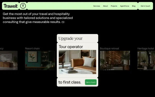
Midnight forest bloom: deep, dark canvases with bursts of vivid green.
Color palette
Navigation backgrounds, soft internal surfaces — a moderate green that signals active states and subtle content segmentation without being overly bold
Primary action backgrounds, interactive elements, brand highlights — the vivid, defining accent color that draws attention and signals action
Page backgrounds, primary text, borders, dark overlay surfaces — creates a rich, absorbing dark mode experience
Muted accents, inactive text, icon details, ghost borders — provides stark contrast against the deep black for high readability
Hero section backgrounds, prominent accent surfaces — a near-gray with a warm undertone, offering a subtle shift from pure achromatic neutrals
Subtle background shifts, content block differentiation — a light, cool gray-green that offers a soft visual break from the black
Card backgrounds, light button states, subtle highlights — an almost-white neutral that softens the contrast of internal elements
Typography
- Weights
- 400
- Sizes
- 16px, 20px, 23px, 28px, 31px, 39px, 43px, 53px, 435px
- Line height
- 0.8, 1, 1.1, 1.2, 1.3, 1.5
- Letter spacing
- -0.72, -0.1, 0.1
- Fallback
- Space Grotesk, Cabinet Grotesk
Primary display font for headings, navigation, and key informational text — its distinctive character and varied letter-spacing create a unique editorial feel.
- Weights
- 250
- Sizes
- 20px, 39px, 43px, 53px
- Line height
- 1.1, 1.2, 1.3
- Letter spacing
- -0.1
- Fallback
- Canela, Recoleta
Secondary display for select large headlines, offering a lighter, more refined contrast to Labour Grotesk for dramatic visual impact.
Spacing & shape
Components
Solid Forest Green background with Paper White text, softened corners at 10.08px radius. Used for primary actions like 'Get in Touch'.
Transparent background with a Paper White 6px circular border and Paper White icon. Used for subtle navigation or interactive controls.
Ink Black text on transparent background, transitioning to Fresh Mint background for active states. Text uses Labour Grotesk at 16px with precise letter-spacing.
Cloud White background, 15.04px border radius, with 15px internal padding. Uses Ink Black text and often pairs with images or headlines.
No explicit background, 15.04px border radius. Uses Ink Black text, with specific headlines in Labour Grotesk size depending on hierarchy.
Guidelines
- Prioritize Ink Black (#000000) for all main backgrounds to maintain the brand's dark aesthetic.
- Use Forest Green (#2d9b4c) exclusively for primary interactive elements and key brand accents to maximize its impact.
- Employ Labour Grotesk for all headings and navigational text, varying sizes from 16px to 435px and line heights and letter spacing from its varied properties to create visual rhythm.
- Apply a consistent 15.04px border radius to cards and significant navigation elements, contrasting with the tighter 10.08px for buttons.
- Ensure generous section gaps of 187px to create ample negative space and visual breathability between content blocks.
- Utilize Cloud White (#efefe7) for card backgrounds and subtle surface elevations, never applying hard borders or shadows beyond the defined radius.
- Avoid using multiple chromatic colors; limit brand accents to Forest Green and Fresh Mint.
- Do not introduce sharp corners or square elements; maintain the consistent use of 10.08px or 15.04px radii.
- Refrain from using drop shadows or heavy elevation; surfaces should appear flat or subtly raised through color contrast only.
- Do not deviate from Labour Grotesk for headings or Reckless Neue for dramatic display text; avoid generic system fonts in these roles.
- Never use generic 1rem or 16px padding on cards; adhere to the specific 15px card padding.
- Avoid text colors other than Ink Black or Paper White, except where explicitly defined by component properties.
About this system
ShowHide
Trawelt embodies a vibrant, dark-mode consultancy aesthetic. Deep black canvases are punctuated by a singular, vivid green that marks brand elements, interactive states, and key navigational points. Typography balances a strong, characterful display font for headlines with a clean, functional sans-serif for body text. Components are largely borderless and flush with the background, relying on color contrast for definition, or a subtle, almost-white card surface to highlight content.
Reminiscent of Framer, Linear, Stripe, Superhuman.
# Trawelt — Style Reference
> Midnight forest bloom: deep, dark canvases with bursts of vivid green.

**Theme:** dark

**Site:** https://www.trawelt.com

Trawelt embodies a vibrant, dark-mode consultancy aesthetic. Deep black canvases are punctuated by a singular, vivid green that marks brand elements, interactive states, and key navigational points. Typography balances a strong, characterful display font for headlines with a clean, functional sans-serif for body text. Components are largely borderless and flush with the background, relying on color contrast for definition, or a subtle, almost-white card surface to highlight content.

## Tokens — Colors

| Name | Value | Token | Role |
|------|------|------|------|
| Fresh Mint | `#d3ffc3` | `--color-fresh-mint` | Navigation backgrounds, soft internal surfaces — a moderate green that signals active states and subtle content segmentation without being overly bold |
| Forest Green | `#2d9b4c` | `--color-forest-green` | Primary action backgrounds, interactive elements, brand highlights — the vivid, defining accent color that draws attention and signals action |
| Ink Black | `#000000` | `--color-ink-black` | Page backgrounds, primary text, borders, dark overlay surfaces — creates a rich, absorbing dark mode experience |
| Paper White | `#ffffff` | `--color-paper-white` | Muted accents, inactive text, icon details, ghost borders — provides stark contrast against the deep black for high readability |
| Desert Sand | `#e7d5ba` | `--color-desert-sand` | Hero section backgrounds, prominent accent surfaces — a near-gray with a warm undertone, offering a subtle shift from pure achromatic neutrals |
| Pale Sage | `#e4e9dc` | `--color-pale-sage` | Subtle background shifts, content block differentiation — a light, cool gray-green that offers a soft visual break from the black |
| Cloud White | `#efefe7` | `--color-cloud-white` | Card backgrounds, light button states, subtle highlights — an almost-white neutral that softens the contrast of internal elements |

## Tokens — Typography

### Labour Grotesk
- **Substitute:** Space Grotesk, Cabinet Grotesk
- **Weights:** 400
- **Sizes:** 16px, 20px, 23px, 28px, 31px, 39px, 43px, 53px, 435px
- **Line height:** 0.8, 1, 1.1, 1.2, 1.3, 1.5
- **Letter spacing:** -0.72, -0.1, 0.1
- **Role:** Primary display font for headings, navigation, and key informational text — its distinctive character and varied letter-spacing create a unique editorial feel.

### Reckless Neue
- **Substitute:** Canela, Recoleta
- **Weights:** 250
- **Sizes:** 20px, 39px, 43px, 53px
- **Line height:** 1.1, 1.2, 1.3
- **Letter spacing:** -0.1
- **Role:** Secondary display for select large headlines, offering a lighter, more refined contrast to Labour Grotesk for dramatic visual impact.

## Tokens — Type Scale

Major Third (1.25) from 16px base.

| Role | Size | Line height | Letter spacing |
|------|------|------|------|
| body | 16px | 1.5 | 0.1px |
| subheading | 20px | 1.3 | -0.1px |
| heading-sm | 23px | 1.2 | -0.1px |
| heading | 28px | 1.2 | -0.1px |
| heading-lg | 39px | 1.1 | -0.1px |
| display | 53px | 1 | -0.1px |

## Tokens — Spacing

- **Section gap:** 187px
- **Card padding:** 15px
- **Element gap:** 15px

## Tokens — Radius

- **Buttons:** 10.08px
- **Cards:** 15.04px
- **navigation:** 15.04px

## Components

### Primary Call to Action Button
*Filled button*

Solid Forest Green background with Paper White text, softened corners at 10.08px radius. Used for primary actions like 'Get in Touch'.

### Ghost Icon Button
*Outlined icon button*

Transparent background with a Paper White 6px circular border and Paper White icon. Used for subtle navigation or interactive controls.

### Navigation Link
*Navigational item*

Ink Black text on transparent background, transitioning to Fresh Mint background for active states. Text uses Labour Grotesk at 16px with precise letter-spacing.

### Content Card
*Information display*

Cloud White background, 15.04px border radius, with 15px internal padding. Uses Ink Black text and often pairs with images or headlines.

### Blog Post Item
*List item for blog articles*

No explicit background, 15.04px border radius. Uses Ink Black text, with specific headlines in Labour Grotesk size depending on hierarchy.

## Guidelines

### Do

- Prioritize Ink Black (#000000) for all main backgrounds to maintain the brand's dark aesthetic.
- Use Forest Green (#2d9b4c) exclusively for primary interactive elements and key brand accents to maximize its impact.
- Employ Labour Grotesk for all headings and navigational text, varying sizes from 16px to 435px and line heights and letter spacing from its varied properties to create visual rhythm.
- Apply a consistent 15.04px border radius to cards and significant navigation elements, contrasting with the tighter 10.08px for buttons.
- Ensure generous section gaps of 187px to create ample negative space and visual breathability between content blocks.
- Utilize Cloud White (#efefe7) for card backgrounds and subtle surface elevations, never applying hard borders or shadows beyond the defined radius.

### Don't

- Avoid using multiple chromatic colors; limit brand accents to Forest Green and Fresh Mint.
- Do not introduce sharp corners or square elements; maintain the consistent use of 10.08px or 15.04px radii.
- Refrain from using drop shadows or heavy elevation; surfaces should appear flat or subtly raised through color contrast only.
- Do not deviate from Labour Grotesk for headings or Reckless Neue for dramatic display text; avoid generic system fonts in these roles.
- Never use generic 1rem or 16px padding on cards; adhere to the specific 15px card padding.
- Avoid text colors other than Ink Black or Paper White, except where explicitly defined by component properties.

## Agent Prompt Guide

Quick Color Reference:
text: #ffffff
background: #000000
border: #ffffff
accent: #2d9b4c
primary action: #2d9b4c (filled action)

Example Component Prompts:
1. Create a hero section: Ink Black (#000000) background, with an overlay background of Desert Sand (#e7d5ba). Centered headline in Labour Grotesk, size 53px, Paper White (#ffffff) text, line-height 1.0, letter-spacing -0.1px. Below, a subtitle in Labour Grotesk, size 23px, Paper White (#ffffff) text, line-height 1.2, letter-spacing -0.1px.
2. Design a primary call-to-action button: Solid Forest Green (#2d9b4c) background, Paper White (#ffffff) text, 10.08px radius, 10px vertical padding, 10.08px horizontal padding. Text is 'Get in Touch' in Labour Grotesk, 16px.
3. Build a content card: Cloud White (#efefe7) background, 15.04px radius, 15px padding. Place a headline inside using Labour Grotesk, size 28px, Ink Black (#000000) text, line-height 1.2, letter-spacing -0.1px.
4. Show a navigation item: Fresh Mint (#d3ffc3) background, Ink Black (#000000) text (Labour Grotesk, 16px). This is for an active state. For an inactive state, use a transparent background with Paper White (#ffffff) text and Ink Black (#000000) border.
5. Create a ghost icon button: Transparent background, Paper White (#ffffff) 6px solid circular border, 0px padding. The icon should be Paper White.
More like this









Keep what you find
A free account saves references to boards and can send you a weekly email of picks based on what you save.
To see every result, go Pro.