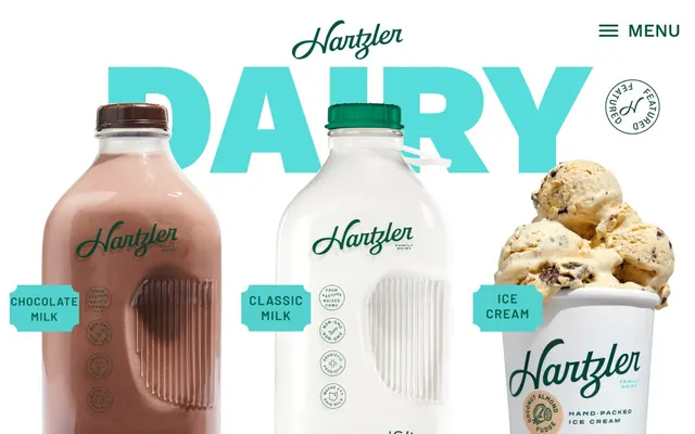
Preview image. Unlock full-res
Farm-Fresh Bold Text
Color palette
Secondary text, outlined button borders, key interactive elements, brand accents. This color evokes natural ingredients and freshness
Outlined links, border highlights, secondary brand accent. Its vibrancy draws attention without overwhelming
Teal outline accent for tags, dividers, and focused UI edges.
Yellow outline accent for tags, dividers, and focused UI edges.
Page backgrounds, button backgrounds, primary surface
Primary body text, bold headings, borders and outlines on neutral elements
Typography
- Weights
- 400, 500, 900
- Sizes
- 14px, 17px, 18px, 40px, 290px, 333px
- Line height
- 0.7, 1, 1.06, 1.45
- Letter spacing
- -0.0100em
- Fallback
- system-ui
This is the primary font for all textual content, from body to large display headings. The variety of weights, especially the extra-bold 900, combined with significant sizing for display elements, allows for dramatic visual impact and clear hierarchy. The negative letter-spacing on larger sizes makes the text feel cohesive and impactful.
- Weights
- 400
- Sizes
- 40px
- Line height
- 1
- Letter spacing
- normal
- Fallback
- system-ui
Used exclusively for brand icons.
Spacing & shape
Components
Ghost button with Pasture Green text and border. Uses the largest pill-shaped radius for a friendly, approachable feel. Padding: 12px vertical, 24px horizontal. Text color: #035542, border color: #035542, background: transparent, border-radius: 100px.
Filled button with Canvas White background and Pasture Green text. Uses a 20px radius. Padding: 12px vertical, 24px horizontal. Text color: #035542, background: #ffffff, border-color: #035542, border-radius: 20px.
Minimal link-style button often used in navigation or secondary actions. Text color: Pasture Green (#035542), transparent background. Padding 0px. No distinct border or radius. Used for 'Skip to content' etc.
Label for product categories. Uses square shape with 0px radius. Text color is Pasture Green (#035542) on a transparent background, but often visually backed by a decorative shape. Padding 0px.
Circular 'Featured' badge with an 'H' monogram. This component is primarily visual and acts as a brand embellishment. It features a transparent background and Pasture Green text/border outlining.
Button with an outline in Sky Blue and corresponding text color. Ideal for secondary calls to action that shouldn't dominate. Background transparent, color #2b7bb9, border-color #2b7bb9, border-radius 0px, 10px vertical, 15px horizontal padding.
Guidelines
- Prioritize Canvas White (#ffffff) as the dominant background, ensuring high contrast with text.
- Use Shadow Graphite (#333333) for primary body text and darker neutral outlines.
- Apply Work Sans 900 weight at large sizes (290px, 333px) for dramatic display headings, using Dairy Teal (#56dddb) or Buttercream Yellow (#f9e9a9) as accent colors against Pasture Green surrounds.
- Implement pill-shaped buttons with 100px radius for primary interactive elements, using Pasture Green (#035542) for text and borders.
- Maintain a comfortable density with 20px element gaps and 50px section gaps.
- Utilize Pasture Green (#035542) as the primary brand accent for links, functional text, and outlined buttons.
- Ensure all interactive elements have sufficient padding: 12px vertical and 24px horizontal for most buttons.
- Avoid heavy shadows or gradients on UI elements; the design relies on flat colors and strong typography.
- Do not introduce new typefaces; strictly adhere to Work Sans for all text.
- Refrain from highly saturated, unbranded colors for backgrounds or large areas; stick to natural tones and white.
- Do not deviate from the rounded or pill-shaped radii for buttons; square buttons are not part of the system's interactive language.
- Avoid busy layouts or excessive UI elements; focus on presenting content clearly and directly.
- Do not use generic blue for links or buttons; use either Pasture Green (#035542) or Sky Blue (#2b7bb9) as designated action colors.
- Do not make every heading a display-sized colorful element; reserve the large accent-colored headings for focal sections.
About this system
ShowHide
Hartzler Family Dairy uses a farm-fresh, bold, and wholesome visual language. Large, expressive typography grounds the product imagery against a clean white canvas, frequently paired with strong accent colors that pop. Components are minimal, relying on typography and color for definition rather than heavy borders or shadows. The overall impression is one of simple, direct communication of purity and tradition.
The page primarily uses a full-bleed layout for hero sections, which are then often contrasted with content areas that appear to be vertically stacked within a comfortable content width. Hero sections feature large, centrally aligned text over product imagery. Content sections typically alternate between feature blocks, often with a two-column structure (e.g., text beside product or graphic elements). The overall rhythm is expansive and spacious, with clear vertical separation (50px section gap) between content blocks.
The site uses a combination of high-quality product photography and minimal, context-setting graphics. Product photography features tight crops on a pure white background, highlighting the product (e.g., milk bottles, butter sticks) as the hero without lifestyle clutter. Illustrations are primarily icons or decorative outlines (like the circular 'Featured' badge) in brand colors, providing visual interest without being overly complex. Imagery serves to showcase products and reinforce the brand's 'clean' and 'natural' aesthetic, rather than for decorative atmosphere or social proof. The density is image-rich on product showcase sections, but balanced with expansive typography.
Reminiscent of Tillamook, Straus Family Creamery, Trader Joe's, Oatly.
# Hartzler Family Dairy — Style Reference
> Farm-Fresh Bold Text

**Theme:** light

**Site:** https://www.hartzlerdairy.com

Hartzler Family Dairy uses a farm-fresh, bold, and wholesome visual language. Large, expressive typography grounds the product imagery against a clean white canvas, frequently paired with strong accent colors that pop. Components are minimal, relying on typography and color for definition rather than heavy borders or shadows. The overall impression is one of simple, direct communication of purity and tradition.

## Tokens — Colors

| Name | Value | Token | Role |
|------|------|------|------|
| Pasture Green | `#035542` | `--color-pasture-green` | Secondary text, outlined button borders, key interactive elements, brand accents. This color evokes natural ingredients and freshness |
| Sky Blue | `#2b7bb9` | `--color-sky-blue` | Outlined links, border highlights, secondary brand accent. Its vibrancy draws attention without overwhelming |
| Dairy Teal | `#56dddb` | `--color-dairy-teal` | Teal outline accent for tags, dividers, and focused UI edges. |
| Buttercream Yellow | `#f9e9a9` | `--color-buttercream-yellow` | Yellow outline accent for tags, dividers, and focused UI edges. |
| Canvas White | `#ffffff` | `--color-canvas-white` | Page backgrounds, button backgrounds, primary surface |
| Shadow Graphite | `#333333` | `--color-shadow-graphite` | Primary body text, bold headings, borders and outlines on neutral elements |

## Tokens — Typography

### Work Sans
- **Substitute:** system-ui
- **Weights:** 400, 500, 900
- **Sizes:** 14px, 17px, 18px, 40px, 290px, 333px
- **Line height:** 0.7, 1, 1.06, 1.45
- **Letter spacing:** -0.0100em
- **Role:** This is the primary font for all textual content, from body to large display headings. The variety of weights, especially the extra-bold 900, combined with significant sizing for display elements, allows for dramatic visual impact and clear hierarchy. The negative letter-spacing on larger sizes makes the text feel cohesive and impactful.

### Font Awesome 5 Brands
- **Substitute:** system-ui
- **Weights:** 400
- **Sizes:** 40px
- **Line height:** 1
- **Letter spacing:** normal
- **Role:** Used exclusively for brand icons.

## Tokens — Type Scale

| Role | Size | Line height | Letter spacing |
|------|------|------|------|
| caption | 14px | 1.45 | -0.14px |
| body-sm | 17px | 1.45 | -0.17px |
| heading | 40px | 1.06 | -0.4px |
| display-lg | 290px | 0.7 | -2.9px |
| display-xl | 333px | 0.7 | -3.33px |

## Tokens — Spacing

- **Section gap:** 50px
- **Card padding:** 12px
- **Element gap:** 20px

## Tokens — Radius

- **buttons-pill:** 100px
- **buttons-rounded:** 20px
- **content-boxes:** 4px

## Layout

The page primarily uses a full-bleed layout for hero sections, which are then often contrasted with content areas that appear to be vertically stacked within a comfortable content width. Hero sections feature large, centrally aligned text over product imagery. Content sections typically alternate between feature blocks, often with a two-column structure (e.g., text beside product or graphic elements). The overall rhythm is expansive and spacious, with clear vertical separation (50px section gap) between content blocks.

## Imagery

The site uses a combination of high-quality product photography and minimal, context-setting graphics. Product photography features tight crops on a pure white background, highlighting the product (e.g., milk bottles, butter sticks) as the hero without lifestyle clutter. Illustrations are primarily icons or decorative outlines (like the circular 'Featured' badge) in brand colors, providing visual interest without being overly complex. Imagery serves to showcase products and reinforce the brand's 'clean' and 'natural' aesthetic, rather than for decorative atmosphere or social proof. The density is image-rich on product showcase sections, but balanced with expansive typography.

## Components

### Primary Ghost Button
*Interactive element*

Ghost button with Pasture Green text and border. Uses the largest pill-shaped radius for a friendly, approachable feel. Padding: 12px vertical, 24px horizontal. Text color: #035542, border color: #035542, background: transparent, border-radius: 100px.

### Rounded Filled Button
*Interactive element*

Filled button with Canvas White background and Pasture Green text. Uses a 20px radius. Padding: 12px vertical, 24px horizontal. Text color: #035542, background: #ffffff, border-color: #035542, border-radius: 20px.

### Minimal Link Button
*Interactive element*

Minimal link-style button often used in navigation or secondary actions. Text color: Pasture Green (#035542), transparent background. Padding 0px. No distinct border or radius. Used for 'Skip to content' etc.

### Product Highlight Badge
*Informational tag*

Label for product categories. Uses square shape with 0px radius. Text color is Pasture Green (#035542) on a transparent background, but often visually backed by a decorative shape. Padding 0px.

### Featured Label
*Decorative brand element*

Circular 'Featured' badge with an 'H' monogram. This component is primarily visual and acts as a brand embellishment. It features a transparent background and Pasture Green text/border outlining.

### Outlined Action Button
*Secondary action or link*

Button with an outline in Sky Blue and corresponding text color. Ideal for secondary calls to action that shouldn't dominate. Background transparent, color #2b7bb9, border-color #2b7bb9, border-radius 0px, 10px vertical, 15px horizontal padding.

## Guidelines

### Do

- Prioritize Canvas White (#ffffff) as the dominant background, ensuring high contrast with text.
- Use Shadow Graphite (#333333) for primary body text and darker neutral outlines.
- Apply Work Sans 900 weight at large sizes (290px, 333px) for dramatic display headings, using Dairy Teal (#56dddb) or Buttercream Yellow (#f9e9a9) as accent colors against Pasture Green surrounds.
- Implement pill-shaped buttons with 100px radius for primary interactive elements, using Pasture Green (#035542) for text and borders.
- Maintain a comfortable density with 20px element gaps and 50px section gaps.
- Utilize Pasture Green (#035542) as the primary brand accent for links, functional text, and outlined buttons.
- Ensure all interactive elements have sufficient padding: 12px vertical and 24px horizontal for most buttons.

### Don't

- Avoid heavy shadows or gradients on UI elements; the design relies on flat colors and strong typography.
- Do not introduce new typefaces; strictly adhere to Work Sans for all text.
- Refrain from highly saturated, unbranded colors for backgrounds or large areas; stick to natural tones and white.
- Do not deviate from the rounded or pill-shaped radii for buttons; square buttons are not part of the system's interactive language.
- Avoid busy layouts or excessive UI elements; focus on presenting content clearly and directly.
- Do not use generic blue for links or buttons; use either Pasture Green (#035542) or Sky Blue (#2b7bb9) as designated action colors.
- Do not make every heading a display-sized colorful element; reserve the large accent-colored headings for focal sections.

## Agent Prompt Guide

Quick Color Reference:
text: #333333
background: #ffffff
border: #035542
accent: #56dddb
primary action: #2b7bb9 (outlined action border)

Example Component Prompts:
Create a hero section with a transparent background. Headline 'DAIRY' in Dairy Teal (#56dddb) on a border, size 290px, Work Sans 900, -2.9px letter spacing. Below it, a ghost button: Pasture Green (#035542) text and border, border-radius 100px, 12px vertical, 24px horizontal padding.

Generate a product card: Canvas White (#ffffff) background. Title: Shadow Graphite (#333333), Work Sans 500, size 40px. Body text: Shadow Graphite (#333333), Work Sans 400, size 18px. Include a product highlight badge using Pasture Green (#035542) text on transparent background, no radius, 0px padding.

Design a navigation item: Link text 'PRODUCTS' in Pasture Green (#035542), Work Sans 400, size 17px, transparent background, 0px padding.

Create a 'MENU' button: Pasture Green (#035542) text, transparent background, 0px padding, no radius, Work Sans 400, size 17px.
More like this









Keep what you find
A free account saves references to boards and can send you a weekly email of picks based on what you save.
To see every result, go Pro.