Preview image. Unlock full-res
Rounded digital canvas.
Color palette
Major brand accent color for headings that announce key features and sections. The color choice ensures these elements are distinct and inviting
Primary background for the entire application, card surfaces, and key content blocks. Its extensive use creates an airy and unobstructed visual environment
Primary text color for body copy, navigational elements, and strong headings. Provides high contrast against Canvas White for optimal legibility
Background for secondary list items or subtle separators, providing a gentle visual break from pure white. Used for subtle text in less prominent UI elements
Used for prominent heading text, offering a slightly softer alternative to Ink Black while maintaining strong contrast
Fine borders and dividers for lists and subtle UI elements. Its lightness maintains the overall spacious and unburdened aesthetic
Secondary and helper text, links in less prominent areas. Softens the text appearance for less critical information
Typography
- Weights
- 400, 500
- Sizes
- 14px, 16px, 18px, 20px, 24px, 32px, 35px, 37px, 39px, 44px, 81px, 84px, 85px, 141px, 220px, 280px
- Line height
- 1, 1.04, 1.1, 1.15, 1.18, 1.2, 1.25, 1.33, 1.43, 1.67, 2.44, 2.5, 2.78
- Letter spacing
- -0.0570em at largest sizes, reducing to -0.0120em for body text
- Fallback
- system-ui, sans-serif
The primary typeface for all text content. Its clean, humanist characteristics support both large, impactful headlines and legible body copy, contributing to the app's friendly and accessible tone. The varied weights and sizes allow for a rich typographic hierarchy.
Spacing & shape
Elevation
Components
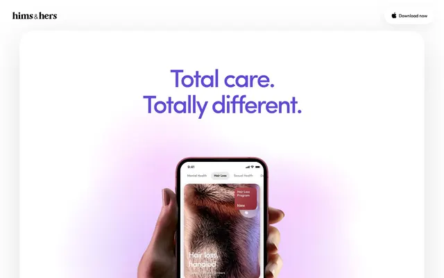
A fixed element at the top of the page, acting as the brand anchor and universal download call to action. Features the 'Hims & Hers' logo in Ink Black on Canvas White, with a 'Download now' button to the far right. No background fill, utilizing the page body as its background. Features a soft shadow rgba(0, 0, 0, 0.06) 0px 8px 30px 0px for subtle elevation.
Contained within the header, this button is Canvas White with Ink Black text, 52px border radius. It is a ghost button, defined only by its subtle shadow rgba(0, 0, 0, 0.06) 0px 8px 30px 0px and the text 'Download now'.
Large, rounded card used in the hero, often appearing as a device mockup frame. Background is Canvas White with a generous 45px border radius. Its prominence is established by a soft, spread-out shadow: rgba(0, 0, 0, 0.12) 0px 27px 104px 0px.
Headings like 'Total care. Totally different.' use App Brand Violet (#5d48db) with a Sofia font, often at very large sizes (81px or 141px) and a line height of 1.0, and letter-spacing -0.0570em. These headings are the primary visual anchor for each content section.
Used throughout the page for various content blocks. It has a Canvas White background and a 30px border radius, providing a softer boundary than sharp edges. Features a subtle shadow `rgba(0, 0, 0, 0.11) 0px 8px 127px 0px` for minimal uplift.
List items (e.g., in FAQ sections) have a Subtle Gray (#f0f0f0) background with Ink Black text. These items use Border Light Gray (#e0e0e0) for dividers, ensuring visual separation without heavy lines.
Guidelines
- Always use Canvas White (#ffffff) as the primary background for all UI elements to maintain a spacious and clinical aesthetic.
- Apply App Brand Violet (#5d48db) sparingly, primarily for high-impact headings and key brand identifiers where a vibrant accent is desired.
- Utilize large border radii, specifically 45px for cards and 52px for interactive elements in the header, to promote a soft, approachable feel.
- Employ Sofia font for all text content, selecting weights 400 or 500 depending on hierarchy, and meticulously adjust letter-spacing as per the type scale.
- Introduce depth and hierarchy through soft, diffuse shadows like rgba(0, 0, 0, 0.12) 0px 27px 104px 0px for prominent cards, rather than hard lines or strong gradients.
- Maintain generous sectionGap of 90px and elementGap of 20px to ensure an uncluttered and spacious layout.
- Ensure all interactive elements, even ghost buttons, have a clearly defined shadow or border for discoverability.
- Avoid using saturated background colors for primary content areas; stick to Canvas White or Subtle Gray to maintain visual lightness.
- Do not introduce sharp corners or small radii; the system's roundedness is a core visual identity.
- Refrain from heavy, opaque dividers or borders. Instead, use Border Light Gray (#e0e0e0) or Subtle Gray (#f0f0f0) backgrounds for visual separation.
- Do not apply bold or black text for every heading; utilize Deep Charcoal (#2e2e2e) for impactful but softer headings and Muted Text Gray (#8f8f8f) for secondary information.
- Avoid complex, multi-color gradient backgrounds on UI components; reserve gradients for large, atmospheric background elements if necessary, ensuring they are subtle.
- Do not use letter-spacing values tighter than -0.0570em for large display text or looser than default for body text.
- Do not cluster elements too closely; always respect the established elementGap of 20px and sectionGap of 90px.
About this system
ShowHide
The Hims App design system projects a clean, spacious, and subtly playful aesthetic. A generous use of white space and large, rounded corner elements creates an open, approachable feel. Typography is dominant, with large, bold headings drawing attention, while a single vivid violet provides a consistent brand accent. Shadows are soft and diffuse, adding a gentle sense of depth without harsh contrasts, framing content on the bright canvas.
The page primarily employs a max-width contained layout, though the hero section often creates a sense of full-bleed through background gradients and centered elements on a Canvas White backdrop. The hero features a large, centered headline on a gradient background, followed by a prominently placed device mockup showcasing the app. Sections maintain a consistent vertical rhythm with a 90px sectionGap. Content is typically arranged in centered stacks or two-column text-left/image-right configurations. Call-to-action elements like the 'Download now' button are consistently placed in the top right of the sticky header. The composition feels spacious and organized, prioritizing legible content delivery.
The visual language for imagery is characterized by product screenshots within device mockups (specifically phones), often held by hands with diverse skin tones. These images serve a product showcase and explanatory role. Abstract and atmospheric gradients are used in the background to provide mood without distracting from the central product. Icons are filled, bold, and black, representing objects or concepts directly without extraneous detail, emphasizing clear communication. Imagery is contained within rounded frames or device screens, emphasizing integration rather than raw, full-bleed visuals. Visuals are dominant within sections, balancing text-heavy areas.
Reminiscent of Calm, Headspace, Apple.
# Hims App — Style Reference
> Rounded digital canvas.

**Theme:** light

**Site:** https://app.forhims.com

The Hims App design system projects a clean, spacious, and subtly playful aesthetic. A generous use of white space and large, rounded corner elements creates an open, approachable feel. Typography is dominant, with large, bold headings drawing attention, while a single vivid violet provides a consistent brand accent. Shadows are soft and diffuse, adding a gentle sense of depth without harsh contrasts, framing content on the bright canvas.

## Tokens — Colors

| Name | Value | Token | Role |
|------|------|------|------|
| App Brand Violet | `#5d48db` | `--color-app-brand-violet` | Major brand accent color for headings that announce key features and sections. The color choice ensures these elements are distinct and inviting |
| Canvas White | `#ffffff` | `--color-canvas-white` | Primary background for the entire application, card surfaces, and key content blocks. Its extensive use creates an airy and unobstructed visual environment |
| Ink Black | `#000000` | `--color-ink-black` | Primary text color for body copy, navigational elements, and strong headings. Provides high contrast against Canvas White for optimal legibility |
| Subtle Gray | `#f0f0f0` | `--color-subtle-gray` | Background for secondary list items or subtle separators, providing a gentle visual break from pure white. Used for subtle text in less prominent UI elements |
| Deep Charcoal | `#2e2e2e` | `--color-deep-charcoal` | Used for prominent heading text, offering a slightly softer alternative to Ink Black while maintaining strong contrast |
| Border Light Gray | `#e0e0e0` | `--color-border-light-gray` | Fine borders and dividers for lists and subtle UI elements. Its lightness maintains the overall spacious and unburdened aesthetic |
| Muted Text Gray | `#8f8f8f` | `--color-muted-text-gray` | Secondary and helper text, links in less prominent areas. Softens the text appearance for less critical information |

## Tokens — Typography

### sofia
- **Substitute:** system-ui, sans-serif
- **Weights:** 400, 500
- **Sizes:** 14px, 16px, 18px, 20px, 24px, 32px, 35px, 37px, 39px, 44px, 81px, 84px, 85px, 141px, 220px, 280px
- **Line height:** 1, 1.04, 1.1, 1.15, 1.18, 1.2, 1.25, 1.33, 1.43, 1.67, 2.44, 2.5, 2.78
- **Letter spacing:** -0.0570em at largest sizes, reducing to -0.0120em for body text
- **Role:** The primary typeface for all text content. Its clean, humanist characteristics support both large, impactful headlines and legible body copy, contributing to the app's friendly and accessible tone. The varied weights and sizes allow for a rich typographic hierarchy.

## Tokens — Type Scale

| Role | Size | Line height | Letter spacing |
|------|------|------|------|
| caption | 14px | 1.43 | -0.16px |
| body-sm | 16px | 1.33 | -0.19px |
| body | 18px | 1.25 | -0.22px |
| subheading | 20px | 1.2 | -0.24px |
| heading-sm | 24px | 1.15 | -0.29px |
| heading | 32px | 1.1 | -0.38px |
| heading-lg | 39px | 1.04 | -0.47px |
| display | 81px | 1 | -0.97px |

## Tokens — Spacing

- **Section gap:** 90px
- **Card padding:** 32px
- **Element gap:** 20px

## Tokens — Radius

- **Cards:** 45px
- **genericComponent:** 30px
- **navigation:** 52px

## Tokens — Elevation

- **Card (Large):** `rgba(0, 0, 0, 0.12) 0px 27px 104px 0px`
- **Card (Standard):** `rgba(0, 0, 0, 0.11) 0px 8px 127px 0px`
- **Header Navigation:** `rgba(0, 0, 0, 0.06) 0px 8px 30px 0px`

## Layout

The page primarily employs a max-width contained layout, though the hero section often creates a sense of full-bleed through background gradients and centered elements on a Canvas White backdrop. The hero features a large, centered headline on a gradient background, followed by a prominently placed device mockup showcasing the app. Sections maintain a consistent vertical rhythm with a 90px sectionGap. Content is typically arranged in centered stacks or two-column text-left/image-right configurations. Call-to-action elements like the 'Download now' button are consistently placed in the top right of the sticky header. The composition feels spacious and organized, prioritizing legible content delivery.

## Imagery

The visual language for imagery is characterized by product screenshots within device mockups (specifically phones), often held by hands with diverse skin tones. These images serve a product showcase and explanatory role. Abstract and atmospheric gradients are used in the background to provide mood without distracting from the central product. Icons are filled, bold, and black, representing objects or concepts directly without extraneous detail, emphasizing clear communication. Imagery is contained within rounded frames or device screens, emphasizing integration rather than raw, full-bleed visuals. Visuals are dominant within sections, balancing text-heavy areas.

## Components

### Primary Header
*Top navigation bar*

A fixed element at the top of the page, acting as the brand anchor and universal download call to action. Features the 'Hims & Hers' logo in Ink Black on Canvas White, with a 'Download now' button to the far right. No background fill, utilizing the page body as its background. Features a soft shadow rgba(0, 0, 0, 0.06) 0px 8px 30px 0px for subtle elevation.

### Download Now Button
*Primary Call to Action in header*

Contained within the header, this button is Canvas White with Ink Black text, 52px border radius. It is a ghost button, defined only by its subtle shadow rgba(0, 0, 0, 0.06) 0px 8px 30px 0px and the text 'Download now'.

### Hero Section Card
*Prominent content container for hero sections*

Large, rounded card used in the hero, often appearing as a device mockup frame. Background is Canvas White with a generous 45px border radius. Its prominence is established by a soft, spread-out shadow: rgba(0, 0, 0, 0.12) 0px 27px 104px 0px.

### Feature Section Heading
*Large, descriptive titles for major sections*

Headings like 'Total care. Totally different.' use App Brand Violet (#5d48db) with a Sofia font, often at very large sizes (81px or 141px) and a line height of 1.0, and letter-spacing -0.0570em. These headings are the primary visual anchor for each content section.

### Informational Card
*General purpose content container*

Used throughout the page for various content blocks. It has a Canvas White background and a 30px border radius, providing a softer boundary than sharp edges. Features a subtle shadow `rgba(0, 0, 0, 0.11) 0px 8px 127px 0px` for minimal uplift.

### List Item with Subtle Gray Background
*Standard list item for structured content*

List items (e.g., in FAQ sections) have a Subtle Gray (#f0f0f0) background with Ink Black text. These items use Border Light Gray (#e0e0e0) for dividers, ensuring visual separation without heavy lines.

## Guidelines

### Do

- Always use Canvas White (#ffffff) as the primary background for all UI elements to maintain a spacious and clinical aesthetic.
- Apply App Brand Violet (#5d48db) sparingly, primarily for high-impact headings and key brand identifiers where a vibrant accent is desired.
- Utilize large border radii, specifically 45px for cards and 52px for interactive elements in the header, to promote a soft, approachable feel.
- Employ Sofia font for all text content, selecting weights 400 or 500 depending on hierarchy, and meticulously adjust letter-spacing as per the type scale.
- Introduce depth and hierarchy through soft, diffuse shadows like rgba(0, 0, 0, 0.12) 0px 27px 104px 0px for prominent cards, rather than hard lines or strong gradients.
- Maintain generous sectionGap of 90px and elementGap of 20px to ensure an uncluttered and spacious layout.
- Ensure all interactive elements, even ghost buttons, have a clearly defined shadow or border for discoverability.

### Don't

- Avoid using saturated background colors for primary content areas; stick to Canvas White or Subtle Gray to maintain visual lightness.
- Do not introduce sharp corners or small radii; the system's roundedness is a core visual identity.
- Refrain from heavy, opaque dividers or borders. Instead, use Border Light Gray (#e0e0e0) or Subtle Gray (#f0f0f0) backgrounds for visual separation.
- Do not apply bold or black text for every heading; utilize Deep Charcoal (#2e2e2e) for impactful but softer headings and Muted Text Gray (#8f8f8f) for secondary information.
- Avoid complex, multi-color gradient backgrounds on UI components; reserve gradients for large, atmospheric background elements if necessary, ensuring they are subtle.
- Do not use letter-spacing values tighter than -0.0570em for large display text or looser than default for body text.
- Do not cluster elements too closely; always respect the established elementGap of 20px and sectionGap of 90px.

## Agent Prompt Guide

Quick Color Reference:
text: #000000
background: #ffffff
border: #e0e0e0
accent: #5d48db
primary action: no distinct CTA color

Example Component Prompts:
1. Create a hero section with a 'Total care. Totally different.' heading: background is a gradient from rgb(150, 133, 255) to rgb(181, 173, 225). Headline 'Total care. Totally different.', color #5d48db, sofia weight 500, size 81px, lineHeight 1.0, letter-spacing -0.97px. Below the headline, place a device mockup within a Canvas White (#ffffff) card with 45px border-radius and shadow rgba(0, 0, 0, 0.12) 0px 27px 104px 0px.
2. Design a feature card for 'Care': Canvas White (#ffffff) background, 30px border-radius, shadow rgba(0, 0, 0, 0.11) 0px 8px 127px 0px. Inside, use a Sofia weight 500 heading, size 32px, Ink Black (#000000), lineHeight 1.1, letter-spacing -0.38px; and body text in Sofia weight 400, size 18px, Muted Text Gray (#8f8f8f), lineHeight 1.25. Use 32px cardPadding.
3. Create a header navigation bar: Height fixed at approximately 70px. Left: 'hims & hers' logo in Ink Black (#000000). Right: ghost 'Download now' button with Ink Black (#000000) text, Sofia weight 500, size 14px, 52px border-radius, shadow of rgba(0, 0, 0, 0.06) 0px 8px 30px 0px, and 16px vertical padding, 22px horizontal padding. The header has a shadow of rgba(0, 0, 0, 0.06) 0px 8px 30px 0px.
More like this









Keep what you find
A free account saves references to boards and can send you a weekly email of picks based on what you save.
To see every result, go Pro.