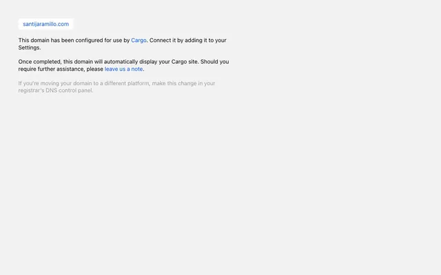
Preview image. Unlock full-res
Direct text, minimalist blue accent
Color palette
Interactive text links, actionable elements, distinguishing primary brand actions through chromatic contrast
Primary text, default borders, ensuring high contrast against light surfaces
Muted secondary text for descriptive or less critical information
Page background, primary surface for content areas
Typography
- Weights
- 400
- Sizes
- 18px
- Line height
- 1.2, 1.3, 2
- Letter spacing
- 0.017em
- Fallback
- system-ui, 'Segoe UI', Roboto, Helvetica, Arial, sans-serif, 'Apple Color Emoji', 'Segoe UI Emoji', 'Segoe UI Symbol'
Primary UI font for all textual content, prioritizing system legibility and neutrality across various operating systems.
Spacing & shape
Components
Displayed in Midnight Ink (#000000) at 18px with a line-height of 1.3 relative to font size and a slight positive letter-spacing of 0.017em. This is the default text treatment for main content.
Displayed in Slate Gray (#999999) at 18px with a line-height of 1.3 relative to font size and a slight positive letter-spacing of 0.017em. Used for disclaimers or supplementary information.
Rendered in Electric Blue (#0055ff) at 18px, with a line-height of 1.3 relative to font size and a letter-spacing of 0.017em. Appears as a text-only link without additional styling.
Guidelines
- Use Electric Blue (#0055ff) exclusively for interactive elements and links, keeping it as the sole chromatic element.
- Prioritize '-apple-system' (or system-ui fallback) at 18px weight 400 for all text to maintain system-native legibility.
- Apply a general letter-spacing of 0.017em to all text elements for consistent visual density.
- Maintain a stark contrast between text (Midnight Ink #000000, Slate Gray #999999) and the Arctic White (#ffffff) background.
- Use 8px for internal element spacing and 15px for padding around content blocks.
- Ensure all components have default 0px border-radius, reflecting a sharp, direct aesthetic.
- Do not introduce additional accent colors; Electric Blue (#0055ff) is the only allowed brand accent.
- Avoid decorative heavy typography; stick to the single font family and its specified weight.
- Do not use elevation or shadows; rely on clear content separation and typography for hierarchy.
- Do not vary border-radius; all elements should maintain sharp corners.
- Do not use gradients or complex background fills; surfaces should remain solid and flat.
- Avoid using icons or imagery unless they are purely functional and unstyled; the emphasis is on text.
About this system
ShowHide
The design system of santijaramillo.com presents a straightforward, minimalist interface, primarily leveraging default browser styles with carefully selected overrides. Its visual identity is defined by a utilitarian palette of strong achromatic colors and a single vivid blue for active elements and links. Typography relies on system fonts, prioritizing direct communication over decorative flourish. Components are sparse, focusing on direct textual information with minimal visual ornamentation, creating an atmosphere of functional clarity.
The page employs a simple, centered block layout for content. There is no explicit max-width for the main content block, allowing it to adapt to the viewport width. The hero pattern is a direct, centered text block. Section rhythm is defined by vertical spacing between discrete text paragraphs. All content is arranged in a single-column, centered stack without complex grid structures. The layout is sparse, with ample whitespace surrounding textual elements. There is no visible navigation bar.
No imagery is used. The visual language is entirely text-based, relying on typography and color to convey information and hierarchy. Graphics are limited to default browser rendering, making content the sole visual focus.
Reminiscent of txt.fyi, manual.ink, Notion (minimal page).
# Cargo — Style Reference
> Direct text, minimalist blue accent

**Theme:** light

**Site:** https://santijaramillo.com

The design system of santijaramillo.com presents a straightforward, minimalist interface, primarily leveraging default browser styles with carefully selected overrides. Its visual identity is defined by a utilitarian palette of strong achromatic colors and a single vivid blue for active elements and links. Typography relies on system fonts, prioritizing direct communication over decorative flourish. Components are sparse, focusing on direct textual information with minimal visual ornamentation, creating an atmosphere of functional clarity.

## Tokens — Colors

| Name | Value | Token | Role |
|------|------|------|------|
| Electric Blue | `#0055ff` | `--color-electric-blue` | Interactive text links, actionable elements, distinguishing primary brand actions through chromatic contrast |
| Midnight Ink | `#000000` | `--color-midnight-ink` | Primary text, default borders, ensuring high contrast against light surfaces |
| Slate Gray | `#999999` | `--color-slate-gray` | Muted secondary text for descriptive or less critical information |
| Arctic White | `#ffffff` | `--color-arctic-white` | Page background, primary surface for content areas |

## Tokens — Typography

### -apple-system
- **Substitute:** system-ui, 'Segoe UI', Roboto, Helvetica, Arial, sans-serif, 'Apple Color Emoji', 'Segoe UI Emoji', 'Segoe UI Symbol'
- **Weights:** 400
- **Sizes:** 18px
- **Line height:** 1.2, 1.3, 2
- **Letter spacing:** 0.017em
- **Role:** Primary UI font for all textual content, prioritizing system legibility and neutrality across various operating systems.

## Tokens — Spacing

- **Section gap:** 64px
- **Card padding:** 15px
- **Element gap:** 8px

## Tokens — Radius

- **Default:** 0px

## Layout

The page employs a simple, centered block layout for content. There is no explicit max-width for the main content block, allowing it to adapt to the viewport width. The hero pattern is a direct, centered text block. Section rhythm is defined by vertical spacing between discrete text paragraphs. All content is arranged in a single-column, centered stack without complex grid structures. The layout is sparse, with ample whitespace surrounding textual elements. There is no visible navigation bar.

## Imagery

No imagery is used. The visual language is entirely text-based, relying on typography and color to convey information and hierarchy. Graphics are limited to default browser rendering, making content the sole visual focus.

## Components

### Primary Text Block
*Standard body text.*

Displayed in Midnight Ink (#000000) at 18px with a line-height of 1.3 relative to font size and a slight positive letter-spacing of 0.017em. This is the default text treatment for main content.

### Muted Text Block
*Secondary, less prominent body text.*

Displayed in Slate Gray (#999999) at 18px with a line-height of 1.3 relative to font size and a slight positive letter-spacing of 0.017em. Used for disclaimers or supplementary information.

### Action Link
*Hyperlinks for navigation or interaction.*

Rendered in Electric Blue (#0055ff) at 18px, with a line-height of 1.3 relative to font size and a letter-spacing of 0.017em. Appears as a text-only link without additional styling.

## Guidelines

### Do

- Use Electric Blue (#0055ff) exclusively for interactive elements and links, keeping it as the sole chromatic element.
- Prioritize '-apple-system' (or system-ui fallback) at 18px weight 400 for all text to maintain system-native legibility.
- Apply a general letter-spacing of 0.017em to all text elements for consistent visual density.
- Maintain a stark contrast between text (Midnight Ink #000000, Slate Gray #999999) and the Arctic White (#ffffff) background.
- Use 8px for internal element spacing and 15px for padding around content blocks.
- Ensure all components have default 0px border-radius, reflecting a sharp, direct aesthetic.

### Don't

- Do not introduce additional accent colors; Electric Blue (#0055ff) is the only allowed brand accent.
- Avoid decorative heavy typography; stick to the single font family and its specified weight.
- Do not use elevation or shadows; rely on clear content separation and typography for hierarchy.
- Do not vary border-radius; all elements should maintain sharp corners.
- Do not use gradients or complex background fills; surfaces should remain solid and flat.
- Avoid using icons or imagery unless they are purely functional and unstyled; the emphasis is on text.

## Agent Prompt Guide

Quick Color Reference:
text: #000000
background: #ffffff
border: #000000
accent: #0055ff
primary action: #0055ff (outlined action border)

Example Component Prompts:

1. Create a descriptive text block: text 'This is a sample text block.' in Midnight Ink (#000000) at 18px -apple-system weight 400, line-height 1.3, letter-spacing 0.017em. Use 15px horizontal padding and 8px vertical padding.

2. Create a muted information paragraph: text 'Secondary information with muted emphasis.' in Slate Gray (#999999) at 18px -apple-system weight 400, line-height 1.3, letter-spacing 0.017em.

3. Create a functional text link: text 'Click here to proceed' in Electric Blue (#0055ff) at 18px -apple-system weight 400, line-height 1.3, letter-spacing 0.017em. This link should have no background or border.
More like this







Keep what you find
A free account saves references to boards and can send you a weekly email of picks based on what you save.
To see every result, go Pro.