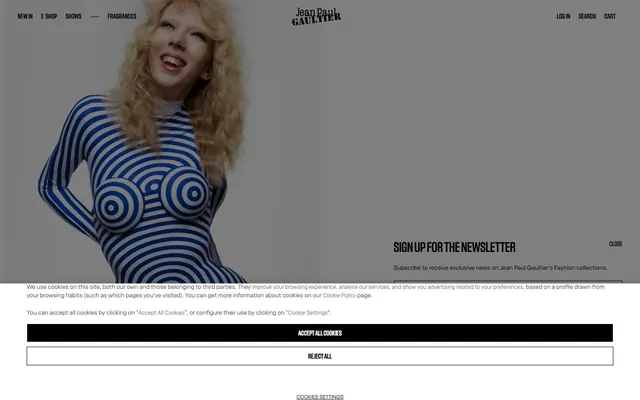
Preview image. Unlock full-res
Gallery Canvas on Black Velvet
Color palette
Primary text, background for high-contrast elements, default borders. Provides a dramatic, deep canvas for content
Page backgrounds, elevated surface backgrounds, primary button text. Creates crisp contrast against Midnight Ink
Subtle card borders, divider lines. Offers a soft visual separation without overpowering the high contrast
Muted text, secondary button text, inactive link states. Provides a softer visual weight for less prominent information
Secondary text, footer links. A darker neutral for slightly de-emphasized text
Neutral form states, badge text, and quiet UI feedback where color should stay understated. Do not promote it to the primary CTA color
Placeholder text, very subtle borders. Provides a hint of visual structure without drawing attention
Error messages, field validation text, notification states. A strong, immediate indicator for critical information
Typography
- Weights
- 400, 500
- Sizes
- 11px, 13px, 16px
- Line height
- 1, 1.1, 1.3, 1.31, 1.5
- Letter spacing
- normal
- Fallback
- Arial
Body copy, navigation links, button text, form inputs, general UI text. This font serves as the workhorse, appearing in multiple weights and sizes to establish informational hierarchy.
- Weights
- 400, 500, 800
- Sizes
- 15px, 16px, 30px, 250px
- Line height
- 1
- Letter spacing
- 0.02em at 30px, 0.05em at 15px
- Fallback
- Playfair Display
Headlines, featured content titles, striking promotional text. Its varied weights and dramatic letter-spacing define the brand's bold and fashion-forward voice, especially at large display sizes.
Spacing & shape
Components
Solid Midnight Ink background with Canvas White text, no border radius for a sharp, uncompromising look. Padding of 20px vertical and 30px horizontal. Uses Gaultier Text weight 400.
Transparent background with Midnight Ink text and a 1px Midnight Ink border. No border radius, minimal padding (0px). Text uses Gaultier Text weight 400.
Transparent background with Steel Gray text and a 1px Steel Gray border. No border radius, minimal padding (0px). Text uses Gaultier Text weight 400. Inactive but still present for visual consistency.
Transparent background with no box shadow or border radius. Products are visually framed by the layout, not the card itself. Minimal padding of 0px encapsulates the product image and details.
Canvas White background with Charcoal Gray text and a 1px Midnight Ink border. No border radius. Generous 20px padding on all sides. Uses Gaultier Text weight 400 for input.
Transparent background with Scarlet Alert text and a 1px Scarlet Alert border. No border radius, minimal padding. Uses Gaultier Text weight 400, signaling invalid input.
Midnight Ink background with Canvas White text (Gaultier Text weight 400). Features a subtle top border in Whisper Gray. Ample vertical padding with 40px left padding.
Specific to cookie consent dialogues, this button has a transparent background, Charcoal Gray text, and a 1px Charcoal Gray border. No radius, minimal padding.
Guidelines
- Design with a dominant high-contrast palette, primarily using Midnight Ink (#000000) and Canvas White (#ffffff).
- Utilize Gaultier Display for all headlines and featured text to establish a strong, fashion-forward brand voice, especially at larger sizes with tight letter-spacing.
- Maintain sharp, angular aesthetics by consistently applying a 0px border-radius to all components, including buttons, cards, and input fields.
- Employ the Ghost Button style for all secondary actions and navigation items to preserve the high-contrast aesthetic without adding heavy fills.
- Use Scarlet Alert (#921d1d) exclusively for error states and critical notifications, avoiding it for decorative or branding purposes.
- Ensure generous vertical spacing between sections (40px) to give content breathing room, typical of a gallery-like presentation.
- Frame product imagery through clean layouts and implied borders rather than distinct card UI, using 0px padding and no visible box shadows on product cards.
- Do not introduce soft shadows or excessive border-radii; the system relies on sharp edges and stark contrasts.
- Avoid using saturated colors for anything other than explicit semantic states like errors; aesthetic color should be reserved for brand imagery.
- Do not deviate from the Gaultier Text and Gaultier Display font families; they are central to the brand's typographic identity.
- Refrain from complex background patterns or gradients; maintain clean, solid color fields for surfaces.
- Do not use generic button styles that introduce rounded corners or subtle coloring; all buttons should follow the primary filled or ghost outlines.
- Avoid dense or cluttered layouts; maintain a spacious and airy feel, even in information-rich sections.
- Do not use subtle gray text (#bdbdbd) for primary body content; reserve it for placeholders or very minor annotations.
About this system
ShowHide
Jean Paul Gaultier's digital presence embodies a stark, high-contrast aesthetic that is both minimalist and confident. The visual system is built on a foundation of pure black and white, accented sparingly with a bold, vivid blue for select graphic elements. Typography is the primary decorative element, leveraging varied weights and tight tracking for a powerful, almost architectural text-driven experience. Layouts are spacious yet direct, prioritizing clear delineation of content over complex visual metaphors, creating a gallery-like presentation for products.
The page model is contained within an implied max-width of approximately 1440px, centered horizontally. The hero section often features a striking full-bleed image with text overlaid or alongside. Section rhythm uses consistent vertical spacing of 40px, creating clean separation without explicit visual dividers. Content is arranged in alternating text-left/image-right patterns or as centered stacks for promotional blocks. Product listings utilize a multi-column grid, showcasing items in a direct, unadorned manner. Navigation consists of a persistent top bar with minimal links.
This site features high-fashion photography and tight product crops against pure white or black backgrounds. Photography is full-bleed or contained within clean rectangular frames. There is no lifestyle context; the product and model are the central focus, presented with a stark, art-gallery feel. Iconography is minimal: outlined, monochrome, and used functionally for navigation or actions like 'search' and 'cart'. The visual language heavily prioritizes product showcase and dramatic, fashion-editorial compositions over explanatory graphics or abstract illustrations, lending an image-heavy, text-dominant density to sections containing text.
Reminiscent of Yves Saint Laurent, Balenciaga, Comme des Garçons (Dover Street Market), Rick Owens.
# Jean Paul Gaultier — Style Reference
> Gallery Canvas on Black Velvet

**Theme:** light

**Site:** https://lilnasx.jeanpaulgaultier.com/en

Jean Paul Gaultier's digital presence embodies a stark, high-contrast aesthetic that is both minimalist and confident. The visual system is built on a foundation of pure black and white, accented sparingly with a bold, vivid blue for select graphic elements. Typography is the primary decorative element, leveraging varied weights and tight tracking for a powerful, almost architectural text-driven experience. Layouts are spacious yet direct, prioritizing clear delineation of content over complex visual metaphors, creating a gallery-like presentation for products.

## Tokens — Colors

| Name | Value | Token | Role |
|------|------|------|------|
| Midnight Ink | `#000000` | `--color-midnight-ink` | Primary text, background for high-contrast elements, default borders. Provides a dramatic, deep canvas for content |
| Canvas White | `#ffffff` | `--color-canvas-white` | Page backgrounds, elevated surface backgrounds, primary button text. Creates crisp contrast against Midnight Ink |
| Whisper Gray | `#e0e0e0` | `--color-whisper-gray` | Subtle card borders, divider lines. Offers a soft visual separation without overpowering the high contrast |
| Steel Gray | `#828282` | `--color-steel-gray` | Muted text, secondary button text, inactive link states. Provides a softer visual weight for less prominent information |
| Deep Dove Gray | `#161616` | `--color-deep-dove-gray` | Secondary text, footer links. A darker neutral for slightly de-emphasized text |
| Charcoal Gray | `#222222` | `--color-charcoal-gray` | Neutral form states, badge text, and quiet UI feedback where color should stay understated. Do not promote it to the primary CTA color |
| Ash Gray | `#bdbdbd` | `--color-ash-gray` | Placeholder text, very subtle borders. Provides a hint of visual structure without drawing attention |
| Scarlet Alert | `#921d1d` | `--color-scarlet-alert` | Error messages, field validation text, notification states. A strong, immediate indicator for critical information |

## Tokens — Typography

### Gaultier Text
- **Substitute:** Arial
- **Weights:** 400, 500
- **Sizes:** 11px, 13px, 16px
- **Line height:** 1, 1.1, 1.3, 1.31, 1.5
- **Letter spacing:** normal
- **Role:** Body copy, navigation links, button text, form inputs, general UI text. This font serves as the workhorse, appearing in multiple weights and sizes to establish informational hierarchy.

### Gaultier Display
- **Substitute:** Playfair Display
- **Weights:** 400, 500, 800
- **Sizes:** 15px, 16px, 30px, 250px
- **Line height:** 1
- **Letter spacing:** 0.02em at 30px, 0.05em at 15px
- **Role:** Headlines, featured content titles, striking promotional text. Its varied weights and dramatic letter-spacing define the brand's bold and fashion-forward voice, especially at large display sizes.

## Tokens — Type Scale

| Role | Size | Line height | Letter spacing |
|------|------|------|------|
| caption | 11px | 1 | — |
| heading-sm | 30px | 1 | 0.02em |
| display | 250px | 1 | 0.02em |

## Tokens — Spacing

- **Max width:** 1440px
- **Section gap:** 40px
- **Card padding:** 20px
- **Element gap:** 10px

## Tokens — Radius

- **none:** 0px

## Layout

The page model is contained within an implied max-width of approximately 1440px, centered horizontally. The hero section often features a striking full-bleed image with text overlaid or alongside. Section rhythm uses consistent vertical spacing of 40px, creating clean separation without explicit visual dividers. Content is arranged in alternating text-left/image-right patterns or as centered stacks for promotional blocks. Product listings utilize a multi-column grid, showcasing items in a direct, unadorned manner. Navigation consists of a persistent top bar with minimal links.

## Imagery

This site features high-fashion photography and tight product crops against pure white or black backgrounds. Photography is full-bleed or contained within clean rectangular frames. There is no lifestyle context; the product and model are the central focus, presented with a stark, art-gallery feel. Iconography is minimal: outlined, monochrome, and used functionally for navigation or actions like 'search' and 'cart'. The visual language heavily prioritizes product showcase and dramatic, fashion-editorial compositions over explanatory graphics or abstract illustrations, lending an image-heavy, text-dominant density to sections containing text.

## Components

### Primary Filled Button
*Primary action, call-to-action.*

Solid Midnight Ink background with Canvas White text, no border radius for a sharp, uncompromising look. Padding of 20px vertical and 30px horizontal. Uses Gaultier Text weight 400.

### Ghost Button
*Secondary actions, navigation links within content.*

Transparent background with Midnight Ink text and a 1px Midnight Ink border. No border radius, minimal padding (0px). Text uses Gaultier Text weight 400.

### Disabled Ghost Button
*Unavailable or inactive secondary actions.*

Transparent background with Steel Gray text and a 1px Steel Gray border. No border radius, minimal padding (0px). Text uses Gaultier Text weight 400. Inactive but still present for visual consistency.

### Product Card
*Displaying product listings.*

Transparent background with no box shadow or border radius. Products are visually framed by the layout, not the card itself. Minimal padding of 0px encapsulates the product image and details.

### Text Input (Default)
*User text entry fields.*

Canvas White background with Charcoal Gray text and a 1px Midnight Ink border. No border radius. Generous 20px padding on all sides. Uses Gaultier Text weight 400 for input.

### Text Input (Error)
*Text input with validation error.*

Transparent background with Scarlet Alert text and a 1px Scarlet Alert border. No border radius, minimal padding. Uses Gaultier Text weight 400, signaling invalid input.

### Copyright Footer
*Persistent site information, legal links.*

Midnight Ink background with Canvas White text (Gaultier Text weight 400). Features a subtle top border in Whisper Gray. Ample vertical padding with 40px left padding.

### Consent Overlay Button
*Confirmation on cookie consent.*

Specific to cookie consent dialogues, this button has a transparent background, Charcoal Gray text, and a 1px Charcoal Gray border. No radius, minimal padding.

## Guidelines

### Do

- Design with a dominant high-contrast palette, primarily using Midnight Ink (#000000) and Canvas White (#ffffff).
- Utilize Gaultier Display for all headlines and featured text to establish a strong, fashion-forward brand voice, especially at larger sizes with tight letter-spacing.
- Maintain sharp, angular aesthetics by consistently applying a 0px border-radius to all components, including buttons, cards, and input fields.
- Employ the Ghost Button style for all secondary actions and navigation items to preserve the high-contrast aesthetic without adding heavy fills.
- Use Scarlet Alert (#921d1d) exclusively for error states and critical notifications, avoiding it for decorative or branding purposes.
- Ensure generous vertical spacing between sections (40px) to give content breathing room, typical of a gallery-like presentation.
- Frame product imagery through clean layouts and implied borders rather than distinct card UI, using 0px padding and no visible box shadows on product cards.

### Don't

- Do not introduce soft shadows or excessive border-radii; the system relies on sharp edges and stark contrasts.
- Avoid using saturated colors for anything other than explicit semantic states like errors; aesthetic color should be reserved for brand imagery.
- Do not deviate from the Gaultier Text and Gaultier Display font families; they are central to the brand's typographic identity.
- Refrain from complex background patterns or gradients; maintain clean, solid color fields for surfaces.
- Do not use generic button styles that introduce rounded corners or subtle coloring; all buttons should follow the primary filled or ghost outlines.
- Avoid dense or cluttered layouts; maintain a spacious and airy feel, even in information-rich sections.
- Do not use subtle gray text (#bdbdbd) for primary body content; reserve it for placeholders or very minor annotations.

## Agent Prompt Guide

Quick Color Reference:
text: #000000
background: #ffffff
border: #000000
accent: no distinct accent color
primary action: no distinct CTA color

Example Component Prompts:
No distinct primary action color was observed; use the extracted neutral button treatments instead of inventing a filled CTA color.

Create a product card: Transparent background, no box shadow, 0px border-radius, 0px padding. Display product name in Midnight Ink (#000000), Gaultier Text weight 400 size 13px, price in Midnight Ink (#000000), Gaultier Text weight 500 size 16px.

Create a default text input: Canvas White background (#ffffff), Charcoal Gray text (#222222), 1px Midnight Ink (#000000) border, 0px border-radius, 20px padding all sides, Gaultier Text weight 400 size 16px.

Create an error message below an input: Scarlet Alert text (#921d1d), Gaultier Text weight 400 size 11px, with 4px top margin from the input field.
More like this









Keep what you find
A free account saves references to boards and can send you a weekly email of picks based on what you save.
To see every result, go Pro.