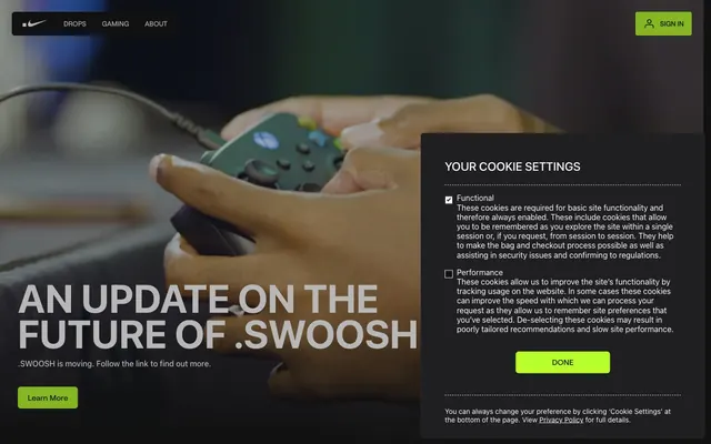
Preview image. Unlock full-res
Gaming console dark mode
Color palette
CTA button fills, active elements, and interactive accents — a vibrant pop that signifies action and engagement
Page backgrounds, default text, button borders and filled button backgrounds, nav background, and general surface accent
Primary text, icon fills, ghost button text, and light card backgrounds
Decorative borders around various elements, often text or sections, providing subtle definition against dark backgrounds
Footer borders, subtle dividers
Card borders
Subtle card borders on light surfaces
Darker card backgrounds, providing a slight elevation above the main background
Typography
- Weights
- 400, 500, 700
- Sizes
- 14px, 16px, 20px, 24px, 64px, 110px
- Line height
- 0.85, 1, 1.2, 1.4, 1.5
- Letter spacing
- normal
- Fallback
- system-ui
Primary brand typeface for headings, larger display text, and key navigational elements. Its sans-serif structure keeps the brand feeling modern and direct.
- Weights
- 400, 500, 700
- Sizes
- 14px, 16px
- Line height
- 1.2, 1.5
- Letter spacing
- normal
- Fallback
- system-ui
Secondary typeface for body text, links, and detailed information, ensuring high legibility within the dark theme.
Spacing & shape
Elevation
Components
Filled with Electron Green (#b7ff2c), text in Midnight Ink (#111111), and a border radius of 6px. Padding is defined by context, but typically feels spacious, e.g., 20px horizontal for small buttons.
Transparent background, Ghost (#ffffff) text, and a decorative Parchment (#e5e5e5) border on hover or active state. No border radius visually, but takes on the parent container's styling. Minimal padding, often integrated directly into text lines.
Filled with Midnight Ink (#111111), Ghost (#ffffff) text, and a border radius of 6px. Features a 16px padding on all sides.
Ghost (#ffffff) background, with padding of 20px around content. Features a Stone (#707072) border to define its edges. Border radius is 6px. No shadows are applied.
Deep Space (#1f1f21) background, with generous padding (e.g., 48px horizontal, 48px top, 28px bottom). Features a Carbon (#28282a) border. Border radius is 6px. No shadows are applied.
Dark panel, likely Midnight Ink or Deep Space background, with a distinct visual presence due to its larger size and internal padding of 48px. It uses Ghost (#ffffff) for primary text and a checkbox with Electron Green fill. Features a 6px border radius.
Guidelines
- Prioritize Midnight Ink (#111111) for backgrounds and Ghost (#ffffff) for primary text to maintain the brand's dark, high-contrast aesthetic.
- Use Electron Green (#b7ff2c) exclusively for primary calls to action, active states, and small, functional highlights.
- Apply a consistent 6px border radius to all interactive elements, cards, and image containers for a unified feel.
- Employ Roobert for all headings and key navigational text, varying sizes and weights to establish clear hierarchy.
- Maintain comfortable spacing with an element gap of 16px between most UI elements and card padding of 20px unless otherwise specified.
- Define separation between elements using subtle Parchment (#e5e5e5) borders rather than heavy box shadows or strong background differentiation.
- Ensure large text, especially headings, uses a normal letter-spacing, while body text might have subtle tracking adjustments if needed for readability at smaller sizes.
- Avoid using saturated colors other than Electron Green (#b7ff2c) for interactive elements or brand accents.
- Do not introduce strong drop shadows; rely on border treatments and background color variation for element separation.
- Refrain from using excessively tight or stretched letter spacing; prioritize 'normal' tracking for most text.
- Do not use white or light backgrounds for main content sections; the system is fundamentally dark mode.
- Avoid arbitrary border radii; stick to the established 6px standard for all rounded corners.
- Do not embed images or illustrations that conflict with the monochromatic, sharp visual styling without explicit brand guidelines.
- Steer clear of gradients unless they are explicitly defined as brand elements, as the system favors solid colors.
About this system
ShowHide
The .SWOOSH brand aesthetic lives in a stark, high-contrast dark mode environment, leveraging deep blacks and near-blacks as a canvas. Typography is direct and impactful, primarily in white or muted gray against dark surfaces, with a single vivid lime green acting as a functional accent for interactive elements. Components are structured but lightweight, often defined by subtle borders rather than heavy fills, and maintain a consistent, moderately rounded shape.
The page primarily uses a full-bleed dark background that extends across the viewport. Hero sections feature large, centered headlines often overlaid on video or atmospheric photography. Section rhythm is created through large vertical gaps, sometimes alternating with dark cards or content blocks. Content is arranged in alternating text-left/image-right patterns or centered stacked blocks, creating a spacious and intentional flow. Navigation is handled by a fixed top bar on a Midnight Ink background, maintaining global access.
The imagery strategy centers around high-quality product photography and 3D renders, often featuring dimly lit, dynamic scenes of gaming hardware or digital assets. Photography is typically mood-driven, with depth-of-field effects and a generally desaturated, cool color palette that allows the UI's Electron Green accents to pop. Visuals are often full-bleed or contained within large, dark sections, serving to set an immersive atmosphere rather than merely illustrating content. Icons are minimalist, outlined, and monochromatic, primarily in Ghost (#ffffff), maintaining a functional rather than decorative role.
Reminiscent of Razer, PlayStation, Xbox, Discord.
# Home — Style Reference
> Gaming console dark mode

**Theme:** dark

**Site:** https://www.swoosh.nike

The .SWOOSH brand aesthetic lives in a stark, high-contrast dark mode environment, leveraging deep blacks and near-blacks as a canvas. Typography is direct and impactful, primarily in white or muted gray against dark surfaces, with a single vivid lime green acting as a functional accent for interactive elements. Components are structured but lightweight, often defined by subtle borders rather than heavy fills, and maintain a consistent, moderately rounded shape.

## Tokens — Colors

| Name | Value | Token | Role |
|------|------|------|------|
| Electron Green | `#b7ff2c` | `--color-electron-green` | CTA button fills, active elements, and interactive accents — a vibrant pop that signifies action and engagement |
| Midnight Ink | `#111111` | `--color-midnight-ink` | Page backgrounds, default text, button borders and filled button backgrounds, nav background, and general surface accent |
| Ghost | `#ffffff` | `--color-ghost` | Primary text, icon fills, ghost button text, and light card backgrounds |
| Parchment | `#e5e5e5` | `--color-parchment` | Decorative borders around various elements, often text or sections, providing subtle definition against dark backgrounds |
| Slate | `#39393b` | `--color-slate` | Footer borders, subtle dividers |
| Carbon | `#28282a` | `--color-carbon` | Card borders |
| Stone | `#707072` | `--color-stone` | Subtle card borders on light surfaces |
| Deep Space | `#1f1f21` | `--color-deep-space` | Darker card backgrounds, providing a slight elevation above the main background |

## Tokens — Typography

### Roobert
- **Substitute:** system-ui
- **Weights:** 400, 500, 700
- **Sizes:** 14px, 16px, 20px, 24px, 64px, 110px
- **Line height:** 0.85, 1, 1.2, 1.4, 1.5
- **Letter spacing:** normal
- **Role:** Primary brand typeface for headings, larger display text, and key navigational elements. Its sans-serif structure keeps the brand feeling modern and direct.

### ui-sans-serif
- **Substitute:** system-ui
- **Weights:** 400, 500, 700
- **Sizes:** 14px, 16px
- **Line height:** 1.2, 1.5
- **Letter spacing:** normal
- **Role:** Secondary typeface for body text, links, and detailed information, ensuring high legibility within the dark theme.

## Tokens — Type Scale

Perfect Fifth (1.5) from 16px base.

| Role | Size | Line height | Letter spacing |
|------|------|------|------|
| caption | 14px | 1.2 | — |
| body | 16px | 1.5 | — |
| subheading | 20px | 1.4 | — |
| heading | 24px | 1.2 | — |
| heading-lg | 64px | 1 | — |
| display | 110px | 0.85 | — |

## Tokens — Spacing

- **Section gap:** 24px
- **Card padding:** 20px
- **Element gap:** 16px

## Tokens — Radius

- **Default:** 6px
- **Buttons:** 6px
- **Cards:** 6px
- **navElements:** 6px

## Tokens — Elevation

- **Nav bar:** `rgba(17, 17, 17, 0.125) 0px 2px 6px 0px`

## Layout

The page primarily uses a full-bleed dark background that extends across the viewport. Hero sections feature large, centered headlines often overlaid on video or atmospheric photography. Section rhythm is created through large vertical gaps, sometimes alternating with dark cards or content blocks. Content is arranged in alternating text-left/image-right patterns or centered stacked blocks, creating a spacious and intentional flow. Navigation is handled by a fixed top bar on a Midnight Ink background, maintaining global access.

## Imagery

The imagery strategy centers around high-quality product photography and 3D renders, often featuring dimly lit, dynamic scenes of gaming hardware or digital assets. Photography is typically mood-driven, with depth-of-field effects and a generally desaturated, cool color palette that allows the UI's Electron Green accents to pop. Visuals are often full-bleed or contained within large, dark sections, serving to set an immersive atmosphere rather than merely illustrating content. Icons are minimalist, outlined, and monochromatic, primarily in Ghost (#ffffff), maintaining a functional rather than decorative role.

## Components

### Primary Action Button
*Call to action button*

Filled with Electron Green (#b7ff2c), text in Midnight Ink (#111111), and a border radius of 6px. Padding is defined by context, but typically feels spacious, e.g., 20px horizontal for small buttons.

### Ghost Navigation Button
*Navigation and secondary action buttons*

Transparent background, Ghost (#ffffff) text, and a decorative Parchment (#e5e5e5) border on hover or active state. No border radius visually, but takes on the parent container's styling. Minimal padding, often integrated directly into text lines.

### Dark Filled Button
*Tertiary action button or navigation element*

Filled with Midnight Ink (#111111), Ghost (#ffffff) text, and a border radius of 6px. Features a 16px padding on all sides.

### Light Content Card
*Information display card on dark background*

Ghost (#ffffff) background, with padding of 20px around content. Features a Stone (#707072) border to define its edges. Border radius is 6px. No shadows are applied.

### Dark Content Card
*Information display card on dark background*

Deep Space (#1f1f21) background, with generous padding (e.g., 48px horizontal, 48px top, 28px bottom). Features a Carbon (#28282a) border. Border radius is 6px. No shadows are applied.

### Cookie Settings Modal
*Overlay content container, e.g., for privacy settings*

Dark panel, likely Midnight Ink or Deep Space background, with a distinct visual presence due to its larger size and internal padding of 48px. It uses Ghost (#ffffff) for primary text and a checkbox with Electron Green fill. Features a 6px border radius.

## Guidelines

### Do

- Prioritize Midnight Ink (#111111) for backgrounds and Ghost (#ffffff) for primary text to maintain the brand's dark, high-contrast aesthetic.
- Use Electron Green (#b7ff2c) exclusively for primary calls to action, active states, and small, functional highlights.
- Apply a consistent 6px border radius to all interactive elements, cards, and image containers for a unified feel.
- Employ Roobert for all headings and key navigational text, varying sizes and weights to establish clear hierarchy.
- Maintain comfortable spacing with an element gap of 16px between most UI elements and card padding of 20px unless otherwise specified.
- Define separation between elements using subtle Parchment (#e5e5e5) borders rather than heavy box shadows or strong background differentiation.
- Ensure large text, especially headings, uses a normal letter-spacing, while body text might have subtle tracking adjustments if needed for readability at smaller sizes.

### Don't

- Avoid using saturated colors other than Electron Green (#b7ff2c) for interactive elements or brand accents.
- Do not introduce strong drop shadows; rely on border treatments and background color variation for element separation.
- Refrain from using excessively tight or stretched letter spacing; prioritize 'normal' tracking for most text.
- Do not use white or light backgrounds for main content sections; the system is fundamentally dark mode.
- Avoid arbitrary border radii; stick to the established 6px standard for all rounded corners.
- Do not embed images or illustrations that conflict with the monochromatic, sharp visual styling without explicit brand guidelines.
- Steer clear of gradients unless they are explicitly defined as brand elements, as the system favors solid colors.

## Agent Prompt Guide

Quick Color Reference:
- text: #ffffff
- background: #111111
- border: #e5e5e5
- accent: #b7ff2c
- primary action: #b7ff2c (filled action)

Example Component Prompts:
1. Create a Primary Action Button: #b7ff2c background, #000000 text, 9999px radius, compact pill padding. Use this filled treatment for the main CTA.
2. Design a Dark Content Card: Deep Space (#1f1f21) background, with a Carbon (#28282a) border, 6px border radius, Ghost (#ffffff) text, 48px left and right padding.
3. Implement a Ghost Navigation Button: Transparent background, Ghost (#ffffff) text, Roobert regular, 14px font size, no explicit border on inactive state, 6px horizontal padding.
4. Build a Light Content Card: Ghost (#ffffff) background, Stone (#707072) border, 6px border radius, Midnight Ink (#111111) text, 20px padding all around.
More like this









Keep what you find
A free account saves references to boards and can send you a weekly email of picks based on what you save.
To see every result, go Pro.