Preview image. Unlock full-res
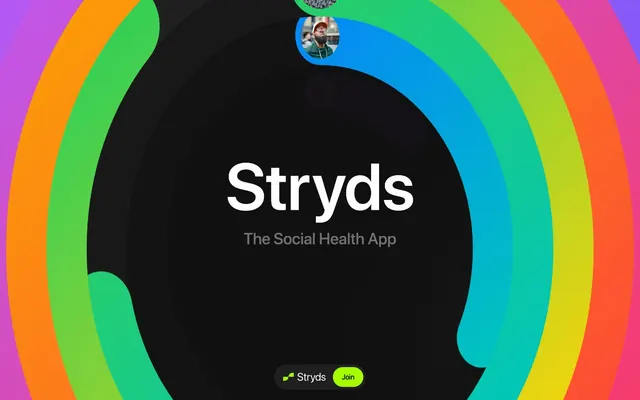
Neon rings in midnight
Color palette
Primary action buttons, active indicators, and prominent highlight accents. This vivid green provides a sharp, energetic contrast against the dark background
Text on bright surfaces, button borders for outlined actions, icon colors. Its deep violet tint adds subtle complexity to what would otherwise be pure black
Divider lines, subtle borders, secondary text, and muted icon fills. A foundational dark gray for content separation and hierarchy
Dominant background for the overall page, creating a deep, immersive dark mode experience
Card borders and subtle separating lines, slightly lighter than Dark Matter for softer definition
Tertiary text, subheadings, and supporting content. Provides subdued contrast, allowing primary information to stand out
Default background for cards and containers, subtly elevated from the main canvas
Primary text on dark backgrounds, ensuring high legibility for headings and key information
Background for certain buttons and interactive elements, providing a slightly lighter dark tone than the main canvas
Typography
- Weights
- 400, 500
- Sizes
- 14px
- Line height
- 1.43
- Letter spacing
- -0.0340em
- Fallback
- Helvetica Neue
Default text, links, and card descriptions. The system font choice implies directness and native integration.
- Weights
- 500, 600
- Sizes
- 16px, 21px, 36px, 44px, 78px, 109px, 148px, 184px
- Line height
- 0.95, 1, 1.1, 1.2, 1.25
- Letter spacing
- -0.0340em, -0.0270em, -0.0260em, -0.0230em, -0.0120em, -0.0100em, -0.0070em, 0.0270em
- Fallback
- Inter
Headings and prominent display text. The wide range of sizes and tight letter spacing at larger scales creates a strong, impactful visual hierarchy, giving headlines a 'command center' feel.
Spacing & shape
Components
Filled with Neon Green (#a6ff00) background, Deep Space (#040126) text. Features 100px border radius, 13px vertical padding, 20px horizontal padding, creating a distinct pill shape for immediate visibility.
Component Dark (#101010) background, Deep Space (#040126) text and border. Features 100px border radius, 16px vertical padding, 56px left padding (implying icon alignment), and 20px right padding. Used for branding or less prominent interactive elements.
Card Surface (#171717) background, 40px border radius. Uses 80px internal padding on all sides, providing generous breathing room for content. Bordered with Graphite Border (#3d3d3d).
Transparent background, 40px border radius. Used for visually light content grouping without adding additional surface depth. Contains 0px padding, relying on content's own spacing.
Guidelines
- Always use Deep Space (#040126) for neutral button outlines on dark backgrounds.
- Prioritize Neon Green (#a6ff00) for all primary calls to action, ensuring button background fills and critical highlights stand out.
- Apply a 100px border radius to all buttons and small interactive elements, creating a distinct pill-shaped aesthetic.
- Maintain a section gap of 80px between major content blocks to create a generous, comfortable density.
- Use Bright Text (#fdfdfd) for all primary headings and body text on dark backgrounds to ensure legibility.
- Ensure headings use a tight line height, typically 0.95 to 1.25, with negative letter spacing for a compact, impactful look.
- Backgrounds should predominantly use Midnight Canvas (#000000) or Card Surface (#171717) to maintain the dark theme.
- Do not use highly saturated colors for large background areas; colors are reserved for accents and interactive elements.
- Avoid sharp corners; all significant UI elements like cards and buttons should embrace the generous 40px or 100px border radii.
- Do not use generic system fonts for display typography; Sf Pro Display (or a suitable substitute) is critical for brand impact.
- Refrain from excessive use of visual hierarchy with shadows; rely on color contrast and spacing for distinction.
- Do not break the dark theme with light backgrounds for content sections; maintain consistency with the neutral dark palette.
- Avoid standard letter spacing on headings; always apply the specified negative tracking for a unique type rhythm.
About this system
ShowHide
Stryds embodies a dark, vibrant gamified aesthetic. The interface uses deep, near-black backgrounds contrasting with neon gradients and vivid accent colors. Typography is bold and assertive, prioritizing impact over traditional readability, often using large scale and tight tracking. Components are rounded and soft, emphasizing a playful yet high-tech feel, with a strategic use of color to highlight active states and primary actions.
The page uses a full-bleed model, with content elements centered within a flexible width, rather than a strict `pageMaxWidth`. The hero section is full-bleed, featuring the brand name and tagline centered over the dynamic, colorful rings on a Midnight Canvas background. Sections appear to flow seamlessly, punctuated by the large background graphics, with a consistent vertical section gap of 80px. Content within sections tends to be centrally stacked or arranged in prominent, isolated blocks. Navigation is minimal, likely integrated into a subtle bottom bar as suggested by the ghost and primary action buttons at the base of the viewport.
This site features abstract, energetic visuals dominated by vibrant, multi-colored rings that swirl and overlap. Imagery is primarily abstract and decorative, forming large background elements rather than product-specific showcases. The rings appear to be vector-based or graphically rendered, using a broad spectrum of vivid hues against deep dark backgrounds. There are some small profile picture-style circular image crops, suggesting social or user-generated content, but they are not the primary imagery focus. The visual language is image-heavy in decorative elements, but text-dominant for content presentation, relying on the background graphics for atmosphere while keeping the foreground UI clear.
Reminiscent of Spotify, Discord, Apple Fitness+, Linear.
# Stryds — Style Reference
> Neon rings in midnight

**Theme:** dark

**Site:** https://stryds.com

Stryds embodies a dark, vibrant gamified aesthetic. The interface uses deep, near-black backgrounds contrasting with neon gradients and vivid accent colors. Typography is bold and assertive, prioritizing impact over traditional readability, often using large scale and tight tracking. Components are rounded and soft, emphasizing a playful yet high-tech feel, with a strategic use of color to highlight active states and primary actions.

## Tokens — Colors

| Name | Value | Token | Role |
|------|------|------|------|
| Neon Green | `#a6ff00` | `--color-neon-green` | Primary action buttons, active indicators, and prominent highlight accents. This vivid green provides a sharp, energetic contrast against the dark background |
| Deep Space | `#040126` | `--color-deep-space` | Text on bright surfaces, button borders for outlined actions, icon colors. Its deep violet tint adds subtle complexity to what would otherwise be pure black |
| Dark Matter | `#333333` | `--color-dark-matter` | Divider lines, subtle borders, secondary text, and muted icon fills. A foundational dark gray for content separation and hierarchy |
| Midnight Canvas | `#000000` | `--color-midnight-canvas` | Dominant background for the overall page, creating a deep, immersive dark mode experience |
| Graphite Border | `#3d3d3d` | `--color-graphite-border` | Card borders and subtle separating lines, slightly lighter than Dark Matter for softer definition |
| Muted Ash | `#6f6f6f` | `--color-muted-ash` | Tertiary text, subheadings, and supporting content. Provides subdued contrast, allowing primary information to stand out |
| Card Surface | `#171717` | `--color-card-surface` | Default background for cards and containers, subtly elevated from the main canvas |
| Bright Text | `#fdfdfd` | `--color-bright-text` | Primary text on dark backgrounds, ensuring high legibility for headings and key information |
| Component Dark | `#101010` | `--color-component-dark` | Background for certain buttons and interactive elements, providing a slightly lighter dark tone than the main canvas |

## Tokens — Typography

### Arial
- **Substitute:** Helvetica Neue
- **Weights:** 400, 500
- **Sizes:** 14px
- **Line height:** 1.43
- **Letter spacing:** -0.0340em
- **Role:** Default text, links, and card descriptions. The system font choice implies directness and native integration.

### Sf Pro Display
- **Substitute:** Inter
- **Weights:** 500, 600
- **Sizes:** 16px, 21px, 36px, 44px, 78px, 109px, 148px, 184px
- **Line height:** 0.95, 1, 1.1, 1.2, 1.25
- **Letter spacing:** -0.0340em, -0.0270em, -0.0260em, -0.0230em, -0.0120em, -0.0100em, -0.0070em, 0.0270em
- **Role:** Headings and prominent display text. The wide range of sizes and tight letter spacing at larger scales creates a strong, impactful visual hierarchy, giving headlines a 'command center' feel.

## Tokens — Type Scale

Perfect Fifth (1.5) from 14px base.

| Role | Size | Line height | Letter spacing |
|------|------|------|------|
| body | 14px | 1.43 | -0.48px |
| heading-sm | 21px | 1.2 | -0.57px |
| heading | 36px | 1.1 | -0.83px |
| heading-lg | 44px | 1 | -1.01px |
| display | 78px | 1 | -1.33px |

## Tokens — Spacing

- **Section gap:** 80px
- **Card padding:** 80px
- **Element gap:** 16px

## Tokens — Radius

- **Buttons:** 100px
- **Cards:** 40px
- **misc:** 100px

## Layout

The page uses a full-bleed model, with content elements centered within a flexible width, rather than a strict `pageMaxWidth`. The hero section is full-bleed, featuring the brand name and tagline centered over the dynamic, colorful rings on a Midnight Canvas background. Sections appear to flow seamlessly, punctuated by the large background graphics, with a consistent vertical section gap of 80px. Content within sections tends to be centrally stacked or arranged in prominent, isolated blocks. Navigation is minimal, likely integrated into a subtle bottom bar as suggested by the ghost and primary action buttons at the base of the viewport.

## Imagery

This site features abstract, energetic visuals dominated by vibrant, multi-colored rings that swirl and overlap. Imagery is primarily abstract and decorative, forming large background elements rather than product-specific showcases. The rings appear to be vector-based or graphically rendered, using a broad spectrum of vivid hues against deep dark backgrounds. There are some small profile picture-style circular image crops, suggesting social or user-generated content, but they are not the primary imagery focus. The visual language is image-heavy in decorative elements, but text-dominant for content presentation, relying on the background graphics for atmosphere while keeping the foreground UI clear.

## Components

### Primary Action Button
*Call to action button*

Filled with Neon Green (#a6ff00) background, Deep Space (#040126) text. Features 100px border radius, 13px vertical padding, 20px horizontal padding, creating a distinct pill shape for immediate visibility.

### Ghost Icon Button
*Secondary action or branding button*

Component Dark (#101010) background, Deep Space (#040126) text and border. Features 100px border radius, 16px vertical padding, 56px left padding (implying icon alignment), and 20px right padding. Used for branding or less prominent interactive elements.

### Elevated Card
*Content container for featured sections*

Card Surface (#171717) background, 40px border radius. Uses 80px internal padding on all sides, providing generous breathing room for content. Bordered with Graphite Border (#3d3d3d).

### Transparent Content Card
*Subtle content grouping within larger sections*

Transparent background, 40px border radius. Used for visually light content grouping without adding additional surface depth. Contains 0px padding, relying on content's own spacing.

## Guidelines

### Do

- Always use Deep Space (#040126) for neutral button outlines on dark backgrounds.
- Prioritize Neon Green (#a6ff00) for all primary calls to action, ensuring button background fills and critical highlights stand out.
- Apply a 100px border radius to all buttons and small interactive elements, creating a distinct pill-shaped aesthetic.
- Maintain a section gap of 80px between major content blocks to create a generous, comfortable density.
- Use Bright Text (#fdfdfd) for all primary headings and body text on dark backgrounds to ensure legibility.
- Ensure headings use a tight line height, typically 0.95 to 1.25, with negative letter spacing for a compact, impactful look.
- Backgrounds should predominantly use Midnight Canvas (#000000) or Card Surface (#171717) to maintain the dark theme.

### Don't

- Do not use highly saturated colors for large background areas; colors are reserved for accents and interactive elements.
- Avoid sharp corners; all significant UI elements like cards and buttons should embrace the generous 40px or 100px border radii.
- Do not use generic system fonts for display typography; Sf Pro Display (or a suitable substitute) is critical for brand impact.
- Refrain from excessive use of visual hierarchy with shadows; rely on color contrast and spacing for distinction.
- Do not break the dark theme with light backgrounds for content sections; maintain consistency with the neutral dark palette.
- Avoid standard letter spacing on headings; always apply the specified negative tracking for a unique type rhythm.

## Agent Prompt Guide

Quick Color Reference:
text: #fdfdfd
background: #000000
border: #333333
accent: #a6ff00
primary action: #a6ff00 (filled action)

Example Component Prompts:
Create a hero section with 'Stryds' as the main title and 'The Social Health App' as a subtitle: Midnight Canvas (#000000) background. Main title in Sf Pro Display weight 600, 184px, #fdfdfd, letter-spacing -0.0100em. Subtitle in Sf Pro Display weight 500, 36px, #6f6f6f, letter-spacing -0.0260em. Both centered.

Create a Primary Action Button: #a6ff00 background, #333333 text, 9999px radius, compact pill padding. Use this filled treatment for the main CTA.

Create an elevated card with a headline 'Your Progress' and body text underneath: Card Surface (#171717) background, 40px border radius, 80px padding. Headline in Sf Pro Display weight 600, 44px, #fdfdfd, letter-spacing -0.0230em. Body text in Arial weight 400, 14px, #fdfdfd.

Create a ghost button labeled 'Stryds' with an implied icon offset: Component Dark (#101010) background, Deep Space (#040126) text in Arial weight 400, 14px, 100px border radius, 16px vertical padding, 56px left padding, 20px right padding.
More like this









Keep what you find
A free account saves references to boards and can send you a weekly email of picks based on what you save.
To see every result, go Pro.