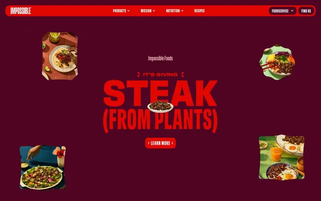
Preview image. Unlock full-res
Saturated Night Butcher
Color palette
Dominant background for page sections and primary canvas, providing a deep, rich foundation
Secondary background color for cards and footers, adding subtle depth against the primary crimson
Signature brand accent color for headings, icons, active states, and calls to attention. Its vividness creates immediate impact
Muted accent color, used for occasional text or decorative elements, offering a warmer, less aggressive tone than the primary reds
Highlight and interactive element background, often used for badges and primary action elements, providing contrast against darker hues
Primary text color and strong element borders, ensuring high contrast against light backgrounds
Inverse text and icon color, used prevalently against dark backgrounds for maximum legibility and for white surface contrast
Typography
- Weights
- 400, 500, 700
- Sizes
- 10px, 12px, 14px, 18px, 20px, 22px, 24px, 28px, 32px, 40px, 48px, 103px, 126px, 149px, 150px, 153px, 160px, 161px, 185px, 189px, 204px, 226px, 228px, 231px
- Line height
- 0.73, 0.75, 0.9, 1.1, 1.15, 1.4, 1.7
- Letter spacing
- 0.02em, 0.03em, 0.06em
- Fallback
- Bebas Neue
Primary brand typeface for all text elements, characterized by its bold, condensed, and impactful presence. Its high visual weight is central to the brand's direct communication style.
Spacing & shape
Components
Large, bold text using sans-meat font at sizes like 150px-231px, weight 700 with a line height of 0.73 and letter spacing of 0.02em, in Impossible Red (#e10600) or Ghost White (#ffffff), often all caps, creating an immediate, impactful statement.
Text in Ghost White (#ffffff), sans-meat font, body size with weight 400, no background. On hover, a 1px Ghost White (#ffffff) border appears below, or text color changes to Impossible Red (#e10600).
Text in Ghost White (#ffffff) or Midnight Ink (#000000), sans-meat font, weight 400. Transparent background with a 1px Ghost White (#ffffff) or Pale Flesh (#ffc7c6) border, 15px border-radius, with 10px vertical and 20px horizontal padding.
Text in Midnight Ink (#000000), sans-meat font, weight 400. Pale Flesh (#ffc7c6) background, with a 12px border-radius and 0px padding (content controls sizing). Used sparingly for high-visibility actions.
Text in Impossible Red (#e10600), sans-meat font, weight 400. Transparent background, typically with no visible border, used for concise labeling without additional padding.
Background can be transparent or Deep Berry (#260212). Features sharp (0px) or significantly rounded (37.8889px) corners without shadow, often containing product imagery and associated details. Padding within the card varies (e.g., 24px horizontal for some types).
Guidelines
- Use Butcher Shop Crimson (#4f0423) or Deep Berry (#260212) as primary background colors for all sections to maintain the dark theme.
- Employ Impossible Red (#e10600) strictly for critical headlines, brand accents, and active UI states to ensure high impact and urgency.
- Utilize 'sans-meat' font family at weight 700 for headlines exceeding 48px to convey strong impactful messaging.
- Ensure all interactive elements have a Ghost White (#ffffff) border or text color when on dark backgrounds, or Midnight Ink (#000000) text on Pale Flesh (#ffc7c6) backgrounds, maintaining contrast.
- Do not introduce light backgrounds beyond Ghost White (#ffffff) for specific input fields or detailed content cards, avoiding deviation from the dark theme.
- Do not use subtle, muted colors for primary actions; they must always be high-contrast combinations like Pale Flesh (#ffc7c6) background with Midnight Ink (#000000) text, or Impossible Red (#e10600) text.
- Avoid generic serif or default sans-serif fonts; the 'sans-meat' typeface is integral to the brand's bold voice.
- Do not use elevation or subtle shadows for cards or containers; rely on strong color blocking and outlines instead.
- Do not introduce overly rounded elements; radii are either minimal (0-5px) or very large (15px, 37.8889px) for distinct purposes.
About this system
ShowHide
Impossible Foods utilizes a bold, high-contrast visual system dominated by deep, saturated reds and blacks, creating an urgent and impactful atmosphere. Typography is large and commanding, often leveraging uppercase and strong tracking for graphic appeal. The design employs a "dark mode" aesthetic with rich, deep background colors that make the vibrant reds and product imagery pop. Components are distinct, featuring sharp corners or subtly rounded edges, with a focus on clear messaging and strong visual hierarchy through color and scale rather than extensive use of elevation or subtle textures.
Reminiscent of Oatly, Liquid Death, RXBAR.
# Home page | Impossible Foods — Style Reference
> Saturated Night Butcher

**Theme:** dark

**Site:** https://impossiblefoods.com

Impossible Foods utilizes a bold, high-contrast visual system dominated by deep, saturated reds and blacks, creating an urgent and impactful atmosphere. Typography is large and commanding, often leveraging uppercase and strong tracking for graphic appeal. The design employs a "dark mode" aesthetic with rich, deep background colors that make the vibrant reds and product imagery pop. Components are distinct, featuring sharp corners or subtly rounded edges, with a focus on clear messaging and strong visual hierarchy through color and scale rather than extensive use of elevation or subtle textures.

## Tokens — Colors

| Name | Value | Token | Role |
|------|------|------|------|
| Butcher Shop Crimson | `#4f0423` | `--color-butcher-shop-crimson` | Dominant background for page sections and primary canvas, providing a deep, rich foundation |
| Deep Berry | `#260212` | `--color-deep-berry` | Secondary background color for cards and footers, adding subtle depth against the primary crimson |
| Impossible Red | `#e10600` | `--color-impossible-red` | Signature brand accent color for headings, icons, active states, and calls to attention. Its vividness creates immediate impact |
| Rich Mahogany | `#8f6174` | `--color-rich-mahogany` | Muted accent color, used for occasional text or decorative elements, offering a warmer, less aggressive tone than the primary reds |
| Pale Flesh | `#ffc7c6` | `--color-pale-flesh` | Highlight and interactive element background, often used for badges and primary action elements, providing contrast against darker hues |
| Midnight Ink | `#000000` | `--color-midnight-ink` | Primary text color and strong element borders, ensuring high contrast against light backgrounds |
| Ghost White | `#ffffff` | `--color-ghost-white` | Inverse text and icon color, used prevalently against dark backgrounds for maximum legibility and for white surface contrast |

## Tokens — Typography

### sans-meat
- **Substitute:** Bebas Neue
- **Weights:** 400, 500, 700
- **Sizes:** 10px, 12px, 14px, 18px, 20px, 22px, 24px, 28px, 32px, 40px, 48px, 103px, 126px, 149px, 150px, 153px, 160px, 161px, 185px, 189px, 204px, 226px, 228px, 231px
- **Line height:** 0.73, 0.75, 0.9, 1.1, 1.15, 1.4, 1.7
- **Letter spacing:** 0.02em, 0.03em, 0.06em
- **Role:** Primary brand typeface for all text elements, characterized by its bold, condensed, and impactful presence. Its high visual weight is central to the brand's direct communication style.

## Tokens — Type Scale

| Role | Size | Line height | Letter spacing |
|------|------|------|------|
| caption | 10px | 1.4 | 0.3px |
| body | 14px | 1.4 | 0.3px |
| subheading | 18px | 1.15 | 0.02em |
| heading-sm | 24px | 1.15 | 0.02em |
| heading | 40px | 1.1 | 0.02em |
| heading-lg | 48px | 1.1 | 0.02em |
| display | 150px | 0.73 | 0.02em |

## Tokens — Spacing

- **Section gap:** 40px
- **Card padding:** 32px
- **Element gap:** 6px

## Tokens — Radius

- **Buttons:** 15px
- **Cards:** 37.8889px
- **misc:** 5px
- **navItems:** 15px

## Components

### Hero Section Headline
*Dominant page title*

Large, bold text using sans-meat font at sizes like 150px-231px, weight 700 with a line height of 0.73 and letter spacing of 0.02em, in Impossible Red (#e10600) or Ghost White (#ffffff), often all caps, creating an immediate, impactful statement.

### Navigation Link
*Primary site navigation*

Text in Ghost White (#ffffff), sans-meat font, body size with weight 400, no background. On hover, a 1px Ghost White (#ffffff) border appears below, or text color changes to Impossible Red (#e10600).

### Outlined Call to Action Button
*Secondary action or informational button*

Text in Ghost White (#ffffff) or Midnight Ink (#000000), sans-meat font, weight 400. Transparent background with a 1px Ghost White (#ffffff) or Pale Flesh (#ffc7c6) border, 15px border-radius, with 10px vertical and 20px horizontal padding.

### Filled Action Button
*Primary call to action button*

Text in Midnight Ink (#000000), sans-meat font, weight 400. Pale Flesh (#ffc7c6) background, with a 12px border-radius and 0px padding (content controls sizing). Used sparingly for high-visibility actions.

### Product Category Badge
*Filters and content categorization*

Text in Impossible Red (#e10600), sans-meat font, weight 400. Transparent background, typically with no visible border, used for concise labeling without additional padding.

### Product Card
*Showcasing individual products*

Background can be transparent or Deep Berry (#260212). Features sharp (0px) or significantly rounded (37.8889px) corners without shadow, often containing product imagery and associated details. Padding within the card varies (e.g., 24px horizontal for some types).

## Guidelines

### Do

- Use Butcher Shop Crimson (#4f0423) or Deep Berry (#260212) as primary background colors for all sections to maintain the dark theme.
- Employ Impossible Red (#e10600) strictly for critical headlines, brand accents, and active UI states to ensure high impact and urgency.
- Utilize 'sans-meat' font family at weight 700 for headlines exceeding 48px to convey strong impactful messaging.
- Ensure all interactive elements have a Ghost White (#ffffff) border or text color when on dark backgrounds, or Midnight Ink (#000000) text on Pale Flesh (#ffc7c6) backgrounds, maintaining contrast.

### Don't

- Do not introduce light backgrounds beyond Ghost White (#ffffff) for specific input fields or detailed content cards, avoiding deviation from the dark theme.
- Do not use subtle, muted colors for primary actions; they must always be high-contrast combinations like Pale Flesh (#ffc7c6) background with Midnight Ink (#000000) text, or Impossible Red (#e10600) text.
- Avoid generic serif or default sans-serif fonts; the 'sans-meat' typeface is integral to the brand's bold voice.
- Do not use elevation or subtle shadows for cards or containers; rely on strong color blocking and outlines instead.
- Do not introduce overly rounded elements; radii are either minimal (0-5px) or very large (15px, 37.8889px) for distinct purposes.

## Agent Prompt Guide

Quick Color Reference:
text: #ffffff
background: #4f0423
border: #e10600
accent: #e10600
primary action: #e10600 (filled action)

Example Component Prompts:
Create a hero section: Butcher Shop Crimson background. Headline 'It's Giving Steak (From Plants)' at 150px sans-meat weight 700, #e10600, letter-spacing 0.02em, with a subtext 'Learn More' in an outlined button with #ffc7c6 border, #ffffff text, 15px radius, 10px 20px padding.
Create a navigation bar: Impossible Red background. Navigation links (e.g., 'Products') at 14px sans-meat weight 400, #ffffff. 'Foodservice' and 'Find Us' buttons with #ffffff border, #ffffff text, 15px radius, 7px vertical and 6px horizontal padding.
Create a product category selection with tabs: Use Product Category Badges. Active badge in Pale Flesh (#ffc7c6) background with Midnight Ink (#000000) text, 12px radius, (content-driven padding). Inactive badges are transparent background with Impossible Red (#e10600) text.
Create a product card: Deep Berry (#260212) background, 37.8889px border-radius, no shadow. Image on top, then product title 'Impossible™ Beef Meat From Plants' at 20px sans-meat weight 500, #ffffff, followed by a 'Learn More' outlined button with #ffc7c6 border and #ffffff text.
More like this









Keep what you find
A free account saves references to boards and can send you a weekly email of picks based on what you save.
To see every result, go Pro.