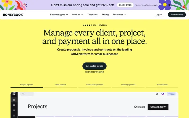
Preview image. Unlock full-res
Warm productivity with a vibrant hum
Color palette
Dominant background color for hero sections and other large content blocks, providing a soft, warm canvas
Primary interactive element background for CTAs, prominent cards, and specific visual highlights. This color is the primary action trigger
Occasional background for distinct content blocks, offering a cool contrast to the dominant yellows
Occasional background for distinct content blocks, providing an alternative accent hue
Occasional background for distinct content blocks, adding a soft, muted violet accent
Primary text, core UI elements, outlines for ghost buttons, dark borders, footer backgrounds
Card backgrounds, secondary container surfaces, default page backgrounds, and text on darker backgrounds
Subtle button backgrounds, inactive states, and soft borders for cards or other UI elements
Secondary page background areas, offering a warmer, slightly off-white alternative to Arctic Mist
Emphasized borders, muted text, and subtle background elements
Fine text, secondary detail elements, and small borders
Muted secondary text and decorative border elements
Light borders and subtle dividers
Muted text and functional icon colors
Very light backgrounds and subtle separators
Card borders and placeholder text
Typography
- Weights
- 400, 500, 600, 700
- Sizes
- 12px, 14px, 16px, 18px, 20px, 24px, 28px, 32px, 48px
- Line height
- 1, 1.2, 1.4, 1.5, 1.8
- Letter spacing
- -0.0500em at 48px, -0.0360em at 32px, -0.0300em at 28px, normal at 12px
- Fallback
- Inter
Primary UI text, body copy, navigation, and button labels. Its wide range of weights supports extensive functional hierarchy. This sans-serif provides a sturdy, readable base for all interactive elements.
- Weights
- 400
- Sizes
- 16px, 28px, 40px, 48px, 56px, 64px
- Line height
- 1, 1.2
- Letter spacing
- -0.0500em at 64px, -0.0420em at 56px, -0.0310em at 48px, -0.0270em at 40px
- Fallback
- Merriweather
Display headings and prominent titles. The serif, combined with tight letter-spacing, gives a sophisticated yet impactful presence, making statements feel considered.
- Weights
- 500
- Sizes
- 14px
- Line height
- 1.2, 1.5
- Letter spacing
- 0.0710em
- Fallback
- Space Mono
Specialized text, such as meta labels or subtle callouts, where generous letter-spacing adds a distinct, almost technical, flair.
Spacing & shape
Components
Ghost button with Onyx Black text (#142127) and a 1px Onyx Black border (#142127). Padding is 8px vertical, 24px horizontal. Radius is a very large 'pill' shape (159984px).
Ghost button with Onyx Black text (#142127) and a 1px Onyx Black border (#142127). Padding is 8px vertical, 16px horizontal. Radius is 0px rectangle.
Circular button with Earl Gray background (#c7d5d9) and Onyx Black text (#142127). Radius is 50% for a perfect circle.
Ghost button with Arctic Mist text (#ffffff) and a 1px Charcoal Grey border (#343c40). Padding is 20px vertical, 20px horizontal. Radius is 8px.
Card with Arctic Mist background (#ffffff), no box shadow. Padding is 24px on all sides. Radius is 10px.
Card with Arctic Mist background (#ffffff), no box shadow. Padding is 20px on all sides. Radius is 20px.
Tag with Lemon Zest background (#fffa56), no box shadow. Padding is 4px vertical, 12px horizontal. Radius is 30px, creating a pill shape.
Filled button with Lemon Zest background (#fffa56) and Onyx Black text (#142127). Border is 1px Onyx Black (#142127). Radius is a very large 'pill' shape (159984px).
Guidelines
- Use Onyx Black (#142127) for all primary text elements to ensure high contrast and readability.
- Implement Buttermilk Yellow (#fffa77) as the dominant background for large, impactful sections, especially the hero.
- Apply a large radius of 159984px to all primary ghost buttons and filled CTA buttons, creating a consistent pill shape.
- Employ STK Bureau Sans for all body text, navigational elements, and functional UI text, picking a weight from 400-700 as needed.
- Utilize STK Bureau Serif with tight letter-spacing for all major headings to establish a distinctive and sophisticated visual voice.
- Maintain an element gap of 16px between most interactive interface elements for comfortable density.
- Use Arctic Mist (#ffffff) for card backgrounds and other contained content areas that require a crisp, clean surface.
- Avoid using saturated colors other than Buttermilk Yellow or Lemon Zest for primary UI elements; reserve other accent colors for large background blocks.
- Do not use box shadows for elevation; rely on background color changes or border thickness to distinguish elements.
- Do not deviate from the specified letter-spacing values for STK Bureau Sans and Serif, as they are crucial for brand typography.
- Never use radii smaller than 6px for interactive elements or cards; all elements should feel soft and rounded.
- Do not introduce new typefaces; rely solely on STK Bureau Sans, STK Bureau Serif, and STK Gerhard.
- Avoid arbitrary uses of #c7d5d9 (Earl Gray) as a primary action; it is specifically for secondary, less emphasized actions or inactive states.
About this system
ShowHide
HoneyBook presents a playful yet established aesthetic, built on a foundation of warm neutrals and a vibrant, almost neon yellow accent. Typography creates distinct hierarchy with a sans-serif for functional text and a serif for display, often with tight tracking. Components are soft and approachable with generous corner radii, emphasizing a friendly user experience. The palette is carefully balanced to keep the vivid yellow from overwhelming the interface, reserving it for key actions and foundational sections.
The page primarily uses a constrained, centered layout within a max-width container, with some full-bleed sections filling the viewport horizontally. The hero section features a full-bleed Buttermilk Yellow background with a centered, prominent heading and call to action. Subsequent sections alternate between light backgrounds like Arctic Mist and Paper White, often featuring 2-column text-left/image-right or text-right/image-left layouts, or centered stacks for feature descriptions. Navigation is a persistent top bar with a log-in link and a 'Start for free' button.
The site uses a combination of minimal, outlined, or filled icons in Onyx Black or white for functional UI. Product screenshots or abstract graphics appear within content sections, often contained within cards rather than full-bleed. Imagery is primarily explanatory, showcasing product features rather than decorative atmosphere. When present, images are tightly cropped or illustrative, focusing on conveying information.
Reminiscent of Airtable, Canva, FreshBooks, Wave Accounting.
# HoneyBook — Style Reference
> Warm productivity with a vibrant hum

**Theme:** light

**Site:** https://www.honeybook.com

HoneyBook presents a playful yet established aesthetic, built on a foundation of warm neutrals and a vibrant, almost neon yellow accent. Typography creates distinct hierarchy with a sans-serif for functional text and a serif for display, often with tight tracking. Components are soft and approachable with generous corner radii, emphasizing a friendly user experience. The palette is carefully balanced to keep the vivid yellow from overwhelming the interface, reserving it for key actions and foundational sections.

## Tokens — Colors

| Name | Value | Token | Role |
|------|------|------|------|
| Buttermilk Yellow | `#fffa77` | `--color-buttermilk-yellow` | Dominant background color for hero sections and other large content blocks, providing a soft, warm canvas |
| Lemon Zest | `#fffa56` | `--color-lemon-zest` | Primary interactive element background for CTAs, prominent cards, and specific visual highlights. This color is the primary action trigger |
| Dusk Blue | `#9ab9e8` | `--color-dusk-blue` | Occasional background for distinct content blocks, offering a cool contrast to the dominant yellows |
| Jade Green | `#99d3ac` | `--color-jade-green` | Occasional background for distinct content blocks, providing an alternative accent hue |
| Lavender Haze | `#dbd2f7` | `--color-lavender-haze` | Occasional background for distinct content blocks, adding a soft, muted violet accent |
| Onyx Black | `#142127` | `--color-onyx-black` | Primary text, core UI elements, outlines for ghost buttons, dark borders, footer backgrounds |
| Arctic Mist | `#ffffff` | `--color-arctic-mist` | Card backgrounds, secondary container surfaces, default page backgrounds, and text on darker backgrounds |
| Earl Gray | `#c7d5d9` | `--color-earl-gray` | Subtle button backgrounds, inactive states, and soft borders for cards or other UI elements |
| Paper White | `#f4eae0` | `--color-paper-white` | Secondary page background areas, offering a warmer, slightly off-white alternative to Arctic Mist |
| Charcoal Grey | `#343c40` | `--color-charcoal-grey` | Emphasized borders, muted text, and subtle background elements |
| Ink Grey | `#131416` | `--color-ink-grey` | Fine text, secondary detail elements, and small borders |
| Stone Grey | `#63696c` | `--color-stone-grey` | Muted secondary text and decorative border elements |
| Ash Grey | `#e0e5e7` | `--color-ash-grey` | Light borders and subtle dividers |
| Cool Grey | `#525660` | `--color-cool-grey` | Muted text and functional icon colors |
| Cloud Grey | `#edf1f3` | `--color-cloud-grey` | Very light backgrounds and subtle separators |
| Steel Grey | `#b0b8bc` | `--color-steel-grey` | Card borders and placeholder text |

## Tokens — Typography

### STK Bureau Sans
- **Substitute:** Inter
- **Weights:** 400, 500, 600, 700
- **Sizes:** 12px, 14px, 16px, 18px, 20px, 24px, 28px, 32px, 48px
- **Line height:** 1, 1.2, 1.4, 1.5, 1.8
- **Letter spacing:** -0.0500em at 48px, -0.0360em at 32px, -0.0300em at 28px, normal at 12px
- **Role:** Primary UI text, body copy, navigation, and button labels. Its wide range of weights supports extensive functional hierarchy. This sans-serif provides a sturdy, readable base for all interactive elements.

### STK Bureau Serif
- **Substitute:** Merriweather
- **Weights:** 400
- **Sizes:** 16px, 28px, 40px, 48px, 56px, 64px
- **Line height:** 1, 1.2
- **Letter spacing:** -0.0500em at 64px, -0.0420em at 56px, -0.0310em at 48px, -0.0270em at 40px
- **Role:** Display headings and prominent titles. The serif, combined with tight letter-spacing, gives a sophisticated yet impactful presence, making statements feel considered.

### STK Gerhard
- **Substitute:** Space Mono
- **Weights:** 500
- **Sizes:** 14px
- **Line height:** 1.2, 1.5
- **Letter spacing:** 0.0710em
- **Role:** Specialized text, such as meta labels or subtle callouts, where generous letter-spacing adds a distinct, almost technical, flair.

## Tokens — Type Scale

Major Third (1.25) from 16px base.

| Role | Size | Line height | Letter spacing |
|------|------|------|------|
| caption | 12px | 1.5 | — |
| body-sm | 14px | 1.5 | 0.071em |
| body | 16px | 1.5 | — |
| body-lg | 18px | 1.5 | — |
| subheading | 20px | 1.4 | — |
| heading-sm | 28px | 1.2 | -0.03em |
| heading | 32px | 1.2 | -0.036em |
| heading-lg | 48px | 1.2 | -0.05em |
| display | 64px | 1 | -0.05em |

## Tokens — Spacing

- **Section gap:** 72px
- **Card padding:** 24px
- **Element gap:** 16px

## Tokens — Radius

- **General:** 6px
- **Buttons:** 159984px
- **Cards:** 20px
- **tags:** 30px

## Layout

The page primarily uses a constrained, centered layout within a max-width container, with some full-bleed sections filling the viewport horizontally. The hero section features a full-bleed Buttermilk Yellow background with a centered, prominent heading and call to action. Subsequent sections alternate between light backgrounds like Arctic Mist and Paper White, often featuring 2-column text-left/image-right or text-right/image-left layouts, or centered stacks for feature descriptions. Navigation is a persistent top bar with a log-in link and a 'Start for free' button.

## Imagery

The site uses a combination of minimal, outlined, or filled icons in Onyx Black or white for functional UI. Product screenshots or abstract graphics appear within content sections, often contained within cards rather than full-bleed. Imagery is primarily explanatory, showcasing product features rather than decorative atmosphere. When present, images are tightly cropped or illustrative, focusing on conveying information.

## Components

### Primary Ghost Button
*Call to action button for primary actions, providing a strong visual cue without a solid fill.*

Ghost button with Onyx Black text (#142127) and a 1px Onyx Black border (#142127). Padding is 8px vertical, 24px horizontal. Radius is a very large 'pill' shape (159984px).

### Secondary Ghost Button
*Call to action button for secondary actions or navigation links, less prominent than primary.*

Ghost button with Onyx Black text (#142127) and a 1px Onyx Black border (#142127). Padding is 8px vertical, 16px horizontal. Radius is 0px rectangle.

### Navigation Circle Button
*Round buttons for navigation or specific icon-based actions.*

Circular button with Earl Gray background (#c7d5d9) and Onyx Black text (#142127). Radius is 50% for a perfect circle.

### Inverted Ghost Button (Dark Background)
*Ghost button for use on darker backgrounds, maintaining brand consistency.*

Ghost button with Arctic Mist text (#ffffff) and a 1px Charcoal Grey border (#343c40). Padding is 20px vertical, 20px horizontal. Radius is 8px.

### Standard Card
*Basic content container for features, information blocks, or testimonials.*

Card with Arctic Mist background (#ffffff), no box shadow. Padding is 24px on all sides. Radius is 10px.

### Elevated Card
*Prominent content container, distinguishing it from standard cards.*

Card with Arctic Mist background (#ffffff), no box shadow. Padding is 20px on all sides. Radius is 20px.

### Lemon Zest Tag/Pill
*Small informational tags or labels, drawing attention with the accent color.*

Tag with Lemon Zest background (#fffa56), no box shadow. Padding is 4px vertical, 12px horizontal. Radius is 30px, creating a pill shape.

### Primary Action Button (Filled)
*High-emphasis button for critical calls to action.*

Filled button with Lemon Zest background (#fffa56) and Onyx Black text (#142127). Border is 1px Onyx Black (#142127). Radius is a very large 'pill' shape (159984px).

## Guidelines

### Do

- Use Onyx Black (#142127) for all primary text elements to ensure high contrast and readability.
- Implement Buttermilk Yellow (#fffa77) as the dominant background for large, impactful sections, especially the hero.
- Apply a large radius of 159984px to all primary ghost buttons and filled CTA buttons, creating a consistent pill shape.
- Employ STK Bureau Sans for all body text, navigational elements, and functional UI text, picking a weight from 400-700 as needed.
- Utilize STK Bureau Serif with tight letter-spacing for all major headings to establish a distinctive and sophisticated visual voice.
- Maintain an element gap of 16px between most interactive interface elements for comfortable density.
- Use Arctic Mist (#ffffff) for card backgrounds and other contained content areas that require a crisp, clean surface.

### Don't

- Avoid using saturated colors other than Buttermilk Yellow or Lemon Zest for primary UI elements; reserve other accent colors for large background blocks.
- Do not use box shadows for elevation; rely on background color changes or border thickness to distinguish elements.
- Do not deviate from the specified letter-spacing values for STK Bureau Sans and Serif, as they are crucial for brand typography.
- Never use radii smaller than 6px for interactive elements or cards; all elements should feel soft and rounded.
- Do not introduce new typefaces; rely solely on STK Bureau Sans, STK Bureau Serif, and STK Gerhard.
- Avoid arbitrary uses of #c7d5d9 (Earl Gray) as a primary action; it is specifically for secondary, less emphasized actions or inactive states.

## Agent Prompt Guide

### Quick Color Reference
- text: #142127
- background: #fffa77
- border: #142127
- accent: #9ab9e8
- primary action: #fffa56 (filled action)

### 3-5 Example Component Prompts
1. Create a Primary Action Button: #fffa56 background, #131416 text, 9999px radius, compact pill padding. Use this filled treatment for the main CTA.
2. Design a 'Standard Card' for a feature list. Use 'Arctic Mist Surface' for the background, 24px padding, and 10px radius. Inside, place a heading using STK Bureau Sans, 24px, weight 600, #142127, and body text using STK Bureau Sans, 16px, weight 400, #142127.
4. Build an 'Elevated Card' featuring a small 'Lemon Zest Tag/Pill' at the top-right. The card background is 'Arctic Mist Surface', 20px padding, 20px radius. The tag uses 'Lemon Zest' background with #142127 text, 4px vertical / 12px horizontal padding, and 30px radius.
5. Generate a section with a 'Paper White Soft Surface' background. Include a 'Subheading' title using STK Bureau Serif, 48px, weight 400, #142127, letter-spacing -0.031em. Follow with a description using STK Bureau Sans, 16px, weight 400, #142127.
More like this
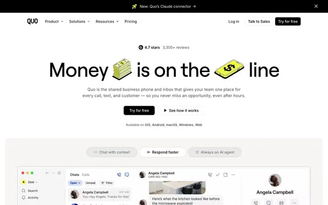









Keep what you find
A free account saves references to boards and can send you a weekly email of picks based on what you save.
To see every result, go Pro.