Preview image. Unlock full-res
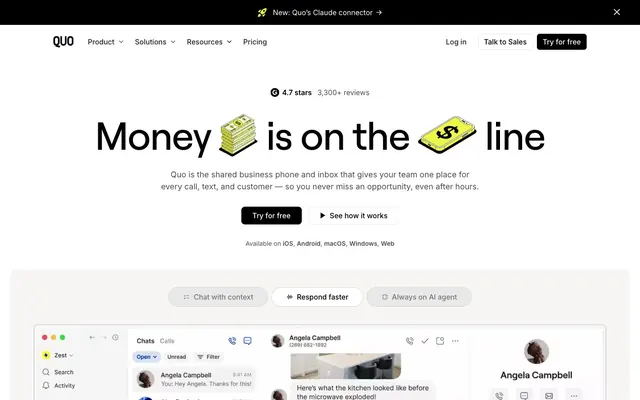
High-contrast digital workspace.
Color palette
Green decorative accent for icons, marks, and small graphic details. Do not promote it to the primary CTA color
Page backgrounds, card surfaces, ghost button backgrounds
Primary text, headings, strong borders, filled button backgrounds, brand logo
Secondary surface backgrounds, subtle card backgrounds, soft button fills
Body text, secondary descriptive text
Hairline borders, dividers, disabled states
Deepest background for contrast, specialized text
Typography
- Weights
- 400, 500, 600
- Sizes
- 12px, 14px, 16px, 18px, 20px
- Line height
- 1, 1.2, 1.3, 1.5
- Letter spacing
- normal
- Fallback
- system-ui
Body text, navigation, links, captions, small functional labels. A versatile workhorse for content, maintaining readability at all sizes.
- Weights
- 500
- Sizes
- 20px, 24px, 40px, 48px, 56px, 64px, 88px
- Line height
- 0.9, 1.1, 1.2
- Letter spacing
- -0.0200em at large sizes, -0.0100em at smaller headline sizes
- Fallback
- Arial
Headlines, section titles, and prominent callouts. The specific 500 weight and tight letter-spacing create a confident, assertive tone without being overtly heavy.
Spacing & shape
Components
Solid Ink Black (#000000) background with Canvas White (#ffffff) text. Features a 6px border radius and generous 16px horizontal/vertical padding. Dominant action element.
Transparent background with Ink Black (#000000) text and a 1px Ink Black (#000000) border. No border radius. Minimum 8px vertical and 16px horizontal padding.
Surface Gray (#f7f6f5) background with Ink Black (#000000) text. Features a 10px border radius and 16px horizontal/vertical padding. Used for filters or less prominent actions.
Transparent background, 10px border radius, no box shadow. 32px internal padding on all sides. Used for structured information blocks.
Surface Gray (#f7f6f5) background, 10px border radius, no box shadow. No internal padding by default, allowing content to control spacing. Used for visually distinct content blocks.
Transparent background with a subtle shadow (rgba(0, 0, 0, 0.1) 0px 11px 17px -10px) and 10px border radius. Padding set to 24px vertical and 32px horizontal. Used for UI overlays or popups.
Ink Black (#000000) text at 16px Inter 500 weight. Transparent background, no border, no padding or radius. Interactive but visually minimal.
Transparent background with Ink Black (#000000) text. No padding or radius. Used for small, unobtrusive labels.
Guidelines
- Prioritize Ink Black (#000000) for primary text and calls to action against Canvas White (#ffffff).
- Use Roobert 500 with tight letter-spacing for all headlines and impactful text, emphasizing confidence.
- Apply Surface Gray (#f7f6f5) for subtle background differentiation on cards and soft buttons, maintaining a muted base.
- Incorporate Lime Accent (#edfc47) sparingly for interactive elements, highlights, and decorative touches to provide energetic punctuation.
- Ensure generous internal padding of 32px for main content cards to create a spacious feel.
- Maintain a clear visual hierarchy with strong contrast between text and background, adhering to AAA accessibility standards where possible.
- Utilize 10px border radii for most containers and 6px for buttons, with 100px for pill-shaped elements like tags.
- Avoid using multiple accent colors; rely on Lime Accent (#edfc47) as the sole chromatic highlight.
- Do not use heavy shadows or gradients; components should generally remain flat or subtly elevated with minimal box-shadows.
- Do not introduce complex background patterns; maintain large areas of Canvas White (#ffffff) or Surface Gray (#f7f6f5).
- Do not use generic system fonts for headlines; always default to Roobert 500 for brand consistency.
- Avoid excessive use of borders; elements should primarily rely on background color to define their boundaries.
- Do not use rounded corners larger than 10px for cards or smaller than 6px for active buttons.
- Do not clutter layouts; aim for comfortable density and clear visual separation with generous spacing.
About this system
ShowHide
Quo adopts a stark, high-contrast digital workspace aesthetic: a spacious white canvas punctuated by bold black typography and strategic use of a single vivid lime accent. The design feels direct and functional, leveraging strong visual hierarchy created by heavy black text and subtle, almost invisible UI elements. Components are lightweight with minimal borders, emphasizing content over chrome, and utilizing soft gray backgrounds for subtle differentiation.
The page adheres to a max-width of 1200px, with content centrally aligned. The hero section is full-width, featuring a prominent centered headline over a white background, occasionally with large, simple illustrative elements. The section rhythm is primarily continuous white space, occasionally broken by soft Surface Gray (#f7f6f5) background bands that seamlessly transition into the next feature block. Content is arranged in alternating text-left/image-right or text-right/image-left patterns, often within multi-column card grids (e.g., 2-column or 3-column feature setups). The layout is spacious with clear vertical separation between sections. Navigation consists of a simple top bar with primary links and prominent 'Log in' and 'Try for free' ghost and filled buttons.
The visual language for imagery is minimal and functional, primarily using product screenshots and software interface depictions. These are often flat, contained within subtle card-like structures with 10px rounded corners, or occasionally full-bleed to showcase the UI. Photography is absent. Illustrations are rare, but when present, they appear as simple, almost outlined or filled icons with a flat, geometric style (e.g., illustrated money stacks in the hero). Icons are typically outlined and monochrome, carrying a consistent stroke weight. Imagery serves an explanatory or product showcase role, focusing on functionality rather than atmosphere or branding, leading to a text-dominant layout with imagery providing visual anchors.
Reminiscent of Superhuman, Linear, Notion, Figma.
# Quo (formerly OpenPhone) — Style Reference
> High-contrast digital workspace.

**Theme:** light

**Site:** https://www.openphone.com

Quo adopts a stark, high-contrast digital workspace aesthetic: a spacious white canvas punctuated by bold black typography and strategic use of a single vivid lime accent. The design feels direct and functional, leveraging strong visual hierarchy created by heavy black text and subtle, almost invisible UI elements. Components are lightweight with minimal borders, emphasizing content over chrome, and utilizing soft gray backgrounds for subtle differentiation.

## Tokens — Colors

| Name | Value | Token | Role |
|------|------|------|------|
| Lime Accent | `#edfc47` | `--color-lime-accent` | Green decorative accent for icons, marks, and small graphic details. Do not promote it to the primary CTA color |
| Canvas White | `#ffffff` | `--color-canvas-white` | Page backgrounds, card surfaces, ghost button backgrounds |
| Ink Black | `#000000` | `--color-ink-black` | Primary text, headings, strong borders, filled button backgrounds, brand logo |
| Surface Gray | `#f7f6f5` | `--color-surface-gray` | Secondary surface backgrounds, subtle card backgrounds, soft button fills |
| Supporting Text Grey | `#4d4d4d` | `--color-supporting-text-grey` | Body text, secondary descriptive text |
| Subtle Border Gray | `#cccccc` | `--color-subtle-border-gray` | Hairline borders, dividers, disabled states |
| Dark Charcoal | `#0a0a0c` | `--color-dark-charcoal` | Deepest background for contrast, specialized text |

## Tokens — Typography

### Inter
- **Substitute:** system-ui
- **Weights:** 400, 500, 600
- **Sizes:** 12px, 14px, 16px, 18px, 20px
- **Line height:** 1, 1.2, 1.3, 1.5
- **Letter spacing:** normal
- **Role:** Body text, navigation, links, captions, small functional labels. A versatile workhorse for content, maintaining readability at all sizes.

### Roobert
- **Substitute:** Arial
- **Weights:** 500
- **Sizes:** 20px, 24px, 40px, 48px, 56px, 64px, 88px
- **Line height:** 0.9, 1.1, 1.2
- **Letter spacing:** -0.0200em at large sizes, -0.0100em at smaller headline sizes
- **Role:** Headlines, section titles, and prominent callouts. The specific 500 weight and tight letter-spacing create a confident, assertive tone without being overtly heavy.

## Tokens — Type Scale

Perfect Fourth (1.333) from 16px base.

| Role | Size | Line height | Letter spacing |
|------|------|------|------|
| caption | 12px | 1.5 | — |
| body-sm | 14px | 1.5 | — |
| body | 16px | 1.5 | — |
| subheading | 20px | 1.2 | -0.2px |
| heading-sm | 24px | 1.2 | -0.24px |
| heading | 40px | 1.1 | -0.8px |
| heading-lg | 56px | 0.9 | -1.12px |
| display | 88px | 0.9 | -1.76px |

## Tokens — Spacing

- **Max width:** 1200px
- **Section gap:** 48px
- **Card padding:** 16px
- **Element gap:** 16px

## Tokens — Radius

- **Default:** 10px
- **Buttons:** 6px
- **Cards:** 10px
- **tags:** 100px

## Layout

The page adheres to a max-width of 1200px, with content centrally aligned. The hero section is full-width, featuring a prominent centered headline over a white background, occasionally with large, simple illustrative elements. The section rhythm is primarily continuous white space, occasionally broken by soft Surface Gray (#f7f6f5) background bands that seamlessly transition into the next feature block. Content is arranged in alternating text-left/image-right or text-right/image-left patterns, often within multi-column card grids (e.g., 2-column or 3-column feature setups). The layout is spacious with clear vertical separation between sections. Navigation consists of a simple top bar with primary links and prominent 'Log in' and 'Try for free' ghost and filled buttons.

## Imagery

The visual language for imagery is minimal and functional, primarily using product screenshots and software interface depictions. These are often flat, contained within subtle card-like structures with 10px rounded corners, or occasionally full-bleed to showcase the UI. Photography is absent. Illustrations are rare, but when present, they appear as simple, almost outlined or filled icons with a flat, geometric style (e.g., illustrated money stacks in the hero). Icons are typically outlined and monochrome, carrying a consistent stroke weight. Imagery serves an explanatory or product showcase role, focusing on functionality rather than atmosphere or branding, leading to a text-dominant layout with imagery providing visual anchors.

## Components

### Primary Filled Button
*Call to action*

Solid Ink Black (#000000) background with Canvas White (#ffffff) text. Features a 6px border radius and generous 16px horizontal/vertical padding. Dominant action element.

### Ghost Button
*Secondary action / navigation link*

Transparent background with Ink Black (#000000) text and a 1px Ink Black (#000000) border. No border radius. Minimum 8px vertical and 16px horizontal padding.

### Soft Filled Button
*Light background action / tag*

Surface Gray (#f7f6f5) background with Ink Black (#000000) text. Features a 10px border radius and 16px horizontal/vertical padding. Used for filters or less prominent actions.

### Default Card
*Content container*

Transparent background, 10px border radius, no box shadow. 32px internal padding on all sides. Used for structured information blocks.

### Surface Accent Card
*Information display*

Surface Gray (#f7f6f5) background, 10px border radius, no box shadow. No internal padding by default, allowing content to control spacing. Used for visually distinct content blocks.

### Elevated Tooltip Card
*Ephemeral information*

Transparent background with a subtle shadow (rgba(0, 0, 0, 0.1) 0px 11px 17px -10px) and 10px border radius. Padding set to 24px vertical and 32px horizontal. Used for UI overlays or popups.

### Navigation Link
*Header navigation*

Ink Black (#000000) text at 16px Inter 500 weight. Transparent background, no border, no padding or radius. Interactive but visually minimal.

### Subtle Badge
*Highlight label*

Transparent background with Ink Black (#000000) text. No padding or radius. Used for small, unobtrusive labels.

## Guidelines

### Do

- Prioritize Ink Black (#000000) for primary text and calls to action against Canvas White (#ffffff).
- Use Roobert 500 with tight letter-spacing for all headlines and impactful text, emphasizing confidence.
- Apply Surface Gray (#f7f6f5) for subtle background differentiation on cards and soft buttons, maintaining a muted base.
- Incorporate Lime Accent (#edfc47) sparingly for interactive elements, highlights, and decorative touches to provide energetic punctuation.
- Ensure generous internal padding of 32px for main content cards to create a spacious feel.
- Maintain a clear visual hierarchy with strong contrast between text and background, adhering to AAA accessibility standards where possible.
- Utilize 10px border radii for most containers and 6px for buttons, with 100px for pill-shaped elements like tags.

### Don't

- Avoid using multiple accent colors; rely on Lime Accent (#edfc47) as the sole chromatic highlight.
- Do not use heavy shadows or gradients; components should generally remain flat or subtly elevated with minimal box-shadows.
- Do not introduce complex background patterns; maintain large areas of Canvas White (#ffffff) or Surface Gray (#f7f6f5).
- Do not use generic system fonts for headlines; always default to Roobert 500 for brand consistency.
- Avoid excessive use of borders; elements should primarily rely on background color to define their boundaries.
- Do not use rounded corners larger than 10px for cards or smaller than 6px for active buttons.
- Do not clutter layouts; aim for comfortable density and clear visual separation with generous spacing.

## Agent Prompt Guide

Quick Color Reference:
text: #000000
background: #ffffff
border: #cccccc
accent: #edfc47
primary action: #000000 (filled action)

Example Component Prompts:
Create a Primary Filled Button: solid Ink Black (#000000) background, Canvas White (#ffffff) text, Roobert 500 at 16px, 6px border radius, 16px vertical and horizontal padding.
Create a Default Card: Canvas White (#ffffff) background, 10px border radius, no shadow, 32px internal padding on all sides.
Create a Navigation Link: Ink Black (#000000) text, Inter 500 at 16px, no background, no border, no padding.
Create a Hero Headline: 'Money is on the Line' in Ink Black (#000000), Roobert 500 at 88px, letter-spacing -1.76px, centered on a Canvas White (#ffffff) background.
More like this









Keep what you find
A free account saves references to boards and can send you a weekly email of picks based on what you save.
To see every result, go Pro.