Preview image. Unlock full-res
Artisanal Collector's Canvas
Color palette
Primary text, filled button backgrounds, critical borders – a very dark, earthy brown that provides strong contrast and a sense of luxury
Page background, card surfaces, prominent content areas – a warm, aged white that feels tactile and refined
Secondary text, subtle borders, inactive link states – a deep gray for supportive information
Decorative borders, divider lines, subtle background texture – a muted, desaturated tan that adds depth without competing
Background for certain content blocks where a softer dark tone is desired, distinct from Deep Bark
Iconography, strong accents, button borders where maximum visual impact is required
Text on dark backgrounds, active link states in navigation – a crisp white for contrast
Typography
- Weights
- 400, 500, 600
- Sizes
- 14px, 16px, 18px, 20px, 21px, 28px, 30px, 32px, 45px, 60px, 70px
- Line height
- 1, 1.15, 1.3, 1.33, 1.44, 1.71, 2.5, 2.79
- Letter spacing
- -0.020em to -0.050em
- Fallback
- Playfair Display
Brand headlines, product titles, and key calls-to-action – its unique character defines the brand's sophisticated, bespoke feel. The negative letter-spacing contributes to its tightly-knit, impactful presence.
- Weights
- 400
- Sizes
- 16px
- Line height
- 2
- Letter spacing
- normal
- Fallback
- Roboto
Fallback text for browser consistency and general UI elements where a neutral, highly readable sans-serif is needed.
- Weights
- 400
- Sizes
- 16px
- Line height
- 1.15, 1.63
- Letter spacing
- normal
- Fallback
- Helvetica Neue
Body text and descriptive content for clarity and legibility, providing a modern, clean counterbalance to the custom serif.
- Weights
- 400
- Sizes
- 16px
- Line height
- 1.5
- Letter spacing
- normal
- Fallback
- Montserrat
Used for specific auxiliary text, possibly emphasizing a structured or informational tone.
Spacing & shape
Elevation
Components
Background: Houseplant Deep Bark (#321e1e), Text: Canvas Parchment (#f4f1e0). Padding: 12px vertical, 20px horizontal. Border radius: 4px. Features a subtle bottom border in Canvas Parchment.
Background: Pure White Text (#ffffff), Text: Pure Black (#000000). Padding: 1px vertical, 6px horizontal. Border radius: 50% (circular). Border: 1px solid Pure Black.
Background: Transparent. Text: Pure White Text (#f4f4f4). No explicit padding or border radius. Underlined on hover or active state using Pure White Text.
Background: Transparent. Text: Text Carbon (#464545). No explicit padding or border radius. Minimalist, relying on surrounding layout for hierarchy.
Background: Houseplant Deep Bark (#321e1e), Text: Canvas Parchment (#f4f1e0). Padding: 0px vertical, 30px horizontal. Border radius: 0px. Used within constrained areas, often at the bottom of a card.
Background: Canvas Parchment (#f4f1e0). Border radius: 8px. Box shadow: rgba(0, 0, 0, 0.1) 0px 2px 8px 0px. No internal padding, allowing content to stretch to edges.
1px solid Surface Shadow (#bdb498).
Transparent background. Text: Text Carbon (#464545). No specific border radius or padding, blending into surrounding text.
Transparent background. Text: Pure White Text (#f4f4f4). Border: 1px solid Pure White Text. Padding: 12px vertical, 20px horizontal. Border radius: 4px.
Guidelines
- Prioritize Canvas Parchment (#f4f1e0) as the dominant background for light sections to maintain the warm, aged base.
- Use Houseplant Deep Bark (#321e1e) for primary text and critical interactive elements, ensuring strong contrast.
- Apply the Houseplant typeface with negative letter-spacing for all primary headings and product names to emphasize brand identity.
- Utilize a border-radius of 4px for interactive buttons and 8px for prominent cards to provide consistent component shaping.
- Employ subtle box shadows (rgba(0, 0, 0, 0.1) 0px 2px 8px 0px) for cards and buttons for gentle elevation, avoiding harsh overlays.
- Maintain a comfortable element gap of 20px between distinct UI components for visual breathing room.
- Contrast Houseplant Deep Bark (#321e1e) against Canvas Parchment (#f4f1e0) for optimal readability and brand impact in text.
- Avoid using bright, saturated colors for backgrounds or large areas; color should predominantly come from product imagery or small accents.
- Do not introduce sharp, angular shapes or radii beyond the defined 4px and 8px, as this deviates from the soft, artisanal feel.
- Refrain from heavy, multi-layered shadows; elevation should be minimal and understated.
- Do not use generic system fonts for headlines or prominent text; the custom Houseplant typeface is essential to brand identity.
- Avoid dense, tightly packed layouts; the design system values comfortable spacing and a focused presentation.
- Do not use highly reflective or glossy textures; the aesthetic leans towards matte, tactile surfaces.
- Do not dilute the contrast between text and background with mid-tone grays; rely on the established dark neutrals on light backgrounds.
About this system
ShowHide
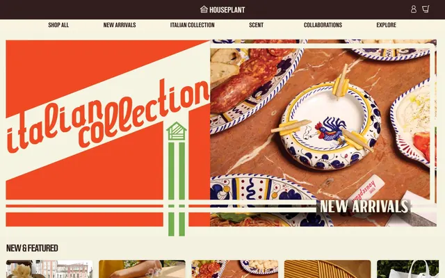
HOUSEPLANT's visual system evokes a collectible-driven, high-end artisanal aesthetic. It features a stark contrast between a dominant, warm off-white canvas and deep, earthy neutrals, lending a sophisticated yet grounded feel. Typography is paramount, leveraging a distinctive custom serif for headlines and strong sans-serifs for body text, creating an almost editorial quality. Components are minimal, often borderless or with subtle shadows, allowing the rich product imagery and bold type to command attention.
The page uses a maximum-width contained layout rather than full-bleed, with content centered. The hero section often features a split-layout with bold graphic elements or photography on one side and a prominent headline with a call to action on the other, sometimes against a full-width background. Sections maintain a consistent vertical rhythm, primarily defined by explicit section gaps, frequently alternating between the Canvas Parchment background and a darker content block (#463938). Content is arranged in flexible grid patterns for product listings (e.g., 3-column carousel of product cards) and alternating text-left / image-right or centered stacks for feature descriptions. Navigation is a sticky top bar with minimal links and iconic utility buttons.
Imagery primarily consists of tight product photography or styled product shots, often isolated on neutral backgrounds or within artistic, curated settings. Photography is high-key with soft lighting, minimizing harsh shadows, and focusing on the material and form of the objects. Illustrations (as seen in the 'Italian Collection' hero) are geometric, bold, and utilize brand colors to create impactful, graphic patterns rather than detailed scenes. Icons are minimal, outlined, and monochromatic, primarily serving functional roles. The visual system is image-heavy, showcasing the products as the hero, balancing aesthetic appeal with clear product visibility.
Reminiscent of Frama, Aesop, Our Place, Tekla Fabrics.
# HOUSEPLANT — Style Reference
> Artisanal Collector's Canvas

**Theme:** light

**Site:** https://www.houseplant.com

HOUSEPLANT's visual system evokes a collectible-driven, high-end artisanal aesthetic. It features a stark contrast between a dominant, warm off-white canvas and deep, earthy neutrals, lending a sophisticated yet grounded feel. Typography is paramount, leveraging a distinctive custom serif for headlines and strong sans-serifs for body text, creating an almost editorial quality. Components are minimal, often borderless or with subtle shadows, allowing the rich product imagery and bold type to command attention.

## Tokens — Colors

| Name | Value | Token | Role |
|------|------|------|------|
| Houseplant Deep Bark | `#321e1e` | `--color-houseplant-deep-bark` | Primary text, filled button backgrounds, critical borders – a very dark, earthy brown that provides strong contrast and a sense of luxury |
| Canvas Parchment | `#f4f1e0` | `--color-canvas-parchment` | Page background, card surfaces, prominent content areas – a warm, aged white that feels tactile and refined |
| Text Carbon | `#464545` | `--color-text-carbon` | Secondary text, subtle borders, inactive link states – a deep gray for supportive information |
| Surface Shadow | `#bdb498` | `--color-surface-shadow` | Decorative borders, divider lines, subtle background texture – a muted, desaturated tan that adds depth without competing |
| Button Shadow | `#463938` | `--color-button-shadow` | Background for certain content blocks where a softer dark tone is desired, distinct from Deep Bark |
| Pure Black | `#000000` | `--color-pure-black` | Iconography, strong accents, button borders where maximum visual impact is required |
| Pure White Text | `#f4f4f4` | `--color-pure-white-text` | Text on dark backgrounds, active link states in navigation – a crisp white for contrast |

## Tokens — Typography

### Houseplant
- **Substitute:** Playfair Display
- **Weights:** 400, 500, 600
- **Sizes:** 14px, 16px, 18px, 20px, 21px, 28px, 30px, 32px, 45px, 60px, 70px
- **Line height:** 1, 1.15, 1.3, 1.33, 1.44, 1.71, 2.5, 2.79
- **Letter spacing:** -0.020em to -0.050em
- **Role:** Brand headlines, product titles, and key calls-to-action – its unique character defines the brand's sophisticated, bespoke feel. The negative letter-spacing contributes to its tightly-knit, impactful presence.

### Roboto
- **Substitute:** Roboto
- **Weights:** 400
- **Sizes:** 16px
- **Line height:** 2
- **Letter spacing:** normal
- **Role:** Fallback text for browser consistency and general UI elements where a neutral, highly readable sans-serif is needed.

### NeueHelvetica55Roman
- **Substitute:** Helvetica Neue
- **Weights:** 400
- **Sizes:** 16px
- **Line height:** 1.15, 1.63
- **Letter spacing:** normal
- **Role:** Body text and descriptive content for clarity and legibility, providing a modern, clean counterbalance to the custom serif.

### GTStandard-M
- **Substitute:** Montserrat
- **Weights:** 400
- **Sizes:** 16px
- **Line height:** 1.5
- **Letter spacing:** normal
- **Role:** Used for specific auxiliary text, possibly emphasizing a structured or informational tone.

## Tokens — Type Scale

Minor Third (1.2) from 16px base.

| Role | Size | Line height | Letter spacing |
|------|------|------|------|
| body-sm | 14px | 1.71 | -0.021em |
| body | 16px | 1.63 | -0.021em |
| subheading | 18px | 1.44 | -0.021em |
| heading-sm | 20px | 1.33 | -0.02em |
| heading | 28px | 1.3 | -0.02em |
| heading-lg | 32px | 1.3 | -0.02em |
| display-sm | 45px | 1.15 | -0.047em |
| display | 60px | 1 | -0.05em |
| display-lg | 70px | 1 | -0.047em |

## Tokens — Spacing

- **Card padding:** 0px
- **Element gap:** 20px

## Tokens — Radius

- **Buttons:** 4px
- **Cards:** 8px

## Tokens — Elevation

- **card:** `rgba(0, 0, 0, 0.1) 0px 2px 8px 0px`
- **button:** `rgba(0, 0, 0, 0.15) 0px 2px 8px 0px`

## Layout

The page uses a maximum-width contained layout rather than full-bleed, with content centered. The hero section often features a split-layout with bold graphic elements or photography on one side and a prominent headline with a call to action on the other, sometimes against a full-width background. Sections maintain a consistent vertical rhythm, primarily defined by explicit section gaps, frequently alternating between the Canvas Parchment background and a darker content block (#463938). Content is arranged in flexible grid patterns for product listings (e.g., 3-column carousel of product cards) and alternating text-left / image-right or centered stacks for feature descriptions. Navigation is a sticky top bar with minimal links and iconic utility buttons.

## Imagery

Imagery primarily consists of tight product photography or styled product shots, often isolated on neutral backgrounds or within artistic, curated settings. Photography is high-key with soft lighting, minimizing harsh shadows, and focusing on the material and form of the objects. Illustrations (as seen in the 'Italian Collection' hero) are geometric, bold, and utilize brand colors to create impactful, graphic patterns rather than detailed scenes. Icons are minimal, outlined, and monochromatic, primarily serving functional roles. The visual system is image-heavy, showcasing the products as the hero, balancing aesthetic appeal with clear product visibility.

## Components

### Filled Brand Button
*Primary call to action.*

Background: Houseplant Deep Bark (#321e1e), Text: Canvas Parchment (#f4f1e0). Padding: 12px vertical, 20px horizontal. Border radius: 4px. Features a subtle bottom border in Canvas Parchment.

### Circular Icon Button
*Utility actions like cart or user profile.*

Background: Pure White Text (#ffffff), Text: Pure Black (#000000). Padding: 1px vertical, 6px horizontal. Border radius: 50% (circular). Border: 1px solid Pure Black.

### Ghost Header Navigation Link
*Top-level navigation items.*

Background: Transparent. Text: Pure White Text (#f4f4f4). No explicit padding or border radius. Underlined on hover or active state using Pure White Text.

### Ghost Footer Nav Link
*Footer navigation and secondary links.*

Background: Transparent. Text: Text Carbon (#464545). No explicit padding or border radius. Minimalist, relying on surrounding layout for hierarchy.

### Shop Now Button (Product Card)
*Secondary action within product cards.*

Background: Houseplant Deep Bark (#321e1e), Text: Canvas Parchment (#f4f1e0). Padding: 0px vertical, 30px horizontal. Border radius: 0px. Used within constrained areas, often at the bottom of a card.

### Elevated Product Card
*Displaying product items with subtle depth.*

Background: Canvas Parchment (#f4f1e0). Border radius: 8px. Box shadow: rgba(0, 0, 0, 0.1) 0px 2px 8px 0px. No internal padding, allowing content to stretch to edges.

### Horizontal Divider
*Separating content blocks or list items.*

1px solid Surface Shadow (#bdb498).

### Minimal Badge
*Informational labels.*

Transparent background. Text: Text Carbon (#464545). No specific border radius or padding, blending into surrounding text.

### Outlined CTA Button (Dark Background)
*Secondary call to action on dark backgrounds.*

Transparent background. Text: Pure White Text (#f4f4f4). Border: 1px solid Pure White Text. Padding: 12px vertical, 20px horizontal. Border radius: 4px.

## Guidelines

### Do

- Prioritize Canvas Parchment (#f4f1e0) as the dominant background for light sections to maintain the warm, aged base.
- Use Houseplant Deep Bark (#321e1e) for primary text and critical interactive elements, ensuring strong contrast.
- Apply the Houseplant typeface with negative letter-spacing for all primary headings and product names to emphasize brand identity.
- Utilize a border-radius of 4px for interactive buttons and 8px for prominent cards to provide consistent component shaping.
- Employ subtle box shadows (rgba(0, 0, 0, 0.1) 0px 2px 8px 0px) for cards and buttons for gentle elevation, avoiding harsh overlays.
- Maintain a comfortable element gap of 20px between distinct UI components for visual breathing room.
- Contrast Houseplant Deep Bark (#321e1e) against Canvas Parchment (#f4f1e0) for optimal readability and brand impact in text.

### Don't

- Avoid using bright, saturated colors for backgrounds or large areas; color should predominantly come from product imagery or small accents.
- Do not introduce sharp, angular shapes or radii beyond the defined 4px and 8px, as this deviates from the soft, artisanal feel.
- Refrain from heavy, multi-layered shadows; elevation should be minimal and understated.
- Do not use generic system fonts for headlines or prominent text; the custom Houseplant typeface is essential to brand identity.
- Avoid dense, tightly packed layouts; the design system values comfortable spacing and a focused presentation.
- Do not use highly reflective or glossy textures; the aesthetic leans towards matte, tactile surfaces.
- Do not dilute the contrast between text and background with mid-tone grays; rely on the established dark neutrals on light backgrounds.

## Agent Prompt Guide

Quick Color Reference:
text: #321e1e
background: #f4f1e0
border: #bdb498
accent: no distinct accent color
primary action: #321e1e (filled action)

Example Component Prompts:
Create a hero section with a 'Filled Brand Button': background #f4f1e0. Headline 'Italian Collection' using Houseplant font at 70px, weight 400, color #321e1e, letter-spacing -0.047em. Subtext 'An ode to Italian hosting' using NeueHelvetica55Roman at 16px, weight 400, color #464545, line-height 1.63. Include a 'Filled Brand Button' with text 'SHOP NOW', background #321e1e, text #f4f1e0, 4px radius, 12px 20px padding.

Create an 'Elevated Product Card': Background #f4f1e0, 8px radius, shadow rgba(0, 0, 0, 0.1) 0px 2px 8px 0px. Title 'Ashtray Set by Seth - Floral' using Houseplant font at 20px, weight 400, color #321e1e, letter-spacing -0.020em. Price '$98.00' using NeueHelvetica55Roman at 16px, weight 400, color #464545. Add a 'Shop Now Button (Product Card)' with text 'SHOP NOW', background #321e1e, text #f4f1e0, 0px radius, 0px 30px padding.

Create a Primary Action Button: #321e1e background, #f4f1e0 text, 9999px radius, compact pill padding. Use this filled treatment for the main CTA.
More like this









Keep what you find
A free account saves references to boards and can send you a weekly email of picks based on what you save.
To see every result, go Pro.