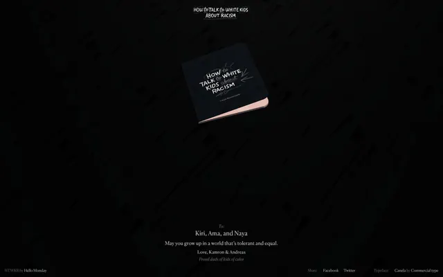
Preview image. Unlock full-res
Shadowed typographic canvas
Color palette
Page and section backgrounds, creating a deep, uniform expanse
Primary text across all elements (body, links, other text) and for borders signaling interaction or framing. This is the luminous foreground against the deep Ebon background
Secondary body text and subtle borders, providing a softer contrast for less prominent information
Tertiary text and very faint borders, used for ancillary information or as a subtle structural cue
Typography
- Weights
- 300, 400
- Sizes
- 12px, 14px, 16px, 20px
- Line height
- 1, 1.12, 1.2, 1.4, 1.6, 1.87
- Letter spacing
- 0.0200em, 0.0240em, 0.0300em, 0.0340em, 0.0400em
- Fallback
- serif
The sole typeface, used for all textual content from headings to body text and links. Its elegant serif forms and range of weights, particularly the lighter 300 and 400, contribute to the site's contemplative and refined character, ensuring that text feels legible without being stark.
Spacing & shape
Components
Text in Chalk (#ffffff), Canela Web, weight 400, size 20px, letter-spacing 0.0200em. Underlined on hover with a Chalk (#ffffff) border.
Text in Chalk (#ffffff), Canela Web, weight 400, size 16px, line-height 1.60.
Text in Muted Ash (#5f5f5f), Canela Web, weight 400, size 14px, line-height 1.40.
Text in Pale Stone (#8f8f8f), Canela Web, weight 300, size 12px, line-height 1.87.
A faint border line of Chalk (#ffffff) applied as a bottom border to elements, often implicitly. Its presence is subtle but indicates distinct content zones.
Guidelines
- Maintain the page background as solid Ebon (#000000) for all main content areas.
- Use Chalk (#ffffff) for all primary readable text, ensuring maximum contrast and legibility.
- Apply Canela Web with weights 300-400 for all typography, maintaining consistency across the site.
- Center-align all major text blocks and elements, adhering to the meditative, symmetric layout.
- Employ a fixed pageMaxWidth of 393px to contain content, creating a focused reading experience.
- Utilize Muted Ash (#5f5f5f) for secondary textual elements that require slightly less prominence than primary text.
- Incorporate Pale Stone (#8f8f8f) only for discreet, peripheral information like footer links, maintaining a subdued presence.
- Do not introduce any vibrant or saturated colors; the palette is strictly achromatic and subtle.
- Avoid using heavy shadows or elevation; the design system favors a flat, understated aesthetic.
- Do not use multiple font families; Canela Web is the exclusive typeface for all content.
- Refrain from using any button components with background fills; all interactive elements should be text-based or outlined subtly.
- Avoid decorative imagery or large graphics; the focus should remain on typography and direct textual communication.
- Do not break the symmetrical, centered content flow with asymmetric layouts or sidebars.
- Do not use large, bold headlines; text prominence is achieved through subtle size variations and deliberate spacing, not aggressive weight.
About this system
ShowHide
HTWKR uses a somber, monastic aesthetic with a dominant dark canvas, allowing text to surface as quiet epigraphs. The visual style feels sparse and contemplative, relying on delicate typography and a restrained palette of deep blacks and subtle grays. Content is primarily text-based, presented with ample negative space. The overall impression is one of respectful seriousness, with a focus on intellectual engagement over dynamic interaction.
The page adheres to a centered, constrained layout with a maximal width of 393px, creating a narrow, focused reading column. The hero features a centered main title over the dark background, with a core object (book) placed centrally. Sections are visually distinct through consistent vertical spacing (60px section gap) and minimal visual dividers. Content is primarily arranged in centered, stacked blocks of text, giving a sense of gravitas and contemplation. Navigation is highly minimal, with subtle links in the header and footer, all following the centered alignment.
The site's visual language is almost entirely UI-driven, with no prominent photography, illustrations, or complex graphics. The only 'imagery' is the textual content itself, treated with careful typography. The single product visual (a book) is presented as a realistic, isolated object on the Ebon background, serving a symbolic rather than decorative role. The background itself features a subtle, almost imperceptible texture or pattern, adding depth without distraction.
Reminiscent of AIGA Design Archives, The New York Times (some feature articles), Are.na, Readymag (certain minimalist templates).
# HTWKR — Style Reference
> Shadowed typographic canvas

**Theme:** dark

**Site:** https://howtotalktowhitekidsaboutracism.com

HTWKR uses a somber, monastic aesthetic with a dominant dark canvas, allowing text to surface as quiet epigraphs. The visual style feels sparse and contemplative, relying on delicate typography and a restrained palette of deep blacks and subtle grays. Content is primarily text-based, presented with ample negative space. The overall impression is one of respectful seriousness, with a focus on intellectual engagement over dynamic interaction.

## Tokens — Colors

| Name | Value | Token | Role |
|------|------|------|------|
| Ebon | `#000000` | `--color-ebon` | Page and section backgrounds, creating a deep, uniform expanse |
| Chalk | `#ffffff` | `--color-chalk` | Primary text across all elements (body, links, other text) and for borders signaling interaction or framing. This is the luminous foreground against the deep Ebon background |
| Muted Ash | `#5f5f5f` | `--color-muted-ash` | Secondary body text and subtle borders, providing a softer contrast for less prominent information |
| Pale Stone | `#8f8f8f` | `--color-pale-stone` | Tertiary text and very faint borders, used for ancillary information or as a subtle structural cue |

## Tokens — Typography

### Canela Web
- **Substitute:** serif
- **Weights:** 300, 400
- **Sizes:** 12px, 14px, 16px, 20px
- **Line height:** 1, 1.12, 1.2, 1.4, 1.6, 1.87
- **Letter spacing:** 0.0200em, 0.0240em, 0.0300em, 0.0340em, 0.0400em
- **Role:** The sole typeface, used for all textual content from headings to body text and links. Its elegant serif forms and range of weights, particularly the lighter 300 and 400, contribute to the site's contemplative and refined character, ensuring that text feels legible without being stark.

## Tokens — Type Scale

Minor Third (1.2) from 14px base.

| Role | Size | Line height | Letter spacing |
|------|------|------|------|
| caption | 12px | 1.87 | — |
| body | 14px | 1.4 | — |
| body-lg | 16px | 1.6 | — |
| heading | 20px | 1.2 | — |

## Tokens — Spacing

- **Max width:** 393px
- **Section gap:** 60px
- **Card padding:** 0px
- **Element gap:** 10px

## Tokens — Radius

- **none:** 0px

## Layout

The page adheres to a centered, constrained layout with a maximal width of 393px, creating a narrow, focused reading column. The hero features a centered main title over the dark background, with a core object (book) placed centrally. Sections are visually distinct through consistent vertical spacing (60px section gap) and minimal visual dividers. Content is primarily arranged in centered, stacked blocks of text, giving a sense of gravitas and contemplation. Navigation is highly minimal, with subtle links in the header and footer, all following the centered alignment.

## Imagery

The site's visual language is almost entirely UI-driven, with no prominent photography, illustrations, or complex graphics. The only 'imagery' is the textual content itself, treated with careful typography. The single product visual (a book) is presented as a realistic, isolated object on the Ebon background, serving a symbolic rather than decorative role. The background itself features a subtle, almost imperceptible texture or pattern, adding depth without distraction.

## Components

### Site Title Link
*Top-level navigational link, prominent, centered.*

Text in Chalk (#ffffff), Canela Web, weight 400, size 20px, letter-spacing 0.0200em. Underlined on hover with a Chalk (#ffffff) border.

### Primary Body Text
*Informational text presented centrally.*

Text in Chalk (#ffffff), Canela Web, weight 400, size 16px, line-height 1.60.

### Muted Body Text
*Secondary informational text, for quieter messages.*

Text in Muted Ash (#5f5f5f), Canela Web, weight 400, size 14px, line-height 1.40.

### Footer Link
*Subtle navigational or informational links in the footer.*

Text in Pale Stone (#8f8f8f), Canela Web, weight 300, size 12px, line-height 1.87.

### Text Section Divider
*Visual separation between text blocks, used sparingly.*

A faint border line of Chalk (#ffffff) applied as a bottom border to elements, often implicitly. Its presence is subtle but indicates distinct content zones.

## Guidelines

### Do

- Maintain the page background as solid Ebon (#000000) for all main content areas.
- Use Chalk (#ffffff) for all primary readable text, ensuring maximum contrast and legibility.
- Apply Canela Web with weights 300-400 for all typography, maintaining consistency across the site.
- Center-align all major text blocks and elements, adhering to the meditative, symmetric layout.
- Employ a fixed pageMaxWidth of 393px to contain content, creating a focused reading experience.
- Utilize Muted Ash (#5f5f5f) for secondary textual elements that require slightly less prominence than primary text.
- Incorporate Pale Stone (#8f8f8f) only for discreet, peripheral information like footer links, maintaining a subdued presence.

### Don't

- Do not introduce any vibrant or saturated colors; the palette is strictly achromatic and subtle.
- Avoid using heavy shadows or elevation; the design system favors a flat, understated aesthetic.
- Do not use multiple font families; Canela Web is the exclusive typeface for all content.
- Refrain from using any button components with background fills; all interactive elements should be text-based or outlined subtly.
- Avoid decorative imagery or large graphics; the focus should remain on typography and direct textual communication.
- Do not break the symmetrical, centered content flow with asymmetric layouts or sidebars.
- Do not use large, bold headlines; text prominence is achieved through subtle size variations and deliberate spacing, not aggressive weight.

## Agent Prompt Guide

Quick Color Reference:
text: #ffffff
background: #000000
border: #ffffff
accent: no distinct accent color
primary action: no distinct CTA color

Example Component Prompts:
1. Create a centered main title for a new page: text in Chalk (#ffffff), Canela Web, weight 400, size 20px, letter-spacing 0.0200em.
2. Design a primary body text block: text in Chalk (#ffffff), Canela Web, weight 400, size 16px, line-height 1.60. Ensure 60px vertical spacing from surrounding sections.
3. Implement a footer link list: each link text in Pale Stone (#8f8f8f), Canela Web, weight 300, size 12px, line-height 1.87, separated by 10px elementGap.
More like this









Keep what you find
A free account saves references to boards and can send you a weekly email of picks based on what you save.
To see every result, go Pro.