Preview image. Unlock full-res
monochromatic luxury, sharp contrast
Color palette
Accent for call-to-action buttons, prominent graphical elements. This warm, earthy tone provides the only saturated color highlight, drawing attention with understated luxury
Primary text, dark surface backgrounds, button backgrounds, interactive elements, nav text. Creates a dominant, authoritative presence
Page backgrounds, light surface backgrounds, secondary text, button text, icons. Provides a clean, expansive foundation
Muted body text, navigation dividers, subtle borders. Used for secondary information that lives harmoniously within the high-contrast system
Typography
- Weights
- 400, 700
- Sizes
- 17px, 18px, 20px, 23px, 30px, 37px, 52px, 60px, 63px, 131px, 187px
- Line height
- 0.8, 0.91, 1, 1.09, 1.1, 1.2, 1.61
- Letter spacing
- -0.02em at largest sizes, -0.01em at medium, 0.01em at smallest
- Fallback
- system-ui
All primary textual content: headlines, body, buttons, navigation. Its large scale and slightly condensed forms deliver a modern, impactful voice.
- Weights
- 700
- Sizes
- 17px
- Line height
- 1
- Letter spacing
- normal
- Fallback
- Arial
Used sparingly for specific bold text, likely for icons or small utility elements where a system sans-serif is a fallback.
Spacing & shape
Components
Background: Desert Sienna (#bc7155), Text: Canvas White (#ffffff), Border: None, Border Radius: 1000px (pill shape), Padding: 15px top, 22px horizontal, 16px bottom. Font: HelveticaNowDisplay, 17px, bold (700).
Background: Obsidian (#000d10), Text: Canvas White (#ffffff), Border: 1px Canvas White (#ffffff) for hover/focus, Border Radius: 1000px (pill shape), Padding: 15px top, 22px horizontal, 16px bottom. Font: HelveticaNowDisplay, 17px, bold (700).
Background: transparent, Text: Canvas White (#ffffff), Border: 1px Canvas White (#ffffff), Border Radius: 1000px (pill shape), Padding: 15px top, 22px horizontal, 16px bottom. Font: HelveticaNowDisplay, 17px, bold (700).
Text: Obsidian (#000d10) or Canvas White (#ffffff), active state may have a subtle underline. Font: HelveticaNowDisplay, 17px, 400 weight. Spacing: 13px top/bottom margin, 34px right margin.
Background: Canvas White (#ffffff), Text: Obsidian (#000d10) or Slate Mist (#8e8e95). Font: HelveticaNowDisplay, varying sizes. Likely has internal padding of 22px.
Guidelines
- Prioritize Canvas White (#ffffff) for primary backgrounds and Obsidian (#000d10) for primary text to maintain high contrast (19.7:1 AAA).
- Use HelveticaNowDisplay consistently across all text, emphasizing weight 700 for headings and weight 400 for body text.
- Apply a 1000px border-radius to all buttons and prominent links to achieve the signature pill shape.
- Reserve Desert Sienna (#bc7155) exclusively for primary action buttons to create a single, clear focal point.
- Ensure generous spacing: utilize 23px for element gaps and 68px between major sections.
- Employ negative letter-spacing for large headlines to condense text and enhance impact, specifically -0.02em at sizes like 187px.
- Use Slate Mist (#8e8e95) for supporting text and subtle UI elements where less visual weight is desired, such as form helper text or secondary navigation.
- Avoid using multiple saturated colors; Desert Sienna (#bc7155) is the singular accent color.
- Do not introduce complex gradients or shadows, as the system relies on flat surfaces and high contrast.
- Refrain from using smaller body text sizes than 17px to maintain readability and design gravitas.
- Do not deviate from the HelveticaNowDisplay font for any brand-related text.
- Avoid tight spacing around interactive elements; maintain a minimum of 22px horizontal padding for buttons.
- Do not use square or mildly rounded corners for buttons; the pill shape (1000px radius) is critical for brand identity.
- Do not use generic gray tones for text; ensure body text aligns with Obsidian (#000d10) or Slate Mist (#8e8e95) to maintain the established hierarchy.
About this system
ShowHide
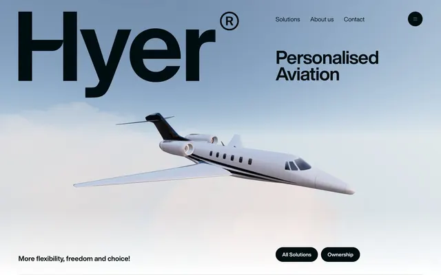
Hyer Aviation employs a commanding, high-contrast aesthetic, juxtaposing crisp white surfaces with deep, almost-black elements. Bold, large-scale typography creates immediate impact, while subtle details like rounded pill shapes and a single warm accent color temper its power. The design feels grounded and luxurious, with ample whitespace and a restrained color palette that allows imagery to take center stage, communicating sophistication through assertive simplicity.
The page primarily utilizes a full-bleed structure, especially for the hero section which extends across the viewport with central text and imagery. Content sections alternate between stark white full-width blocks and dark full-width blocks, creating a distinct visual rhythm. Text and imagery are often arranged in centered stacks or simple two-column layouts. The overall density is spacious, allowing elements to breathe. Navigation is a minimalist top bar with links aligned to the right, often disappearing into a hamburger menu on smaller screens, and a utility navigation in the footer.
The site uses a clean mix of professional product renders (specifically, a white private jet prominent against a subtly cloudy sky) and abstract, high-contrast imagery to convey luxury and precision. Photography is minimalist, focusing on the product itself with little extraneous context. Icons, where present, are likely minimal and monochromatic, adhering to the high-contrast aesthetic. Imagery plays a key role in setting the atmosphere without overwhelming the clean UI.
Reminiscent of NetJets, Flexjet, Stripe, Apple.
# Hyer Aviation — Style Reference
> monochromatic luxury, sharp contrast

**Theme:** light

**Site:** https://www.flyhyer.com

Hyer Aviation employs a commanding, high-contrast aesthetic, juxtaposing crisp white surfaces with deep, almost-black elements. Bold, large-scale typography creates immediate impact, while subtle details like rounded pill shapes and a single warm accent color temper its power. The design feels grounded and luxurious, with ample whitespace and a restrained color palette that allows imagery to take center stage, communicating sophistication through assertive simplicity.

## Tokens — Colors

| Name | Value | Token | Role |
|------|------|------|------|
| Desert Sienna | `#bc7155` | `--color-desert-sienna` | Accent for call-to-action buttons, prominent graphical elements. This warm, earthy tone provides the only saturated color highlight, drawing attention with understated luxury |
| Obsidian | `#000d10` | `--color-obsidian` | Primary text, dark surface backgrounds, button backgrounds, interactive elements, nav text. Creates a dominant, authoritative presence |
| Canvas White | `#ffffff` | `--color-canvas-white` | Page backgrounds, light surface backgrounds, secondary text, button text, icons. Provides a clean, expansive foundation |
| Slate Mist | `#8e8e95` | `--color-slate-mist` | Muted body text, navigation dividers, subtle borders. Used for secondary information that lives harmoniously within the high-contrast system |

## Tokens — Typography

### HelveticaNowDisplay
- **Substitute:** system-ui
- **Weights:** 400, 700
- **Sizes:** 17px, 18px, 20px, 23px, 30px, 37px, 52px, 60px, 63px, 131px, 187px
- **Line height:** 0.8, 0.91, 1, 1.09, 1.1, 1.2, 1.61
- **Letter spacing:** -0.02em at largest sizes, -0.01em at medium, 0.01em at smallest
- **Role:** All primary textual content: headlines, body, buttons, navigation. Its large scale and slightly condensed forms deliver a modern, impactful voice.

### sans-serif
- **Substitute:** Arial
- **Weights:** 700
- **Sizes:** 17px
- **Line height:** 1
- **Letter spacing:** normal
- **Role:** Used sparingly for specific bold text, likely for icons or small utility elements where a system sans-serif is a fallback.

## Tokens — Type Scale

Golden Ratio (1.618) from 17px base.

| Role | Size | Line height | Letter spacing |
|------|------|------|------|
| body-sm | 17px | 1.61 | 0.17px |
| subheading | 20px | 1.2 | 0.2px |
| heading-sm | 30px | 1.1 | -0.3px |
| heading | 52px | 1.09 | -0.52px |
| heading-lg | 63px | 0.91 | -0.63px |
| display | 187px | 0.8 | -3.74px |

## Tokens — Spacing

- **Section gap:** 68px
- **Card padding:** 22px
- **Element gap:** 23px

## Tokens — Radius

- **Buttons:** 1000px
- **links:** 1000px
- **other:** 45px

## Layout

The page primarily utilizes a full-bleed structure, especially for the hero section which extends across the viewport with central text and imagery. Content sections alternate between stark white full-width blocks and dark full-width blocks, creating a distinct visual rhythm. Text and imagery are often arranged in centered stacks or simple two-column layouts. The overall density is spacious, allowing elements to breathe. Navigation is a minimalist top bar with links aligned to the right, often disappearing into a hamburger menu on smaller screens, and a utility navigation in the footer.

## Imagery

The site uses a clean mix of professional product renders (specifically, a white private jet prominent against a subtly cloudy sky) and abstract, high-contrast imagery to convey luxury and precision. Photography is minimalist, focusing on the product itself with little extraneous context. Icons, where present, are likely minimal and monochromatic, adhering to the high-contrast aesthetic. Imagery plays a key role in setting the atmosphere without overwhelming the clean UI.

## Components

### Primary Filled Button
*Main call-to-action button, promoting core actions.*

Background: Desert Sienna (#bc7155), Text: Canvas White (#ffffff), Border: None, Border Radius: 1000px (pill shape), Padding: 15px top, 22px horizontal, 16px bottom. Font: HelveticaNowDisplay, 17px, bold (700).

### Obsidian Filled Button
*Secondary call-to-action or general action buttons.*

Background: Obsidian (#000d10), Text: Canvas White (#ffffff), Border: 1px Canvas White (#ffffff) for hover/focus, Border Radius: 1000px (pill shape), Padding: 15px top, 22px horizontal, 16px bottom. Font: HelveticaNowDisplay, 17px, bold (700).

### Obsidian Ghost Button
*Alternative action buttons, appearing less prominent than filled variants.*

Background: transparent, Text: Canvas White (#ffffff), Border: 1px Canvas White (#ffffff), Border Radius: 1000px (pill shape), Padding: 15px top, 22px horizontal, 16px bottom. Font: HelveticaNowDisplay, 17px, bold (700).

### Navigation Link
*Primary navigation items in the header and footer.*

Text: Obsidian (#000d10) or Canvas White (#ffffff), active state may have a subtle underline. Font: HelveticaNowDisplay, 17px, 400 weight. Spacing: 13px top/bottom margin, 34px right margin.

### Feature Card
*Displays key features or offerings with associated text.*

Background: Canvas White (#ffffff), Text: Obsidian (#000d10) or Slate Mist (#8e8e95). Font: HelveticaNowDisplay, varying sizes. Likely has internal padding of 22px.

## Guidelines

### Do

- Prioritize Canvas White (#ffffff) for primary backgrounds and Obsidian (#000d10) for primary text to maintain high contrast (19.7:1 AAA).
- Use HelveticaNowDisplay consistently across all text, emphasizing weight 700 for headings and weight 400 for body text.
- Apply a 1000px border-radius to all buttons and prominent links to achieve the signature pill shape.
- Reserve Desert Sienna (#bc7155) exclusively for primary action buttons to create a single, clear focal point.
- Ensure generous spacing: utilize 23px for element gaps and 68px between major sections.
- Employ negative letter-spacing for large headlines to condense text and enhance impact, specifically -0.02em at sizes like 187px.
- Use Slate Mist (#8e8e95) for supporting text and subtle UI elements where less visual weight is desired, such as form helper text or secondary navigation.

### Don't

- Avoid using multiple saturated colors; Desert Sienna (#bc7155) is the singular accent color.
- Do not introduce complex gradients or shadows, as the system relies on flat surfaces and high contrast.
- Refrain from using smaller body text sizes than 17px to maintain readability and design gravitas.
- Do not deviate from the HelveticaNowDisplay font for any brand-related text.
- Avoid tight spacing around interactive elements; maintain a minimum of 22px horizontal padding for buttons.
- Do not use square or mildly rounded corners for buttons; the pill shape (1000px radius) is critical for brand identity.
- Do not use generic gray tones for text; ensure body text aligns with Obsidian (#000d10) or Slate Mist (#8e8e95) to maintain the established hierarchy.

## Agent Prompt Guide

Quick Color Reference:
text: #000d10
background: #ffffff
border: #8e8e95
accent: #bc7155
primary action: #bc7155 (filled action)

Example Component Prompts:
Create a hero section: full-bleed background set by an image of a private jet against a light blue sky. Overlay a large headline "Personalised Aviation" in Canvas White (#ffffff), HelveticaNowDisplay, 187px, weight 700, line height 0.8, letter-spacing -3.74px, aligned left. Below the headline, add a subtitle "More flexibility, freedom and choice!" in Canvas White (#ffffff), HelveticaNowDisplay, 23px, weight 400. In the bottom right corner, place two pill-shaped buttons with 1000px radius: 'All Solutions' (Obsidian Filled Button: #000d10 background, #ffffff text, HelveticaNowDisplay, 17px, bold, 15px top, 22px horizontal, 16px bottom padding) and 'Ownership' (Desert Sienna Filled Button: #bc7155 background, #ffffff text, HelveticaNowDisplay, 17px, bold, 15px top, 22px horizontal, 16px bottom padding).

Create a feature panel: Canvas White (#ffffff) background. Headline 'Flexible Solutions' in Obsidian (#000d10), HelveticaNowDisplay, 30px, weight 700, line height 1.1, letter-spacing -0.3px. Below, body text 'Stop depending on airlines. Fly on your own terms or join our exclusive shared flights.' in Slate Mist (#8e8e95), HelveticaNowDisplay, 17px, weight 400, line height 1.61. Separate features with a 1px Slate Mist (#8e8e95) horizontal rule that extends the width of the content.

Create a footer: Obsidian (#000d10) background, with all text in Canvas White (#ffffff). Navigation links 'On-demand', 'Private Charter', 'Aircraft Ownership' should use HelveticaNowDisplay, 17px, weight 400, with 13px top/bottom and 34px right margin between them. Include a minimal copyright text in Canvas White (#ffffff) at 17px.
More like this









Keep what you find
A free account saves references to boards and can send you a weekly email of picks based on what you save.
To see every result, go Pro.