Preview image. Unlock full-res
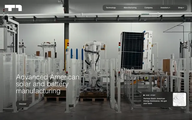
Industrial Blueprint on White Marble
Color palette
Footer backgrounds, deep surface accents, primary text on light backgrounds — providing strong contrast and a sense of gravitas
Hairline borders, dividers, input outlines, and card edges on light surfaces. Do not promote it to the primary CTA color
Secondary text, faint borders for cards and images, UI accents like dividers — creating visual structure without harshness
Default page canvas background — acting as a slightly off-white, warm base that prevents starkness
Backgrounds for ghost buttons, prominent navigation elements — providing a subtle interactive surface within the monochromatic scheme
Typography
- Weights
- 300, 400
- Sizes
- 14px, 52px
- Line height
- 1, 1.3
- Letter spacing
- 0.0100em
- Fallback
- Inter
Primary brand typeface. Its light and regular weights are used for both body text and prominent headlines, setting a tone of understated technical authority.
Spacing & shape
Components
Text: Platinum White (#ffffff) on a semi-transparent Steel Gray (#8b8b8b) background at 50% opacity. Border-radius is 16px. Padding 17.5px vertical, 22.4px horizontal. Uses T1 Sans, weight 400.
Text: Platinum White (#ffffff) on a semi-transparent Steel Gray (#8b8b8b) background at 50% opacity. Border-radius is 100px (pill shape). Minimal padding 4px vertical, 22.4px horizontal. Uses T1 Sans, weight 400.
Background is fully transparent (rgba(0,0,0,0)). No box shadow. Border-radius 0px. No padding.
Background is fully transparent (rgba(0,0,0,0)). No box shadow. Border-radius 80px. No padding.
Background #ffffff, text in an unspecified dark neutral (likely Midnight Onyx or Technical Carbon). 1px border of #322d2a. Border-radius 12px. Padding 18px vertical, 22px horizontal. Uses T1 Sans, weight 400.
Guidelines
- Prioritize Cloud Chalk (#f0efe9) and Platinum White (#ffffff) as dominant background colors to support the light theme.
- Use Nightfall Onyx (#0f0e12) or Technical Carbon (#322d2a) for all primary and secondary text for maximum readability.
- Apply T1 Sans consistently, leveraging weight 300 for a lighter touch on larger headlines and weight 400 for body text.
- Utilize 80px border-radius for large surface elements like cards and images to establish the signature soft, rounded aesthetic.
- For interactive elements such as buttons and navigation, prefer semi-transparent Steel Gray (#8b8b8b) backgrounds with Platinum White (#ffffff) text to maintain the clean, technical overlay appearance.
- Employ consistent section gaps of 48px to create a comfortable, structured vertical rhythm across pages.
- Use a base unit of 4px for all spacing decisions to maintain proportional consistency.
- Avoid introducing vibrant, saturated colors outside of purely decorative image content; the system relies on a near-monochromatic palette.
- Do not use harsh, sharp-cornered elements on larger components; prioritize the 80px and 16px radii for their characteristic softness.
- Refrain from using strong drop shadows or complex elevation; the design system prefers minimal visual depth.
- Do not deviate from T1 Sans as the primary typeface; maintain its subtle weights and consistent letter spacing.
- Avoid small, tight letter spacing for body text; a uniform 0.0100em should be maintained.
- Do not overuse borders; when present, they should be subtle (#322d2a or #ffffff at 1px) to avoid a heavy appearance.
- Do not introduce strong visual gradients or complex background textures; the aesthetic leans towards clean, flat surfaces.
About this system
ShowHide
T1 Energy employs a sophisticated industrial blueprint aesthetic. It uses a restricted, monochromatic palette of deep charcoals, muted grays, and pure white to create a serious, high-tech atmosphere. Typography is precise and confident, often appearing in subtle weights or as a functional overlay. Elements feel lightweight with soft, large radius surfaces and minimal elevation, avoiding heavy borders or decorative flourishes, giving the impression of advanced machinery on a white canvas.
Reminiscent of Tesla, Boston Dynamics, Siemens Energy, NVIDIA.
# T1 Energy — Style Reference
> Industrial Blueprint on White Marble

**Theme:** light

**Site:** https://t1energy.com

T1 Energy employs a sophisticated industrial blueprint aesthetic. It uses a restricted, monochromatic palette of deep charcoals, muted grays, and pure white to create a serious, high-tech atmosphere. Typography is precise and confident, often appearing in subtle weights or as a functional overlay. Elements feel lightweight with soft, large radius surfaces and minimal elevation, avoiding heavy borders or decorative flourishes, giving the impression of advanced machinery on a white canvas.

## Tokens — Colors

| Name | Value | Token | Role |
|------|------|------|------|
| Nightfall Onyx | `#0f0e12` | `--color-nightfall-onyx` | Footer backgrounds, deep surface accents, primary text on light backgrounds — providing strong contrast and a sense of gravitas |
| Platinum White | `#ffffff` | `--color-platinum-white` | Hairline borders, dividers, input outlines, and card edges on light surfaces. Do not promote it to the primary CTA color |
| Technical Carbon | `#322d2a` | `--color-technical-carbon` | Secondary text, faint borders for cards and images, UI accents like dividers — creating visual structure without harshness |
| Cloud Chalk | `#f0efe9` | `--color-cloud-chalk` | Default page canvas background — acting as a slightly off-white, warm base that prevents starkness |
| Steel Gray | `#8b8b8b` | `--color-steel-gray` | Backgrounds for ghost buttons, prominent navigation elements — providing a subtle interactive surface within the monochromatic scheme |

## Tokens — Typography

### T1 Sans
- **Substitute:** Inter
- **Weights:** 300, 400
- **Sizes:** 14px, 52px
- **Line height:** 1, 1.3
- **Letter spacing:** 0.0100em
- **Role:** Primary brand typeface. Its light and regular weights are used for both body text and prominent headlines, setting a tone of understated technical authority.

## Tokens — Type Scale

| Role | Size | Line height | Letter spacing |
|------|------|------|------|
| body | 14px | 1 | — |
| display | 52px | 1.3 | — |

## Tokens — Spacing

- **Section gap:** 48px
- **Card padding:** 22px
- **Element gap:** 8px

## Tokens — Radius

- **Buttons:** 16px
- **Cards:** 80px
- **elements:** 12px
- **smallInteractive:** 100px

## Components

### Ghost Header Button
*Primary navigation and action button within the hero overlay.*

Text: Platinum White (#ffffff) on a semi-transparent Steel Gray (#8b8b8b) background at 50% opacity. Border-radius is 16px. Padding 17.5px vertical, 22.4px horizontal. Uses T1 Sans, weight 400.

### Pill Ghost Button
*Compact action button, often for secondary navigation or small interactive elements.*

Text: Platinum White (#ffffff) on a semi-transparent Steel Gray (#8b8b8b) background at 50% opacity. Border-radius is 100px (pill shape). Minimal padding 4px vertical, 22.4px horizontal. Uses T1 Sans, weight 400.

### Transparent Card
*Displaying informational content without a distinct visual border or background, creating a light, airy feel.*

Background is fully transparent (rgba(0,0,0,0)). No box shadow. Border-radius 0px. No padding.

### Rounded Informational Card
*Content container with a distinctly large rounded corner, providing a softer boundary.*

Background is fully transparent (rgba(0,0,0,0)). No box shadow. Border-radius 80px. No padding.

### Learn More Button
*Secondary action button for deeper content exploration.*

Background #ffffff, text in an unspecified dark neutral (likely Midnight Onyx or Technical Carbon). 1px border of #322d2a. Border-radius 12px. Padding 18px vertical, 22px horizontal. Uses T1 Sans, weight 400.

## Guidelines

### Do

- Prioritize Cloud Chalk (#f0efe9) and Platinum White (#ffffff) as dominant background colors to support the light theme.
- Use Nightfall Onyx (#0f0e12) or Technical Carbon (#322d2a) for all primary and secondary text for maximum readability.
- Apply T1 Sans consistently, leveraging weight 300 for a lighter touch on larger headlines and weight 400 for body text.
- Utilize 80px border-radius for large surface elements like cards and images to establish the signature soft, rounded aesthetic.
- For interactive elements such as buttons and navigation, prefer semi-transparent Steel Gray (#8b8b8b) backgrounds with Platinum White (#ffffff) text to maintain the clean, technical overlay appearance.
- Employ consistent section gaps of 48px to create a comfortable, structured vertical rhythm across pages.
- Use a base unit of 4px for all spacing decisions to maintain proportional consistency.

### Don't

- Avoid introducing vibrant, saturated colors outside of purely decorative image content; the system relies on a near-monochromatic palette.
- Do not use harsh, sharp-cornered elements on larger components; prioritize the 80px and 16px radii for their characteristic softness.
- Refrain from using strong drop shadows or complex elevation; the design system prefers minimal visual depth.
- Do not deviate from T1 Sans as the primary typeface; maintain its subtle weights and consistent letter spacing.
- Avoid small, tight letter spacing for body text; a uniform 0.0100em should be maintained.
- Do not overuse borders; when present, they should be subtle (#322d2a or #ffffff at 1px) to avoid a heavy appearance.
- Do not introduce strong visual gradients or complex background textures; the aesthetic leans towards clean, flat surfaces.

## Agent Prompt Guide

Quick Color Reference:
- text: #0f0e12
- background: #f0efe9
- border: #322d2a
- accent: #8b8b8b
- primary action: no distinct CTA color

Example Component Prompts:
- Create a ghost navigation button: background #8b8b8b at 50% opacity, text #ffffff, border-radius 16px, padding 17.5px 22.4px. Font T1 Sans, weight 400.
- Design a large rounded information card: transparent background, 80px border-radius. No padding.
- Build a secondary action button named 'Learn More': background #ffffff, text #0f0e12, 1px border of #322d2a, border-radius 12px, padding 18px 22px.
- Create a section headline: Text 'TOPCon' in T1 Sans, size 52px, weight 300, line-height 1.3, letter-spacing 0.0100em, color #0f0e12.

## Motion Philosophy

The design system uses expressive animations with moderate durations (primarily 0.25s and 0.5s) and 'ease' timing functions. Transitions commonly affect color, background-color, opacity, and transform properties, indicating a subtle, smooth interactivity rather than abrupt changes. Aim for fluid, understated feedback on user interactions.
More like this









Keep what you find
A free account saves references to boards and can send you a weekly email of picks based on what you save.
To see every result, go Pro.