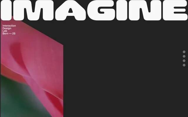
Preview image. Unlock full-res
Academic Dark Canvas – a stark, authoritative presentation with bold typographic statements on a deep charcoal ground.
Color palette
Page background, primary surface
Primary text, headings, list backgrounds, ghost button borders — defining the core readable elements
Muted text elements, icon fills — a subtle step darker than Storm Charcoal for secondary details
Navigation highlight background, secondary surface layer — a mid-gray for subtle interaction states
Typography
- Weights
- 400, 700
- Sizes
- 16px, 18px, 24px, 27px, 36px
- Line height
- 1.1, 1.25, 1.3, 1.35
- Letter spacing
- normal
- Fallback
- Helvetica Neue
Global text, headings, navigation elements — providing a confident, clear voice with a modernist lean.
Spacing & shape
Components
Text labels with Cloud White (#f8f8f8) text, no background, and subtle hover states using Subtle Ash (#757577) for list item background.
Bold text (Neue Haas Unica 700, 36px) in Cloud White (#f8f8f8), often paired with a 15px border radius under the heading text, indicating a conceptual grouping.
Standard body text (Neue Haas Unica 400, 16px) in Cloud White (#f8f8f8) for high readability on Storm Charcoal (#222222) backgrounds. Generous vertical spacing of 24px around blocks.
Large, bold, uppercase text (Neue Haas Unica 700, potentially much larger than 36px, likely filling the screen) in Cloud White (#f8f8f8). The letter-spacing is normal despite its size, contributing to its block-like appearance.
Small circular (20px radius) navigation dots, possibly appearing as a vertical stack. Inactive dots are Slate Ink (#2a2b2d), active dots are Cloud White (#f8f8f8).
List items presented as cards with a Cloud White (#f8f8f8) border and a 20px border radius. Text is in Slate Ink (#2a2b2d) on a Cloud White (#f8f8f8) background.
Guidelines
- Always use Storm Charcoal (#222222) as the primary background for sections and canvases.
- Prioritize Neue Haas Unica 700 for all significant headlines and calls to attention, using Cloud White (#f8f8f8) for maximum contrast.
- Apply 20px border radius to all interactive elements, cards, and list items for a consistent softened aesthetic.
- Maintain a clear visual hierarchy by using Cloud White (#f8f8f8) for primary text and titles, and Slate Ink (#2a2b2d) for secondary details or within light-colored containers.
- Utilize 24px as the default vertical and horizontal element spacing to ensure comfortable readability and distinct content blocks.
- Integrate the 15px border radius token specifically with headings to create a subtle, structured visual break or emphasis.
- Avoid using multiple chromatic colors; color should be introduced sparingly and for specific visual impact in imagery.
- Do not use subtle variations of dark gray for backgrounds; maintain the stark contrast between Storm Charcoal (#222222) and Cloud White (#f8f8f8).
- Do not introduce strong shadows or excessive elevation; the design relies on flat surfaces and minimal depth.
- Avoid tight spacing; maintain the generous 24px element and section gaps to prevent visual clutter, especially in text-heavy areas.
- Do not use custom letter-spacing; all text, regardless of size, should use 'normal' tracking for block-like typographic presence.
- Never use rounded corners less than 15px; the design language favors a distinctly soft, rounded feel for all contained elements.
About this system
ShowHide
IAD-Lab's visual identity centers around stark contrasts and heavy typography, creating an assertive, academic tone. The dark canvas provides a backdrop for crisp white text and geometric imagery, prioritizing content legibility. Minimal use of color ensures that any visual elements that do use color, such as hero imagery, carry significant impact. Component styling uses softened corners and generous spacing, allowing individual elements to exist distinctly within the dark layout.
Reminiscent of AIGA, Are.na, Stripe press releases, Future Fonts.
# Iad-lab — Style Reference
> Academic Dark Canvas – a stark, authoritative presentation with bold typographic statements on a deep charcoal ground.

**Theme:** dark

**Site:** https://iad-lab.ch

IAD-Lab's visual identity centers around stark contrasts and heavy typography, creating an assertive, academic tone. The dark canvas provides a backdrop for crisp white text and geometric imagery, prioritizing content legibility. Minimal use of color ensures that any visual elements that do use color, such as hero imagery, carry significant impact. Component styling uses softened corners and generous spacing, allowing individual elements to exist distinctly within the dark layout.

## Tokens — Colors

| Name | Value | Token | Role |
|------|------|------|------|
| Storm Charcoal | `#222222` | `--color-storm-charcoal` | Page background, primary surface |
| Cloud White | `#f8f8f8` | `--color-cloud-white` | Primary text, headings, list backgrounds, ghost button borders — defining the core readable elements |
| Slate Ink | `#2a2b2d` | `--color-slate-ink` | Muted text elements, icon fills — a subtle step darker than Storm Charcoal for secondary details |
| Subtle Ash | `#757577` | `--color-subtle-ash` | Navigation highlight background, secondary surface layer — a mid-gray for subtle interaction states |

## Tokens — Typography

### Neue Haas Unica
- **Substitute:** Helvetica Neue
- **Weights:** 400, 700
- **Sizes:** 16px, 18px, 24px, 27px, 36px
- **Line height:** 1.1, 1.25, 1.3, 1.35
- **Letter spacing:** normal
- **Role:** Global text, headings, navigation elements — providing a confident, clear voice with a modernist lean.

## Tokens — Type Scale

Minor Third (1.2) from 16px base.

| Role | Size | Line height | Letter spacing |
|------|------|------|------|
| body | 16px | 1.35 | — |
| body-lg | 18px | 1.3 | — |
| subheading | 24px | 1.25 | — |
| heading-sm | 27px | 1.25 | — |
| heading | 36px | 1.1 | — |

## Tokens — Spacing

- **Section gap:** 24px
- **Card padding:** 20px
- **Element gap:** 24px

## Tokens — Radius

- **Default:** 20px
- **headings:** 15px

## Components

### Ghost Navigation Item
*Navigation*

Text labels with Cloud White (#f8f8f8) text, no background, and subtle hover states using Subtle Ash (#757577) for list item background.

### Section Heading
*Title*

Bold text (Neue Haas Unica 700, 36px) in Cloud White (#f8f8f8), often paired with a 15px border radius under the heading text, indicating a conceptual grouping.

### Text Block
*Content*

Standard body text (Neue Haas Unica 400, 16px) in Cloud White (#f8f8f8) for high readability on Storm Charcoal (#222222) backgrounds. Generous vertical spacing of 24px around blocks.

### Hero Title
*Headline*

Large, bold, uppercase text (Neue Haas Unica 700, potentially much larger than 36px, likely filling the screen) in Cloud White (#f8f8f8). The letter-spacing is normal despite its size, contributing to its block-like appearance.

### Pill Navigation Dot
*Navigation*

Small circular (20px radius) navigation dots, possibly appearing as a vertical stack. Inactive dots are Slate Ink (#2a2b2d), active dots are Cloud White (#f8f8f8).

### List Item Card
*Content Display*

List items presented as cards with a Cloud White (#f8f8f8) border and a 20px border radius. Text is in Slate Ink (#2a2b2d) on a Cloud White (#f8f8f8) background.

## Guidelines

### Do

- Always use Storm Charcoal (#222222) as the primary background for sections and canvases.
- Prioritize Neue Haas Unica 700 for all significant headlines and calls to attention, using Cloud White (#f8f8f8) for maximum contrast.
- Apply 20px border radius to all interactive elements, cards, and list items for a consistent softened aesthetic.
- Maintain a clear visual hierarchy by using Cloud White (#f8f8f8) for primary text and titles, and Slate Ink (#2a2b2d) for secondary details or within light-colored containers.
- Utilize 24px as the default vertical and horizontal element spacing to ensure comfortable readability and distinct content blocks.
- Integrate the 15px border radius token specifically with headings to create a subtle, structured visual break or emphasis.

### Don't

- Avoid using multiple chromatic colors; color should be introduced sparingly and for specific visual impact in imagery.
- Do not use subtle variations of dark gray for backgrounds; maintain the stark contrast between Storm Charcoal (#222222) and Cloud White (#f8f8f8).
- Do not introduce strong shadows or excessive elevation; the design relies on flat surfaces and minimal depth.
- Avoid tight spacing; maintain the generous 24px element and section gaps to prevent visual clutter, especially in text-heavy areas.
- Do not use custom letter-spacing; all text, regardless of size, should use 'normal' tracking for block-like typographic presence.
- Never use rounded corners less than 15px; the design language favors a distinctly soft, rounded feel for all contained elements.

## Agent Prompt Guide

Quick Color Reference:
text: #f8f8f8
background: #222222
border: no distinct border color
accent: no distinct accent color
primary action: no distinct CTA color

Example Component Prompts:
1. Create a primary hero section: use Storm Charcoal (#222222) as the background. Display the headline 'IMAGINE' in Neue Haas Unica 700, Cloud White (#f8f8f8), extremely large (e.g., 120px) and centered. Mask an abstract geometric image (muted red/pink tones) into the bottom-left corner of the hero section. Align a pill navigation dot stack vertically on the right side, using Cloud White (#f8f8f8) for the active dot and Slate Ink (#2a2b2d) for inactive dots.
2. Design a content block for 'Interaction Design Lab Bern—25': use Cloud White (#f8f8f8) text, Neue Haas Unica 400, 16px, line height 1.35. Position this text block with a 24px top margin over a Storm Charcoal (#222222) background.
3. Build a navigation list item: Text 'Kaufen' in Neue Haas Unica 400, 16px, Cloud White (#f8f8f8). The list item itself should have a Subtle Ash (#757577) background on hover, with a 20px border-radius applied to the item.
More like this








Keep what you find
A free account saves references to boards and can send you a weekly email of picks based on what you save.
To see every result, go Pro.