Preview image. Unlock full-res
Photographic Contact Sheet — a high-contrast, monochrome canvas where every element is framed with intentional space.
Color palette
Major surface backgrounds, primary text color, button backgrounds, interactive element borders. Creates a deep, foundational contrast.
Primary text color on dark backgrounds, link text, button text, many interactive backgrounds. Provides maximum contrast against dark elements.
Subtle background for specific sections, providing a slight variance from Pitch Black.
Light background for sections, offering a subtle break from Pure White. This is a very light desaturated gray, not a true white.
Background for specific, slightly more defined sections than Faint Gray. Also very desaturated for a neutral appearance.
Used for background variations.
Background for accentuating specific content blocks.
Background for subtle elevation or differentiation of content areas.
Used for deeper background contrasts.
Closest to black for slight background variations, maintains high contrast with white text.
Very dark background shade, indistinguishable from Pitch Black to the casual eye but distinct for UI differentiation.
Typography
- Weights
- 400, 500
- Sizes
- 14px
- Line height
- 1, 1.25, 1.43
- Letter spacing
- normal
- Fallback
- Inter
The single typeface used across all elements: body text, links, headings, and buttons. Its clean, sans-serif design contributes to the site's minimalistic and highly legible aesthetic, maintaining uniformity.
Spacing & shape
Components
A pill-shaped button with a Pitch Black background (#000000) and Pure White text (#ffffff), featuring a border of the same Pitch Black. Padding is 8px vertical and 12px horizontal. This button creates a strong, clear, interactive point against a light background.
A clickable block of content with a Pure White background (#ffffff) containing a project title and description. It uses ABC Oracle font. The block itself does not have a distinct border but is separated from other content by generous spacing. The hover state changes the background to Pitch Black (#000000) and text to Pure White (#ffffff).
Text link using ABC Oracle font, usually Pure White (#ffffff) on dark backgrounds, or Pitch Black (#000000) on light backgrounds. No underlines by default but has a subtle interaction change upon hover (e.g. background change on the containing element).
A distinct horizontal line defined by a color change from Pitch Black (#000000) to Faint Gray (#e5e5e5) or similar light neutral. The change in background color acts as a strong visual divider.
Guidelines
- Maintain a strictly achromatic color scheme using only Pitch Black (#000000), Pure White (#ffffff), and the neutral gray variations provided.
- Use ABC Oracle (or Inter as a substitute) for all text elements to preserve typographic consistency.
- Apply generous vertical padding of at least 48px between main content blocks and sections to ensure a comfortable, airy feel.
- Utilize the pill shape (1.67772e+07px radius) exclusively for interactive buttons to create a distinctive, soft touch point.
- Ensure high contrast between text and background, adhering to AAA accessibility standards for readability, especially for main content and interactive elements.
- Frame content with ample negative space; prioritize whitespace over dense information packing.
- Do not introduce any chromatic colors, gradients, or shadows; the aesthetic is strictly monochrome and flat.
- Avoid using multiple typefaces or varying font sizes excessively; the system relies on a single font with limited size variations.
- Do not break the pill-shape convention for buttons; other elements should remain sharp-edged or rely on spacing for definition.
- Do not use subtle, low-contrast text-on-background combinations; legibility with monochrome is paramount.
- Do not add any decorative elements or complex graphic treatments; the design emphasizes content through its stark presentation.
About this system
ShowHide
Linus Rogge's design system evokes the precision of a photographic contact sheet: stark, high-contrast, and focused. The entire site exists within a monochrome palette of deep blacks and crisp whites, establishing a professional and understated tone. The absence of color or gradients, coupled with the generous spacing, creates an airy yet disciplined aesthetic, emphasizing content without visual distraction. Typography, though minimal, plays a crucial role in maintaining this clean, almost academic, presentation.
The page alternates between full-bleed dark and light sections, creating a strong vertical rhythm. The main content is often left-aligned within these wide bands, creating a dramatic, almost editorial feel. The hero sections present a large, bold heading over a dark background. Content blocks often take a single-column, centered approach for text, or a two-column layout for project listings, where a title and description are presented side-by-side or stacked, with generous vertical spacing. There are no complex grid systems; instead, content is contained, offset, or presented in sequential blocks.
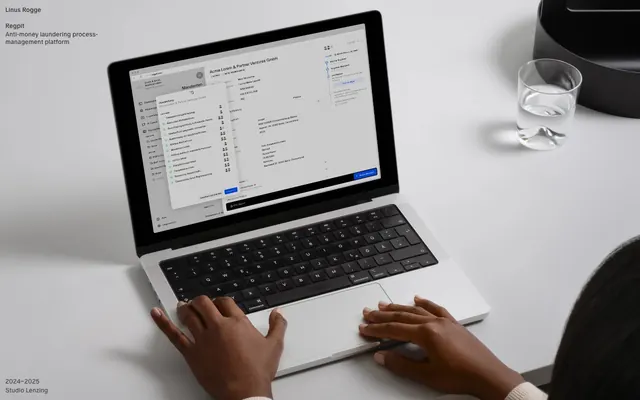
The site primarily uses product screenshots and contained device mockups to illustrate work, rather than decorative photography or complex illustrations. Images are presented sharply and within the bounds of content areas, often against a dark monochromatic background. There's an absence of lifestyle photography or abstract graphics, focusing purely on showcasing the digital products themselves with a matter-of-fact, almost documentary, style. Icons, when present, are simple, monochromatic, and align with the sharp UI.
Reminiscent of Basic Apple Guy, Minimalist portfolio sites, Stripe (early versions), Studio Lenzing.
# Linus Rogge — Style Reference
> Photographic Contact Sheet — a high-contrast, monochrome canvas where every element is framed with intentional space.

**Theme:** mixed

**Site:** https://linusrogge.com

Linus Rogge's design system evokes the precision of a photographic contact sheet: stark, high-contrast, and focused. The entire site exists within a monochrome palette of deep blacks and crisp whites, establishing a professional and understated tone. The absence of color or gradients, coupled with the generous spacing, creates an airy yet disciplined aesthetic, emphasizing content without visual distraction. Typography, though minimal, plays a crucial role in maintaining this clean, almost academic, presentation.

## Tokens — Colors

| Name | Value | Token | Role |
|------|------|------|------|
| Pitch Black | `#000000` | `--color-pitch-black` | Major surface backgrounds, primary text color, button backgrounds, interactive element borders. Creates a deep, foundational contrast. |
| Pure White | `#ffffff` | `--color-pure-white` | Primary text color on dark backgrounds, link text, button text, many interactive backgrounds. Provides maximum contrast against dark elements. |
| Deep Shadow | `#0a0a0a` | `--color-deep-shadow` | Subtle background for specific sections, providing a slight variance from Pitch Black. |
| Faint Gray | `#e5e5e5` | `--color-faint-gray` | Light background for sections, offering a subtle break from Pure White. This is a very light desaturated gray, not a true white. |
| Light Gray | `#d4d4d4` | `--color-light-gray` | Background for specific, slightly more defined sections than Faint Gray. Also very desaturated for a neutral appearance. |
| Mid Gray | `#a3a3a3` | `--color-mid-gray` | Used for background variations. |
| Dark Gray | `#737373` | `--color-dark-gray` | Background for accentuating specific content blocks. |
| Charcoal | `#525252` | `--color-charcoal` | Background for subtle elevation or differentiation of content areas. |
| Deep Charcoal | `#404040` | `--color-deep-charcoal` | Used for deeper background contrasts. |
| Near Black | `#262626` | `--color-near-black` | Closest to black for slight background variations, maintains high contrast with white text. |
| True Black | `#171717` | `--color-true-black` | Very dark background shade, indistinguishable from Pitch Black to the casual eye but distinct for UI differentiation. |

## Tokens — Typography

### ABC Oracle
- **Substitute:** Inter
- **Weights:** 400, 500
- **Sizes:** 14px
- **Line height:** 1, 1.25, 1.43
- **Letter spacing:** normal
- **Role:** The single typeface used across all elements: body text, links, headings, and buttons. Its clean, sans-serif design contributes to the site's minimalistic and highly legible aesthetic, maintaining uniformity.

## Tokens — Type Scale

| Role | Size | Line height | Letter spacing |
|------|------|------|------|
| button | 14px | 1 | — |

## Tokens — Spacing

- **Card padding:** 12px
- **Element gap:** 6px

## Tokens — Radius

- **Buttons:** 1.67772e+07px

## Layout

The page alternates between full-bleed dark and light sections, creating a strong vertical rhythm. The main content is often left-aligned within these wide bands, creating a dramatic, almost editorial feel. The hero sections present a large, bold heading over a dark background. Content blocks often take a single-column, centered approach for text, or a two-column layout for project listings, where a title and description are presented side-by-side or stacked, with generous vertical spacing. There are no complex grid systems; instead, content is contained, offset, or presented in sequential blocks.

## Imagery

The site primarily uses product screenshots and contained device mockups to illustrate work, rather than decorative photography or complex illustrations. Images are presented sharply and within the bounds of content areas, often against a dark monochromatic background. There's an absence of lifestyle photography or abstract graphics, focusing purely on showcasing the digital products themselves with a matter-of-fact, almost documentary, style. Icons, when present, are simple, monochromatic, and align with the sharp UI.

## Components

### Writing Post List

### About Bio with CTA Button

### Project Card — Regpit

### Primary Black Button
*Call-to-action and navigation.*

A pill-shaped button with a Pitch Black background (#000000) and Pure White text (#ffffff), featuring a border of the same Pitch Black. Padding is 8px vertical and 12px horizontal. This button creates a strong, clear, interactive point against a light background.

### Project Link Card
*Showcasing individual projects.*

A clickable block of content with a Pure White background (#ffffff) containing a project title and description. It uses ABC Oracle font. The block itself does not have a distinct border but is separated from other content by generous spacing. The hover state changes the background to Pitch Black (#000000) and text to Pure White (#ffffff).

### Navigation Link
*Primary navigation for site sections or external pages.*

Text link using ABC Oracle font, usually Pure White (#ffffff) on dark backgrounds, or Pitch Black (#000000) on light backgrounds. No underlines by default but has a subtle interaction change upon hover (e.g. background change on the containing element).

### Footer Section Divider
*Separating main content from footer information.*

A distinct horizontal line defined by a color change from Pitch Black (#000000) to Faint Gray (#e5e5e5) or similar light neutral. The change in background color acts as a strong visual divider.

## Guidelines

### Do

- Maintain a strictly achromatic color scheme using only Pitch Black (#000000), Pure White (#ffffff), and the neutral gray variations provided.
- Use ABC Oracle (or Inter as a substitute) for all text elements to preserve typographic consistency.
- Apply generous vertical padding of at least 48px between main content blocks and sections to ensure a comfortable, airy feel.
- Utilize the pill shape (1.67772e+07px radius) exclusively for interactive buttons to create a distinctive, soft touch point.
- Ensure high contrast between text and background, adhering to AAA accessibility standards for readability, especially for main content and interactive elements.
- Frame content with ample negative space; prioritize whitespace over dense information packing.

### Don't

- Do not introduce any chromatic colors, gradients, or shadows; the aesthetic is strictly monochrome and flat.
- Avoid using multiple typefaces or varying font sizes excessively; the system relies on a single font with limited size variations.
- Do not break the pill-shape convention for buttons; other elements should remain sharp-edged or rely on spacing for definition.
- Do not use subtle, low-contrast text-on-background combinations; legibility with monochrome is paramount.
- Do not add any decorative elements or complex graphic treatments; the design emphasizes content through its stark presentation.

## Agent Prompt Guide

### Quick Color Reference
- Text (dark bg): #ffffff (Pure White)
- Text (light bg): #000000 (Pitch Black)
- Background (dark): #000000 (Pitch Black)
- Background (light): #ffffff (Pure White)
- Button Background: #000000 (Pitch Black)
- Button Text: #ffffff (Pure White)

### 3-5 Example Component Prompts
1. **Create a hero section:** Full-width, Pitch Black (#000000) background. Centered main heading 'Project Showcase' using ABC Oracle weight 500, size 14px, Pure White (#ffffff). Below it, a subheading 'A selection of recent works' in ABC Oracle weight 400, size 14px, Pure White (#ffffff). Ensure generous vertical padding of 96px above and below content.
2. **Generate a project link block:** White (#ffffff) background. Text 'Regpit Anti-money laundering process-management platform' in ABC Oracle weight 400, size 14px, Pitch Black (#000000), lineHeight 1.43. On hover, background should transition to Pitch Black (#000000) and text to Pure White (#ffffff). Apply 12px padding on all sides.
3. **Design a primary navigation button:** Create a button with Pitch Black (#000000) background, Pure White (#ffffff) text 'Information', ABC Oracle weight 400, size 14px, lineHeight 1.0. Radius should be 1.67772e+07px (pill shape). Apply 8px vertical and 12px horizontal padding. The border should also be Pitch Black (#000000).
4. **Produce a footer text section:** Use a Faint Gray (#e5e5e5) background. Include a copyright notice '© 2024 Linus Rogge' using ABC Oracle weight 400, size 14px, Pitch Black (#000000). Apply at least 48px vertical padding to the section.
More like this










Keep what you find
A free account saves references to boards and can send you a weekly email of picks based on what you save.
To see every result, go Pro.