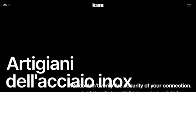
Preview image. Unlock full-res
Monochrome industrial precision
Color palette
Primary text, headers at smaller sizes, icons, structural borders, initial hero background filler
Footer background, secondary dark surface, used for large dark background areas
Decorative borders for cards and images, hinting at depth without full elevation
Secondary text for paragraphs, links, and detailed information
Muted helper text, tertiary body copy, and subtle heading details
Inactive link text, light decorative borders, and copyright information
Primary page background, card surfaces, and subtle button borders
Container backgrounds, button fills, active text for dark backgrounds, and prominent borders
Muted icon strokes, separators, and secondary graphic details. Do not promote it to the primary CTA color
Typography
- Weights
- 400, 500, 600, 700
- Sizes
- 14px, 16px, 18px, 19px, 24px, 26px, 32px, 259px
- Line height
- 0.76, 0.8, 0.83, 1, 1.14, 1.17, 1.25, 1.39, 1.5, 2
- Letter spacing
- -0.0720em at 259px, -0.0450em at 32px, -0.0400em at 24px and 26px, normal at 14-19px
- Fallback
- system-ui, sans-serif
The sole typeface, Inter, handles all text roles. Its variable weights are used to establish hierarchy against a monochrome backdrop, with very tight letter-spacing for display headings creating a compressed, impactful look. Regular spacing aids readability for body text.
Spacing & shape
Components
Filled with Pure White (#ffffff), text in Absolute Black (#000000). Features generous padding of 25px on all sides and a 20px border-radius, giving it a soft, pill-like appearance.
Transparent background, text in Pure White (#ffffff) and bordered with Pure White (#ffffff) for visibility against dark backgrounds. Padding is 18px on all sides, with no border-radius defined, maintaining sharp corners.
Background in Near White (#f3f3f3) with a 20px border-radius and no box shadow, presenting a flat, clean surface. Content inside the card has no inherent padding, implying images or text extend to edges or are managed by internal content spacing.
Typically uses Charcoal Text (#333333) or Absolute Black (#000000), becoming Silver Link (#aaaaaa) when inactive or for minor metadata. Padding of 17px top/bottom and 5px left/right suggests clickable areas extending beyond text, often used in header/footer navigation.
Guidelines
- Use Inter for all typography, leveraging its multiple weights to define hierarchy from display to body text.
- Apply Absolute Black (#000000) for primary headlines and Pure White (#ffffff) for light section backgrounds, establishing high contrast.
- Maintain a comfortable density with 10px element gaps for most inline elements and 64px or 71px vertical section spacing.
- Form all buttons and cards with a 20px border-radius to consistently introduce a soft, rounded aesthetic.
- Utilize Near White (#f3f3f3) for card backgrounds and secondary light surfaces to distinguish them from the main Pure White (#ffffff) canvas.
- Employ tightly tracked letter-spacing for large display text, such as -0.0720em for 259px, to achieve a condensed, impactful visual.
- Do not introduce additional color beyond the established monochrome palette, including new accent or brand colors.
- Avoid box shadows or gradients; rely on contrasting surfaces, typography, and borders for visual hierarchy.
- Do not use letter-spacing on body text; keep it at normal for optimal readability.
- Do not deviate from the 20px border-radius for buttons and cards; sharp or smaller radii will break the visual consistency.
- Do not add unnecessary decorative elements; the design emphasizes functional clarity through direct presentation.
- Avoid dense information blocks; maintain generous spacing between elements and sections to preserve an airy, open feel.
About this system
ShowHide
The Icam visual system is a study in stark monochrome contrast and material precision. It pairs crisp, confident typography with expansive white and deep black surfaces, creating a sense of technical authority. Subtle, large radius rounded corners soften rigid forms, while minimal borders and generous spacing maintain an airy, professional feel. The design emphasizes content through direct visual hierarchy rather than ornamental complexity.
The page primarily uses a full-bleed layout, particularly for the hero section which can be a stark black canvas with prominent white typography. Content sections below often alternate between full-width black and white backgrounds, creating strong vertical rhythm. Within these sections, content appears to be structured in a max-width, center-aligned manner for readability over extensive line lengths, though a specific `pageMaxWidth` is not enforced globally. Feature sections utilize a grid of cards, likely 3-column. The navigation sits in a fixed header with minimal elements, usually a logo, language switcher, and a hamburger menu icon.
The visual language predominantly features high-contrast, product-focused photography of stainless steel and industrial components. Images are typically tightly cropped, showcasing the material and form directly without extraneous context or lifestyle elements. They are contained within card-like structures or used as backgrounds. The sparse use of icons is limited to outlined, monochrome symbols, primarily for navigation or utility. The overall impression is one of material honesty and technical precision, using imagery to illustrate product rather than decorate.
Reminiscent of Stripe, Apple (product pages), Figma, Linear.
# Icam inox s.r.l. — Style Reference
> Monochrome industrial precision

**Theme:** light

**Site:** https://www.icam-inox.com

The Icam visual system is a study in stark monochrome contrast and material precision. It pairs crisp, confident typography with expansive white and deep black surfaces, creating a sense of technical authority. Subtle, large radius rounded corners soften rigid forms, while minimal borders and generous spacing maintain an airy, professional feel. The design emphasizes content through direct visual hierarchy rather than ornamental complexity.

## Tokens — Colors

| Name | Value | Token | Role |
|------|------|------|------|
| Absolute Black | `#000000` | `--color-absolute-black` | Primary text, headers at smaller sizes, icons, structural borders, initial hero background filler |
| Heavy Graphite | `#090909` | `--color-heavy-graphite` | Footer background, secondary dark surface, used for large dark background areas |
| Deep Shadow | `#0f0f0f` | `--color-deep-shadow` | Decorative borders for cards and images, hinting at depth without full elevation |
| Charcoal Text | `#333333` | `--color-charcoal-text` | Secondary text for paragraphs, links, and detailed information |
| Medium Gray | `#535353` | `--color-medium-gray` | Muted helper text, tertiary body copy, and subtle heading details |
| Silver Link | `#aaaaaa` | `--color-silver-link` | Inactive link text, light decorative borders, and copyright information |
| Near White | `#f3f3f3` | `--color-near-white` | Primary page background, card surfaces, and subtle button borders |
| Pure White | `#ffffff` | `--color-pure-white` | Container backgrounds, button fills, active text for dark backgrounds, and prominent borders |
| Decorative Gray Blue | `#a0a9b9` | `--color-decorative-gray-blue` | Muted icon strokes, separators, and secondary graphic details. Do not promote it to the primary CTA color |

## Tokens — Typography

### Inter
- **Substitute:** system-ui, sans-serif
- **Weights:** 400, 500, 600, 700
- **Sizes:** 14px, 16px, 18px, 19px, 24px, 26px, 32px, 259px
- **Line height:** 0.76, 0.8, 0.83, 1, 1.14, 1.17, 1.25, 1.39, 1.5, 2
- **Letter spacing:** -0.0720em at 259px, -0.0450em at 32px, -0.0400em at 24px and 26px, normal at 14-19px
- **Role:** The sole typeface, Inter, handles all text roles. Its variable weights are used to establish hierarchy against a monochrome backdrop, with very tight letter-spacing for display headings creating a compressed, impactful look. Regular spacing aids readability for body text.

## Tokens — Type Scale

Perfect Fifth (1.5) from 18px base.

| Role | Size | Line height | Letter spacing |
|------|------|------|------|
| caption | 14px | 1.17 | — |
| body-sm | 16px | 1.17 | — |
| body | 18px | 1.17 | — |
| body-lg | 19px | 1.17 | — |
| heading-sm | 24px | 1.17 | — |
| heading | 26px | 1.17 | — |
| heading-lg | 32px | 1.17 | — |
| display-sm | 259px | 1.17 | — |

## Tokens — Spacing

- **Card padding:** 0px
- **Element gap:** 10px

## Tokens — Radius

- **Buttons:** 20px
- **Cards:** 20px

## Layout

The page primarily uses a full-bleed layout, particularly for the hero section which can be a stark black canvas with prominent white typography. Content sections below often alternate between full-width black and white backgrounds, creating strong vertical rhythm. Within these sections, content appears to be structured in a max-width, center-aligned manner for readability over extensive line lengths, though a specific `pageMaxWidth` is not enforced globally. Feature sections utilize a grid of cards, likely 3-column. The navigation sits in a fixed header with minimal elements, usually a logo, language switcher, and a hamburger menu icon.

## Imagery

The visual language predominantly features high-contrast, product-focused photography of stainless steel and industrial components. Images are typically tightly cropped, showcasing the material and form directly without extraneous context or lifestyle elements. They are contained within card-like structures or used as backgrounds. The sparse use of icons is limited to outlined, monochrome symbols, primarily for navigation or utility. The overall impression is one of material honesty and technical precision, using imagery to illustrate product rather than decorate.

## Components

### Primary Filled Button
*Call to action button for prominent actions.*

Filled with Pure White (#ffffff), text in Absolute Black (#000000). Features generous padding of 25px on all sides and a 20px border-radius, giving it a soft, pill-like appearance.

### Outlined Ghost Button
*Secondary action button, typically for navigation or less critical actions.*

Transparent background, text in Pure White (#ffffff) and bordered with Pure White (#ffffff) for visibility against dark backgrounds. Padding is 18px on all sides, with no border-radius defined, maintaining sharp corners.

### Feature Card
*Used for showcasing distinct features or categories.*

Background in Near White (#f3f3f3) with a 20px border-radius and no box shadow, presenting a flat, clean surface. Content inside the card has no inherent padding, implying images or text extend to edges or are managed by internal content spacing.

### Text Link
*Navigational links and inline text links.*

Typically uses Charcoal Text (#333333) or Absolute Black (#000000), becoming Silver Link (#aaaaaa) when inactive or for minor metadata. Padding of 17px top/bottom and 5px left/right suggests clickable areas extending beyond text, often used in header/footer navigation.

## Guidelines

### Do

- Use Inter for all typography, leveraging its multiple weights to define hierarchy from display to body text.
- Apply Absolute Black (#000000) for primary headlines and Pure White (#ffffff) for light section backgrounds, establishing high contrast.
- Maintain a comfortable density with 10px element gaps for most inline elements and 64px or 71px vertical section spacing.
- Form all buttons and cards with a 20px border-radius to consistently introduce a soft, rounded aesthetic.
- Utilize Near White (#f3f3f3) for card backgrounds and secondary light surfaces to distinguish them from the main Pure White (#ffffff) canvas.
- Employ tightly tracked letter-spacing for large display text, such as -0.0720em for 259px, to achieve a condensed, impactful visual.

### Don't

- Do not introduce additional color beyond the established monochrome palette, including new accent or brand colors.
- Avoid box shadows or gradients; rely on contrasting surfaces, typography, and borders for visual hierarchy.
- Do not use letter-spacing on body text; keep it at normal for optimal readability.
- Do not deviate from the 20px border-radius for buttons and cards; sharp or smaller radii will break the visual consistency.
- Do not add unnecessary decorative elements; the design emphasizes functional clarity through direct presentation.
- Avoid dense information blocks; maintain generous spacing between elements and sections to preserve an airy, open feel.

## Agent Prompt Guide

Quick Color Reference:
text: #000000
background: #ffffff
border: #0f0f0f
accent: no distinct accent color
primary action: no distinct CTA color

Example Component Prompts:
No distinct primary action color was observed; use the extracted neutral button treatments instead of inventing a filled CTA color.
2. Design an Outlined Ghost Button for a dark background: transparent background, text in Pure White (#ffffff), border 1px solid Pure White (#ffffff), 18px padding, 0px border-radius.
3. Build a Feature Card: background Near White (#f3f3f3), 0px padding, 20px border-radius, no shadow. Inside, place a heading using Inter weight 700 at 24px and body text using Inter weight 400 at 16px, both in Absolute Black (#000000).
4. Form a Hero Section: full-width background Absolute Black (#000000). Place a headline 'Artigiani dell'acciaio inox' with Inter weight 700 at 259px, color Pure White (#ffffff), letter-spacing -0.0720em, centered on the page.
More like this









Keep what you find
A free account saves references to boards and can send you a weekly email of picks based on what you save.
To see every result, go Pro.