Preview image. Unlock full-res
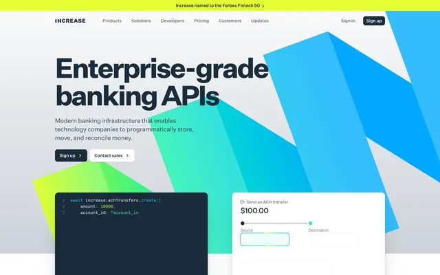
Angular neon blueprint
Color palette
Primary UI text, interactive elements (buttons, links), card backgrounds in dark sections
Dark card backgrounds, prominent content blocks in dark sections
Green wash for highlight backgrounds, decorative bands, and soft emphasis behind content; Dynamic background accents, callout sections with energetic visuals
Green outline accent for tags, dividers, and focused UI edges. Do not promote it to the primary CTA color; Highlighting API code examples, energetic visual elements; Subtle background accents, connecting elements in a flow
Prominent hero section backgrounds, defining visual anchors
Secondary text, subtle borders, and descriptive content
Muted helper text, placeholder text, disabled states
Inactive navigation items, subtle button borders for ghost actions, tertiary text
Page backgrounds, large container surfaces, subtle form field backgrounds
High contrast text, decorative elements, code snippets
Default backgrounds for cards and text, active state text for dark buttons
Hairline borders, dividers, subtle card shadows
Subtle card backgrounds, distinct yet light surface transitions
Typography
- Weights
- 400, 500, 700
- Sizes
- 14px, 16px, 20px, 24px, 32px, 40px, 90px
- Line height
- 1, 1.1, 1.13, 1.17, 1.4, 1.43, 1.5
- Letter spacing
- -0.14, -0.16, -0.2, -0.24, -0.32, -0.4, -0.9
- Fallback
- system-ui, sans-serif
Primary brand typeface for all headings, body text, and UI labels. The tighter letter spacing across various sizes creates a compact, modern feel.
- Weights
- 400
- Sizes
- 10px, 13px, 14px, 20px
- Line height
- 1.43, 1.5, 1.54, 1.6
- Letter spacing
- -0.1, -0.13, -0.14, -0.2
- Fallback
- SFMono-Regular, Consolas, Liberation Mono, Menlo, monospace
Monospaced font for code examples and technical data displays. The specific stylistic sets ('ss01', 'ss02', 'ss12') enhance legibility and distinguish it from generic monospace fonts.
Spacing & shape
Elevation
Components
Solid Midnight Ink (#1a2b3b) background with Polar White (#ffffff) text. Features 8px border-radius and 5px vertical, 10px horizontal padding.
Transparent background with Smoke Light (#687887) text and a matching 1px border. Flexible padding with no explicit border radius (0px, likely text link style).
Polar White (#ffffff) background, Midnight Ink (#1a2b3b) text, with a Pale Stone (#edf0f2) 1px border. Rounded corners at 8px, with 10px vertical and 15px horizontal padding.
Transparent background with Smoke Light (#687887) text and a matching 1px border. Small 5px vertical and 10px horizontal padding, with 8px border-radius. Visually similar to ghost but with more padding.
Oceanic Deep (#0d1726) background with a large shadow: rgba(12, 25, 39, 0.05) 0px 6px 8px, rgba(12, 25, 39, 0.06) 0px 16px 20px, rgba(12, 25, 39, 0.1) 0px 50px 60px. No internal padding, uses 12px border-radius.
Polar White (#ffffff) background, subtle shadow: rgba(0, 0, 0, 0.1) 0px 1px 3px, rgba(0, 0, 0, 0.1) 0px 1px 2px -1px. Padding of 12px on all sides and a 12px border-radius.
Pale Stone (#e1e5e9) background, no padding, 12px border-radius, and a prominent shadow: rgba(12, 25, 39, 0.05) 0px 6px 8px, rgba(12, 25, 39, 0.06) 0px 16px 20px, rgba(12, 25, 39, 0.1) 0px 50px 60px.
Oceanic Deep (#0d1726) background, no padding, 12px border-radius, and a subtle shadow: rgba(12, 25, 39, 0.03) 0px 6px 8px, rgba(12, 25, 39, 0.09) 0px 18px 22px.
Guidelines
- Prioritize Midnight Ink (#1a2b3b) for primary headings and key interactive elements, ensuring strong contrast against light backgrounds.
- Use Cloud Canvas (#edf0f2) as the default page background to establish a consistent light theme foundation.
- Apply Aqua Glow (#31f2bf) and Electric Lime (#e4ff33) sparingly for functional highlights, iconography, and code syntax, bringing bursts of energy.
- Maintain a clear visual hierarchy with Untitled Sans, using larger sizes (90px, 40px) with tighter letter spacing (-0.9px, -0.4px) for display text and smaller sizes for body and UI elements (16px, 14px) with less aggressive tracking.
- Utilize Input Mono for all code blocks and technical snippets, applying font-feature-settings 'ss01', 'ss02', 'ss12' for consistent code readability.
- Implement 12px border-radius for all cards and containers, and 8px for buttons and form elements, for a cohesive friendly curvature.
- Employ the subtle shadow rgba(0, 0, 0, 0.1) 0px 1px 3px, rgba(0, 0, 0, 0.1) 0px 1px 2px -1px for elevated components like Feature Grid Cards to provide gentle depth.
- Do not introduce new saturated primary colors; adhere strictly to Electric Lime (#e4ff33) and Aqua Glow (#31f2bf) for accentuation.
- Avoid using generic system fonts; always specify 'Untitled Sans' or 'Input Mono' to maintain brand consistency.
- Do not deviate from the established letter-spacing values for type roles; the precise tracking is a core element of the typographic identity.
- Refrain from using heavy, opaque shadows; always opt for the provided soft, diffused shadow styles to prevent visual clutter and maintain lightness.
- Avoid arbitrary padding or margin values; stick to multiples of the 4px base unit, with a default element gap of 8px.
- Never apply gradients to text or small UI elements; reserve them for large decorative backgrounds or brand illustrations.
- Do not introduce additional border patterns beyond 1px solid, as surface treatment relies on subtle shadows and distinct background colors.
About this system
ShowHide
Increase employs a 'dark mode on light canvas' aesthetic, contrasting a clean, spacious white background with a deeply saturated, almost black primary UI color. Angular, vivid gradients provide dynamic accents, creating an energetic feel for a brand focused on API infrastructure. Typography is engineered for technical clarity, utilizing a custom monospace font for code snippets and a precise sans-serif for all other text. Components are sharp and functional, embracing subtle shadows for depth over heavy borders, emphasizing a modern and highly interactive user experience.
The page primarily uses a max-width contained layout, though the hero section is full-bleed with dynamic angular gradients that extend edge-to-edge. The hero features a large, centered headline over a dark background with an action button set. Sections below alternate between white and gray backgrounds, creating a clear vertical rhythm. Content often arranges in two-column layouts with text on one side and a visual (product screenshot or code example) on the other, or a three-column card grid for features. Vertical spacing between sections is generous, contributing to a comfortable, uncrowded feel. A sticky top navigation bar provides consistent access to primary links and sign-in/sign-up buttons.
The site uses a combination of abstract, angular gradients and focused product screenshots. Photography is absent. Illustrations are abstract, geometric, and vibrant, using the brand's key accent colors (Aqua Glow, Electric Lime) and blues. Icons are primarily outlined or filled with solid colors, appearing with medium stroke weight (likely 1.5-2px visually) in either accent colors or Midnight Ink. The imagery serves both decorative atmospheric purposes (gradients) and explanatory content (product screenshots, code examples with syntax highlighting). The density is balanced, with imagery carefully integrated to support text rather than overwhelm it.
Reminiscent of Stripe, Linear, Vercel, Retool.
# Increase — Style Reference
> Angular neon blueprint

**Theme:** light

**Site:** https://increase.com

Increase employs a 'dark mode on light canvas' aesthetic, contrasting a clean, spacious white background with a deeply saturated, almost black primary UI color. Angular, vivid gradients provide dynamic accents, creating an energetic feel for a brand focused on API infrastructure. Typography is engineered for technical clarity, utilizing a custom monospace font for code snippets and a precise sans-serif for all other text. Components are sharp and functional, embracing subtle shadows for depth over heavy borders, emphasizing a modern and highly interactive user experience.

## Tokens — Colors

| Name | Value | Token | Role |
|------|------|------|------|
| Midnight Ink | `#1a2b3b` | `--color-midnight-ink` | Primary UI text, interactive elements (buttons, links), card backgrounds in dark sections |
| Oceanic Deep | `#0d1726` | `--color-oceanic-deep` | Dark card backgrounds, prominent content blocks in dark sections |
| Electric Lime | `#e4ff33` | `--color-electric-lime` | Green wash for highlight backgrounds, decorative bands, and soft emphasis behind content; Dynamic background accents, callout sections with energetic visuals |
| Aqua Glow | `#31f2bf` | `--color-aqua-glow` | Green outline accent for tags, dividers, and focused UI edges. Do not promote it to the primary CTA color; Highlighting API code examples, energetic visual elements; Subtle background accents, connecting elements in a flow |
| Sky Surge Gradient | `#02b7f1` | `--color-sky-surge-gradient` | Prominent hero section backgrounds, defining visual anchors |
| Storm Gray | `#314352` | `--color-storm-gray` | Secondary text, subtle borders, and descriptive content |
| Stone Whisper | `#8995a1` | `--color-stone-whisper` | Muted helper text, placeholder text, disabled states |
| Smoke Light | `#687887` | `--color-smoke-light` | Inactive navigation items, subtle button borders for ghost actions, tertiary text |
| Cloud Canvas | `#edf0f2` | `--color-cloud-canvas` | Page backgrounds, large container surfaces, subtle form field backgrounds |
| Ink Black | `#000000` | `--color-ink-black` | High contrast text, decorative elements, code snippets |
| Polar White | `#ffffff` | `--color-polar-white` | Default backgrounds for cards and text, active state text for dark buttons |
| Ash Grey | `#caced2` | `--color-ash-grey` | Hairline borders, dividers, subtle card shadows |
| Pale Stone | `#e1e5e9` | `--color-pale-stone` | Subtle card backgrounds, distinct yet light surface transitions |

## Tokens — Typography

### Untitled Sans
- **Substitute:** system-ui, sans-serif
- **Weights:** 400, 500, 700
- **Sizes:** 14px, 16px, 20px, 24px, 32px, 40px, 90px
- **Line height:** 1, 1.1, 1.13, 1.17, 1.4, 1.43, 1.5
- **Letter spacing:** -0.14, -0.16, -0.2, -0.24, -0.32, -0.4, -0.9
- **Role:** Primary brand typeface for all headings, body text, and UI labels. The tighter letter spacing across various sizes creates a compact, modern feel.

### Input Mono
- **Substitute:** SFMono-Regular, Consolas, Liberation Mono, Menlo, monospace
- **Weights:** 400
- **Sizes:** 10px, 13px, 14px, 20px
- **Line height:** 1.43, 1.5, 1.54, 1.6
- **Letter spacing:** -0.1, -0.13, -0.14, -0.2
- **Role:** Monospaced font for code examples and technical data displays. The specific stylistic sets ('ss01', 'ss02', 'ss12') enhance legibility and distinguish it from generic monospace fonts.

## Tokens — Type Scale

Perfect Fourth (1.333) from 16px base.

| Role | Size | Line height | Letter spacing |
|------|------|------|------|
| caption | 14px | 1.43 | -0.14px |
| body | 16px | 1.5 | -0.16px |
| subheading | 20px | 1.4 | -0.2px |
| heading-sm | 24px | 1.4 | -0.24px |
| heading | 32px | 1.17 | -0.32px |
| heading-lg | 40px | 1.13 | -0.4px |
| display | 90px | 1 | -0.9px |

## Tokens — Spacing

- **Section gap:** 40px
- **Card padding:** 12px
- **Element gap:** 8px

## Tokens — Radius

- **Buttons:** 8px
- **Cards:** 12px
- **pills:** 999px
- **tags:** 4px

## Tokens — Elevation

- **Feature Grid Card:** `rgba(0, 0, 0, 0.1) 0px 1px 3px 0px, rgba(0, 0, 0, 0.1) 0px 1px 2px -1px`
- **API Service Card / Hero Code Card:** `rgba(12, 25, 39, 0.05) 0px 6px 8px 0px, rgba(12, 25, 39, 0.06) 0px 16px 20px 0px, rgba(12, 25, 39, 0.1) 0px 50px 60px 0px`
- **Input Preview Card:** `rgba(12, 25, 39, 0.03) 0px 6px 8px 0px, rgba(12, 25, 39, 0.09) 0px 18px 22px 0px`

## Layout

The page primarily uses a max-width contained layout, though the hero section is full-bleed with dynamic angular gradients that extend edge-to-edge. The hero features a large, centered headline over a dark background with an action button set. Sections below alternate between white and gray backgrounds, creating a clear vertical rhythm. Content often arranges in two-column layouts with text on one side and a visual (product screenshot or code example) on the other, or a three-column card grid for features. Vertical spacing between sections is generous, contributing to a comfortable, uncrowded feel. A sticky top navigation bar provides consistent access to primary links and sign-in/sign-up buttons.

## Imagery

The site uses a combination of abstract, angular gradients and focused product screenshots. Photography is absent. Illustrations are abstract, geometric, and vibrant, using the brand's key accent colors (Aqua Glow, Electric Lime) and blues. Icons are primarily outlined or filled with solid colors, appearing with medium stroke weight (likely 1.5-2px visually) in either accent colors or Midnight Ink. The imagery serves both decorative atmospheric purposes (gradients) and explanatory content (product screenshots, code examples with syntax highlighting). The density is balanced, with imagery carefully integrated to support text rather than overwhelm it.

## Components

### Primary Filled Button
*Main call-to-action button for sign-ups and key actions.*

Solid Midnight Ink (#1a2b3b) background with Polar White (#ffffff) text. Features 8px border-radius and 5px vertical, 10px horizontal padding.

### Ghost Sales Button
*Secondary call-to-action for sales inquiries, subtly presented.*

Transparent background with Smoke Light (#687887) text and a matching 1px border. Flexible padding with no explicit border radius (0px, likely text link style).

### Secondary Outlined Button
*Alternative action button, visually distinct but less prominent than primary.*

Polar White (#ffffff) background, Midnight Ink (#1a2b3b) text, with a Pale Stone (#edf0f2) 1px border. Rounded corners at 8px, with 10px vertical and 15px horizontal padding.

### Icon Link Button
*Text link style button, used for navigation or supplementary actions.*

Transparent background with Smoke Light (#687887) text and a matching 1px border. Small 5px vertical and 10px horizontal padding, with 8px border-radius. Visually similar to ghost but with more padding.

### Hero Code Card
*Displays technical code examples against a dark background.*

Oceanic Deep (#0d1726) background with a large shadow: rgba(12, 25, 39, 0.05) 0px 6px 8px, rgba(12, 25, 39, 0.06) 0px 16px 20px, rgba(12, 25, 39, 0.1) 0px 50px 60px. No internal padding, uses 12px border-radius.

### Feature Grid Card
*Showcases individual features or service offerings in a clean, distinct block.*

Polar White (#ffffff) background, subtle shadow: rgba(0, 0, 0, 0.1) 0px 1px 3px, rgba(0, 0, 0, 0.1) 0px 1px 2px -1px. Padding of 12px on all sides and a 12px border-radius.

### API Service Card
*Displays specific API services, with a light background and subtle borders.*

Pale Stone (#e1e5e9) background, no padding, 12px border-radius, and a prominent shadow: rgba(12, 25, 39, 0.05) 0px 6px 8px, rgba(12, 25, 39, 0.06) 0px 16px 20px, rgba(12, 25, 39, 0.1) 0px 50px 60px.

### Input Preview Card
*Interactive mockups or examples of input fields, often within a product display.*

Oceanic Deep (#0d1726) background, no padding, 12px border-radius, and a subtle shadow: rgba(12, 25, 39, 0.03) 0px 6px 8px, rgba(12, 25, 39, 0.09) 0px 18px 22px.

## Guidelines

### Do

- Prioritize Midnight Ink (#1a2b3b) for primary headings and key interactive elements, ensuring strong contrast against light backgrounds.
- Use Cloud Canvas (#edf0f2) as the default page background to establish a consistent light theme foundation.
- Apply Aqua Glow (#31f2bf) and Electric Lime (#e4ff33) sparingly for functional highlights, iconography, and code syntax, bringing bursts of energy.
- Maintain a clear visual hierarchy with Untitled Sans, using larger sizes (90px, 40px) with tighter letter spacing (-0.9px, -0.4px) for display text and smaller sizes for body and UI elements (16px, 14px) with less aggressive tracking.
- Utilize Input Mono for all code blocks and technical snippets, applying font-feature-settings 'ss01', 'ss02', 'ss12' for consistent code readability.
- Implement 12px border-radius for all cards and containers, and 8px for buttons and form elements, for a cohesive friendly curvature.
- Employ the subtle shadow rgba(0, 0, 0, 0.1) 0px 1px 3px, rgba(0, 0, 0, 0.1) 0px 1px 2px -1px for elevated components like Feature Grid Cards to provide gentle depth.

### Don't

- Do not introduce new saturated primary colors; adhere strictly to Electric Lime (#e4ff33) and Aqua Glow (#31f2bf) for accentuation.
- Avoid using generic system fonts; always specify 'Untitled Sans' or 'Input Mono' to maintain brand consistency.
- Do not deviate from the established letter-spacing values for type roles; the precise tracking is a core element of the typographic identity.
- Refrain from using heavy, opaque shadows; always opt for the provided soft, diffused shadow styles to prevent visual clutter and maintain lightness.
- Avoid arbitrary padding or margin values; stick to multiples of the 4px base unit, with a default element gap of 8px.
- Never apply gradients to text or small UI elements; reserve them for large decorative backgrounds or brand illustrations.
- Do not introduce additional border patterns beyond 1px solid, as surface treatment relies on subtle shadows and distinct background colors.

## Agent Prompt Guide

Quick Color Reference:
text: #1a2b3b
background: #edf0f2
border: #caced2
accent: #e4ff33
primary action: #1a2b3b (filled action)

Example Component Prompts:
1. Create a Primary Filled Button: midnight ink background (#1a2b3b), polar white text (#ffffff), 8px radius, untitled sans weight 500 at 16px, 5px vertical padding, 10px horizontal padding.
2. Create a Feature Grid Card: polar white background (#ffffff), 12px radius, shadow rgba(0, 0, 0, 0.1) 0px 1px 3px 0px, rgba(0, 0, 0, 0.1) 0px 1px 2px -1px, 12px padding, untitled sans weight 500 at 20px for title in midnight ink (#1a2b3b).
3. Create a Hero Code Card: oceanic deep background (#0d1726), 12px radius, shadow rgba(12, 25, 39, 0.05) 0px 6px 8px, rgba(12, 25, 39, 0.06) 0px 16px 20px, rgba(12, 25, 39, 0.1) 0px 50px 60px; for code, use input mono weight 400 at 14px with aqua glow (#31f2bf) for keywords, and polar white (#ffffff) for general text, with 'ss01', 'ss02', 'ss12' font features.
More like this









Keep what you find
A free account saves references to boards and can send you a weekly email of picks based on what you save.
To see every result, go Pro.