Preview image. Unlock full-res
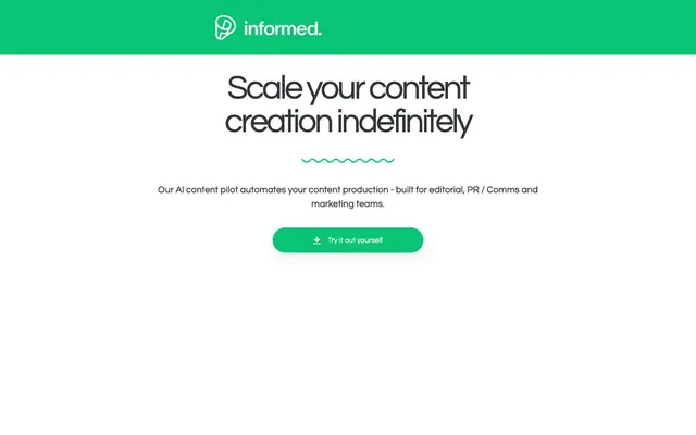
Vibrant green precision
Color palette
Primary accent for interactive elements like CTA buttons, input borders, and active states. It signals action and key information without overwhelming the clean, white canvas
Primary text color for headlines and strong body content, ensuring highest contrast on light backgrounds. Also used for primary borders and structural outlines
Secondary surface background for cards and subtle content sections, providing a slight elevation from the pure white canvas. Also used for ghost button backgrounds
Muted text for helper content, descriptions, and secondary labels. Provides a legible but softer presence than primary text
Used for some body text and subheadings, offering a slightly softer contrast than pure black for dense content
Subtle text and button-text variant, providing a softer contrast than Midnight Ink
Dominant page background, providing a clean, expansive canvas. Also used for text on green buttons and as a decorative border for ghost buttons
Typography
- Weights
- 400
- Sizes
- 17px, 28px
- Line height
- 1
Times — detected in extracted data but not described by AI
- Weights
- 400, 700
- Sizes
- 13px, 15px, 17px, 20px, 22px, 24px, 52px, 69px
- Line height
- 1, 1.25, 1.5, 2.88, 3
- Letter spacing
- -0.0620em
- Fallback
- Montserrat
Primary typeface for headings and prominent UI elements. Its clean, geometric forms, combined with slightly condensed letter-spacing, create a contemporary and precise feel. The use of a single, consistent letter-spacing across all sizes contributes to a unified visual rhythm.
- Weights
- 100, 400
- Sizes
- 20px, 26px
- Line height
- 1.5, 2.56
- Letter spacing
- normal
- Fallback
- Inter
Used for more technical input elements and some secondary body text, providing a highly legible and functional counterpoint to Questrial. The normal letter spacing ensures clarity in smaller contexts.
Spacing & shape
Components
Filled with Canopy Green (#08c474), white text (#ffffff), and a fully rounded ('pill') 43.3333px border-radius. Padding is 0px top/bottom, 8.67px left/right.
Ghost button with Canvas White (#ffffff) background, Midnight Ink (#000000) text and border. Fully rounded 100% border-radius, with 0px padding. This creates a small, circular, outlined action.
Background is Cloud Gray (#f8f8f7), Coal Text (#252525) for text and border. Features a 43.3333px border-radius (pill shape). Padding is 0px top/bottom, 8.67px left/right.
Background is Cloud Gray (#f8f8f7) with no shadow. Features a large 67.1667px border-radius, creating a soft, friendly appearance. Padding within the card is 0px.
Transparent background with Ash Gray (#7e838f) placeholder text. The input has a 1px solid Canopy Green (#08c474) border and a 43.3333px border-radius. Padding is 0px top/bottom, 18.2px left/right.
Guidelines
- Use Canopy Green (#08c474) sparingly and purposefully to highlight interactive elements and essential information.
- Maintain a generous amount of Canvas White (#ffffff) as background space to create an open and airy feel.
- Prioritize Questrial for all headings and prominent text elements, ensuring the specified letter-spacing of -0.0620em.
- Apply the distinctive 43.3333px border-radius for all buttons and input fields to maintain a consistent pill-shaped aesthetic.
- Use Cloud Gray (#f8f8f7) as the background for cards and subtly differentiated sections to create visual layering without heavy shadows.
- Employ Ash Gray (#7e838f) for supporting text and helper elements, ensuring a softer visual presence than primary text.
- Utilize a 1px solid Canopy Green (#08c474) border for focused or active input states.
- Do not use dark backgrounds for large content areas; the system is designed for a light theme.
- Avoid strong box-shadows or complex elevation layers; prefer subtle background color changes for hierarchy.
- Do not introduce additional bold accent colors; limit the palette primarily to greens and neutrals.
- Do not deviate from the specified border-radii for interactive components; small variations will disrupt the rounded aesthetic.
- Avoid overusing Canopy Green; it should punctuate, not dominate, the layout.
- Do not use highly decorative or illustrative imagery; prefer functional graphics or clean product screenshots.
- Avoid dense, information-heavy blocks; prioritize comfortable spacing and clear visual hierarchy.
About this system
ShowHide
informed Copilot employs a bright, minimal aesthetic anchored by a vibrant green accent. The visual system prioritizes clarity and a lightweight feel with ample white space, rounded elements, and a subtle but confident typographic presence. Interface elements are compact, utilizing ghost buttons and fine borders over heavy fills, while the brand's signature green highlights interaction and key information. Components should appear modern and approachable, avoiding strong shadows or complex layering.
The page adheres to a max-width of 1440px, centered on the screen, creating a contained and structured experience. The hero section features a centered headline over a white background, occasionally using a full-width brand color band at the very top. Sections maintain a consistent vertical rhythm with 35px gaps and element gaps of 17px. Content arrangement prioritizes stacked, centered blocks for headlines and body text, sometimes transitioning to a card-based grid or a two-column layout for features. Navigation is handled by a minimal top bar, with elements floating to the left and right.
Imagery is minimal, focusing on clean product screenshots and UI elements. Where present, icons are simple, outlined, and monochromatic, often in Canopy Green (#08c474) for emphasis. The overall density is text-dominant, with graphics serving an explanatory role rather than decorative. Product screenshots are typically tightly cropped against white or light gray backgrounds, without complex staging.
Reminiscent of Linear, Raycast, Supabase, Notion.
# informed Copilot — Style Reference
> Vibrant green precision

**Theme:** light

**Site:** https://www.informed.so

informed Copilot employs a bright, minimal aesthetic anchored by a vibrant green accent. The visual system prioritizes clarity and a lightweight feel with ample white space, rounded elements, and a subtle but confident typographic presence. Interface elements are compact, utilizing ghost buttons and fine borders over heavy fills, while the brand's signature green highlights interaction and key information. Components should appear modern and approachable, avoiding strong shadows or complex layering.

## Tokens — Colors

| Name | Value | Token | Role |
|------|------|------|------|
| Canopy Green | `#08c474` | `--color-canopy-green` | Primary accent for interactive elements like CTA buttons, input borders, and active states. It signals action and key information without overwhelming the clean, white canvas |
| Midnight Ink | `#000000` | `--color-midnight-ink` | Primary text color for headlines and strong body content, ensuring highest contrast on light backgrounds. Also used for primary borders and structural outlines |
| Cloud Gray | `#f8f8f7` | `--color-cloud-gray` | Secondary surface background for cards and subtle content sections, providing a slight elevation from the pure white canvas. Also used for ghost button backgrounds |
| Ash Gray | `#7e838f` | `--color-ash-gray` | Muted text for helper content, descriptions, and secondary labels. Provides a legible but softer presence than primary text |
| Slate Text | `#31343b` | `--color-slate-text` | Used for some body text and subheadings, offering a slightly softer contrast than pure black for dense content |
| Coal Text | `#252525` | `--color-coal-text` | Subtle text and button-text variant, providing a softer contrast than Midnight Ink |
| Canvas White | `#ffffff` | `--color-canvas-white` | Dominant page background, providing a clean, expansive canvas. Also used for text on green buttons and as a decorative border for ghost buttons |

## Tokens — Typography

### Times
- **Weights:** 400
- **Sizes:** 17px, 28px
- **Line height:** 1
- **Role:** Times — detected in extracted data but not described by AI

### Questrial
- **Substitute:** Montserrat
- **Weights:** 400, 700
- **Sizes:** 13px, 15px, 17px, 20px, 22px, 24px, 52px, 69px
- **Line height:** 1, 1.25, 1.5, 2.88, 3
- **Letter spacing:** -0.0620em
- **Role:** Primary typeface for headings and prominent UI elements. Its clean, geometric forms, combined with slightly condensed letter-spacing, create a contemporary and precise feel. The use of a single, consistent letter-spacing across all sizes contributes to a unified visual rhythm.

### Roboto
- **Substitute:** Inter
- **Weights:** 100, 400
- **Sizes:** 20px, 26px
- **Line height:** 1.5, 2.56
- **Letter spacing:** normal
- **Role:** Used for more technical input elements and some secondary body text, providing a highly legible and functional counterpoint to Questrial. The normal letter spacing ensures clarity in smaller contexts.

## Tokens — Type Scale

Perfect Fourth (1.333) from 15px base.

| Role | Size | Line height | Letter spacing |
|------|------|------|------|
| body | 15px | 1.5 | -0.062em |
| heading-sm | 20px | 1.5 | -0.062em |
| heading | 22px | 1.5 | -0.062em |
| heading-lg | 24px | 1.5 | -0.062em |
| display | 52px | 1 | -0.062em |
| display-lg | 69px | 1 | -0.062em |

## Tokens — Spacing

- **Max width:** 1440px
- **Section gap:** 35px
- **Card padding:** 18px
- **Element gap:** 17px

## Tokens — Radius

- **General:** 63.1667px
- **Buttons:** 43.3333px
- **Inputs:** 43.3333px
- **Cards:** 67.1667px

## Layout

The page adheres to a max-width of 1440px, centered on the screen, creating a contained and structured experience. The hero section features a centered headline over a white background, occasionally using a full-width brand color band at the very top. Sections maintain a consistent vertical rhythm with 35px gaps and element gaps of 17px. Content arrangement prioritizes stacked, centered blocks for headlines and body text, sometimes transitioning to a card-based grid or a two-column layout for features. Navigation is handled by a minimal top bar, with elements floating to the left and right.

## Imagery

Imagery is minimal, focusing on clean product screenshots and UI elements. Where present, icons are simple, outlined, and monochromatic, often in Canopy Green (#08c474) for emphasis. The overall density is text-dominant, with graphics serving an explanatory role rather than decorative. Product screenshots are typically tightly cropped against white or light gray backgrounds, without complex staging.

## Components

### Primary Action Button
*High-contrast call to action*

Filled with Canopy Green (#08c474), white text (#ffffff), and a fully rounded ('pill') 43.3333px border-radius. Padding is 0px top/bottom, 8.67px left/right.

### Accent Ghost Button
*Secondary action or navigational link*

Ghost button with Canvas White (#ffffff) background, Midnight Ink (#000000) text and border. Fully rounded 100% border-radius, with 0px padding. This creates a small, circular, outlined action.

### Subtle Ghost Button
*Tertiary action or filter tag*

Background is Cloud Gray (#f8f8f7), Coal Text (#252525) for text and border. Features a 43.3333px border-radius (pill shape). Padding is 0px top/bottom, 8.67px left/right.

### Standard Card
*Content grouping element*

Background is Cloud Gray (#f8f8f7) with no shadow. Features a large 67.1667px border-radius, creating a soft, friendly appearance. Padding within the card is 0px.

### Text Input Field
*User data entry*

Transparent background with Ash Gray (#7e838f) placeholder text. The input has a 1px solid Canopy Green (#08c474) border and a 43.3333px border-radius. Padding is 0px top/bottom, 18.2px left/right.

## Guidelines

### Do

- Use Canopy Green (#08c474) sparingly and purposefully to highlight interactive elements and essential information.
- Maintain a generous amount of Canvas White (#ffffff) as background space to create an open and airy feel.
- Prioritize Questrial for all headings and prominent text elements, ensuring the specified letter-spacing of -0.0620em.
- Apply the distinctive 43.3333px border-radius for all buttons and input fields to maintain a consistent pill-shaped aesthetic.
- Use Cloud Gray (#f8f8f7) as the background for cards and subtly differentiated sections to create visual layering without heavy shadows.
- Employ Ash Gray (#7e838f) for supporting text and helper elements, ensuring a softer visual presence than primary text.
- Utilize a 1px solid Canopy Green (#08c474) border for focused or active input states.

### Don't

- Do not use dark backgrounds for large content areas; the system is designed for a light theme.
- Avoid strong box-shadows or complex elevation layers; prefer subtle background color changes for hierarchy.
- Do not introduce additional bold accent colors; limit the palette primarily to greens and neutrals.
- Do not deviate from the specified border-radii for interactive components; small variations will disrupt the rounded aesthetic.
- Avoid overusing Canopy Green; it should punctuate, not dominate, the layout.
- Do not use highly decorative or illustrative imagery; prefer functional graphics or clean product screenshots.
- Avoid dense, information-heavy blocks; prioritize comfortable spacing and clear visual hierarchy.

## Agent Prompt Guide

Quick Color Reference:
text: #000000
background: #ffffff
border: #000000
accent: #08c474
primary action: #08c474 (filled action)

Example Component Prompts:
1. Create a Primary Action Button: #08c474 background, #000000 text, 9999px radius, compact pill padding. Use this filled treatment for the main CTA.
2. Create a content card: Cloud Gray (#f8f8f7) background, 67.1667px border-radius, 0px padding. Inside, place a subheading 'Automate annoying tasks' using Questrial, 22px, 400 weight, Slate Text (#31343b).
3. Create an input field: Transparent background, 1px solid Canopy Green (#08c474) border, 43.3333px border-radius. Placeholder text 'Enter your email' in Ash Gray (#7e838f). Padding 0px vertical, 18.2px horizontal.
4. Create a callout box: Canvas White background, 63.1667px radius. Use Questrial 15px, 400 weight, Ash Gray (#7e838f) for body text and Questrial 20px, 700 weight, Midnight Ink (#000000) for caption.
More like this








Keep what you find
A free account saves references to boards and can send you a weekly email of picks based on what you save.
To see every result, go Pro.