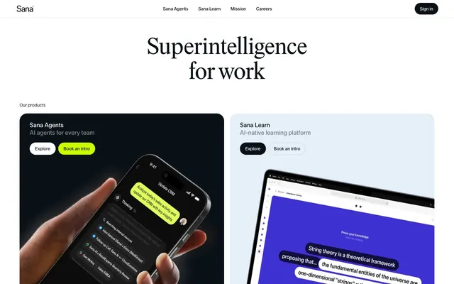
Preview image. Unlock full-res
Architectural blueprint on white marble. Sharp, expansive white spaces frame meticulously placed elements, with occasional flashes of neon green illuminating key interactions.
Color palette
Primary call-to-action buttons, indicating action and drawing immediate attention with its vivid contrast against the neutral palette.
Primary text, dark backgrounds for feature cards, active states. This near-black serves as the dominant dark tone contrasting against the pervasive white background.
Page backgrounds, card surfaces, primary button backgrounds. Expansive and dominant, it provides a sense of spaciousness and clarity.
Subtle background for secondary sections or hover states on light elements, offering a minimal visual lift from Canvas White.
Secondary text, specific interactive elements like input text. Used sparingly to ensure maximum contrast and legibility.
Muted body text and secondary information, providing a softer contrast than Tarmac.
Subtle text elements, navigational links, and less prominent headings, maintaining readability without overpowering.
Typography
- Weights
- 400
- Sizes
- 72px
- Line height
- 1.1
- Letter spacing
- normal
- Fallback
- Playfair Display
Display headings. The single 72px size and serif face at weight 400 make a strong, non-shouting statement, conveying established authority.
- Weights
- 400, 450, 500
- Sizes
- 13px, 14px, 16px, 20px
- Line height
- 1.2, 1.4, 1.43, 1.5
- Letter spacing
- normal
- Fallback
- Inter
Body text, navigation, buttons, and most interactive elements. Its varied weights provide flexibility for hierarchy while maintaining a clean, modern feel across interface elements.
Spacing & shape
Components
Transparent background (rgba(0, 0, 0, 0)), Tarmac text (#0a1217), Tarmac 1px border, 9999px border-radius, 10px padding.
Tarmac background (#0a1217), Canvas White text (#ffffff), 24px border-radius, 8px 16px padding.
Canvas White background (#ffffff), Tarmac text (#0a1217), 24px border-radius, 8px 16px padding.
Transparent background (rgba(0, 0, 0, 0)), 0px border-radius, no box-shadow, 24px 32px padding.
Canvas White background (#ffffff), Jet Black text (#000000), light Tarmac border (rgba(10, 18, 23, 0.15)), 24px border-radius, 8px 18px padding.
Guidelines
- Use Sana Serif for display headlines at 72px, weight 400, to establish authority.
- Apply Tarmac (#0a1217) for primary text and dark surface backgrounds to maintain strong contrast.
- Utilize Bio-Luminescent Green (#cdfe00) exclusively for primary call-to-action buttons, drawing clear attention.
- Employ 24px border-radius for all primary buttons and input fields to ensure a consistent contemporary feel.
- Maintain a clear page structure with 62px vertical spacing between major sections.
- Use Sana Sans (lnum, tnum) across all body text, navigation, and interactive elements for numeral consistency and legibility.
- Ensure all interactive elements have sufficient padding: 8px 16px for buttons, 8px 18px for inputs.
- Do not use highly saturated colors other than Bio-Luminescent Green (#cdfe00); the palette is intentionally restrained.
- Avoid decorative shadows or complex gradients; the aesthetic is flat and crisp.
- Do not introduce additional font families; Sana Serif and Sana Sans are the only approved typefaces.
- Do not deviate from the established border radii; 24px and 9999px are the only sanctioned options for interactive elements.
- Do not vary paragraph line-height aggressively; keep it within the 1.2-1.5 range to maintain reading comfort.
- Avoid using Jet Black (#000000) for large blocks of text; reserve it for specific accents or input fields.
- Do not use small padding values; minimum 8px padding ensures adequate tap targets and visual breathing room.
About this system
ShowHide
This design system projects a clean, authoritative presence through a stark black-on-white palette, punctuated by a single vibrant accent. The large, elegant serif headlines create a sense of established gravitas, while the rounded corners and vibrant lime green call-to-action offer a touch of approachable modernism. This creates a balanced aesthetic where seriousness meets accessible innovation, making complex AI feel intuitive.
The layout is primarily a max-width contained design at 1305px, centered on the page. The hero features a large, centered Sana Serif headline over a white background. Sections alternate between full-width white backgrounds and contained white space. Content is arranged using a mix of centered stacks (for headings and forms) and a prominent two-column grid for product features, where text is often paired with a product showcase card. Vertical spacing between sections is generous at 62px, giving elements ample breathing room. The navigation is a minimalist top bar, right-aligned with interactive links and a prominent 'Sign in' button.
This site features a blend of product screenshots and abstract graphic elements. Product shots are typically tight crops showcasing hands interacting with devices, often with a dark, monochromatic background. The treatment is full-bleed within card components, featuring rounded corners (24px) that soften the edges. Abstract elements are geometric, often in saturated tones (like blue or purple) within a device screen context, serving to illustrate the UI without being literal. The overall role of imagery is to demonstrate product functionality and create a sense of direct engagement, balancing technical detail with a clean, aspirational feel. Image density is moderate, used effectively within feature sections rather than as decorative full-bleed hero backgrounds.
Reminiscent of OpenAI, Notion, Linear, Replit, Supabase.
# Sana Agents — Style Reference
> Architectural blueprint on white marble.  Sharp, expansive white spaces frame meticulously placed elements, with occasional flashes of neon green illuminating key interactions.

**Theme:** light

**Site:** https://sana.ai

This design system projects a clean, authoritative presence through a stark black-on-white palette, punctuated by a single vibrant accent. The large, elegant serif headlines create a sense of established gravitas, while the rounded corners and vibrant lime green call-to-action offer a touch of approachable modernism. This creates a balanced aesthetic where seriousness meets accessible innovation, making complex AI feel intuitive.

## Tokens — Colors

| Name | Value | Token | Role |
|------|------|------|------|
| Bio-Luminescent Green | `#cdfe00` | `--color-bio-luminescent-green` | Primary call-to-action buttons, indicating action and drawing immediate attention with its vivid contrast against the neutral palette. |
| Tarmac | `#0a1217` | `--color-tarmac` | Primary text, dark backgrounds for feature cards, active states. This near-black serves as the dominant dark tone contrasting against the pervasive white background. |
| Canvas White | `#ffffff` | `--color-canvas-white` | Page backgrounds, card surfaces, primary button backgrounds. Expansive and dominant, it provides a sense of spaciousness and clarity. |
| Limestone | `#e4eff7` | `--color-limestone` | Subtle background for secondary sections or hover states on light elements, offering a minimal visual lift from Canvas White. |
| Jet Black | `#000000` | `--color-jet-black` | Secondary text, specific interactive elements like input text. Used sparingly to ensure maximum contrast and legibility. |
| Cloud Gray | `#85898b` | `--color-cloud-gray` | Muted body text and secondary information, providing a softer contrast than Tarmac. |
| Steel Gray | `#6c7174` | `--color-steel-gray` | Subtle text elements, navigational links, and less prominent headings, maintaining readability without overpowering. |

## Tokens — Typography

### Sana Serif
- **Substitute:** Playfair Display
- **Weights:** 400
- **Sizes:** 72px
- **Line height:** 1.1
- **Letter spacing:** normal
- **Role:** Display headings. The single 72px size and serif face at weight 400 make a strong, non-shouting statement, conveying established authority.

### Sana Sans
- **Substitute:** Inter
- **Weights:** 400, 450, 500
- **Sizes:** 13px, 14px, 16px, 20px
- **Line height:** 1.2, 1.4, 1.43, 1.5
- **Letter spacing:** normal
- **Role:** Body text, navigation, buttons, and most interactive elements. Its varied weights provide flexibility for hierarchy while maintaining a clean, modern feel across interface elements.

## Tokens — Type Scale

| Role | Size | Line height | Letter spacing |
|------|------|------|------|
| caption | 13px | 1.4 | — |
| body | 16px | 1.5 | — |
| subheading | 20px | 1.2 | — |
| display | 72px | 1.1 | — |

## Tokens — Spacing

- **Max width:** 1305px
- **Section gap:** 62px
- **Element gap:** 8px

## Tokens — Radius

- **Buttons:** 24px
- **input:** 24px
- **pill:** 9999px

## Layout

The layout is primarily a max-width contained design at 1305px, centered on the page. The hero features a large, centered Sana Serif headline over a white background. Sections alternate between full-width white backgrounds and contained white space. Content is arranged using a mix of centered stacks (for headings and forms) and a prominent two-column grid for product features, where text is often paired with a product showcase card. Vertical spacing between sections is generous at 62px, giving elements ample breathing room. The navigation is a minimalist top bar, right-aligned with interactive links and a prominent 'Sign in' button.

## Imagery

This site features a blend of product screenshots and abstract graphic elements. Product shots are typically tight crops showcasing hands interacting with devices, often with a dark, monochromatic background. The treatment is full-bleed within card components, featuring rounded corners (24px) that soften the edges. Abstract elements are geometric, often in saturated tones (like blue or purple) within a device screen context, serving to illustrate the UI without being literal. The overall role of imagery is to demonstrate product functionality and create a sense of direct engagement, balancing technical detail with a clean, aspirational feel. Image density is moderate, used effectively within feature sections rather than as decorative full-bleed hero backgrounds.

## Components

### Product Cards — Sana Agents & Sana Learn

### Sign Up Form — Try for free with your work email

### Button Group — Primary, Secondary & Outline variants

### Pill Outline Button
*Secondary action button, often for navigation or subtle interactions.*

Transparent background (rgba(0, 0, 0, 0)), Tarmac text (#0a1217), Tarmac 1px border, 9999px border-radius, 10px padding.

### Dark Filled Button
*Primary action button within dark contexts or for prominent interactions.*

Tarmac background (#0a1217), Canvas White text (#ffffff), 24px border-radius, 8px 16px padding.

### Light Filled Button
*Secondary action button in light contexts or for less prominent interactions.*

Canvas White background (#ffffff), Tarmac text (#0a1217), 24px border-radius, 8px 16px padding.

### Feature Card
*Container for introducing product features, often in a grid.*

Transparent background (rgba(0, 0, 0, 0)), 0px border-radius, no box-shadow, 24px 32px padding.

### Form Input Field
*Standard user input field for text.*

Canvas White background (#ffffff), Jet Black text (#000000), light Tarmac border (rgba(10, 18, 23, 0.15)), 24px border-radius, 8px 18px padding.

## Guidelines

### Do

- Use Sana Serif for display headlines at 72px, weight 400, to establish authority.
- Apply Tarmac (#0a1217) for primary text and dark surface backgrounds to maintain strong contrast.
- Utilize Bio-Luminescent Green (#cdfe00) exclusively for primary call-to-action buttons, drawing clear attention.
- Employ 24px border-radius for all primary buttons and input fields to ensure a consistent contemporary feel.
- Maintain a clear page structure with 62px vertical spacing between major sections.
- Use Sana Sans (lnum, tnum) across all body text, navigation, and interactive elements for numeral consistency and legibility.
- Ensure all interactive elements have sufficient padding: 8px 16px for buttons, 8px 18px for inputs.

### Don't

- Do not use highly saturated colors other than Bio-Luminescent Green (#cdfe00); the palette is intentionally restrained.
- Avoid decorative shadows or complex gradients; the aesthetic is flat and crisp.
- Do not introduce additional font families; Sana Serif and Sana Sans are the only approved typefaces.
- Do not deviate from the established border radii; 24px and 9999px are the only sanctioned options for interactive elements.
- Do not vary paragraph line-height aggressively; keep it within the 1.2-1.5 range to maintain reading comfort.
- Avoid using Jet Black (#000000) for large blocks of text; reserve it for specific accents or input fields.
- Do not use small padding values; minimum 8px padding ensures adequate tap targets and visual breathing room.

## Agent Prompt Guide

### Quick Color Reference
- Text (primary): Tarmac #0a1217
- Background (page): Canvas White #ffffff
- Background (dark card): Tarmac #0a1217
- CTA (primary): Bio-Luminescent Green #cdfe00
- Border (input): rgba(10, 18, 23, 0.15)
- Text (secondary): Cloud Gray #85898b

### 3-5 Example Component Prompts
1. Create a hero section: Canvas White background. Headline 'Superintelligence for work' using Sana Serif, 72px, weight 400, #0a1217. Subtext 'AI agents for every team' using Sana Sans, 20px, weight 400, #0a1217. Both centered, with 62px sectionGap from previous/next elements.
2. Design a product feature card: Tarmac background (#0a1217), 24px border-radius, 24px 32px padding. Include a light-filled button 'Explore' (Canvas White background, Tarmac text, 24px border-radius, 8px 16px padding) and a pill outline button 'Book an intro' (transparent, Tarmac text, 9999px border-radius, 10px padding).
3. Generate a 'Sign in' button for the navigation: Dark Filled Button variant – Tarmac background (#0a1217), Canvas White text (#ffffff), 24px border-radius, 8px 16px padding.
4. Create an email input field: Canvas White background (#ffffff), Jet Black text (#000000), borderTopColor=rgba(10, 18, 23, 0.15), 24px border-radius, 8px 18px padding. Placeholder text should be Cloud Gray (#85898b).
5. Lay out a footer section: Canvas White background. Use Sana Sans, 14px, weight 400, #85898b for general links and copyright text. Links should be Tarmac (#0a1217) by default. Arrange content in a multi-column grid within the 1305px max-width, with 62px padding from the bottom of the previous section.
More like this







Keep what you find
A free account saves references to boards and can send you a weekly email of picks based on what you save.
To see every result, go Pro.