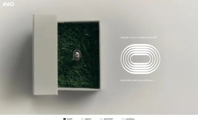
Preview image. Unlock full-res
Gallery Plinth Refinement
Color palette
Primary text, strong borders, icon fills. The core color for content and structure, presenting a near-black against the light canvas
Page backgrounds, card surfaces, pristine backdrop for product display
Muted text for inactive buttons, less prominent links, and ghost button borders. Provides subtle visual hierarchy
Secondary body text, smaller price details. A lighter gray for quieter information
Used for product card borders and occasional icon fills, providing sharp contrast
Typography
- Weights
- 400
- Sizes
- 11px, 14px, 16px, 18px
- Line height
- 1, 1.2, 1.3, 1.5, 1.6
- Letter spacing
- normal
- Fallback
- Montserrat
Primary typeface for all headings, body text, links, and buttons. Its wide, uniform character sets the brand's distinctive, minimalist, and slightly architectural tone.
- Weights
- 400
- Sizes
- 11px
- Line height
- 1
- Letter spacing
- normal
Fallback font, specifically for certain button contexts where a system default is used.
Spacing & shape
Components
Text: Filter Gray (#999999), Weight 400, Size 11px. Background: transparent. Border: 0px. Padding: 13.5px vertical, 0px horizontal.
Text: Obsidian (#212123), Weight 400, Size 11px. Background: transparent. Bottom border: 1px solid Obsidian (#212123). Padding: 0px.
Background: Canvas White (#ffffff). Border radius: 50.4px. Padding: 43px vertical, 34px horizontal. No shadow. Product image centered.
Background: transparent. Text: Obsidian (#212123). Border: 1px solid Obsidian (#212123) with 0px radius. No internal padding specified for input element itself, but appears contained by larger layout padding.
Guidelines
- Prioritize product photography as the primary visual element, ensuring high contrast and clean presentation against muted backgrounds.
- Use Sequel100Wide throughout for all textual elements to maintain typographical consistency and brand identity.
- Apply Canvas White (#ffffff) as the overarching page background and primary card surface for a clean, gallery-like feel.
- Utilize Obsidian (#212123) for all primary text, strong borders, and interactive elements to provide crisp definition.
- Implement ghost buttons with Filter Gray (#999999) text and no background for secondary actions and categorization.
- Maintain a comfortable density with element gaps between 9-11px and generous section gaps of 36-38px.
- Use a border radius of 50.4px for product cards to give them a distinctive, soft, and substantial appearance.
- Avoid strong accent colors; the palette should remain largely achromatic to keep focus on the product.
- Do not use heavy shadows or gradients; elevation should be minimal to maintain a flat, modern aesthetic.
- Do not deviate from the Sequel100Wide typeface for headlines or body copy; its specific character defines the brand.
- Avoid dense information layouts; prioritize clear spacing and visual breathing room between elements.
- Do not introduce complex UI elements; keep interactive components minimal and direct.
- Do not use rounded corners on buttons or input fields, maintaining their sharp, geometric forms.
About this system
ShowHide
INO embraces a minimalist, gallery-like aesthetic, presenting fine jewelry as art objects on a clean, muted canvas. The design emphasizes precise typography, subtle interactions, and a focus on product photography, creating an atmosphere of understated luxury. Typography is used sparingly but with impact, while subtle grays and whites provide a refined backdrop for the metallic luster of the jewelry. Components are lightweight, often outlined or ghosted, conveying a sophisticated restraint.
This site predominantly uses studio product photography featuring jewelry in clean, isolated contexts, often on neutral backgrounds or minimalist props like grass-lined boxes or human skin, with extreme focus on the object itself. Photography is high-key, with no lifestyle or editorial compositions. There are also occasional monochromatic, high-contrast, zoomed-in photographic details used as decorative elements. Icons are minimalist, outlined, and monochromatic, typically Obsidian (#212123). Imagery is central to the product showcase, heavily impacting layout and content density.
Reminiscent of Mejuri, Everlane, Aesop, The Row.
# INO — Style Reference
> Gallery Plinth Refinement

**Theme:** light

**Site:** https://ino.jewelry

INO embraces a minimalist, gallery-like aesthetic, presenting fine jewelry as art objects on a clean, muted canvas. The design emphasizes precise typography, subtle interactions, and a focus on product photography, creating an atmosphere of understated luxury. Typography is used sparingly but with impact, while subtle grays and whites provide a refined backdrop for the metallic luster of the jewelry. Components are lightweight, often outlined or ghosted, conveying a sophisticated restraint.

## Tokens — Colors

| Name | Value | Token | Role |
|------|------|------|------|
| Obsidian | `#212123` | `--color-obsidian` | Primary text, strong borders, icon fills. The core color for content and structure, presenting a near-black against the light canvas |
| Canvas White | `#ffffff` | `--color-canvas-white` | Page backgrounds, card surfaces, pristine backdrop for product display |
| Filter Gray | `#999999` | `--color-filter-gray` | Muted text for inactive buttons, less prominent links, and ghost button borders. Provides subtle visual hierarchy |
| Subtle Ash | `#a6a6a7` | `--color-subtle-ash` | Secondary body text, smaller price details. A lighter gray for quieter information |
| Ink Black | `#000000` | `--color-ink-black` | Used for product card borders and occasional icon fills, providing sharp contrast |

## Tokens — Typography

### Sequel100Wide
- **Substitute:** Montserrat
- **Weights:** 400
- **Sizes:** 11px, 14px, 16px, 18px
- **Line height:** 1, 1.2, 1.3, 1.5, 1.6
- **Letter spacing:** normal
- **Role:** Primary typeface for all headings, body text, links, and buttons. Its wide, uniform character sets the brand's distinctive, minimalist, and slightly architectural tone.

### Arial
- **Weights:** 400
- **Sizes:** 11px
- **Line height:** 1
- **Letter spacing:** normal
- **Role:** Fallback font, specifically for certain button contexts where a system default is used.

## Tokens — Type Scale

Minor Third (1.2) from 16px base.

| Role | Size | Line height | Letter spacing |
|------|------|------|------|
| caption | 11px | 1 | — |
| body-sm | 14px | 1.2 | — |
| body | 16px | 1.3 | — |
| subheading | 18px | 1.5 | — |

## Tokens — Spacing

- **Section gap:** 36-38px
- **Card padding:** 34px
- **Element gap:** 9-11px

## Tokens — Radius

- **Buttons:** 0px
- **Cards:** 50.4px
- **body:** 7.8768px

## Imagery

This site predominantly uses studio product photography featuring jewelry in clean, isolated contexts, often on neutral backgrounds or minimalist props like grass-lined boxes or human skin, with extreme focus on the object itself. Photography is high-key, with no lifestyle or editorial compositions. There are also occasional monochromatic, high-contrast, zoomed-in photographic details used as decorative elements. Icons are minimalist, outlined, and monochromatic, typically Obsidian (#212123). Imagery is central to the product showcase, heavily impacting layout and content density.

## Components

### Ghost Category Button
*Category navigation, filter options*

Text: Filter Gray (#999999), Weight 400, Size 11px. Background: transparent. Border: 0px. Padding: 13.5px vertical, 0px horizontal.

### Underlined Nav Link
*Primary navigation, collection links*

Text: Obsidian (#212123), Weight 400, Size 11px. Background: transparent. Bottom border: 1px solid Obsidian (#212123). Padding: 0px.

### Product Card
*Display individual jewelry products*

Background: Canvas White (#ffffff). Border radius: 50.4px. Padding: 43px vertical, 34px horizontal. No shadow. Product image centered.

### Filter Input
*Input for filtering product listings*

Background: transparent. Text: Obsidian (#212123). Border: 1px solid Obsidian (#212123) with 0px radius. No internal padding specified for input element itself, but appears contained by larger layout padding.

## Guidelines

### Do

- Prioritize product photography as the primary visual element, ensuring high contrast and clean presentation against muted backgrounds.
- Use Sequel100Wide throughout for all textual elements to maintain typographical consistency and brand identity.
- Apply Canvas White (#ffffff) as the overarching page background and primary card surface for a clean, gallery-like feel.
- Utilize Obsidian (#212123) for all primary text, strong borders, and interactive elements to provide crisp definition.
- Implement ghost buttons with Filter Gray (#999999) text and no background for secondary actions and categorization.
- Maintain a comfortable density with element gaps between 9-11px and generous section gaps of 36-38px.
- Use a border radius of 50.4px for product cards to give them a distinctive, soft, and substantial appearance.

### Don't

- Avoid strong accent colors; the palette should remain largely achromatic to keep focus on the product.
- Do not use heavy shadows or gradients; elevation should be minimal to maintain a flat, modern aesthetic.
- Do not deviate from the Sequel100Wide typeface for headlines or body copy; its specific character defines the brand.
- Avoid dense information layouts; prioritize clear spacing and visual breathing room between elements.
- Do not introduce complex UI elements; keep interactive components minimal and direct.
- Do not use rounded corners on buttons or input fields, maintaining their sharp, geometric forms.

## Agent Prompt Guide

**Quick Color Reference:**
text: #212123
background: #ffffff
border: #212123
accent: no distinct accent color
primary action: no distinct CTA color

**3-5 Example Component Prompts:**
1. Create a primary navigation item: 'Shop' in Sequel100Wide, weight 400, size 11px, Obsidian (#212123) text with a 1px solid Obsidian (#212123) bottom border, no background, 0px padding.
2. Design a ghost product category button: 'Necklaces' in Sequel100Wide, weight 400, size 11px, Filter Gray (#999999) text, transparent background, 13.5px vertical padding, 0px horizontal padding.
3. Render a product card: Background Canvas White (#ffffff), 50.4px border radius. Place a square product image. Beneath it, display 'FF Swivel Ring' in Sequel100Wide, weight 400, size 16px, Obsidian (#212123). Below that, '€295,95 - €1.738,95' in Sequel100Wide, weight 400, size 14px, Subtle Ash (#a6a6a7).
4. Create a filter input field container: Background transparent, 1px solid Obsidian (#212123) border, 0px border radius. Placeholder text 'Filter' in Sequel100Wide, weight 400, size 14px, Obsidian (#212123). Include a small, subtle dropdown icon.
More like this









Keep what you find
A free account saves references to boards and can send you a weekly email of picks based on what you save.
To see every result, go Pro.