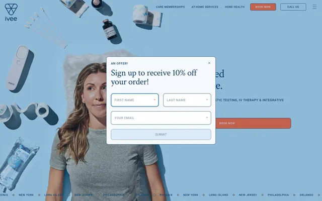
Preview image. Unlock full-res
Serene blue wellness canvas.
Color palette
Primary text color for headings and body, providing strong contrast against light backgrounds. Also used for borders, subtle backgrounds for content blocks, and navigation elements, defining structural elements with a cool, clinical blue
Light background for cards and hero sections, offering a gentle tint of blue. Also used for inputs and buttons as a secondary background
Call-to-action buttons, active navigation items, and small accent marks – a vivid contrast color to draw attention
Primary page background, setting a light, airy base for the interface
Card backgrounds, input fields, elevating content above the Sky Canvas
Subtle background for specific sections or cards, adding warmth without overt color
Used for button text on light backgrounds and prominent icons
Subtle borders and dividers, providing visual separation without harsh lines
Typography
- Weights
- 400
- Sizes
- 24px, 40px, 52px, 120px
- Line height
- 1, 1.17, 1.25
- Letter spacing
- -0.025em for 120px, -0.020em for 52px, 0.020em for 24px
- Fallback
- Lora
Distinguished serif for page headlines and key visual statements, imparting a sense of traditional authority and elegance. The light tracking at larger sizes maintains legibility.
- Weights
- 400, 500, 700
- Sizes
- 12px, 14px
- Line height
- 1, 1.25, 1.43, 1.75, 2
- Letter spacing
- 0.060em for 12px, 0.020em for 14px
- Fallback
- Inter
Highly legible sans-serif for body text, navigation, buttons, and form inputs. Its clean lines ensure clarity for functional content and smaller text sizes.
Spacing & shape
Components
Filled button with 'Sunset Orange' background (#fc6b42), 'Arctic Mist' text (#ffffff), and 10px border radius. Padding of 15px top/bottom, 30px left/right. Font is Roboto, typically 700 weight.
Transparent background with 'Ocean Deep' text (#0c4170), no border radius. Used for inline links and navigation items. Font is Roboto, usually 400 weight.
White background (#ffffff), 'Ocean Deep' text and border (#0c4170), 10px border radius. Generous 15px padding on all sides. Placeholder text is 'Ocean Deep'.
Background of 'Azure Glow' (#c4e3fa) or 'Sand Dune' (#faf4e6), with very large 40px border radius for a soft, friendly appearance. Contains text and other elements without explicit padding values, suggesting content defines internal spacing.
Background of 'Azure Glow' (#c4e3fa) with a large 40px border radius, featuring a subtle shadow (rgba(0,0,0,0) 0px 0px 30px 0px) for emphasis. No explicit padding.
White background (#ffffff) with a 10px border radius, containing text and input fields. Shadow is implied through the context of being an overlay, but no explicit boxShadow token is applied to the modal itself in the component data, relying on context for elevation.
Guidelines
- Always use 'Ocean Deep' (#0c4170) for primary text and significant borders to maintain brand consistency and readability.
- Apply 'Sunset Orange' (#fc6b42) exclusively to primary call-to-action elements for maximum impact and to guide user flow.
- Utilize soft 40px border radii for major content cards and larger visual containers to convey a friendly, approachable aesthetic.
- Pair 'Crimson Text' for headlines with 'Roboto' for body copy to establish clear typographic hierarchy and a balanced visual style.
- Maintain comfortable spacing with an element gap of 20px and a section gap of 40px to ensure visual breathability.
- Use 'Arctic Mist' (#ffffff) for inputs and backgrounds that need to stand out against the main 'Sky Canvas' (#f5f9fd).
- Employ 'Azure Glow' (#c4e3fa) for secondary section backgrounds and cards, creating visual interest without straying from the brand's cool palette.
- Do not introduce sharp corners; avoid radii smaller than 5px for interactive elements.
- Never use 'Sunset Orange' (#fc6b42) for body text or large blocks of content; reserve it for functional accents.
- Avoid overusing shadows; elevation should be subtle and primarily for modals or distinct cards.
- Do not deviate from the 'Crimson Text' and 'Roboto' font families; maintain the established typographic voice.
- Refrain from tight spacing; always provide comfortable padding within elements and ample gaps between sections.
- Do not use dark backgrounds for entire page sections unless specifically for a full-bleed hero that integrates with the 'Ocean Deep' color.
- Avoid arbitrary color choices for text; stick to 'Ocean Deep' for primary text and 'Pitch Black' for button text on light backgrounds.
About this system
ShowHide
Ivee conveys a calm and trustworthy atmosphere through a primarily cool blue and white palette, accented by a warm, inviting orange. Typography is a measured blend of traditional serifs for headlines and crisp sans-serifs for functional text, establishing both gravitas and clarity. Components feature generous rounded corners and light elevation, suggesting a friendly yet refined digital experience. The design prioritizes readability and ease of interaction within a clean, spacious layout.
The page primarily uses a max-width contained layout, centering content within a defined boundary. The hero section often features a full-bleed image with text overlaid, immediately setting a tone. Sections alternate between 'Sky Canvas' and 'Azure Glow' backgrounds, creating a clear visual rhythm. Content is arranged in alternating text-left, image-right patterns, and in multi-column card grids for features. Navigation is a sticky top bar, minimalist with primary actions highlighted.
The site uses a mix of lifestyle photography and product visuals. Photography features subjects in a relaxed, comfortable environment, often with a slightly desaturated or cool-toned filter that matches the brand's blues. Product shots are clean and focused, often showing medical devices or IV bags on neutral or blue-tinted backgrounds, emphasizing the health aspect. Icons are simple, outlined, and monochromatic, primarily in 'Ocean Deep', serving explanatory and functional roles rather than decorative.
Reminiscent of Calm, Kaiser Permanente, Headspace, Cigna.
# ivee — Style Reference
> Serene blue wellness canvas.

**Theme:** light

**Site:** https://www.iveeapp.com

Ivee conveys a calm and trustworthy atmosphere through a primarily cool blue and white palette, accented by a warm, inviting orange. Typography is a measured blend of traditional serifs for headlines and crisp sans-serifs for functional text, establishing both gravitas and clarity. Components feature generous rounded corners and light elevation, suggesting a friendly yet refined digital experience. The design prioritizes readability and ease of interaction within a clean, spacious layout.

## Tokens — Colors

| Name | Value | Token | Role |
|------|------|------|------|
| Ocean Deep | `#0c4170` | `--color-ocean-deep` | Primary text color for headings and body, providing strong contrast against light backgrounds. Also used for borders, subtle backgrounds for content blocks, and navigation elements, defining structural elements with a cool, clinical blue |
| Azure Glow | `#c4e3fa` | `--color-azure-glow` | Light background for cards and hero sections, offering a gentle tint of blue. Also used for inputs and buttons as a secondary background |
| Sunset Orange | `#fc6b42` | `--color-sunset-orange` | Call-to-action buttons, active navigation items, and small accent marks – a vivid contrast color to draw attention |
| Sky Canvas | `#f5f9fd` | `--color-sky-canvas` | Primary page background, setting a light, airy base for the interface |
| Arctic Mist | `#ffffff` | `--color-arctic-mist` | Card backgrounds, input fields, elevating content above the Sky Canvas |
| Sand Dune | `#faf4e6` | `--color-sand-dune` | Subtle background for specific sections or cards, adding warmth without overt color |
| Pitch Black | `#000000` | `--color-pitch-black` | Used for button text on light backgrounds and prominent icons |
| Cloud Gray | `#ced9e2` | `--color-cloud-gray` | Subtle borders and dividers, providing visual separation without harsh lines |

## Tokens — Typography

### Crimson Text
- **Substitute:** Lora
- **Weights:** 400
- **Sizes:** 24px, 40px, 52px, 120px
- **Line height:** 1, 1.17, 1.25
- **Letter spacing:** -0.025em for 120px, -0.020em for 52px, 0.020em for 24px
- **Role:** Distinguished serif for page headlines and key visual statements, imparting a sense of traditional authority and elegance. The light tracking at larger sizes maintains legibility.

### Roboto
- **Substitute:** Inter
- **Weights:** 400, 500, 700
- **Sizes:** 12px, 14px
- **Line height:** 1, 1.25, 1.43, 1.75, 2
- **Letter spacing:** 0.060em for 12px, 0.020em for 14px
- **Role:** Highly legible sans-serif for body text, navigation, buttons, and form inputs. Its clean lines ensure clarity for functional content and smaller text sizes.

## Tokens — Type Scale

Golden Ratio (1.618) from 14px base.

| Role | Size | Line height | Letter spacing |
|------|------|------|------|
| caption | 12px | 1.75 | 0.06em |
| body | 14px | 1.43 | 0.02em |
| heading-sm | 24px | 1.25 | 0.48px |
| heading | 40px | 1.17 | -0.8px |
| heading-lg | 52px | 1.17 | -1.04px |
| display | 120px | 1 | -3px |

## Tokens — Spacing

- **Section gap:** 40px
- **Card padding:** 20px
- **Element gap:** 20px

## Tokens — Radius

- **Buttons:** 10px
- **Inputs:** 10px
- **Cards:** 40px
- **Images:** 20px
- **navigation:** 5px

## Layout

The page primarily uses a max-width contained layout, centering content within a defined boundary. The hero section often features a full-bleed image with text overlaid, immediately setting a tone. Sections alternate between 'Sky Canvas' and 'Azure Glow' backgrounds, creating a clear visual rhythm. Content is arranged in alternating text-left, image-right patterns, and in multi-column card grids for features. Navigation is a sticky top bar, minimalist with primary actions highlighted.

## Imagery

The site uses a mix of lifestyle photography and product visuals. Photography features subjects in a relaxed, comfortable environment, often with a slightly desaturated or cool-toned filter that matches the brand's blues. Product shots are clean and focused, often showing medical devices or IV bags on neutral or blue-tinted backgrounds, emphasizing the health aspect. Icons are simple, outlined, and monochromatic, primarily in 'Ocean Deep', serving explanatory and functional roles rather than decorative.

## Components

### Primary Action Button
*Call-to-action*

Filled button with 'Sunset Orange' background (#fc6b42), 'Arctic Mist' text (#ffffff), and 10px border radius. Padding of 15px top/bottom, 30px left/right. Font is Roboto, typically 700 weight.

### Ghost Navigation Button
*Secondary action*

Transparent background with 'Ocean Deep' text (#0c4170), no border radius. Used for inline links and navigation items. Font is Roboto, usually 400 weight.

### Input Field
*Data entry*

White background (#ffffff), 'Ocean Deep' text and border (#0c4170), 10px border radius. Generous 15px padding on all sides. Placeholder text is 'Ocean Deep'.

### Rounded Feature Card
*Content container*

Background of 'Azure Glow' (#c4e3fa) or 'Sand Dune' (#faf4e6), with very large 40px border radius for a soft, friendly appearance. Contains text and other elements without explicit padding values, suggesting content defines internal spacing.

### Card with Shadow
*Elevated content container*

Background of 'Azure Glow' (#c4e3fa) with a large 40px border radius, featuring a subtle shadow (rgba(0,0,0,0) 0px 0px 30px 0px) for emphasis. No explicit padding.

### Modal Dialog
*Overlay content*

White background (#ffffff) with a 10px border radius, containing text and input fields. Shadow is implied through the context of being an overlay, but no explicit boxShadow token is applied to the modal itself in the component data, relying on context for elevation.

## Guidelines

### Do

- Always use 'Ocean Deep' (#0c4170) for primary text and significant borders to maintain brand consistency and readability.
- Apply 'Sunset Orange' (#fc6b42) exclusively to primary call-to-action elements for maximum impact and to guide user flow.
- Utilize soft 40px border radii for major content cards and larger visual containers to convey a friendly, approachable aesthetic.
- Pair 'Crimson Text' for headlines with 'Roboto' for body copy to establish clear typographic hierarchy and a balanced visual style.
- Maintain comfortable spacing with an element gap of 20px and a section gap of 40px to ensure visual breathability.
- Use 'Arctic Mist' (#ffffff) for inputs and backgrounds that need to stand out against the main 'Sky Canvas' (#f5f9fd).
- Employ 'Azure Glow' (#c4e3fa) for secondary section backgrounds and cards, creating visual interest without straying from the brand's cool palette.

### Don't

- Do not introduce sharp corners; avoid radii smaller than 5px for interactive elements.
- Never use 'Sunset Orange' (#fc6b42) for body text or large blocks of content; reserve it for functional accents.
- Avoid overusing shadows; elevation should be subtle and primarily for modals or distinct cards.
- Do not deviate from the 'Crimson Text' and 'Roboto' font families; maintain the established typographic voice.
- Refrain from tight spacing; always provide comfortable padding within elements and ample gaps between sections.
- Do not use dark backgrounds for entire page sections unless specifically for a full-bleed hero that integrates with the 'Ocean Deep' color.
- Avoid arbitrary color choices for text; stick to 'Ocean Deep' for primary text and 'Pitch Black' for button text on light backgrounds.

## Agent Prompt Guide

### Quick Color Reference
- text: #0c4170
- background: #f5f9fd
- border: #0c4170
- accent: #fc6b42
- primary action: #fc6b42 (filled action)

### 3-5 Example Component Prompts
1. Create a Primary Action Button: #fc6b42 background, #000000 text, 9999px radius, compact pill padding. Use this filled treatment for the main CTA.
2. Design an Input Field: background #ffffff, border #0c4170, text #0c4170, 10px radius, 15px padding all sides, Roboto font weight 400.
3. Build a Feature Card: background #c4e3fa, 40px radius, with 'Ocean Deep' (#0c4170) text headlines in Crimson Text 40px, and 'Ocean Deep' (#0c4170) body text in Roboto 14px.
4. Compose a Hero Headline: 'Ocean Deep' (#0c4170) text, Crimson Text font weight 400, size 120px, letter-spacing -3px.
More like this









Keep what you find
A free account saves references to boards and can send you a weekly email of picks based on what you save.
To see every result, go Pro.