Preview image. Unlock full-res
Midnight console, vivid blue accents.
Color palette
Page background, primary surface color for tables and footers. Its deep, vivid character sets the somber, digital tone
Background for elevated elements like modals and overlays, and some subtle box shadows. Slightly less saturated than Midnight Violet
Primary action background for buttons and active states, highlight color for links. Its vivid saturation provides a clear focal point against the dark neutrals
Decorative border for footer, providing a subtle cool accent
Primary text color for headlines and body copy, button text, and some borders. Offers stark contrast against dark backgrounds
Secondary text color, muted borders. Used for informational text on lighter surfaces, and borders in more complex structures
Tertiary text or icon color, table borders. Provides less emphasis than Paper White or Dark Ink
Muted text color, subtle link borders. Creates a soft contrast on white backgrounds, or a subtle element on dark surfaces
Typography
- Weights
- 300, 400, 700
- Sizes
- 15px, 16px, 18px, 20px
- Line height
- 0.83, 0.94, 1, 1.33, 1.5
- Letter spacing
- normal
- Fallback
- Arial
Primary font for headlines, table content, and general body text. Its broad weight range supports clear hierarchy without needing multiple typefaces.
- Weights
- 300, 400, 700
- Sizes
- 10px, 13px, 15px
- Line height
- 1, 1.15, 1.4, 1.6, 1.85, 2.4
- Letter spacing
- normal
- Fallback
- sans-serif
Used for smaller text, such as list items, icon labels, footer text, and auxiliary body text. Supports dense information presentation at smaller sizes.
- Weights
- 300, 400
- Sizes
- 9px, 15px
- Line height
- 1, 1.4, 1.86
- Letter spacing
- normal
- Fallback
- sans-serif
Functional text for links and buttons, often at smaller sizes. The system default provides quick rendering for interactive elements.
Spacing & shape
Components
Background: Action Blue (#1967d2), Text: Paper White (#ffffff). Radius: 8px. Padding: 0px vertical, 20px horizontal. Uses 'system-ui' font.
Background: Paper White (#ffffff), Text: Action Blue (#1967d2). Border: 1px solid Action Blue (#1967d2). Radius: 8px. Padding: 0px vertical, 20px horizontal. Uses 'system-ui' font.
Background: rgba(0, 0, 0, 0) (transparent). No border, no shadow. Radius: 0px. Padding: 0px.
Background: Paper White (#ffffff), Box shadow: rgba(0, 0, 0, 0.2) 0px 4px 8px. Radius: 8px. Contains a title (`arial` 20px bold), body text (`arial` 16px normal), and two action buttons (Primary Action, Ghost Action).
Guidelines
- Prioritize Midnight Violet (#01074b) and Twilight Indigo (#010535) as background and primary surface colors, establishing the dark theme.
- Use Paper White (#ffffff) for all primary text against dark backgrounds to ensure maximum contrast and readability.
- Apply Action Blue (#1967d2) strictly for primary interactive elements and critical links; avoid decorative use.
- Ensure all buttons use an 8px border-radius, while other small interactive elements use 4px for a unified UI language.
- Maintain a compact information density using the 15px elementGap and 20px cardPadding, while structuring sections with 70px vertical spacing.
- Utilize 'arial' for headlines and main content, and 'Source Sans Pro' or 'system-ui' for smaller, functional text.
- Emphasize content over component chrome where possible, using minimal borders and transparent backgrounds for cards.
- Avoid using light backgrounds for entire pages; the system is designed around a dominant dark mode.
- Do not introduce new vibrant colors outside of the defined accent palette; rely on Action Blue for highlights.
- Refrain from using heavy shadows or decorative gradients on surfaces; aim for a flat, digital aesthetic.
- Do not deviate from the specified typography for titles and body text; maintain the Arial, Source Sans Pro, and system-ui hierarchy.
- Avoid large empty spaces; leverage the compact density by carefully placing content and maintaining appropriate element gaps.
- Do not use generic system link styles (like #0000ee); apply Soft Black (#000322) or Action Blue (#1967d2) as defined.
About this system
ShowHide
Jant employs a dark, highly contrasted visual system reminiscent of a digital console. Deep, saturated violets form the primary backgrounds, creating an immersive, almost holographic feel. Type is direct and functional, predominantly white or light gray against the dark canvas, with vivid blue used carefully for interactive elements. Components are lightweight and largely borderless, emphasizing content over Chrome, contributing to a dense, information-rich display.
The page maintains a maximum width of 660px, creating a focused, single-column content flow, centered on the dark background. The hero section is characterized by a prominent headline and body text, with a 70px section gap before the next content block. Content is presented in vertical stacks, with elements like tables and lists filling the constrained width. Navigation appears minimal, likely a discreet sticky header or footer, reflecting the content-first approach.
The site uses minimal imagery, primarily focusing on text and UI elements. When present, images are tightly integrated into the content, rather than serving as large decorative backdrops. Visuals are functional rather than atmospheric. Icons would likely be solid or filled, appearing crisp against the dark backgrounds, potentially in Paper White or Action Blue to align with the high-contrast UI.
Reminiscent of Replit, Vercel, Linear, Plural.
# Jant — Style Reference
> Midnight console, vivid blue accents.

**Theme:** dark

**Site:** https://jant.fr

Jant employs a dark, highly contrasted visual system reminiscent of a digital console. Deep, saturated violets form the primary backgrounds, creating an immersive, almost holographic feel. Type is direct and functional, predominantly white or light gray against the dark canvas, with vivid blue used carefully for interactive elements. Components are lightweight and largely borderless, emphasizing content over Chrome, contributing to a dense, information-rich display.

## Tokens — Colors

| Name | Value | Token | Role |
|------|------|------|------|
| Midnight Violet | `#01074b` | `--color-midnight-violet` | Page background, primary surface color for tables and footers. Its deep, vivid character sets the somber, digital tone |
| Twilight Indigo | `#010535` | `--color-twilight-indigo` | Background for elevated elements like modals and overlays, and some subtle box shadows. Slightly less saturated than Midnight Violet |
| Action Blue | `#1967d2` | `--color-action-blue` | Primary action background for buttons and active states, highlight color for links. Its vivid saturation provides a clear focal point against the dark neutrals |
| Aqua Glow | `#00a0bd` | `--color-aqua-glow` | Decorative border for footer, providing a subtle cool accent |
| Paper White | `#ffffff` | `--color-paper-white` | Primary text color for headlines and body copy, button text, and some borders. Offers stark contrast against dark backgrounds |
| Dark Ink | `#202124` | `--color-dark-ink` | Secondary text color, muted borders. Used for informational text on lighter surfaces, and borders in more complex structures |
| Medium Gray | `#808080` | `--color-medium-gray` | Tertiary text or icon color, table borders. Provides less emphasis than Paper White or Dark Ink |
| Soft Black | `#000322` | `--color-soft-black` | Muted text color, subtle link borders. Creates a soft contrast on white backgrounds, or a subtle element on dark surfaces |

## Tokens — Typography

### arial
- **Substitute:** Arial
- **Weights:** 300, 400, 700
- **Sizes:** 15px, 16px, 18px, 20px
- **Line height:** 0.83, 0.94, 1, 1.33, 1.5
- **Letter spacing:** normal
- **Role:** Primary font for headlines, table content, and general body text. Its broad weight range supports clear hierarchy without needing multiple typefaces.

### Source Sans Pro
- **Substitute:** sans-serif
- **Weights:** 300, 400, 700
- **Sizes:** 10px, 13px, 15px
- **Line height:** 1, 1.15, 1.4, 1.6, 1.85, 2.4
- **Letter spacing:** normal
- **Role:** Used for smaller text, such as list items, icon labels, footer text, and auxiliary body text. Supports dense information presentation at smaller sizes.

### system-ui
- **Substitute:** sans-serif
- **Weights:** 300, 400
- **Sizes:** 9px, 15px
- **Line height:** 1, 1.4, 1.86
- **Letter spacing:** normal
- **Role:** Functional text for links and buttons, often at smaller sizes. The system default provides quick rendering for interactive elements.

## Tokens — Type Scale

Major Second (1.125) from 18px base.

| Role | Size | Line height | Letter spacing |
|------|------|------|------|
| caption | 15px | 1 | — |
| body-sm | 16px | 1 | — |
| body | 18px | 1 | — |
| body-lg | 20px | 1 | — |

## Tokens — Spacing

- **Max width:** 660px
- **Section gap:** 70px
- **Card padding:** 20px
- **Element gap:** 15px

## Tokens — Radius

- **Buttons:** 8px
- **elements:** 4px

## Layout

The page maintains a maximum width of 660px, creating a focused, single-column content flow, centered on the dark background. The hero section is characterized by a prominent headline and body text, with a 70px section gap before the next content block. Content is presented in vertical stacks, with elements like tables and lists filling the constrained width. Navigation appears minimal, likely a discreet sticky header or footer, reflecting the content-first approach.

## Imagery

The site uses minimal imagery, primarily focusing on text and UI elements. When present, images are tightly integrated into the content, rather than serving as large decorative backdrops. Visuals are functional rather than atmospheric. Icons would likely be solid or filled, appearing crisp against the dark backgrounds, potentially in Paper White or Action Blue to align with the high-contrast UI.

## Components

### Primary Action Button
*Filled button indicating the primary action.*

Background: Action Blue (#1967d2), Text: Paper White (#ffffff). Radius: 8px. Padding: 0px vertical, 20px horizontal. Uses 'system-ui' font.

### Ghost Action Button
*Outlined button for secondary actions, provides visual hierarchy.*

Background: Paper White (#ffffff), Text: Action Blue (#1967d2). Border: 1px solid Action Blue (#1967d2). Radius: 8px. Padding: 0px vertical, 20px horizontal. Uses 'system-ui' font.

### Information Card (Transparent)
*A decorative, invisible card for content grouping.*

Background: rgba(0, 0, 0, 0) (transparent). No border, no shadow. Radius: 0px. Padding: 0px.

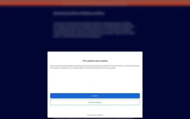
### Cookie Consent Modal
*Modal for cookie consent, often at page load.*

Background: Paper White (#ffffff), Box shadow: rgba(0, 0, 0, 0.2) 0px 4px 8px. Radius: 8px. Contains a title (`arial` 20px bold), body text (`arial` 16px normal), and two action buttons (Primary Action, Ghost Action).

## Guidelines

### Do

- Prioritize Midnight Violet (#01074b) and Twilight Indigo (#010535) as background and primary surface colors, establishing the dark theme.
- Use Paper White (#ffffff) for all primary text against dark backgrounds to ensure maximum contrast and readability.
- Apply Action Blue (#1967d2) strictly for primary interactive elements and critical links; avoid decorative use.
- Ensure all buttons use an 8px border-radius, while other small interactive elements use 4px for a unified UI language.
- Maintain a compact information density using the 15px elementGap and 20px cardPadding, while structuring sections with 70px vertical spacing.
- Utilize 'arial' for headlines and main content, and 'Source Sans Pro' or 'system-ui' for smaller, functional text.
- Emphasize content over component chrome where possible, using minimal borders and transparent backgrounds for cards.

### Don't

- Avoid using light backgrounds for entire pages; the system is designed around a dominant dark mode.
- Do not introduce new vibrant colors outside of the defined accent palette; rely on Action Blue for highlights.
- Refrain from using heavy shadows or decorative gradients on surfaces; aim for a flat, digital aesthetic.
- Do not deviate from the specified typography for titles and body text; maintain the Arial, Source Sans Pro, and system-ui hierarchy.
- Avoid large empty spaces; leverage the compact density by carefully placing content and maintaining appropriate element gaps.
- Do not use generic system link styles (like #0000ee); apply Soft Black (#000322) or Action Blue (#1967d2) as defined.

## Agent Prompt Guide

Quick Color Reference:
text: #ffffff
background: #01074b
border: #808080
accent: #00a0bd
primary action: #1967d2 (filled action)

Example Component Prompts:
1. Create a primary call-to-action button: background Action Blue (#1967d2), text Paper White (#ffffff), 8px radius, 0px vertical padding, 20px horizontal padding, 'system-ui' font at 15px weight 400.
2. Design a section header: text Paper White (#ffffff), 'arial' font at 20px weight 400, line-height 0.83, spaced 70px below the previous section.
3. Build a link within body text: text Action Blue (#1967d2), 'Source Sans Pro' font at 13px weight 400, letter-spacing normal, no underline.
4. Create a ghost button: background Paper White (#ffffff), text Action Blue (#1967d2), 1px solid Action Blue (#1967d2) border, 8px radius, 0px vertical padding, 20px horizontal padding, 'system-ui' font at 15px weight 400.
More like this









Keep what you find
A free account saves references to boards and can send you a weekly email of picks based on what you save.
To see every result, go Pro.