Preview image. Unlock full-res
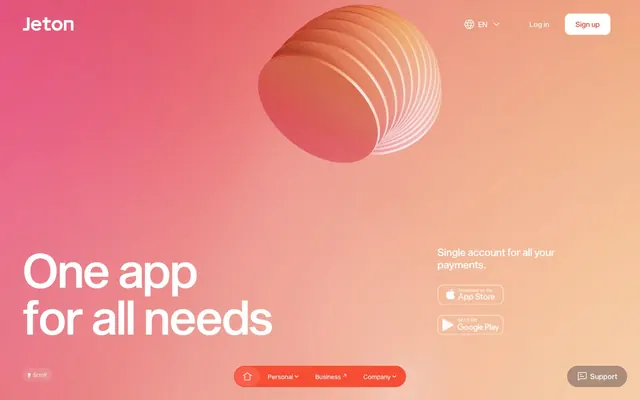
Vibrant gradient pulse.
Color palette
Primary brand color. Outlined actions, badges, decorative elements, accents, and hero gradients; Primary hero section background, providing a warm, dynamic visual anchor
Accent surface background in navigation elements, decorative elements
Red outline accent for tags, dividers, and focused UI edges.
Violet outline accent for tags, dividers, and focused UI edges.
Green outline accent for tags, dividers, and focused UI edges. Use as a supporting accent, not as a status color
Page backgrounds, card surfaces, primary text on dark backgrounds
General body text, icons, neutral button text
Muted text, input placeholder text, subtle icon details
Typography
- Weights
- 400, 450, 500
- Sizes
- 12px, 14px, 16px, 23px, 33px, 44px, 72px, 106px, 110px, 155px
- Line height
- 0.9, 1, 1.2, 1.25, 1.4, 1.5
- Letter spacing
- 0.0100em, 0.0300em
- Fallback
- Inter, Montserrat
Primary brand typeface for all text. Headlines tend to be large and tightly tracked for visual impact, while body text balances readability with a confident, modern feel.
Spacing & shape
Elevation
Components
Ghost button with Jeton Red text and a 1px Jeton Red border, 16px border-radius, no background fill. Text uses Sequel Sans, weight 400.
Ghost button with Canvas White text and a 1px Canvas White border, 84px (pill-shaped) border-radius, no background fill. Text uses Sequel Sans, weight 400, with 16px horizontal padding.
Pill-shaped button with Text Black text and a 1px Text Black border, 16px border-radius, no background fill. Has 12px padding all around.
Card with Canvas White background, 16px border-radius, and a soft shadow (rgba(0, 0, 0, 0.05) 0px -4px 16px 0px). No internal padding specified, assumed to be content-driven.
Card with a soft Jeton Red background (rgba(247, 59, 32, 0.05)), 16px border-radius, and no shadow. No internal padding.
Pill-shaped button with Jeton Red text, no border or background (transparent), and a massive 84px border-radius for fluid shapes. Has 16px horizontal padding.
Input field with subtle Jeton Red background (rgba(247, 59, 32, 0.05)), Red Velvet text and border, and 16px border-radius. Includes 17.6px top padding, 10px right padding, 6.4px bottom padding, and 48px left padding.
Guidelines
- Always use Sequel Sans for all text elements, prioritizing weights 400, 450, and 500 for clarity.
- Apply Jeton Red (#f73b20) as the primary accent, particularly for interactive elements, outlined actions, and key branding.
- Ensure all primary call-to-action buttons are ghost buttons with Jeton Red text and borders, following the Outline Primary Button component specification.
- Use 16px for card, button, and input border-radii, embracing the rounded aesthetic.
- Implement the Sunrise Gradient linear-gradient(rgba(122, 39, 57, 0) 15%, rgb(247, 59, 32) 69%) for hero sections and prominent visual backgrounds.
- Maintain a default letter-spacing of 0.0100em or 0.0300em, specially for headlines, to achieve a compact and impactful typographic appearance.
- Utilize Canvas White (#ffffff) for all main page backgrounds and component surfaces to provide a clean, expansive canvas.
- Do not introduce new color hues; strictly adhere to the defined brand, accent, and semantic palette.
- Avoid solid background fills for primary calls to action; always prefer the outlined Jeton Red style.
- Do not deviate from the established border-radii; avoid sharp corners or excessively small radii.
- Never use generic system fonts; always utilize Sequel Sans or its approved substitutes.
- Do not use heavy, opaque shadows unless specifically for card elevation (rgba(0, 0, 0, 0.05) 0px -4px 16px 0px).
- Avoid overly loose letter-spacing; maintain a tight, controlled textual presentation especially for headings.
- Do not overuse accent colors, ensure they serve a functional or brand-defining purpose.
About this system
ShowHide
Jeton's design system radiates a vibrant, energetic feel with a strong focus on a single, dominant red accent color. Typography is precise and impactful, preferring tightly tracked, strong headlines. Surfaces are primarily clean white, contrasted by gradients that inject warmth and dynamism. Components feature generous border-radii, often creating pill shapes, and subtle shadows or gradient overlays are used sparingly for depth and interaction feedback.
The page primarily uses a full-bleed layout for hero sections, transitioning to a contained, max-width layout for subsequent content. The hero typically features a centered headline over a gradient background with a prominent 3D abstract graphic. Section rhythm is often seamless, with consistent vertical spacing and a lack of strong visual dividers, except for subtle card elevations. Content arrangement often utilizes centered stacks or dual-column text-left/image-right patterns. A grid of cards can be seen for feature showcases. The navigation is a sticky top bar with a minimal set of links, along with a secondary bottom navigation or floating support button. The design leans towards a comfortable density, allowing visual breathing room.
Jeton uses a mix of abstract 3D renders with a volumetric, gradient light treatment, product screenshots embedded in device mockups, and vibrant brand-colored icons. Photography is absent. Abstract 3D elements are prominent in hero sections, creating a dynamic and modern feel. Icons are clean, often filled, and use the brand's primary and accent colors to denote different categories or actions (e.g., green for 'Add', blue for 'Send', red for 'Exchange'). The overall density is balanced, with imagery serving as decorative atmosphere and explanatory content, rather than overwhelming the layout.
Reminiscent of Revolut, N26, Stripe, Wise (formerly TransferWise).
# Jeton — Style Reference
> Vibrant gradient pulse.

**Theme:** light

**Site:** https://www.jeton.com

Jeton's design system radiates a vibrant, energetic feel with a strong focus on a single, dominant red accent color. Typography is precise and impactful, preferring tightly tracked, strong headlines. Surfaces are primarily clean white, contrasted by gradients that inject warmth and dynamism. Components feature generous border-radii, often creating pill shapes, and subtle shadows or gradient overlays are used sparingly for depth and interaction feedback.

## Tokens — Colors

| Name | Value | Token | Role |
|------|------|------|------|
| Jeton Red | `#f73b20` | `--color-jeton-red` | Primary brand color. Outlined actions, badges, decorative elements, accents, and hero gradients; Primary hero section background, providing a warm, dynamic visual anchor |
| Flamingo Pink | `#f84d35` | `--color-flamingo-pink` | Accent surface background in navigation elements, decorative elements |
| Fiery Rose | `#fb2d54` | `--color-fiery-rose` | Red outline accent for tags, dividers, and focused UI edges. |
| Ocean Blue | `#477ee9` | `--color-ocean-blue` | Violet outline accent for tags, dividers, and focused UI edges. |
| Mint Green | `#34c771` | `--color-mint-green` | Green outline accent for tags, dividers, and focused UI edges. Use as a supporting accent, not as a status color |
| Canvas White | `#ffffff` | `--color-canvas-white` | Page backgrounds, card surfaces, primary text on dark backgrounds |
| Text Black | `#000000` | `--color-text-black` | General body text, icons, neutral button text |
| Red Velvet | `#360802` | `--color-red-velvet` | Muted text, input placeholder text, subtle icon details |

## Tokens — Typography

### Sequel Sans
- **Substitute:** Inter, Montserrat
- **Weights:** 400, 450, 500
- **Sizes:** 12px, 14px, 16px, 23px, 33px, 44px, 72px, 106px, 110px, 155px
- **Line height:** 0.9, 1, 1.2, 1.25, 1.4, 1.5
- **Letter spacing:** 0.0100em, 0.0300em
- **Role:** Primary brand typeface for all text. Headlines tend to be large and tightly tracked for visual impact, while body text balances readability with a confident, modern feel.

## Tokens — Type Scale

Augmented Fourth (1.414) from 16px base.

| Role | Size | Line height | Letter spacing |
|------|------|------|------|
| caption | 12px | 1.4 | 0.12px |
| body-sm | 14px | 1.4 | — |
| body | 16px | 1.4 | — |
| subheading | 23px | 1.25 | — |
| heading-sm | 33px | 1.2 | 0.33px |
| heading | 44px | 1.2 | 0.44px |
| heading-lg | 72px | 1 | 0.72px |
| display | 155px | 0.9 | 1.55px |

## Tokens — Spacing

- **Section gap:** 51px
- **Card padding:** 16px
- **Element gap:** 8px

## Tokens — Radius

- **Buttons:** 16px
- **Inputs:** 16px
- **Cards:** 16px
- **links:** 8px
- **pills:** 84px

## Tokens — Elevation

- **App Store Link Card:** `rgba(0, 0, 0, 0.05) 0px -4px 16px 0px`
- **Navigation/Other:** `rgba(247, 59, 32, 0.1) 0px 8px 24px 0px, rgba(247, 59, 32, 0.05) 0px 2px 8px 0px`

## Layout

The page primarily uses a full-bleed layout for hero sections, transitioning to a contained, max-width layout for subsequent content. The hero typically features a centered headline over a gradient background with a prominent 3D abstract graphic. Section rhythm is often seamless, with consistent vertical spacing and a lack of strong visual dividers, except for subtle card elevations. Content arrangement often utilizes centered stacks or dual-column text-left/image-right patterns. A grid of cards can be seen for feature showcases. The navigation is a sticky top bar with a minimal set of links, along with a secondary bottom navigation or floating support button. The design leans towards a comfortable density, allowing visual breathing room.

## Imagery

Jeton uses a mix of abstract 3D renders with a volumetric, gradient light treatment, product screenshots embedded in device mockups, and vibrant brand-colored icons. Photography is absent. Abstract 3D elements are prominent in hero sections, creating a dynamic and modern feel. Icons are clean, often filled, and use the brand's primary and accent colors to denote different categories or actions (e.g., green for 'Add', blue for 'Send', red for 'Exchange'). The overall density is balanced, with imagery serving as decorative atmosphere and explanatory content, rather than overwhelming the layout.

## Components

### Outline Primary Button
*Call to action button for primary actions.*

Ghost button with Jeton Red text and a 1px Jeton Red border, 16px border-radius, no background fill. Text uses Sequel Sans, weight 400.

### Outline Inverse Button
*Secondary call to action, or actions on dark backgrounds.*

Ghost button with Canvas White text and a 1px Canvas White border, 84px (pill-shaped) border-radius, no background fill. Text uses Sequel Sans, weight 400, with 16px horizontal padding.

### Neutral Pill Button
*Informational or navigation buttons in neutral contexts.*

Pill-shaped button with Text Black text and a 1px Text Black border, 16px border-radius, no background fill. Has 12px padding all around.

### App Store Link Card
*Download links for mobile applications.*

Card with Canvas White background, 16px border-radius, and a soft shadow (rgba(0, 0, 0, 0.05) 0px -4px 16px 0px). No internal padding specified, assumed to be content-driven.

### Accent Highlight Card
*Decorative card for emphasized content.*

Card with a soft Jeton Red background (rgba(247, 59, 32, 0.05)), 16px border-radius, and no shadow. No internal padding.

### Pill Navigation Button
*Navigation items within a segmented control or menu.*

Pill-shaped button with Jeton Red text, no border or background (transparent), and a massive 84px border-radius for fluid shapes. Has 16px horizontal padding.

### Form Input Field
*Standard input field for user data.*

Input field with subtle Jeton Red background (rgba(247, 59, 32, 0.05)), Red Velvet text and border, and 16px border-radius. Includes 17.6px top padding, 10px right padding, 6.4px bottom padding, and 48px left padding.

## Guidelines

### Do

- Always use Sequel Sans for all text elements, prioritizing weights 400, 450, and 500 for clarity.
- Apply Jeton Red (#f73b20) as the primary accent, particularly for interactive elements, outlined actions, and key branding.
- Ensure all primary call-to-action buttons are ghost buttons with Jeton Red text and borders, following the Outline Primary Button component specification.
- Use 16px for card, button, and input border-radii, embracing the rounded aesthetic.
- Implement the Sunrise Gradient linear-gradient(rgba(122, 39, 57, 0) 15%, rgb(247, 59, 32) 69%) for hero sections and prominent visual backgrounds.
- Maintain a default letter-spacing of 0.0100em or 0.0300em, specially for headlines, to achieve a compact and impactful typographic appearance.
- Utilize Canvas White (#ffffff) for all main page backgrounds and component surfaces to provide a clean, expansive canvas.

### Don't

- Do not introduce new color hues; strictly adhere to the defined brand, accent, and semantic palette.
- Avoid solid background fills for primary calls to action; always prefer the outlined Jeton Red style.
- Do not deviate from the established border-radii; avoid sharp corners or excessively small radii.
- Never use generic system fonts; always utilize Sequel Sans or its approved substitutes.
- Do not use heavy, opaque shadows unless specifically for card elevation (rgba(0, 0, 0, 0.05) 0px -4px 16px 0px).
- Avoid overly loose letter-spacing; maintain a tight, controlled textual presentation especially for headings.
- Do not overuse accent colors, ensure they serve a functional or brand-defining purpose.

## Agent Prompt Guide

### Quick Color Reference
- text: #000000
- background: #ffffff
- border: #f73b20
- accent: #f73b20
- primary action: #f73b20 (outlined action border)

### 3-5 Example Component Prompts
1. Create a hero section: Sunrise Gradient background, centered heading 'One app for all needs' (Sequel Sans, size 155px, weight 500, letter-spacing 1.55px, color #ffffff). Below it, display an Outline Inverse Button 'Sign up' (Sequel Sans, size 16px, weight 400, color #ffffff, 84px radius, 16px horizontal padding).
2. Create a feature section: Canvas White background. Heading 'Unify your finances' (Sequel Sans, size 72px, weight 500, letter-spacing 0.72px, color #f73b20). Below the heading, a stack of three Accent Highlight Cards, each featuring a semantic icon (green, blue, red respectively) with corresponding text ('Add', 'Send', 'Exchange') using Fiery Rose, Ocean Blue, and Mint Green for their text colors. Each card has a subtle Jeton Red background (rgba(247, 59, 32, 0.05)) and 16px radius.
3. Create an Outlined Primary Action: Transparent background, #f73b20 border and text, 9999px radius, compact pill padding. Use it for the main CTA instead of a filled button.
More like this









Keep what you find
A free account saves references to boards and can send you a weekly email of picks based on what you save.
To see every result, go Pro.