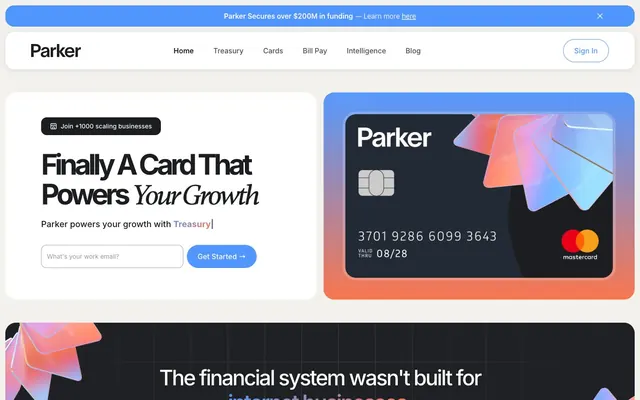
Preview image. Unlock full-res
Matte bluescreen material
Color palette
Interactive elements like links, outlined buttons, decorative accents, and the main brand color
Primary call-to-action button fills – a warm, inviting accent for crucial actions
Background for informational banners or highlights, providing a soft background contrast
Primary text, darkest surface background for sections, base UI elements like navigation
Page backgrounds, card surfaces, ghost button backgrounds, text on dark accents
Secondary text, muted icon fills, dividers in neutral contexts
Subtle background for UI elements, light card surfaces within sections
Hairline borders for cards and other UI components, subtle visual separation
Default border color for input fields
Typography
- Weights
- 400, 500, 600, 700
- Sizes
- 14px, 16px, 18px, 19px, 20px, 32px, 48px, 64px
- Line height
- 1.05, 1.13, 1.16, 1.42, 1.43, 1.5, 1.55
- Letter spacing
- -0.1em at 64px, -0.06em at 48px, -0.03em at 32px, -0.023em at 20px, -0.02em at 18px, 0.008em at 14px
- Fallback
- system-ui
Primary typeface for all UI elements, including body text, navigation, and smaller headings. Its compact nature supports dense information presentation without sacrificing clarity.
- Weights
- 500
- Sizes
- 51px, 64px
- Line height
- 1.05, 1.16
- Letter spacing
- -0.08em at 64px, -0.04em at 51px
- Fallback
- Georgia
Used for prominent display headlines, providing a distinctive, authoritative voice. Its moderate weight and tighter tracking set it apart for key statements.
- Weights
- 400, 500, 600
- Sizes
- 14px, 16px
- Line height
- 1.42, 1.5
system-ui — detected in extracted data but not described by AI
Spacing & shape
Elevation
Components
Filled button with Parker Orange (#f9754e) background and Pure White (#ffffff) text. Features a full pill shape (1584px border-radius) with 8px vertical and 24px horizontal padding.
Ghost button with a 1px Parker Blue (#5196fe) border and Parker Blue text. Full pill shape (1584px border-radius) with 8px vertical and 24px horizontal padding.
Ghost button with Pure White (#ffffff) background and Off-Black (#1b1d20) text, with no visible border. Full pill shape (1584px border-radius) with 8px vertical and 24px horizontal padding.
Pure White (#ffffff) background, with Border Gray (#e1dfd8) 1px border. Features a 24px border-radius and generous internal padding (48px top/bottom, 32px right, ~58px left).
Plain white background, Input Border (#a3a3a3) with a 1px border, and 12px border-radius. Internal padding is 8px vertical and 12px horizontal. Text is Medium Gray (#333333).
Off-Black (#1b1d20) background with Off-Black text. Features a 12.8px border-radius for a slightly rounded pill shape with 10px vertical and 20px horizontal padding.
Guidelines
- Always use the Parker Orange (#f9754e) for primary call-to-action button fills to maintain brand recognition and visual hierarchy.
- Apply 24px border-radius to all content cards and major section containers to maintain the friendly, soft aesthetic.
- Utilize Inter for all body text, UI labels, and most headings, adjusting weight to 400 for body and 600/700 for distinct headings.
- Ensure a horizontal padding of 24px and vertical of 8px for all buttons to achieve the consistent pill shape.
- Use Parker Blue (#5196fe) for all interactive links and secondary action outlines, ensuring clear visual distinction from primary actions.
- Maintain maximum content width at 1200px, centered on the page, with consistent 64px vertical section gaps.
- Use Gambetta for high-impact headlines (e.g., above 48px) with its defined tighter letter spacing (e.g., -0.08em at 64px) for a focused, bold statement.
- Do not use multiple accent colors for CTA buttons; restrict chromatic fills to Parker Orange and outlines to Parker Blue.
- Avoid sharp corners; all major UI elements like cards and buttons must adhere to the specified border-radii of 24px or 1584px.
- Do not introduce new typefaces; rely solely on Inter and Gambetta to preserve typographic rhythm and brand voice.
- Do not use generic gray backgrounds for prominent cards; use Pure White (#ffffff) or Ash Gray (#f2f1ec).
- Avoid heavy drop shadows; elevation should be subtle, defined by a single rgba(0,0,0,0.1) 0px 2px 10px 0px shadow for cards, or none at all.
- Do not vary line-height arbitrarily; stick to the defined ratios of 1.05 and 1.16 for display text and 1.42-1.55 for body text.
- Do not use less than 8px element gap for components unless explicitly defined in a specific component recipe.
About this system
ShowHide
Parker's visual system evokes a smart, modern financial platform with a distinct material quality. Cool grays and crisp whites form a quiet canvas that allows a vibrant blue and a warm orange to highlight key interactive elements and brand accents. Typography is compact and precise, maintaining readability while maximizing information density. Softly rounded cards and buttons provide a friendly tactile feel, contrasting with the directness of the color palette.
Reminiscent of Ramp, Brex, Mercury, Stripe.
# Join Parker — Style Reference
> Matte bluescreen material

**Theme:** light

**Site:** https://www.getparker.com

Parker's visual system evokes a smart, modern financial platform with a distinct material quality. Cool grays and crisp whites form a quiet canvas that allows a vibrant blue and a warm orange to highlight key interactive elements and brand accents. Typography is compact and precise, maintaining readability while maximizing information density. Softly rounded cards and buttons provide a friendly tactile feel, contrasting with the directness of the color palette.

## Tokens — Colors

| Name | Value | Token | Role |
|------|------|------|------|
| Parker Blue | `#5196fe` | `--color-parker-blue` | Interactive elements like links, outlined buttons, decorative accents, and the main brand color |
| Parker Orange | `#f9754e` | `--color-parker-orange` | Primary call-to-action button fills – a warm, inviting accent for crucial actions |
| Alert Blue | `#f4ebff` | `--color-alert-blue` | Background for informational banners or highlights, providing a soft background contrast |
| Off-Black | `#1b1d20` | `--color-off-black` | Primary text, darkest surface background for sections, base UI elements like navigation |
| Pure White | `#ffffff` | `--color-pure-white` | Page backgrounds, card surfaces, ghost button backgrounds, text on dark accents |
| Medium Gray | `#6e6e6e` | `--color-medium-gray` | Secondary text, muted icon fills, dividers in neutral contexts |
| Ash Gray | `#f2f1ec` | `--color-ash-gray` | Subtle background for UI elements, light card surfaces within sections |
| Border Gray | `#e1dfd8` | `--color-border-gray` | Hairline borders for cards and other UI components, subtle visual separation |
| Input Border | `#a3a3a3` | `--color-input-border` | Default border color for input fields |

## Tokens — Typography

### Inter
- **Substitute:** system-ui
- **Weights:** 400, 500, 600, 700
- **Sizes:** 14px, 16px, 18px, 19px, 20px, 32px, 48px, 64px
- **Line height:** 1.05, 1.13, 1.16, 1.42, 1.43, 1.5, 1.55
- **Letter spacing:** -0.1em at 64px, -0.06em at 48px, -0.03em at 32px, -0.023em at 20px, -0.02em at 18px, 0.008em at 14px
- **Role:** Primary typeface for all UI elements, including body text, navigation, and smaller headings. Its compact nature supports dense information presentation without sacrificing clarity.

### Gambetta
- **Substitute:** Georgia
- **Weights:** 500
- **Sizes:** 51px, 64px
- **Line height:** 1.05, 1.16
- **Letter spacing:** -0.08em at 64px, -0.04em at 51px
- **Role:** Used for prominent display headlines, providing a distinctive, authoritative voice. Its moderate weight and tighter tracking set it apart for key statements.

### system-ui
- **Weights:** 400, 500, 600
- **Sizes:** 14px, 16px
- **Line height:** 1.42, 1.5
- **Role:** system-ui — detected in extracted data but not described by AI

## Tokens — Type Scale

Major Third (1.25) from 16px base.

| Role | Size | Line height | Letter spacing |
|------|------|------|------|
| caption | 14px | 1.5 | 0.008em |
| body | 16px | 1.5 | — |
| body-lg | 18px | 1.43 | -0.02em |
| subheading | 20px | 1.42 | -0.023em |
| heading | 32px | 1.13 | -0.03em |
| heading-lg | 48px | 1.16 | -0.06em |
| display-sm | 51px | 1.16 | -0.04em |
| display | 64px | 1.05 | -0.08em |

## Tokens — Spacing

- **Max width:** 1200px
- **Section gap:** 64px
- **Card padding:** 24px
- **Element gap:** 8px

## Tokens — Radius

- **Buttons:** 1584px
- **Inputs:** 12px
- **Cards:** 24px
- **badges:** 12.8px

## Tokens — Elevation

- **Card:** `rgba(0, 0, 0, 0.1) 0px 2px 10px 0px`

## Components

### Primary Action Button (Orange)
*Call to action*

Filled button with Parker Orange (#f9754e) background and Pure White (#ffffff) text. Features a full pill shape (1584px border-radius) with 8px vertical and 24px horizontal padding.

### Outlined Action Button (Blue)
*Secondary action or link*

Ghost button with a 1px Parker Blue (#5196fe) border and Parker Blue text. Full pill shape (1584px border-radius) with 8px vertical and 24px horizontal padding.

### Neutral Ghost Button
*Tertiary action or navigation*

Ghost button with Pure White (#ffffff) background and Off-Black (#1b1d20) text, with no visible border. Full pill shape (1584px border-radius) with 8px vertical and 24px horizontal padding.

### Feature Card
*Content container*

Pure White (#ffffff) background, with Border Gray (#e1dfd8) 1px border. Features a 24px border-radius and generous internal padding (48px top/bottom, 32px right, ~58px left).

### Input Field
*User input*

Plain white background, Input Border (#a3a3a3) with a 1px border, and 12px border-radius. Internal padding is 8px vertical and 12px horizontal. Text is Medium Gray (#333333).

### Branded Pill Badge
*Categorization or status*

Off-Black (#1b1d20) background with Off-Black text. Features a 12.8px border-radius for a slightly rounded pill shape with 10px vertical and 20px horizontal padding.

## Guidelines

### Do

- Always use the Parker Orange (#f9754e) for primary call-to-action button fills to maintain brand recognition and visual hierarchy.
- Apply 24px border-radius to all content cards and major section containers to maintain the friendly, soft aesthetic.
- Utilize Inter for all body text, UI labels, and most headings, adjusting weight to 400 for body and 600/700 for distinct headings.
- Ensure a horizontal padding of 24px and vertical of 8px for all buttons to achieve the consistent pill shape.
- Use Parker Blue (#5196fe) for all interactive links and secondary action outlines, ensuring clear visual distinction from primary actions.
- Maintain maximum content width at 1200px, centered on the page, with consistent 64px vertical section gaps.
- Use Gambetta for high-impact headlines (e.g., above 48px) with its defined tighter letter spacing (e.g., -0.08em at 64px) for a focused, bold statement.

### Don't

- Do not use multiple accent colors for CTA buttons; restrict chromatic fills to Parker Orange and outlines to Parker Blue.
- Avoid sharp corners; all major UI elements like cards and buttons must adhere to the specified border-radii of 24px or 1584px.
- Do not introduce new typefaces; rely solely on Inter and Gambetta to preserve typographic rhythm and brand voice.
- Do not use generic gray backgrounds for prominent cards; use Pure White (#ffffff) or Ash Gray (#f2f1ec).
- Avoid heavy drop shadows; elevation should be subtle, defined by a single rgba(0,0,0,0.1) 0px 2px 10px 0px shadow for cards, or none at all.
- Do not vary line-height arbitrarily; stick to the defined ratios of 1.05 and 1.16 for display text and 1.42-1.55 for body text.
- Do not use less than 8px element gap for components unless explicitly defined in a specific component recipe.

## Agent Prompt Guide

### Quick Color Reference
text: #1b1d20
background: #ffffff
border: #e1dfd8
accent: #5196fe
primary action: #f9754e (filled action)

### 3-5 Example Component Prompts
1. Create a Primary Action Button: #f9754e background, #1b1d20 text, 9999px radius, compact pill padding. Use this filled treatment for the main CTA.
2. Create an outlined secondary button: background transparent, border 1px solid #5196fe, text #5196fe, Inter font weight 500, 1584px radius, 8px vertical and 24px horizontal padding, 'Learn More'.
3. Generate a feature card: background #ffffff, border 1px solid #e1dfd8, 24px radius, 48px top/bottom padding, 32px right padding, 58px left padding. Card title: Inter 32px weight 600, #1b1d20; Body text: Inter 16px weight 400, #6e6e6e.
4. Design an input field: background #ffffff, border 1px solid #a3a3a3, 12px radius, 8px vertical and 12px horizontal padding. Placeholder text: Inter 16px weight 400, #6e6e6e.
More like this









Keep what you find
A free account saves references to boards and can send you a weekly email of picks based on what you save.
To see every result, go Pro.