Preview image. Unlock full-res
Skyward Glide
Color palette
Dominant brand blue for primary backgrounds, full page sections, and active navigation indicators. Conveys innovation and optimism
Brand accent for navigation, subtle surface backgrounds, and graphic elements. Used in conjunction with other blues
Accent for navigation elements and small graphic details
Outlined button borders when interacting with light backgrounds; also used for informational icons and input borders
Subtle accent for navigation backgrounds and decorative graphics
Primary text, darkest backgrounds, interface borders
Off-white for backgrounds, secondary text, button outlines, and subtle card surfaces
Used for card box shadows, providing a soft lift
Typography
- Weights
- 500, 550
- Sizes
- 10px, 18px, 24px, 28px, 40px, 48px, 64px, 80px, 141px, 207px
- Line height
- 1, 1.05, 1.2
- Letter spacing
- -0.0300em, -0.0200em, -0.0100em
- Fallback
- Inter
Headlines and display text. The bold weights and precise tracking convey authority and a contemporary feel.
- Weights
- 400, 450, 500, 550
- Sizes
- 12px, 14px, 16px, 18px
- Line height
- 0.89, 1, 1.2, 1.3, 1.4
- Letter spacing
- -0.0200em, -0.0100em
- Fallback
- Inter
Body text, navigation links, and badges. Its slightly condensed nature at smaller sizes maintains a structured, purposeful tone.
- Weights
- 400
- Sizes
- 13px
- Line height
- 1.2
- Letter spacing
- normal
- Fallback
- Arial
Fallback and specific utility text, primarily for buttons and icons where system legibility is prioritized.
- Weights
- 500
- Sizes
- 12px
- Line height
- 1.2
- Letter spacing
- -0.0300em
- Fallback
- Inter
Used for specific body and icon text, featuring tighter tracking for a more compact impression.
Spacing & shape
Components
Background: transparent (rgba(0, 0, 0, 0)), Text: Cloud Whisper (#f5f4df), Border: Cloud Whisper (#f5f4df), Radius: 0px, Padding: 0px.
Background: transparent (rgba(0, 0, 0, 0)), Text: Horizon Blue (#083e6f), Border: Horizon Blue (#083e6f), Radius: 0px, Padding: 0px.
Background: Skybound Blue (#007ae5), Text: Cloud Whisper (#f5f4df), Border Radius: 16px, Shadow: rgba(0, 0, 0, 0.3) 0px 16px 47.6px 0px, Padding: 0px. Headings use 'JobyDisplay' 550, body uses 'jobyText' 400.
Background: Skybound Blue (#007ae5), Border Radius: 160px 160px 0px 0px, Shadow: none, Padding: 0px 40px 0px 40px. Content within uses 'JobyDisplay' for titles and 'jobyText' for descriptive text, typically in Cloud Whisper.
Background: transparent (rgba(0, 0, 0, 0)), Text/Placeholder: Cloud Whisper (#f5f4df), Border: Cloud Whisper (#f5f4df), Radius: 0px, Padding: 0px.
Background: transparent (rgba(0, 0, 0, 0)), Text: Cloud Whisper (#f5f4df), Radius: 0px, Padding: 0px.
Guidelines
- Always use Midnight Ink (#0e1620) for primary text on light backgrounds and Cloud Whisper (#f5f4df) for text on dark/brand backgrounds to maintain high contrast (16.4:1 AAA on Cloud Whisper).
- Employ JobyDisplay for all headings and JobyText for body copy, adjusting letter-spacing per size: tighter for display text (-0.0300em) and slightly looser for body text (-0.0100em).
- Utilize Skybound Blue (#007ae5) as the primary background color for immersive sections, conveying the brand's core identity.
- Apply 16px border-radius to standard cards and 160px 160px 0px 0px for distinctive, flowing card shapes in prominent areas.
- Maintain a spacious layout with a consistent elementGap of 8px and a sectionGap of approximately 113px for clear content separation.
- Use Horizon Blue (#083e6f) as the border color for outlined ghost buttons on light backgrounds, ensuring brand-aligned interactivity.
- Integrate expressive motion with ease timing and 0.4s duration for transitions like transform, visibility, and opacity to enhance perceived responsiveness.
- Avoid using highly saturated colors for large text blocks; reserve them for accents or backgrounds.
- Do not use box-shadows on elements not explicitly defined with one; maintain a generally flat aesthetic unless an element needs distinct visual elevation (like the Feature Card's rgba(0, 0, 0, 0.3) 0px 16px 47.6px 0px).
- Do not deviate from the established font families and their respective weights; consistency is key to brand recognition.
- Refrain from tight spacing between content blocks or elements; maintain the spacious feel with the established elementGap and sectionGap values.
- Do not use generic system font Arial unless it's for specific, small utility components where JobyText doesn't fit the specified size range.
- Avoid arbitrary border radii; stick to the defined 16px, 8px, 160px, or 147.6px values for visual consistency and brand recognition.
- Never use primary brand colors like Skybound Blue or Cosmic Violet for primary action text or borders. Interactivity for primary actions is conveyed through ghost buttons with specific text/border colors (e.g., Cloud Whisper or Horizon Blue).
About this system
ShowHide
Joby Aviation's visual system evokes a sense of aspirational flight and advanced technology. The primary design language pairs deep, saturated blues with stark white typography, creating a high-contrast, almost nocturnal-but-optimistic feel. Large, asymmetric rounded forms in backgrounds and card elements suggest fluidity and motion, while the overall spaciousness and minimal use of decorative elements keep the focus on the product's promise.
The page primarily utilizes a full-bleed layout, where background imagery and brand colors extend to the viewport edges, especially in the hero section. Content is typically centered within this full-bleed context. The hero section features a dramatic, large-scale image with a prominent, centered headline. Subsequent sections exhibit consistent vertical spacing, often switching between full-bleed brand color backgrounds (Skybound Blue) and white content areas. A loose, implicit grid is used for feature presentation, combining text and visuals. Navigation consists of a sticky top bar with minimal links.
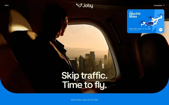
The visual language predominantly features high-contrast, moody photography showcasing an individual looking out of an aircraft window at a city skyline, emphasizing aspiration and cutting-edge travel. Imagery is often full-bleed or large-scale, providing an immersive experience. Product shots are not explicitly shown but implied. Iconography is minimal and appears as stroke-based and monochromatic, consistent with the overall clean UI. Imagery serves a decorative and atmospheric role, setting the brand's aspirational tone rather than explaining specific features.
Reminiscent of Archer Aviation, Boom Supersonic, Airbus, Impossible Foods.
# Joby Aviation — Style Reference
> Skyward Glide

**Theme:** light

**Site:** https://www.jobyaviation.com

Joby Aviation's visual system evokes a sense of aspirational flight and advanced technology. The primary design language pairs deep, saturated blues with stark white typography, creating a high-contrast, almost nocturnal-but-optimistic feel. Large, asymmetric rounded forms in backgrounds and card elements suggest fluidity and motion, while the overall spaciousness and minimal use of decorative elements keep the focus on the product's promise.

## Tokens — Colors

| Name | Value | Token | Role |
|------|------|------|------|
| Skybound Blue | `#007ae5` | `--color-skybound-blue` | Dominant brand blue for primary backgrounds, full page sections, and active navigation indicators. Conveys innovation and optimism |
| Cosmic Violet | `#1c3f99` | `--color-cosmic-violet` | Brand accent for navigation, subtle surface backgrounds, and graphic elements. Used in conjunction with other blues |
| Sunset Orange | `#eb6110` | `--color-sunset-orange` | Accent for navigation elements and small graphic details |
| Horizon Blue | `#083e6f` | `--color-horizon-blue` | Outlined button borders when interacting with light backgrounds; also used for informational icons and input borders |
| Pale Peach | `#ffd9c9` | `--color-pale-peach` | Subtle accent for navigation backgrounds and decorative graphics |
| Midnight Ink | `#0e1620` | `--color-midnight-ink` | Primary text, darkest backgrounds, interface borders |
| Cloud Whisper | `#f5f4df` | `--color-cloud-whisper` | Off-white for backgrounds, secondary text, button outlines, and subtle card surfaces |
| Shadow Grey | `#abab9c` | `--color-shadow-grey` | Used for card box shadows, providing a soft lift |

## Tokens — Typography

### JobyDisplay
- **Substitute:** Inter
- **Weights:** 500, 550
- **Sizes:** 10px, 18px, 24px, 28px, 40px, 48px, 64px, 80px, 141px, 207px
- **Line height:** 1, 1.05, 1.2
- **Letter spacing:** -0.0300em, -0.0200em, -0.0100em
- **Role:** Headlines and display text. The bold weights and precise tracking convey authority and a contemporary feel.

### jobyText
- **Substitute:** Inter
- **Weights:** 400, 450, 500, 550
- **Sizes:** 12px, 14px, 16px, 18px
- **Line height:** 0.89, 1, 1.2, 1.3, 1.4
- **Letter spacing:** -0.0200em, -0.0100em
- **Role:** Body text, navigation links, and badges. Its slightly condensed nature at smaller sizes maintains a structured, purposeful tone.

### Arial
- **Substitute:** Arial
- **Weights:** 400
- **Sizes:** 13px
- **Line height:** 1.2
- **Letter spacing:** normal
- **Role:** Fallback and specific utility text, primarily for buttons and icons where system legibility is prioritized.

### Joby Sans Display
- **Substitute:** Inter
- **Weights:** 500
- **Sizes:** 12px
- **Line height:** 1.2
- **Letter spacing:** -0.0300em
- **Role:** Used for specific body and icon text, featuring tighter tracking for a more compact impression.

## Tokens — Type Scale

Perfect Fourth (1.333) from 14px base.

| Role | Size | Line height | Letter spacing |
|------|------|------|------|
| caption | 10px | 1 | -0.03em |
| body | 14px | 1.3 | -0.01em |
| subheading | 18px | 1.4 | -0.01em |
| heading-sm | 24px | 1.2 | -0.02em |
| heading | 28px | 1.05 | -0.02em |
| heading-lg | 40px | 1.05 | -0.03em |
| display | 64px | 1.05 | -0.03em |

## Tokens — Spacing

- **Section gap:** 113px
- **Card padding:** 40px
- **Element gap:** 8px

## Tokens — Radius

- **Default:** 8px
- **Cards:** 16px
- **asymmetricCards:** 160px 160px 0px 0px
- **otherLarge:** 147.6px

## Layout

The page primarily utilizes a full-bleed layout, where background imagery and brand colors extend to the viewport edges, especially in the hero section. Content is typically centered within this full-bleed context. The hero section features a dramatic, large-scale image with a prominent, centered headline. Subsequent sections exhibit consistent vertical spacing, often switching between full-bleed brand color backgrounds (Skybound Blue) and white content areas. A loose, implicit grid is used for feature presentation, combining text and visuals. Navigation consists of a sticky top bar with minimal links.

## Imagery

The visual language predominantly features high-contrast, moody photography showcasing an individual looking out of an aircraft window at a city skyline, emphasizing aspiration and cutting-edge travel. Imagery is often full-bleed or large-scale, providing an immersive experience. Product shots are not explicitly shown but implied. Iconography is minimal and appears as stroke-based and monochromatic, consistent with the overall clean UI. Imagery serves a decorative and atmospheric role, setting the brand's aspirational tone rather than explaining specific features.

## Components

### Ghost Navigation Button (Light Text)
*Interactive element for navigation or secondary actions, appearing on dark backgrounds.*

Background: transparent (rgba(0, 0, 0, 0)), Text: Cloud Whisper (#f5f4df), Border: Cloud Whisper (#f5f4df), Radius: 0px, Padding: 0px.

### Ghost Navigation Button (Dark Text)
*Interactive element for navigation or secondary actions, appearing on light backgrounds.*

Background: transparent (rgba(0, 0, 0, 0)), Text: Horizon Blue (#083e6f), Border: Horizon Blue (#083e6f), Radius: 0px, Padding: 0px.

### Feature Card (Blue BG)
*Container for showcasing features or information, using the primary brand blue.*

Background: Skybound Blue (#007ae5), Text: Cloud Whisper (#f5f4df), Border Radius: 16px, Shadow: rgba(0, 0, 0, 0.3) 0px 16px 47.6px 0px, Padding: 0px. Headings use 'JobyDisplay' 550, body uses 'jobyText' 400.

### Hero Section Card
*Prominent card used in hero sections, often with asymmetric rounded corners.*

Background: Skybound Blue (#007ae5), Border Radius: 160px 160px 0px 0px, Shadow: none, Padding: 0px 40px 0px 40px. Content within uses 'JobyDisplay' for titles and 'jobyText' for descriptive text, typically in Cloud Whisper.

### Ghost Input
*Input field for user entry, designed for dark backgrounds.*

Background: transparent (rgba(0, 0, 0, 0)), Text/Placeholder: Cloud Whisper (#f5f4df), Border: Cloud Whisper (#f5f4df), Radius: 0px, Padding: 0px.

### Context Badge
*Small informational or labeling element.*

Background: transparent (rgba(0, 0, 0, 0)), Text: Cloud Whisper (#f5f4df), Radius: 0px, Padding: 0px.

## Guidelines

### Do

- Always use Midnight Ink (#0e1620) for primary text on light backgrounds and Cloud Whisper (#f5f4df) for text on dark/brand backgrounds to maintain high contrast (16.4:1 AAA on Cloud Whisper).
- Employ JobyDisplay for all headings and JobyText for body copy, adjusting letter-spacing per size: tighter for display text (-0.0300em) and slightly looser for body text (-0.0100em).
- Utilize Skybound Blue (#007ae5) as the primary background color for immersive sections, conveying the brand's core identity.
- Apply 16px border-radius to standard cards and 160px 160px 0px 0px for distinctive, flowing card shapes in prominent areas.
- Maintain a spacious layout with a consistent elementGap of 8px and a sectionGap of approximately 113px for clear content separation.
- Use Horizon Blue (#083e6f) as the border color for outlined ghost buttons on light backgrounds, ensuring brand-aligned interactivity.
- Integrate expressive motion with ease timing and 0.4s duration for transitions like transform, visibility, and opacity to enhance perceived responsiveness.

### Don't

- Avoid using highly saturated colors for large text blocks; reserve them for accents or backgrounds.
- Do not use box-shadows on elements not explicitly defined with one; maintain a generally flat aesthetic unless an element needs distinct visual elevation (like the Feature Card's rgba(0, 0, 0, 0.3) 0px 16px 47.6px 0px).
- Do not deviate from the established font families and their respective weights; consistency is key to brand recognition.
- Refrain from tight spacing between content blocks or elements; maintain the spacious feel with the established elementGap and sectionGap values.
- Do not use generic system font Arial unless it's for specific, small utility components where JobyText doesn't fit the specified size range.
- Avoid arbitrary border radii; stick to the defined 16px, 8px, 160px, or 147.6px values for visual consistency and brand recognition.
- Never use primary brand colors like Skybound Blue or Cosmic Violet for primary action text or borders. Interactivity for primary actions is conveyed through ghost buttons with specific text/border colors (e.g., Cloud Whisper or Horizon Blue).

## Agent Prompt Guide

Quick Color Reference:
text: #0e1620
background: #007ae5
border: #f5f4df
accent: #083e6f
primary action: #083e6f (outlined action border)

Example Component Prompts:
1. Create a hero section: full-bleed Skybound Blue (#007ae5) background, centered headline 'Skip traffic. Time to fly.' in JobyDisplay weight 550, size 80px, Cloud Whisper (#f5f4df) color, letter-spacing -0.03em. Max-width 1200px. Add a Ghost Navigation Button (Light Text) 'Investors' on the top right using JobyText weight 400, size 16px, transparent background, Cloud Whisper (#f5f4df) border and text.
2. Design a feature card: Background Skybound Blue (#007ae5), 16px border-radius, box-shadow rgba(0, 0, 0, 0.3) 0px 16px 47.6px 0px. Headline 'Technology that makes the dream possible' in JobyDisplay weight 500, size 24px, Cloud Whisper (#f5f4df). Body text 'Achieve seamless door to door travel with our innovative electric air taxi.' in jobyText weight 400, size 16px, Cloud Whisper (#f5f4df). No padding on card itself, content uses elementGap: 8px.
3. Implement a secondary navigation link: 'Discover the Experience' using jobyText weight 400, size 18px, Midnight Ink (#0e1620) text color, with a Horizon Blue (#083e6f) 1.5px solid border on hover, padding 15px top/right/bottom/left. Ensure base elementGap of 8px around it.
More like this









Keep what you find
A free account saves references to boards and can send you a weekly email of picks based on what you save.
To see every result, go Pro.