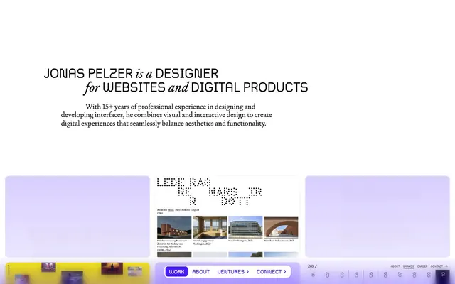
Preview image. Unlock full-res
dot-matrix digital blueprint
Color palette
Violet outline accent for tags, dividers, and focused UI edges. Do not promote it to the primary CTA color
Violet accent for outlined action borders, linked labels, and lightweight interactive emphasis. Do not promote it to the primary CTA color
Violet text accent for links, tags, and emphasized short phrases. Do not promote it to the primary CTA color
Page backgrounds, card surfaces, ghost button backgrounds, active navigation text
Primary text, headings, body copy, list items, card text, general borders, button outlines
Subtle button borders, decorative strokes
Typography
- Weights
- 400
- Sizes
- 13px, 14px, 17px, 22px, 42px
- Line height
- 1, 1.1, 1.2
- Letter spacing
- 0.0200em at 13-14px, 0.0250em at 17-22px, 0.0360em at 42px
- Fallback
- IBM Plex Mono
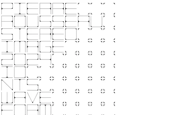
Display headings and navigation items — its monospaced, dot-matrix character is a signature choice, giving a distinct digital, architectural feel. This font defines the brand's machine-like precision.
- Weights
- 400
- Sizes
- 15px, 16px, 18px, 22px, 25px, 42px
- Line height
- 1, 1.2
- Letter spacing
- 0.0200em
- Fallback
- Playfair Display
Body copy, list items, and subheadings — its classic serif presence grounds the design, providing readability and a timeless counterpoint to the more rigid display font. Offers a sense of established authority.
Spacing & shape
Elevation
Components
Transparent background with a subtle border in Ghost Gray (#d4d6dd). Text is Ink Black (#000000). Radius is 12px. Used for navigation elements and low-hierarchy actions, maintaining a minimal aesthetic.
Transparent background, Muted Lilac (#d7ccff) border at 1px. Text is Action Grape (#5d35ff). Padding is 6px vertical, 14px horizontal. Radius is 12px. Visually distinct as the primary action through its chromatic outline and text color.
Background in Muted Lilac (rgba(53, 2, 255, 0.1)), with a 12px border-radius. No box shadow. Used to subtly contain portfolio items, featuring a soft violet tint.
Background in Digital Violet (#3502ff), text in Canvas White (#ffffff). Radius is 3.5px for individual items, contained within a navbar with 8.26px radius. Creates a strong visual cue for the active state.
Background opacity of Canvas White (rgba(255, 255, 255, 0.3)), with a Digital Violet (rgba(53, 2, 255, 0.2)) border. Blur filter of 10px applied. Has a radius of 8.26px and a shadow rgba(53, 2, 255, 0.1) 0px 1px 4px 2px.
Guidelines
- Prioritize Canvas White (#ffffff) for page backgrounds to maintain an open, clean aesthetic.
- Use Ink Black (#000000) for all primary text elements, ensuring high contrast and legibility.
- Apply Digital Violet (#3502ff) exclusively for active navigation states and decorative accents.
- Use the Scope typeface for all headings and navigation to leverage its distinctive digital character.
- Employ a 12px border-radius for all cards and buttons to ensure a consistent softened aesthetic.
- Utilize Muted Lilac (#d7ccff) for ghost button outlines and subtle card backgrounds.
- Maintain a compact elementGap of 5px to keep interactive elements closely related.
- Do not use highly saturated colors for large background areas; maintain a light monochromatic base.
- Avoid heavy drop shadows; implement transparent shadows like rgba(53, 2, 255, 0.1) 0px 1px 4px 2px sparingly, only for elevated components like the navigation wrap.
- Do not use generic system fonts for headings; maintain the distinct visual identity provided by Scope.
- Do not apply excessive padding to cards or buttons; adhere to the compact 6px vertical, 14px horizontal button padding and 14px card padding.
- Do not introduce strong visual dividers between sections; rely on spacing and subtle background shifts to define content blocks.
- Avoid bold or heavy weights for any typeface; the design relies on the weight 400 of Scope and Signifier for consistent typography.
- Do not use solid fills for primary action buttons; always use the outlined Muted Lilac style.
About this system
ShowHide
Jonas Pelzer's design system evokes an industrial, dot-matrix digital aesthetic on a clean white canvas. Typography blends a monospaced display font with a classic serif for body text, creating a tech-forward yet grounded feel. Interactions are highlighted with a distinct violet, often in subtle outlines or transparent fills, suggesting responsive interfaces and active states without overwhelming the stark, high-contrast monochrome base. Surface treatments favor soft, rounded cards and ghost buttons, maintaining lightness across the layout.
Reminiscent of Figma, Linear, Read.cv, Stripe (early designs).
# Jonas Pelzer — Style Reference
> dot-matrix digital blueprint

**Theme:** light

**Site:** https://jonaspelzer.com

Jonas Pelzer's design system evokes an industrial, dot-matrix digital aesthetic on a clean white canvas. Typography blends a monospaced display font with a classic serif for body text, creating a tech-forward yet grounded feel. Interactions are highlighted with a distinct violet, often in subtle outlines or transparent fills, suggesting responsive interfaces and active states without overwhelming the stark, high-contrast monochrome base. Surface treatments favor soft, rounded cards and ghost buttons, maintaining lightness across the layout.

## Tokens — Colors

| Name | Value | Token | Role |
|------|------|------|------|
| Digital Violet | `#3502ff` | `--color-digital-violet` | Violet outline accent for tags, dividers, and focused UI edges. Do not promote it to the primary CTA color |
| Muted Lilac | `#d7ccff` | `--color-muted-lilac` | Violet accent for outlined action borders, linked labels, and lightweight interactive emphasis. Do not promote it to the primary CTA color |
| Action Grape | `#5d35ff` | `--color-action-grape` | Violet text accent for links, tags, and emphasized short phrases. Do not promote it to the primary CTA color |
| Canvas White | `#ffffff` | `--color-canvas-white` | Page backgrounds, card surfaces, ghost button backgrounds, active navigation text |
| Ink Black | `#000000` | `--color-ink-black` | Primary text, headings, body copy, list items, card text, general borders, button outlines |
| Ghost Gray | `#d4d6dd` | `--color-ghost-gray` | Subtle button borders, decorative strokes |

## Tokens — Typography

### Scope
- **Substitute:** IBM Plex Mono
- **Weights:** 400
- **Sizes:** 13px, 14px, 17px, 22px, 42px
- **Line height:** 1, 1.1, 1.2
- **Letter spacing:** 0.0200em at 13-14px, 0.0250em at 17-22px, 0.0360em at 42px
- **Role:** Display headings and navigation items — its monospaced, dot-matrix character is a signature choice, giving a distinct digital, architectural feel. This font defines the brand's machine-like precision.

### Signifier
- **Substitute:** Playfair Display
- **Weights:** 400
- **Sizes:** 15px, 16px, 18px, 22px, 25px, 42px
- **Line height:** 1, 1.2
- **Letter spacing:** 0.0200em
- **Role:** Body copy, list items, and subheadings — its classic serif presence grounds the design, providing readability and a timeless counterpoint to the more rigid display font. Offers a sense of established authority.

## Tokens — Type Scale

Perfect Fourth (1.333) from 15px base.

| Role | Size | Line height | Letter spacing |
|------|------|------|------|
| caption | 13px | 1.1 | 0.26px |
| body | 15px | 1.2 | 0.3px |
| heading-sm | 22px | 1 | 0.55px |
| heading | 25px | 1 | 0.5px |
| display | 42px | 1 | 1.512px |

## Tokens — Spacing

- **Section gap:** 64px
- **Card padding:** 14px
- **Element gap:** 5px

## Tokens — Radius

- **Default:** 12px
- **Buttons:** 12px
- **Cards:** 12px
- **navbar:** 8.26px
- **navbarItem:** 3.5px

## Tokens — Elevation

- **Navigation Wrap:** `rgba(53, 2, 255, 0.1) 0px 1px 4px 2px`

## Components

### Ghost Button
*Navigation and secondary actions*

Transparent background with a subtle border in Ghost Gray (#d4d6dd). Text is Ink Black (#000000). Radius is 12px. Used for navigation elements and low-hierarchy actions, maintaining a minimal aesthetic.

### Outlined Violet Button
*Primary Call to Action*

Transparent background, Muted Lilac (#d7ccff) border at 1px. Text is Action Grape (#5d35ff). Padding is 6px vertical, 14px horizontal. Radius is 12px. Visually distinct as the primary action through its chromatic outline and text color.

### Work Card
*Portfolio item container*

Background in Muted Lilac (rgba(53, 2, 255, 0.1)), with a 12px border-radius. No box shadow. Used to subtly contain portfolio items, featuring a soft violet tint.

### Navigation Link (Active)
*Current page indicator*

Background in Digital Violet (#3502ff), text in Canvas White (#ffffff). Radius is 3.5px for individual items, contained within a navbar with 8.26px radius. Creates a strong visual cue for the active state.

### Navigation Wrap
*Container for primary navigation*

Background opacity of Canvas White (rgba(255, 255, 255, 0.3)), with a Digital Violet (rgba(53, 2, 255, 0.2)) border. Blur filter of 10px applied. Has a radius of 8.26px and a shadow rgba(53, 2, 255, 0.1) 0px 1px 4px 2px.

## Guidelines

### Do

- Prioritize Canvas White (#ffffff) for page backgrounds to maintain an open, clean aesthetic.
- Use Ink Black (#000000) for all primary text elements, ensuring high contrast and legibility.
- Apply Digital Violet (#3502ff) exclusively for active navigation states and decorative accents.
- Use the Scope typeface for all headings and navigation to leverage its distinctive digital character.
- Employ a 12px border-radius for all cards and buttons to ensure a consistent softened aesthetic.
- Utilize Muted Lilac (#d7ccff) for ghost button outlines and subtle card backgrounds.
- Maintain a compact elementGap of 5px to keep interactive elements closely related.

### Don't

- Do not use highly saturated colors for large background areas; maintain a light monochromatic base.
- Avoid heavy drop shadows; implement transparent shadows like rgba(53, 2, 255, 0.1) 0px 1px 4px 2px sparingly, only for elevated components like the navigation wrap.
- Do not use generic system fonts for headings; maintain the distinct visual identity provided by Scope.
- Do not apply excessive padding to cards or buttons; adhere to the compact 6px vertical, 14px horizontal button padding and 14px card padding.
- Do not introduce strong visual dividers between sections; rely on spacing and subtle background shifts to define content blocks.
- Avoid bold or heavy weights for any typeface; the design relies on the weight 400 of Scope and Signifier for consistent typography.
- Do not use solid fills for primary action buttons; always use the outlined Muted Lilac style.

## Agent Prompt Guide

### Quick Color Reference
Text: #000000
Background: #ffffff
Border: #000000
Accent: #3502ff
primary action: #d7ccff (outlined action border)

### 3-5 Example Component Prompts
1. Create a hero section: Canvas White background. Headline 'JONAS PELZER is a DESIGNER' using Scope, weight 400, size 42px, Ink Black, with 0.0360em letter-spacing. Subtext 'With 15+ years of professional experience...' using Signifier, weight 400, size 18px, Ink Black, 0.0200em letter-spacing.
2. Design an 'Outlined Violet Button': with Muted Lilac (#d7ccff) border, Action Grape (#5d35ff) text 'See more work' using Scope, weight 400, size 14px, 6px vertical padding, 14px horizontal padding, and 12px border-radius.
3. Implement a 'Work Card': Muted Lilac (rgba(53, 2, 255, 0.1)) background, 12px border-radius, no shadow, with 14px padding inside for content.
4. Build an 'Active Navigation Link': Digital Violet (#3502ff) background, Canvas White (#ffffff) text 'Work' using Scope, weight 400, size 17px, 6px vertical padding, 14px horizontal padding, and 3.5px border-radius.
5. Create a sticky 'Navigation Wrap': Canvas White (rgba(255, 255, 255, 0.3)) background, 8.26px border-radius, with a Digital Violet (rgba(53, 2, 255, 0.2)) border and a shadow of rgba(53, 2, 255, 0.1) 0px 1px 4px 2px, and a blur(10px) filter applied.

## Motion Philosophy

Motion interactions are controlled and expressive, with a preference for 'ease' timing functions. Durations mostly in the 0.2s to 0.8s range suggest noticeable but not distracting transitions. Common transformations like 'transform' indicate subtle shifts and movements to guide user attention without being overly flashy. The personality is expressive, hinting at delightful micro-interactions without sacrificing professionalism.
More like this









Keep what you find
A free account saves references to boards and can send you a weekly email of picks based on what you save.
To see every result, go Pro.