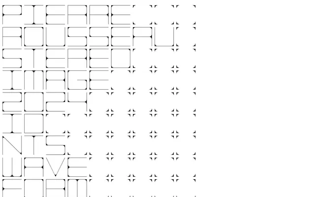
Preview image. Unlock full-res
monochrome digital canvas, with precise typographic elements
Color palette
Interactive elements, outlined link borders, active text states — a vibrant focal point against an achromatic base
Page backgrounds, large inactive UI surfaces
Primary text, borders for structural elements, emphasis
Typography
- Weights
- 400, 700
- Sizes
- 13px
- Line height
- 1, 1.3
- Letter spacing
- 0.03em
- Fallback
- Space Mono
Body text, navigation links, metadata, and general content where legibility and a consistent monospace aesthetic are key
- Weights
- 400
- Sizes
- 124px
- Line height
- 0.8
- Fallback
- Oxanium
Large, decorative headlines and key navigational elements, creating a distinctive, highly stylized visual identity with its low line height for tight stacking
Spacing & shape
Components
Uses 'Apato' at 124px weight 400 for a large, impactful statement. Default text is Midnight Ink (#000000). Active or hovered states are indicated by an Electric Blue (#0000ff) outline or background, with a tight lineHeight of 0.8 to stack text closely.
Set in 'LL Mono Book Web' at 13px weight 400 with a lineHeight of 1.3. Text color is Midnight Ink (#000000). Features a subtle letterSpacing of 0.03em for a precise, legible feel.
Rendered in 'LL Mono Book Web' at 13px weight 400, with an Electric Blue (#0000ff) color for both text and an implied border upon interaction (like underline or highlight). Has a lineHeight of 1.0.
A div or section element with a subtle Canvas Ice (#dddddd) background. Features internal padding of 6px on top and left, 5px on right, and 27px on bottom, creating asymmetric visual tension. All borders are sharp at 0px radius.
Guidelines
- Prioritize a minimalist aesthetic; use Canvas Ice (#dddddd) for primary backgrounds and Midnight Ink (#000000) for all primary text and structural borders.
- Introduce Electric Blue (#0000ff) sparingly, exclusively for interactive elements like links and hover states, to ensure high visual impact.
- Employ 'Apato' at 124px weight 400 for all large, statement headlines and main navigation entries, ensuring a lineHeight of 0.8 for a dense, architectural look.
- Use 'LL Mono Book Web' at 13px weight 400 for all body text and secondary information, distinguishing it with a 0.03em letter-spacing and 1.3 lineHeight.
- Maintain sharp, 0px border radii across all elements; rounded corners are not part of this visual vocabulary.
- Utilize a base spacing unit of 6px; apply 13px for general element gaps and 18px for vertical section spacing.
- Ensure all interactive elements, particularly links, are clearly distinguishable with Electric Blue (#0000ff), often presented as an outlined border rather than a filled background.
- Avoid superfluous gradients, shadows, or complex textures; stick to solid colors and stark contrasts.
- Do not use generic system fonts; 'LL Mono Book Web' and 'Apato' define the typographic identity.
- Refrain from introducing additional saturated colors; Electric Blue (#0000ff) is the sole accent color.
- Do not use rounded corners; all interface elements should maintain sharp, 0px radii.
- Avoid verbose text or dense paragraphs; content should be presented concisely, often in list format or short statements.
- Do not break the strict monochromatic palette with imagery; stick to abstract graphics and text-based visuals.
- Do not deviate from the specified Apato line height of 0.8 for headlines; this low value is critical to the visual identity.
About this system
ShowHide
Pierre Rousseau manifests a stark, conceptual interface, operating like a digital gallery for sonic art. Its sparse monochrome canvas is punctuated by precise geometric typography and a singular, vivid blue accent for interactive elements, which acts as a focused highlight against the otherwise understated aesthetic. The overall impression is one of minimalist precision, emphasizing content through its deliberate presentation rather than decorative flourishing.
The page employs a full-bleed layout, taking up the entire viewport without a fixed max-width. The hero section features extremely large, highly stylized 'Apato' typography (124px) for the brand name, arranged in a custom grid-like fashion that dominates the left half of the screen. This typographic hero establishes the site's unique visual identity immediately. Content sections that follow maintain a strong left alignment. Vertical rhythm is governed by 18px section gaps and 13px element gaps, creating a comfortable yet precise density. Navigation elements are integrated directly into the page content, often as large, interactive typographic blocks, rather than a conventional top bar or sidebar. The layout is unconventional, prioritizing visual impact and artistic expression over standard information hierarchy, leading to a text-dominant, almost graphic design as content approach.
The site's visual language is purely typographic and conceptual. There are no photographs, illustrations, or product screenshots. Imagery is created through the stylized interplay of geometric font forms, acting as decorative elements. Iconography is also conceptual, represented by asterisk-like symbols that are part of the 'Apato' font or character set, integrated into the larger typographic elements.
Reminiscent of B&O (Bang & Olufsen), Certain typeFoundries' sites (e.g., Vulf), Electronic music artist portfolios, Daniel Buren Estate.
# Pierre Rousseau — Style Reference
> monochrome digital canvas, with precise typographic elements

**Theme:** light

**Site:** https://pierrerousseau.info

Pierre Rousseau manifests a stark, conceptual interface, operating like a digital gallery for sonic art. Its sparse monochrome canvas is punctuated by precise geometric typography and a singular, vivid blue accent for interactive elements, which acts as a focused highlight against the otherwise understated aesthetic. The overall impression is one of minimalist precision, emphasizing content through its deliberate presentation rather than decorative flourishing.

## Tokens — Colors

| Name | Value | Token | Role |
|------|------|------|------|
| Electric Blue | `#0000ff` | `--color-electric-blue` | Interactive elements, outlined link borders, active text states — a vibrant focal point against an achromatic base |
| Canvas Ice | `#dddddd` | `--color-canvas-ice` | Page backgrounds, large inactive UI surfaces |
| Midnight Ink | `#000000` | `--color-midnight-ink` | Primary text, borders for structural elements, emphasis |

## Tokens — Typography

### LL Mono Book Web
- **Substitute:** Space Mono
- **Weights:** 400, 700
- **Sizes:** 13px
- **Line height:** 1, 1.3
- **Letter spacing:** 0.03em
- **Role:** Body text, navigation links, metadata, and general content where legibility and a consistent monospace aesthetic are key

### Apato
- **Substitute:** Oxanium
- **Weights:** 400
- **Sizes:** 124px
- **Line height:** 0.8
- **Role:** Large, decorative headlines and key navigational elements, creating a distinctive, highly stylized visual identity with its low line height for tight stacking

## Tokens — Type Scale

| Role | Size | Line height | Letter spacing |
|------|------|------|------|
| display | 124px | 0.8 | — |

## Tokens — Spacing

- **Card padding:** 12px
- **Element gap:** 13px

## Tokens — Radius

- **Default:** 0px

## Layout

The page employs a full-bleed layout, taking up the entire viewport without a fixed max-width. The hero section features extremely large, highly stylized 'Apato' typography (124px) for the brand name, arranged in a custom grid-like fashion that dominates the left half of the screen. This typographic hero establishes the site's unique visual identity immediately. Content sections that follow maintain a strong left alignment. Vertical rhythm is governed by 18px section gaps and 13px element gaps, creating a comfortable yet precise density. Navigation elements are integrated directly into the page content, often as large, interactive typographic blocks, rather than a conventional top bar or sidebar. The layout is unconventional, prioritizing visual impact and artistic expression over standard information hierarchy, leading to a text-dominant, almost graphic design as content approach.

## Imagery

The site's visual language is purely typographic and conceptual. There are no photographs, illustrations, or product screenshots. Imagery is created through the stylized interplay of geometric font forms, acting as decorative elements. Iconography is also conceptual, represented by asterisk-like symbols that are part of the 'Apato' font or character set, integrated into the larger typographic elements.

## Components

### Main Navigation Link
*Primary navigational elements and section titles*

Uses 'Apato' at 124px weight 400 for a large, impactful statement. Default text is Midnight Ink (#000000). Active or hovered states are indicated by an Electric Blue (#0000ff) outline or background, with a tight lineHeight of 0.8 to stack text closely.

### Body Text Block
*Informational paragraphs and descriptions*

Set in 'LL Mono Book Web' at 13px weight 400 with a lineHeight of 1.3. Text color is Midnight Ink (#000000). Features a subtle letterSpacing of 0.03em for a precise, legible feel.

### Info Link
*External links and contact information*

Rendered in 'LL Mono Book Web' at 13px weight 400, with an Electric Blue (#0000ff) color for both text and an implied border upon interaction (like underline or highlight). Has a lineHeight of 1.0.

### Content Wrapper
*Container for content sections*

A div or section element with a subtle Canvas Ice (#dddddd) background. Features internal padding of 6px on top and left, 5px on right, and 27px on bottom, creating asymmetric visual tension. All borders are sharp at 0px radius.

## Guidelines

### Do

- Prioritize a minimalist aesthetic; use Canvas Ice (#dddddd) for primary backgrounds and Midnight Ink (#000000) for all primary text and structural borders.
- Introduce Electric Blue (#0000ff) sparingly, exclusively for interactive elements like links and hover states, to ensure high visual impact.
- Employ 'Apato' at 124px weight 400 for all large, statement headlines and main navigation entries, ensuring a lineHeight of 0.8 for a dense, architectural look.
- Use 'LL Mono Book Web' at 13px weight 400 for all body text and secondary information, distinguishing it with a 0.03em letter-spacing and 1.3 lineHeight.
- Maintain sharp, 0px border radii across all elements; rounded corners are not part of this visual vocabulary.
- Utilize a base spacing unit of 6px; apply 13px for general element gaps and 18px for vertical section spacing.
- Ensure all interactive elements, particularly links, are clearly distinguishable with Electric Blue (#0000ff), often presented as an outlined border rather than a filled background.

### Don't

- Avoid superfluous gradients, shadows, or complex textures; stick to solid colors and stark contrasts.
- Do not use generic system fonts; 'LL Mono Book Web' and 'Apato' define the typographic identity.
- Refrain from introducing additional saturated colors; Electric Blue (#0000ff) is the sole accent color.
- Do not use rounded corners; all interface elements should maintain sharp, 0px radii.
- Avoid verbose text or dense paragraphs; content should be presented concisely, often in list format or short statements.
- Do not break the strict monochromatic palette with imagery; stick to abstract graphics and text-based visuals.
- Do not deviate from the specified Apato line height of 0.8 for headlines; this low value is critical to the visual identity.

## Agent Prompt Guide

Quick Color Reference:
text: #000000
background: #dddddd
border: #000000
accent: #0000ff
primary action: #0000ff (outlined action border)

Example Component Prompts:
1. Create a large navigational heading: 'Apato' at 124px, weight 400, color #000000, lineHeight 0.8. On hover, change text color to #0000ff and add a 1px border of #0000ff around the text block.
2. Design a standard body text paragraph: 'LL Mono Book Web' at 13px, weight 400, color #000000, lineHeight 1.3, letterSpacing 0.03em. Apply a 13px bottom margin.
3. Implement an informational link: 'LL Mono Book Web' at 13px, weight 400, color #0000ff, lineHeight 1.0, letterSpacing 0.03em. Use a 6px left padding.
More like this









Keep what you find
A free account saves references to boards and can send you a weekly email of picks based on what you save.
To see every result, go Pro.