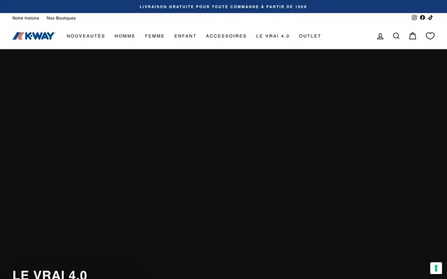
Preview image. Unlock full-res
Alpine utility, pure fabric
Color palette
Top announcement bar background — signals important information with a strong, deep blue
Call to action borders and text for ghost buttons — provides a distinct interactive highlight against the neutral palette
Primary text for headings, body, navigation, and input text; heavy borders and accents — establishes crisp contrast and visual anchors
Page backgrounds, card surfaces, button backgrounds, primary text on dark elements — creates a clean, bright foundation
Subtle background for UI elements, light borders, and the overall canvas base color — offers a soft visual separation without introducing strong chromaticity
Background for large image overlays, distinguishing hero sections or impactful visual blocks
Secondary text, price labels, and subtle borders — a slightly softer black for less prominent text elements
Typography
- Weights
- 400, 500, 700
- Sizes
- 11px, 12px, 13px, 14px, 16px, 21px, 30px, 31px, 34px, 40px, 41px
- Line height
- 1, 1.1, 1.2, 1.42, 1.5, 1.6
- Letter spacing
- 0.0190em, 0.0250em, 0.0290em, 0.0330em, 0.2000em, 0.2330em, 0.3000em
- Fallback
- system-ui, sans-serif
The core typeface for all textual content, from headings to body text, navigation, and buttons. Its clean, humanist sans-serif nature ensures universal legibility and a no-fuss functional aesthetic across all sizes and weights. The variation in letter-spacing for different sizes creates an expressive rhythm.
- Weights
- 700
- Sizes
- 14px
- Line height
- 2.71
- Letter spacing
- 0.3
-apple-system — detected in extracted data but not described by AI
Spacing & shape
Components
Background: Midnight Blue (#133977), text: White Canvas (#ffffff). Fixed at the top, full-width. Min-height of 40px.
Background: transparent, text: Pitch Black (#000000), no border, no radius. Padding around text for clickable area. Used for top navigation and footer links.
Background: transparent, text: Ocean Teal (#01607c), border: 1px solid Ocean Teal (#01607c), border-radius: 4px. Used for 'S'inscrire' buttons in the footer and potentially product-related actions.
Background: White Canvas (#ffffff), text: Pitch Black (#000000), border: 1px solid Pitch Black (#000000), border-radius: 0px. Padding: 10px vertical, 0px left/right for text, with optional right padding for icons.
Background: White Canvas (#ffffff), minimal borders around content sections, text in Pitch Black (#000000) for product titles and Charcoal Grey (#1c1d1d) for prices. Placeholder image backgrounds are Pale Ash (#e8e8e1). No explicit radius, appears square. Card padding value is 45px, creating significant internal space.
Guidelines
- Use Pitch Black (#000000) for all primary text content including headings, body, and navigation items to maintain high contrast and legibility.
- Apply White Canvas (#ffffff) sparingly for backgrounds of content areas and cards, ensuring a clean and bright stage for product imagery.
- Employ Pale Ash (#e8e8e1) as the default page background and for subtle dividers to create a soft, non-intrusive backdrop.
- Reserve Ocean Teal (#01607c) strictly for outlined interactive elements and their corresponding text, to clearly identify actions without overwhelming the design with color.
- Maintain a clear visual hierarchy by differentiating text with Helvetica weights: 700 for main headings, 500 for subheadings and navigation, and 400 for body text.
- Use a border-radius of 4px for all button-like elements and icons to maintain a very subtle softness within the otherwise angular design.
- Ensure generous internal padding within components, particularly cards (45px), to provide adequate breathing room and emphasize product photography.
- Do not use highly saturated colors for large background areas or extensive text blocks; limit such colors to functional accents.
- Avoid applying excessive box-shadows or gradients; the design relies on flat planes and crisp borders for visual depth.
- Do not introduce additional font families; maintain a consistent look with Helvetica and its specified weights.
- Refrain from drastically altering letter-spacing for body text; apply only predetermined values for headings and specific UI elements to preserve readability.
- Do not use radii larger than 4px on any component, as it would conflict with the system's slightly angular and functional aesthetic.
- Avoid dense packing of elements; maintain the established elementGap of 10px for consistent spacing between UI components.
- Do not use Midnight Blue (#133977) for interactive elements, as its primary role is for informational banners, not user actions.
About this system
ShowHide
K-Way France uses a utilitarian-modern approach with a high-contrast monochromatic base accented by vibrant, purposeful blues. The design prioritizes clear information hierarchy and legibility, suitable for e-commerce. Components are lightweight and functional, with minimal decorative flourishes, emphasizing clean lines and direct interaction. The overall feel is restrained yet energetic, reflecting the brand's sporty heritage.
The page structure is a contained, centered layout, where content doesn't extend edge-to-edge except for the very top announcement bar and some hero sections. The hero section typically features a large full-width image or video, often with a dark overlay and prominent centered text. Sections maintain a consistent vertical rhythm, often delineated by distinct content blocks or subtle background color changes (e.g., Pale Ash vs White Canvas). Content is primarily arranged in two-column grids for text-plus-image layouts or multi-column card grids for product listings. The navigation is a sticky top bar with clearly spaced links and utility icons. Visual density is balanced, prioritizing clear grouping and breathing room rather than information-packed blocks.
Imagery on K-Way France is product-focused and clean. Product photography features items either in studio settings with stark white or soft grey backgrounds, or in context on models against blurred, natural environments. There are no abstract graphics or 3D renders. Photography serves to showcase the product directly, avoiding heavy lifestyle context. Iconic stroke icons are used for utility functions like search or account. Image density is moderate, acting as the primary visual content within a text-dominant layout, with many images contained within square or rectangular frames rather than being full-bleed.
Reminiscent of Patagonia, The North Face, Moncler, Uniqlo.
# K-Way France — Style Reference
> Alpine utility, pure fabric

**Theme:** light

**Site:** https://www.k-way.fr

K-Way France uses a utilitarian-modern approach with a high-contrast monochromatic base accented by vibrant, purposeful blues. The design prioritizes clear information hierarchy and legibility, suitable for e-commerce. Components are lightweight and functional, with minimal decorative flourishes, emphasizing clean lines and direct interaction. The overall feel is restrained yet energetic, reflecting the brand's sporty heritage.

## Tokens — Colors

| Name | Value | Token | Role |
|------|------|------|------|
| Midnight Blue | `#133977` | `--color-midnight-blue` | Top announcement bar background — signals important information with a strong, deep blue |
| Ocean Teal | `#01607c` | `--color-ocean-teal` | Call to action borders and text for ghost buttons — provides a distinct interactive highlight against the neutral palette |
| Pitch Black | `#000000` | `--color-pitch-black` | Primary text for headings, body, navigation, and input text; heavy borders and accents — establishes crisp contrast and visual anchors |
| White Canvas | `#ffffff` | `--color-white-canvas` | Page backgrounds, card surfaces, button backgrounds, primary text on dark elements — creates a clean, bright foundation |
| Pale Ash | `#e8e8e1` | `--color-pale-ash` | Subtle background for UI elements, light borders, and the overall canvas base color — offers a soft visual separation without introducing strong chromaticity |
| Soft Black | `#0f0f0f` | `--color-soft-black` | Background for large image overlays, distinguishing hero sections or impactful visual blocks |
| Charcoal Grey | `#1c1d1d` | `--color-charcoal-grey` | Secondary text, price labels, and subtle borders — a slightly softer black for less prominent text elements |

## Tokens — Typography

### Helvetica
- **Substitute:** system-ui, sans-serif
- **Weights:** 400, 500, 700
- **Sizes:** 11px, 12px, 13px, 14px, 16px, 21px, 30px, 31px, 34px, 40px, 41px
- **Line height:** 1, 1.1, 1.2, 1.42, 1.5, 1.6
- **Letter spacing:** 0.0190em, 0.0250em, 0.0290em, 0.0330em, 0.2000em, 0.2330em, 0.3000em
- **Role:** The core typeface for all textual content, from headings to body text, navigation, and buttons. Its clean, humanist sans-serif nature ensures universal legibility and a no-fuss functional aesthetic across all sizes and weights. The variation in letter-spacing for different sizes creates an expressive rhythm.

### -apple-system
- **Weights:** 700
- **Sizes:** 14px
- **Line height:** 2.71
- **Letter spacing:** 0.3
- **Role:** -apple-system — detected in extracted data but not described by AI

## Tokens — Type Scale

| Role | Size | Line height | Letter spacing |
|------|------|------|------|
| caption | 11px | 1 | — |
| heading-lg | 30px | 1.1 | — |
| display | 41px | 1.1 | 0.019em |

## Tokens — Spacing

- **Section gap:** 75px
- **Card padding:** 45px
- **Element gap:** 10px

## Tokens — Radius

- **Buttons:** 4px
- **icons:** 4px

## Layout

The page structure is a contained, centered layout, where content doesn't extend edge-to-edge except for the very top announcement bar and some hero sections. The hero section typically features a large full-width image or video, often with a dark overlay and prominent centered text. Sections maintain a consistent vertical rhythm, often delineated by distinct content blocks or subtle background color changes (e.g., Pale Ash vs White Canvas). Content is primarily arranged in two-column grids for text-plus-image layouts or multi-column card grids for product listings. The navigation is a sticky top bar with clearly spaced links and utility icons. Visual density is balanced, prioritizing clear grouping and breathing room rather than information-packed blocks.

## Imagery

Imagery on K-Way France is product-focused and clean. Product photography features items either in studio settings with stark white or soft grey backgrounds, or in context on models against blurred, natural environments. There are no abstract graphics or 3D renders. Photography serves to showcase the product directly, avoiding heavy lifestyle context. Iconic stroke icons are used for utility functions like search or account. Image density is moderate, acting as the primary visual content within a text-dominant layout, with many images contained within square or rectangular frames rather than being full-bleed.

## Components

### Announcement Bar
*Top banner for critical information*

Background: Midnight Blue (#133977), text: White Canvas (#ffffff). Fixed at the top, full-width. Min-height of 40px.

### Ghost Navigation Button
*Primary navigation links and interactive text*

Background: transparent, text: Pitch Black (#000000), no border, no radius. Padding around text for clickable area. Used for top navigation and footer links.

### Outlined Call to Action Button
*Emphasized interactive elements, usually for actions*

Background: transparent, text: Ocean Teal (#01607c), border: 1px solid Ocean Teal (#01607c), border-radius: 4px. Used for 'S'inscrire' buttons in the footer and potentially product-related actions.

### Basic Input Field
*Standard text input for forms*

Background: White Canvas (#ffffff), text: Pitch Black (#000000), border: 1px solid Pitch Black (#000000), border-radius: 0px. Padding: 10px vertical, 0px left/right for text, with optional right padding for icons.

### Product Card
*Display individual product items in a grid layout*

Background: White Canvas (#ffffff), minimal borders around content sections, text in Pitch Black (#000000) for product titles and Charcoal Grey (#1c1d1d) for prices. Placeholder image backgrounds are Pale Ash (#e8e8e1). No explicit radius, appears square. Card padding value is 45px, creating significant internal space.

## Guidelines

### Do

- Use Pitch Black (#000000) for all primary text content including headings, body, and navigation items to maintain high contrast and legibility.
- Apply White Canvas (#ffffff) sparingly for backgrounds of content areas and cards, ensuring a clean and bright stage for product imagery.
- Employ Pale Ash (#e8e8e1) as the default page background and for subtle dividers to create a soft, non-intrusive backdrop.
- Reserve Ocean Teal (#01607c) strictly for outlined interactive elements and their corresponding text, to clearly identify actions without overwhelming the design with color.
- Maintain a clear visual hierarchy by differentiating text with Helvetica weights: 700 for main headings, 500 for subheadings and navigation, and 400 for body text.
- Use a border-radius of 4px for all button-like elements and icons to maintain a very subtle softness within the otherwise angular design.
- Ensure generous internal padding within components, particularly cards (45px), to provide adequate breathing room and emphasize product photography.

### Don't

- Do not use highly saturated colors for large background areas or extensive text blocks; limit such colors to functional accents.
- Avoid applying excessive box-shadows or gradients; the design relies on flat planes and crisp borders for visual depth.
- Do not introduce additional font families; maintain a consistent look with Helvetica and its specified weights.
- Refrain from drastically altering letter-spacing for body text; apply only predetermined values for headings and specific UI elements to preserve readability.
- Do not use radii larger than 4px on any component, as it would conflict with the system's slightly angular and functional aesthetic.
- Avoid dense packing of elements; maintain the established elementGap of 10px for consistent spacing between UI components.
- Do not use Midnight Blue (#133977) for interactive elements, as its primary role is for informational banners, not user actions.

## Agent Prompt Guide

Quick Color Reference:
- text: #000000
- background: #e8e8e1
- accent: #01607c
- primary action: #01607c (outlined action border)

Example Component Prompts:
- Create an outlined button for 'Subscribe' using Helvetica weight 500 at 14px size, text #01607c, border 1px solid #01607c, 4px radius, 10px vertical and 15px horizontal padding.
- Design a product card: background #ffffff, no radius; with a placeholder image area in #e8e8e1. Product title is Helvetica weight 700 at 16px size in #000000, price is Helvetica weight 400 at 14px in #1c1d1d. Internal padding within the card should be 45px.
- Build a header navigation link: Helvetica weight 500 at 14px size, text #000000, 8px vertical padding. No background or border. An element gap of 10px separates each link.
- Create an information banner: background #133977, text #ffffff, Helvetica weight 400 at 12px size, line-height 1; min-height 40px.
More like this









Keep what you find
A free account saves references to boards and can send you a weekly email of picks based on what you save.
To see every result, go Pro.