Preview image. Unlock full-res
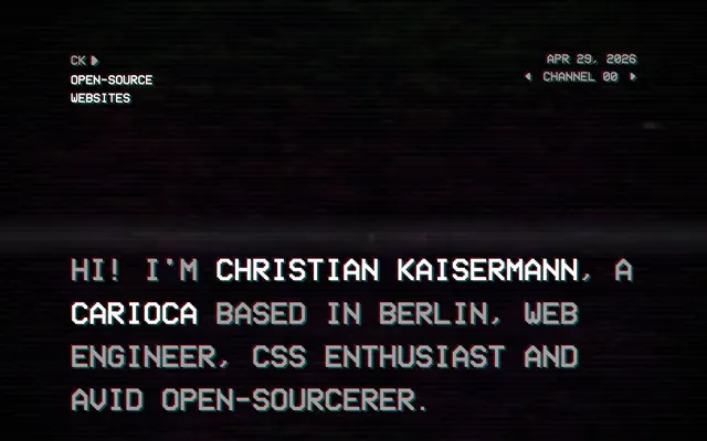
monochrome command-line interface
Color palette
Decorative glitch effect on text and UI elements, adding a digital artifact quality
Decorative glitch effect on text and UI elements, adding a digital artifact quality
Page backgrounds, surface background for all elements, creating a deep digital void
Medium-contrast borders, control outlines, and structural separators. Do not promote it to the primary CTA color
Hairline borders, dividers, input outlines, and card edges on light surfaces. Do not promote it to the primary CTA color
Typography
- Weights
- 400
- Sizes
- 23px, 26px, 63px
- Line height
- 0.9, 1.2, 1.4
- Letter spacing
- normal
- Fallback
- monospace
All text elements, including headings, body, navigation, and buttons. Its fixed-width, pixelated style is central to the retro terminal aesthetic, creating an intentional low-fidelity digital feel.
Spacing & shape
Components
Text in Text Gray (#a0a0a0) with a 0px border-radius. On hover or active state, the text and a 1px bottom border switch to Active White (#ffffff). No background or padding.
VCR OSD Mono, size 63px, line height 0.9. Color Active White (#ffffff). No background, border, or padding. Integrates directly into the page content.
VCR OSD Mono, size 23px or 26px, line height 1.2 or 1.4. Color Text Gray (#a0a0a0). Rendered as plain text or within card contexts without visual distinction.
Small text elements typically in the page header with Text Gray (#a0a0a0) and 0px radius. Used for functional, non-interactive visual data.
Guidelines
- Always use 'VCR OSD Mono' for all text content, respecting its fixed letter-spacing and line heights to maintain the pixelated aesthetic.
- Utilize Terminal Black (#000000) as the universal background for all sections and components without exception.
- Apply Active White (#ffffff) exclusively for high-emphasis text, active states, and interactive element borders.
- Employ Text Gray (#a0a0a0) for all primary body text, secondary information, and inactive interactive borders.
- Maintain a uniform 0px border-radius for all interactive and visual elements, reinforcing the sharp, digital interface feel.
- Keep padding and margins on interactive elements, like buttons and links, at 0px to ensure the compact, text-only interaction.
- Introduce Glitch Cyan or Glitch Red as decorative rgba(..., .4) overlays for hover states or loading indicators to amplify the retro digital effect.
- Do not introduce any chromatic colors beyond the defined Glitch Cyan or Glitch Red accent, and only as subtle overlays or visual effects.
- Avoid using any form of background color or padding on interactive elements; they should appear as text-only entities with border changes for state.
- Never apply border-radius values greater than 0px to any component or element.
- Do not use box-shadows or any form of elevation; the design system emphasizes a flat, screen-rendered aesthetic.
- Avoid custom gradients; stick to the solid color palette and occasional glitch overlays.
- Do not use imagery in the main content area; the experience is text-centric and code-like.
- Refrain from using common UI iconography or graphical elements that deviate from the text-based or ASCII art style.
About this system
ShowHide
Kaisermann's design system evokes a retro-futuristic terminal experience: a dark, unadorned canvas with blocky, pixelated typography as the primary visual element. There's an intentional absence of traditional UI components like rounded buttons or cards, replaced by text-based links and headers that carry border accents. Color is limited to a monochrome palette, punctuated by subtle glitch effects, creating a sense of raw, digital interaction rather than polished graphical user interfaces.
The page adheres to a full-bleed layout, taking up the entire viewport without a maximum width or centered constraint. The hero section displays a minimal, centered text arrangement with header and metadata. Content sections flow vertically with consistent, generous 160px gaps between them, giving a spacious and uncluttered feel. The primary content arrangement is a single column of text, often with text-based 'links' acting as interactive elements. Navigation elements are subtly integrated into the header, typically text-only. The overall density is spacious, with ample negative space around text blocks.
The site is devoid of traditional imagery like photography or illustrations, relying entirely on typography and text-based elements to convey information. The only 'visuals' are occasional ASCII-art like symbols within text and the simulated glitch effects provided by the Glitch Cyan and Glitch Red colors. This creates an extremely text-dominant experience, putting all focus on the rendered characters.
Reminiscent of Terminal.com, Figma - Dark Mode, Vercel.
# kaisermann — Style Reference
> monochrome command-line interface

**Theme:** dark

**Site:** https://kaisermann.me

Kaisermann's design system evokes a retro-futuristic terminal experience: a dark, unadorned canvas with blocky, pixelated typography as the primary visual element. There's an intentional absence of traditional UI components like rounded buttons or cards, replaced by text-based links and headers that carry border accents. Color is limited to a monochrome palette, punctuated by subtle glitch effects, creating a sense of raw, digital interaction rather than polished graphical user interfaces.

## Tokens — Colors

| Name | Value | Token | Role |
|------|------|------|------|
| Glitch Cyan | `#02b7b6` | `--color-glitch-cyan` | Decorative glitch effect on text and UI elements, adding a digital artifact quality |
| Glitch Red | `#b70202` | `--color-glitch-red` | Decorative glitch effect on text and UI elements, adding a digital artifact quality |
| Terminal Black | `#000000` | `--color-terminal-black` | Page backgrounds, surface background for all elements, creating a deep digital void |
| Text Gray | `#a0a0a0` | `--color-text-gray` | Medium-contrast borders, control outlines, and structural separators. Do not promote it to the primary CTA color |
| Active White | `#ffffff` | `--color-active-white` | Hairline borders, dividers, input outlines, and card edges on light surfaces. Do not promote it to the primary CTA color |

## Tokens — Typography

### VCR OSD Mono
- **Substitute:** monospace
- **Weights:** 400
- **Sizes:** 23px, 26px, 63px
- **Line height:** 0.9, 1.2, 1.4
- **Letter spacing:** normal
- **Role:** All text elements, including headings, body, navigation, and buttons. Its fixed-width, pixelated style is central to the retro terminal aesthetic, creating an intentional low-fidelity digital feel.

## Tokens — Type Scale

Golden Ratio (1.618) from 23px base.

| Role | Size | Line height | Letter spacing |
|------|------|------|------|
| body | 23px | 1.2 | — |
| subheading | 26px | 1.4 | — |
| display | 63px | 0.9 | — |

## Tokens — Spacing

- **Section gap:** 160px
- **Card padding:** 0px
- **Element gap:** 0px

## Tokens — Radius

- **none:** 0px

## Layout

The page adheres to a full-bleed layout, taking up the entire viewport without a maximum width or centered constraint. The hero section displays a minimal, centered text arrangement with header and metadata. Content sections flow vertically with consistent, generous 160px gaps between them, giving a spacious and uncluttered feel. The primary content arrangement is a single column of text, often with text-based 'links' acting as interactive elements. Navigation elements are subtly integrated into the header, typically text-only. The overall density is spacious, with ample negative space around text blocks.

## Imagery

The site is devoid of traditional imagery like photography or illustrations, relying entirely on typography and text-based elements to convey information. The only 'visuals' are occasional ASCII-art like symbols within text and the simulated glitch effects provided by the Glitch Cyan and Glitch Red colors. This creates an extremely text-dominant experience, putting all focus on the rendered characters.

## Components

### Ghost Navigation Link
*Primary navigation and interactive text elements within articles.*

Text in Text Gray (#a0a0a0) with a 0px border-radius. On hover or active state, the text and a 1px bottom border switch to Active White (#ffffff). No background or padding.

### Primary Heading
*Main page titles and prominent textual information.*

VCR OSD Mono, size 63px, line height 0.9. Color Active White (#ffffff). No background, border, or padding. Integrates directly into the page content.

### Body Text Block
*Standard page content and paragraphs.*

VCR OSD Mono, size 23px or 26px, line height 1.2 or 1.4. Color Text Gray (#a0a0a0). Rendered as plain text or within card contexts without visual distinction.

### System Status Line
*Metadata display like dates and channel numbers.*

Small text elements typically in the page header with Text Gray (#a0a0a0) and 0px radius. Used for functional, non-interactive visual data.

## Guidelines

### Do

- Always use 'VCR OSD Mono' for all text content, respecting its fixed letter-spacing and line heights to maintain the pixelated aesthetic.
- Utilize Terminal Black (#000000) as the universal background for all sections and components without exception.
- Apply Active White (#ffffff) exclusively for high-emphasis text, active states, and interactive element borders.
- Employ Text Gray (#a0a0a0) for all primary body text, secondary information, and inactive interactive borders.
- Maintain a uniform 0px border-radius for all interactive and visual elements, reinforcing the sharp, digital interface feel.
- Keep padding and margins on interactive elements, like buttons and links, at 0px to ensure the compact, text-only interaction.
- Introduce Glitch Cyan or Glitch Red as decorative rgba(..., .4) overlays for hover states or loading indicators to amplify the retro digital effect.

### Don't

- Do not introduce any chromatic colors beyond the defined Glitch Cyan or Glitch Red accent, and only as subtle overlays or visual effects.
- Avoid using any form of background color or padding on interactive elements; they should appear as text-only entities with border changes for state.
- Never apply border-radius values greater than 0px to any component or element.
- Do not use box-shadows or any form of elevation; the design system emphasizes a flat, screen-rendered aesthetic.
- Avoid custom gradients; stick to the solid color palette and occasional glitch overlays.
- Do not use imagery in the main content area; the experience is text-centric and code-like.
- Refrain from using common UI iconography or graphical elements that deviate from the text-based or ASCII art style.

## Agent Prompt Guide

Quick Color Reference: text: #a0a0a0, background: #000000, border: #a0a0a0, accent: Glitch Cyan (rgba(2, 183, 182, .4)), primary action: no distinct CTA color

Example Component Prompts:
1. Create a navigation item: 'OPEN-SOURCE' (VCR OSD Mono 400, 23px, #a0a0a0, 0px border-radius) with bottom border #a0a0a0. On hover, text and border become #ffffff. No background or padding.
2. Create a main headline: 'HI! I'M CHRISTIAN KAISERMANN' (VCR OSD Mono 400, 63px, #ffffff, line-height 0.9). Background is #000000.
3. Create a descriptive body paragraph: 'CARIOCA BASED IN BERLIN, WEB ENGINEER, CSS ENTHUSIAST AND AVID OPEN-SOURCERER.' (VCR OSD Mono 400, 26px, #a0a0a0, line-height 1.2). Background is #000000.
4. Create a system status indicator: 'APR 29, 2026' (VCR OSD Mono 400, 23px, #a0a0a0). No background, border, or padding.
More like this









Keep what you find
A free account saves references to boards and can send you a weekly email of picks based on what you save.
To see every result, go Pro.