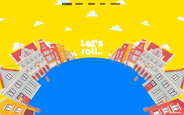
Preview image. Unlock full-res
joyful circus tent, bright and in motion
Color palette
Major background for page sections, conveying energy and playfulness
Dominant background for large, organic sections and defining visual elements; it grounds the yellow with a contrasting cool tone
Primary text color for navigation, headlines, and general content, providing strong contrast against the bright backgrounds. Used for subtle button borders
Hairline borders, dividers, input outlines, and card edges on light surfaces. Do not promote it to the primary CTA color
Typography
- Weights
- 400
- Sizes
- 12px, 20px, 32px, 50px, 75px
- Line height
- 0.72, 0.8, 1, 1.25, 1.67
- Fallback
- Bebas Neue
Headline and display text for all prominent messaging. Its heavy, condensed form at various sizes, along with its specific line heights (e.g., 0.72 for 12px and 0.8 for 20px), contributes to a compact, impactful, and almost comic-book-like visual rhythm, distinct from standard web typography.
- Weights
- 400
- Sizes
- 14px
- Line height
- 1.43
- Fallback
- Helvetica Neue
Supportive body text and explanatory captions, providing accessibility and a counterpoint to the display typeface.
Spacing & shape
Components
Text links for navigation, styled in Midnight Graphite (#333333) with a base padding of 10px vertically and 20px horizontally. Uses Arial 14px for accessibility.
A very large, curved background element using Ocean Blue (#007FFF) with an extreme border-radius of 1440px, creating fluid, non-linear sections.
Bold headline using Changa One, weight 400, sizes like 50px or 75px, with tight line heights (e.g. 1.25 for 50px). Text color is Midnight Graphite (#333333) or Polar White (#FFFFFF) depending on background contrast.
Text rendered in Changa One, weight 400, size 32px, lineHeight 1.00, in Midnight Graphite (#333333). Used for prominent but secondary text blocks.
Guidelines
- Prioritize Sunshine Yellow (#FFFF00) as the primary background for most sections to maintain a bright, optimistic tone.
- Use Ocean Blue (#007FFF) only for large, contrasting visual elements or backgrounds, ensuring it creates distinct 'anchor' points within the bright yellow canvas.
- Employ Changa One for all headlines, subheadings, and any text intended for immediate visual impact, varying sizes (12px, 20px, 32px, 50px, 75px) at weight 400.
- Maintain tight line heights for Changa One, adhering to the specified values (e.g., 0.72 for 12px, 0.8 for 20px, 1.00 for 32px) to achieve a compact, 'stacked' text appearance.
- Utilize a 1440px border-radius for large background shapes to create sweeping, circular, or arc-like visual elements that define section structure.
- Apply 10px vertical and 20px horizontal padding for interactive text elements like navigation links to provide generous tap targets and visual breathing room.
- Use the cityscape illustrations as a recurring visual motif, ensuring they are integrated into curvilinear or 'rolled' compositions.
- Avoid using gradients; the design system strictly relies on flat, contrasting color blocks.
- Do not introduce drop shadows for elevation; elements are defined by high contrast and placement, not depth effects.
- Refrain from using semi-transparent overlays or subtle background textures; the visual style is characterized by solid, saturated colors.
- Do not deviate from the specified tight line heights for Changa One; increasing them would dilute the compact, impactful aesthetic.
- Avoid standard rectangular card shapes; all significant background elements should use the extreme 1440px radius for curved forms.
- Do not use subtle, muted, or pastel colors; the system's identity is built on vivid, high-saturation hues.
- Do not use generic stock photography; the design leans heavily on custom, playful vector illustrations and clear UI elements.
About this system
ShowHide
Karl embraces a vibrant, playful aesthetic with a primary color palette of bright yellow and vivid blue, creating a distinct, high-contrast visual identity. Typography is bold and informal, heavily leveraging a custom display font with tight line heights for a 'pop art' feel. The layout is characterized by sweeping, curvilinear forms, especially in the hero section, where cityscapes curve around a large central blue element, suggesting dynamic motion and whimsy.
Reminiscent of Awwwards Nominees (some portfolios), Some children's book websites, Webflow showcase sites for cartoonists.
# Karl — Style Reference
> joyful circus tent, bright and in motion

**Theme:** light

**Site:** https://karlgonsalves.com

Karl embraces a vibrant, playful aesthetic with a primary color palette of bright yellow and vivid blue, creating a distinct, high-contrast visual identity. Typography is bold and informal, heavily leveraging a custom display font with tight line heights for a 'pop art' feel. The layout is characterized by sweeping, curvilinear forms, especially in the hero section, where cityscapes curve around a large central blue element, suggesting dynamic motion and whimsy.

## Tokens — Colors

| Name | Value | Token | Role |
|------|------|------|------|
| Sunshine Yellow | `#FFFF00` | `--color-sunshine-yellow` | Major background for page sections, conveying energy and playfulness |
| Ocean Blue | `#007FFF` | `--color-ocean-blue` | Dominant background for large, organic sections and defining visual elements; it grounds the yellow with a contrasting cool tone |
| Midnight Graphite | `#333333` | `--color-midnight-graphite` | Primary text color for navigation, headlines, and general content, providing strong contrast against the bright backgrounds. Used for subtle button borders |
| Polar White | `#FFFFFF` | `--color-polar-white` | Hairline borders, dividers, input outlines, and card edges on light surfaces. Do not promote it to the primary CTA color |

## Tokens — Typography

### Changa One
- **Substitute:** Bebas Neue
- **Weights:** 400
- **Sizes:** 12px, 20px, 32px, 50px, 75px
- **Line height:** 0.72, 0.8, 1, 1.25, 1.67
- **Role:** Headline and display text for all prominent messaging. Its heavy, condensed form at various sizes, along with its specific line heights (e.g., 0.72 for 12px and 0.8 for 20px), contributes to a compact, impactful, and almost comic-book-like visual rhythm, distinct from standard web typography.

### Arial
- **Substitute:** Helvetica Neue
- **Weights:** 400
- **Sizes:** 14px
- **Line height:** 1.43
- **Role:** Supportive body text and explanatory captions, providing accessibility and a counterpoint to the display typeface.

## Tokens — Type Scale

Augmented Fourth (1.414) from 14px base.

| Role | Size | Line height | Letter spacing |
|------|------|------|------|
| caption | 12px | 0.72 | — |
| body | 14px | 1.43 | — |
| subheading | 20px | 0.8 | — |
| heading | 32px | 1 | — |
| heading-lg | 50px | 1.25 | — |
| display | 75px | 1.67 | — |

## Tokens — Spacing

- **Section gap:** 45px
- **Card padding:** 0px
- **Element gap:** 20px

## Tokens — Radius

- **circular:** 1440px

## Components

### Navigation Link
*Primary navigation item*

Text links for navigation, styled in Midnight Graphite (#333333) with a base padding of 10px vertically and 20px horizontally. Uses Arial 14px for accessibility.

### Curved Background Card
*Decorative background element*

A very large, curved background element using Ocean Blue (#007FFF) with an extreme border-radius of 1440px, creating fluid, non-linear sections.

### Main Headline
*Primary page title or major section heading.*

Bold headline using Changa One, weight 400, sizes like 50px or 75px, with tight line heights (e.g. 1.25 for 50px). Text color is Midnight Graphite (#333333) or Polar White (#FFFFFF) depending on background contrast.

### Supporting Text Block
*Introductory or explanatory text.*

Text rendered in Changa One, weight 400, size 32px, lineHeight 1.00, in Midnight Graphite (#333333). Used for prominent but secondary text blocks.

## Guidelines

### Do

- Prioritize Sunshine Yellow (#FFFF00) as the primary background for most sections to maintain a bright, optimistic tone.
- Use Ocean Blue (#007FFF) only for large, contrasting visual elements or backgrounds, ensuring it creates distinct 'anchor' points within the bright yellow canvas.
- Employ Changa One for all headlines, subheadings, and any text intended for immediate visual impact, varying sizes (12px, 20px, 32px, 50px, 75px) at weight 400.
- Maintain tight line heights for Changa One, adhering to the specified values (e.g., 0.72 for 12px, 0.8 for 20px, 1.00 for 32px) to achieve a compact, 'stacked' text appearance.
- Utilize a 1440px border-radius for large background shapes to create sweeping, circular, or arc-like visual elements that define section structure.
- Apply 10px vertical and 20px horizontal padding for interactive text elements like navigation links to provide generous tap targets and visual breathing room.
- Use the cityscape illustrations as a recurring visual motif, ensuring they are integrated into curvilinear or 'rolled' compositions.

### Don't

- Avoid using gradients; the design system strictly relies on flat, contrasting color blocks.
- Do not introduce drop shadows for elevation; elements are defined by high contrast and placement, not depth effects.
- Refrain from using semi-transparent overlays or subtle background textures; the visual style is characterized by solid, saturated colors.
- Do not deviate from the specified tight line heights for Changa One; increasing them would dilute the compact, impactful aesthetic.
- Avoid standard rectangular card shapes; all significant background elements should use the extreme 1440px radius for curved forms.
- Do not use subtle, muted, or pastel colors; the system's identity is built on vivid, high-saturation hues.
- Do not use generic stock photography; the design leans heavily on custom, playful vector illustrations and clear UI elements.

## Agent Prompt Guide

### Quick Color Reference
- text: #333333 (Midnight Graphite)
- background: #FFFF00 (Sunshine Yellow)
- border: #333333 (Midnight Graphite) for ghost buttons/links
- accent: no distinct accent color
- primary action: no distinct CTA color

### 3-5 Example Component Prompts
1. Create a hero section: Sunshine Yellow (#FFFF00) background. Centered headline 'Let's roll..' with Changa One, weight 400, size 50px, lineHeight 1.25, in Midnight Graphite (#333333). Below it, a large semicircular Ocean Blue (#007FFF) element with 1440px border-radius, with cityscape illustrations wrapping around it.
2. Design a navigation bar: Full-width, centered text links. Each link: Arial, weight 400, size 14px, in Midnight Graphite (#333333). Padding of 10px vertical, 20px horizontal for each link item.
3. Create a 'About me' text block: Centered, 'I'm Karl, a motion designer.' using Changa One, weight 400, size 32px, lineHeight 1.00, in Polar White (#FFFFFF), against an Ocean Blue (#007FFF) background.
More like this









Keep what you find
A free account saves references to boards and can send you a weekly email of picks based on what you save.
To see every result, go Pro.