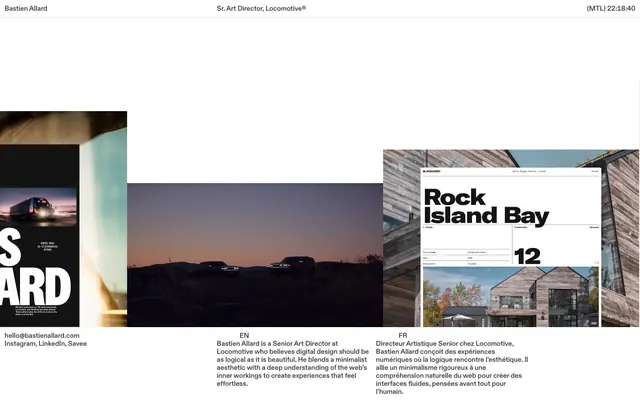
Preview image. Unlock full-res
Architectural Blueprint Canvas
Color palette
Supporting palette color for small decorative accents when the core palette needs contrast. Do not promote it to the primary CTA color
Page background, primary surface for content blocks
Dark borders and separators for elevated surfaces and inverted UI. Do not promote it to the primary CTA color
Dark borders and separators for elevated surfaces and inverted UI. Do not promote it to the primary CTA color
Hairline borders, dividers, input outlines, and card edges on light surfaces. Do not promote it to the primary CTA color
Typography
- Weights
- 540
- Sizes
- 16px
- Line height
- 1.15
- Letter spacing
- -0.0020em at 16px
- Fallback
- Inter
Primary font for all display text and body copy. Its variable nature allows fine-tuning for visual balance.
- Weights
- 400
- Sizes
- 15px
- Line height
- 1.65
- Letter spacing
- normal
- Fallback
- system-ui
Fallback font for system text and secondary information, ensuring readability across platforms.
Spacing & shape
Components
Text in Storm Gray (#333333), 16px Diatype Variable, weight 540. Underline on hover/focus is a 1px solid Silver Haze (#e5e5e5) border-bottom.
Implied card structure with a white background and sharp, 0px radius corners. A 1px solid border in Midnight Graphite (#000000) or Storm Gray (#333333) likely defines its edges.
Text in Midnight Graphite (#000000), 16px Diatype Variable, weight 540. No visual distinction beyond text color, implying minimalist navigation.
Guidelines
- Prioritize high contrast between text and background: use Midnight Graphite (#000000) or Storm Gray (#333333) on Canvas White (#ffffff).
- Maintain a compact information density across layouts, minimizing excessive whitespace between content blocks.
- Use subtle border treatments for interactive elements: 1px solid borders in Silver Haze (#e5e5e5) or Storm Gray (#333333) for states and definitions.
- Apply Diatype Variable (or Inter) at 16px for all primary body text, ensuring consistent weight 540.
- Keep all corners sharp with a 0px border-radius, reflecting a precise, structured aesthetic.
- Use Midnight Graphite (#000000) for all prominent headings and labels to establish visual hierarchy.
- Ensure all text links are styled with Strom Gray (#333333) and hint interaction through border-bottom changes, not color changes.
- Avoid using saturated colors for backgrounds or large areas; maintain an achromatic base palette.
- Do not introduce soft shadows or excessive elevation – rely on borders and negative space for component separation.
- Do not use rounded corners on any UI elements; maintain a strict 0px border-radius.
- Avoid large, widely spaced content blocks; maintain a dense, information-rich visual experience.
- Do not use multiple font families for body text; stick to Diatype Variable (Inter) for primary text.
- Do not introduce heavy gradient overlays or background images that detract from content clarity.
- Avoid large-scale photography or illustrations that aren't tightly integrated into a structured grid or content block.
About this system
ShowHide
Bastien Allard's design system creates a 'digital canvas' aesthetic: a stark white background accented by deep black typography and subtle greys, evoking the precision of architectural blueprints. The dominant characteristic is a compact, dense arrangement of content, with an emphasis on strong typographic forms. UI elements are rendered with fine borders rather than heavy fills, giving an airy yet structured feel. The visual language prioritizes information density and clarity through a high-contrast monochrome palette, with subtle hints of interaction through border changes, suggesting a lean, content-focused experience.
The page exhibits a clean, contained layout, centered on the screen with implied maximum width constraints. The hero section features a stark header with minimal information – name, title, and current time. Content below organizes into a grid-like structure for showcasing projects, often with distinct visual blocks for text alongside imagery. Sections appear to have consistent vertical spacing, creating an organized, deliberate rhythm. The overall arrangement feels symmetrical and balanced for readability, leaning towards a text-left/image-right or centered stack compositional approach for feature presentation. Navigation is limited to a minimal top header.
This site uses a combination of high-contrast, minimalist product/case study photography and dark, atmospheric abstract imagery. Photography is typically tightly cropped or contained within specific UI elements, often against dark backgrounds that contrast with the overall light theme. The abstract images, like the sunset scene, convey a mood without being overly literal, often serving as background elements. Icons are implicit, likely using minimal, outlined styles if present, maintaining the overall clean aesthetic. Imagery plays a supportive role, providing visual interest and context without dominating the page, enhancing the text-dominant interface.
Reminiscent of Figma, Linear, Read.cv, Stripe (documentation).
# Bastien Allard — Style Reference
> Architectural Blueprint Canvas

**Theme:** light

**Site:** https://bastienallard.com

Bastien Allard's design system creates a 'digital canvas' aesthetic: a stark white background accented by deep black typography and subtle greys, evoking the precision of architectural blueprints. The dominant characteristic is a compact, dense arrangement of content, with an emphasis on strong typographic forms. UI elements are rendered with fine borders rather than heavy fills, giving an airy yet structured feel. The visual language prioritizes information density and clarity through a high-contrast monochrome palette, with subtle hints of interaction through border changes, suggesting a lean, content-focused experience.

## Tokens — Colors

| Name | Value | Token | Role |
|------|------|------|------|
| Ocean Blue | `#0064e1` | `--color-ocean-blue` | Supporting palette color for small decorative accents when the core palette needs contrast. Do not promote it to the primary CTA color |
| Canvas White | `#ffffff` | `--color-canvas-white` | Page background, primary surface for content blocks |
| Midnight Graphite | `#000000` | `--color-midnight-graphite` | Dark borders and separators for elevated surfaces and inverted UI. Do not promote it to the primary CTA color |
| Storm Gray | `#333333` | `--color-storm-gray` | Dark borders and separators for elevated surfaces and inverted UI. Do not promote it to the primary CTA color |
| Silver Haze | `#e5e5e5` | `--color-silver-haze` | Hairline borders, dividers, input outlines, and card edges on light surfaces. Do not promote it to the primary CTA color |

## Tokens — Typography

### Diatype Variable
- **Substitute:** Inter
- **Weights:** 540
- **Sizes:** 16px
- **Line height:** 1.15
- **Letter spacing:** -0.0020em at 16px
- **Role:** Primary font for all display text and body copy. Its variable nature allows fine-tuning for visual balance.

### -apple-system
- **Substitute:** system-ui
- **Weights:** 400
- **Sizes:** 15px
- **Line height:** 1.65
- **Letter spacing:** normal
- **Role:** Fallback font for system text and secondary information, ensuring readability across platforms.

## Tokens — Spacing

- **Section gap:** 64px
- **Card padding:** 24px
- **Element gap:** 13px

## Tokens — Radius

- **Default:** 0px

## Layout

The page exhibits a clean, contained layout, centered on the screen with implied maximum width constraints. The hero section features a stark header with minimal information – name, title, and current time. Content below organizes into a grid-like structure for showcasing projects, often with distinct visual blocks for text alongside imagery. Sections appear to have consistent vertical spacing, creating an organized, deliberate rhythm. The overall arrangement feels symmetrical and balanced for readability, leaning towards a text-left/image-right or centered stack compositional approach for feature presentation. Navigation is limited to a minimal top header.

## Imagery

This site uses a combination of high-contrast, minimalist product/case study photography and dark, atmospheric abstract imagery. Photography is typically tightly cropped or contained within specific UI elements, often against dark backgrounds that contrast with the overall light theme. The abstract images, like the sunset scene, convey a mood without being overly literal, often serving as background elements. Icons are implicit, likely using minimal, outlined styles if present, maintaining the overall clean aesthetic. Imagery plays a supportive role, providing visual interest and context without dominating the page, enhancing the text-dominant interface.

## Components

### Text Link
*Interactive text link, border changes on hover/focus.*

Text in Storm Gray (#333333), 16px Diatype Variable, weight 540. Underline on hover/focus is a 1px solid Silver Haze (#e5e5e5) border-bottom.

### Project Card (Implicit)
*Container for individual project previews.*

Implied card structure with a white background and sharp, 0px radius corners. A 1px solid border in Midnight Graphite (#000000) or Storm Gray (#333333) likely defines its edges.

### Header Navigation Item
*Top-level navigation link.*

Text in Midnight Graphite (#000000), 16px Diatype Variable, weight 540. No visual distinction beyond text color, implying minimalist navigation.

## Guidelines

### Do

- Prioritize high contrast between text and background: use Midnight Graphite (#000000) or Storm Gray (#333333) on Canvas White (#ffffff).
- Maintain a compact information density across layouts, minimizing excessive whitespace between content blocks.
- Use subtle border treatments for interactive elements: 1px solid borders in Silver Haze (#e5e5e5) or Storm Gray (#333333) for states and definitions.
- Apply Diatype Variable (or Inter) at 16px for all primary body text, ensuring consistent weight 540.
- Keep all corners sharp with a 0px border-radius, reflecting a precise, structured aesthetic.
- Use Midnight Graphite (#000000) for all prominent headings and labels to establish visual hierarchy.
- Ensure all text links are styled with Strom Gray (#333333) and hint interaction through border-bottom changes, not color changes.

### Don't

- Avoid using saturated colors for backgrounds or large areas; maintain an achromatic base palette.
- Do not introduce soft shadows or excessive elevation – rely on borders and negative space for component separation.
- Do not use rounded corners on any UI elements; maintain a strict 0px border-radius.
- Avoid large, widely spaced content blocks; maintain a dense, information-rich visual experience.
- Do not use multiple font families for body text; stick to Diatype Variable (Inter) for primary text.
- Do not introduce heavy gradient overlays or background images that detract from content clarity.
- Avoid large-scale photography or illustrations that aren't tightly integrated into a structured grid or content block.

## Agent Prompt Guide

Quick Color Reference:
text: #333333
background: #ffffff
border: #e5e5e5
accent: #0064e1
primary action: no distinct CTA color

Example Component Prompts:
Create a header with the text 'Bastien Allard' aligned left and 'Sr. Art Director, Locomotive®' aligned right, both using Midnight Graphite (#000000) at 16px Diatype Variable, weight 540. Ensure a 13px element gap between main header items.
Create a descriptive text block for a project: Lead with a 'Rock Island Bay' headline in Midnight Graphite (#000000) at 48px Diatype Variable, weight 540. Follow with body text in Storm Gray (#333333) at 16px Diatype Variable, weight 540, lineHeight 1.15, with -0.0020em letter-spacing. The block should be contained within a Canvas White (#ffffff) surface with 0px radius.
Design a contact link item: The email 'hello@bastienallard.com' uses Storm Gray (#333333), 16px Diatype Variable, weight 540, with a 1px solid Silver Haze (#e5e5e5) border-bottom on hover. Place it within a Canvas White (#ffffff) area.
More like this









Keep what you find
A free account saves references to boards and can send you a weekly email of picks based on what you save.
To see every result, go Pro.