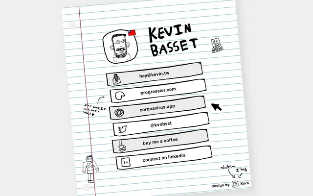
Preview image. Unlock full-res
ink-scribbled notebook paper
Color palette
Decorative notebook lines – a subtle accent that defines the page's core structure (derived from linear-gradient)
Dark borders and separators for elevated surfaces and inverted UI.
Light neutral action fill for buttons on dark surfaces.
Hover state for interactive links, subtle background fill for selected/active elements – evokes the lighter tone of pencil shading on paper
Typography
- Weights
- 400, 600, 700
- Sizes
- 16px, 20px, 50px
- Line height
- 1.2
- Letter spacing
- 0.0200em at 16px, 0.0500em at 20px, 0.0630em at 50px
- Fallback
- Avenir Next, sans-serif (for similar humanist sans-serif feel and good rendering)
All text elements, including headings, body, and interactive links. The humanist sans-serif with varying letter spacing contributes to the bespoke, slightly informal 'hand-drawn' feel of the site.
Spacing & shape
Components
A rectangular button-like element with a Paper White background, an Ink Black hand-drawn border, and Ink Black text. The corners are sharp, reinforcing the 'cut paper' aesthetic. The drawing effect is applied through illustrations.
Similar to the default link button but with a Pencil Sketch background. The Ink Black border and text remain consistent, providing a subtle visual cue without departing from the monochrome scheme.
Guidelines
- Use Ink Black (#000000) for all text, borders, and hand-drawn visual elements.
- Set the primary page background to Paper White (#ffffff) to simulate notebook paper.
- Apply Pencil Sketch (#ececec) as the background color for interactive elements on hover.
- Maintain the system sans-serif font across all text, emphasizing a hand-drawn yet legible feel.
- Ensure all interactive links have a visible Ink Black border and Paper White background by default.
- Integrate Notebook Line Teal (#1d97b8) only as decorative ruled lines, not for primary UI elements.
- Avoid using any saturated colors for functional UI elements; the palette is strictly monochrome with a single subtle accent.
- Do not introduce rounded corners; elements should maintain sharp, cut-paper edges.
- Refrain from using shadows or gradients on interactive elements, as this would break the flat, hand-drawn aesthetic.
- Do not use multiple font families; stick to the single system font to maintain typographic consistency.
- Avoid typical button styling like strong background fills or complex hover animations that would distract from the sketched feel.
- Do not vary line heights from the specified 1.2 across different type sizes.
About this system
ShowHide
The Kevin Basset site adopts a 'notebook scribble' aesthetic, reminiscent of a student's hand-drawn notes on lined paper. The design is characterized by its light, monochrome palette, with all elements rendered as if sketched in black ink. Interactive elements, such as links, appear as light gray boxes, maintaining the paper-like texture. Handwriting-style typography reinforces this informal, personal, and childlike visual identity.
The page uses a centered, max-width contained layout, though no specific max-width is provided, suggesting adaptability. The hero section features a prominent centered headline/name with a hand-drawn avatar. Content is primarily a vertical stack of uniform 'sketched link buttons,' each occupying its own horizontal band. There are no complex grid layouts or alternating section patterns; the rhythm is consistent and linear, like a list on a piece of paper.
The site predominantly uses hand-drawn, black-ink illustrations and icons that mimic a quirky, child-like scribble aesthetic. There are no photographs or complex graphics. Visuals are contained and appear outlined, often with a slight wobble to convey an imperfect, unpolished feel. They serve both decorative and explanatory roles, like the robot graphic or the avatar sketch. Imagery density is moderate, with illustrations breaking up text blocks and adding character.
Reminiscent of Paper.js (website), Neat.css, Rough.js library, Hand-drawn.io.
# Kevin Basset — Style Reference
> ink-scribbled notebook paper

**Theme:** light

**Site:** https://kevin.tw

The Kevin Basset site adopts a 'notebook scribble' aesthetic, reminiscent of a student's hand-drawn notes on lined paper. The design is characterized by its light, monochrome palette, with all elements rendered as if sketched in black ink. Interactive elements, such as links, appear as light gray boxes, maintaining the paper-like texture. Handwriting-style typography reinforces this informal, personal, and childlike visual identity.

## Tokens — Colors

| Name | Value | Token | Role |
|------|------|------|------|
| Notebook Line Teal | `#1d97b8` | `--color-notebook-line-teal` | Decorative notebook lines – a subtle accent that defines the page's core structure (derived from linear-gradient) |
| Ink Black | `#000000` | `--color-ink-black` | Dark borders and separators for elevated surfaces and inverted UI. |
| Paper White | `#ffffff` | `--color-paper-white` | Light neutral action fill for buttons on dark surfaces. |
| Pencil Sketch | `#ececec` | `--color-pencil-sketch` | Hover state for interactive links, subtle background fill for selected/active elements – evokes the lighter tone of pencil shading on paper |

## Tokens — Typography

### system
- **Substitute:** Avenir Next, sans-serif (for similar humanist sans-serif feel and good rendering)
- **Weights:** 400, 600, 700
- **Sizes:** 16px, 20px, 50px
- **Line height:** 1.2
- **Letter spacing:** 0.0200em at 16px, 0.0500em at 20px, 0.0630em at 50px
- **Role:** All text elements, including headings, body, and interactive links. The humanist sans-serif with varying letter spacing contributes to the bespoke, slightly informal 'hand-drawn' feel of the site.

## Tokens — Type Scale

| Role | Size | Line height | Letter spacing |
|------|------|------|------|
| body | 16px | 1.2 | 0.32px |
| subheading | 20px | 1.2 | 1px |
| display | 50px | 1.2 | 3.15px |

## Tokens — Spacing

- **Section gap:** 25px
- **Card padding:** 20px
- **Element gap:** 20px

## Tokens — Radius

- **links:** 0px

## Layout

The page uses a centered, max-width contained layout, though no specific max-width is provided, suggesting adaptability. The hero section features a prominent centered headline/name with a hand-drawn avatar. Content is primarily a vertical stack of uniform 'sketched link buttons,' each occupying its own horizontal band. There are no complex grid layouts or alternating section patterns; the rhythm is consistent and linear, like a list on a piece of paper.

## Imagery

The site predominantly uses hand-drawn, black-ink illustrations and icons that mimic a quirky, child-like scribble aesthetic. There are no photographs or complex graphics. Visuals are contained and appear outlined, often with a slight wobble to convey an imperfect, unpolished feel. They serve both decorative and explanatory roles, like the robot graphic or the avatar sketch. Imagery density is moderate, with illustrations breaking up text blocks and adding character.

## Components

### Sketched Link Button (Default/Inactive)
*Primary interactive element for all links on the site.*

A rectangular button-like element with a Paper White background, an Ink Black hand-drawn border, and Ink Black text. The corners are sharp, reinforcing the 'cut paper' aesthetic. The drawing effect is applied through illustrations.

### Sketched Link Button (Hover)
*Visual feedback for interactive links.*

Similar to the default link button but with a Pencil Sketch background. The Ink Black border and text remain consistent, providing a subtle visual cue without departing from the monochrome scheme.

## Guidelines

### Do

- Use Ink Black (#000000) for all text, borders, and hand-drawn visual elements.
- Set the primary page background to Paper White (#ffffff) to simulate notebook paper.
- Apply Pencil Sketch (#ececec) as the background color for interactive elements on hover.
- Maintain the system sans-serif font across all text, emphasizing a hand-drawn yet legible feel.
- Ensure all interactive links have a visible Ink Black border and Paper White background by default.
- Integrate Notebook Line Teal (#1d97b8) only as decorative ruled lines, not for primary UI elements.

### Don't

- Avoid using any saturated colors for functional UI elements; the palette is strictly monochrome with a single subtle accent.
- Do not introduce rounded corners; elements should maintain sharp, cut-paper edges.
- Refrain from using shadows or gradients on interactive elements, as this would break the flat, hand-drawn aesthetic.
- Do not use multiple font families; stick to the single system font to maintain typographic consistency.
- Avoid typical button styling like strong background fills or complex hover animations that would distract from the sketched feel.
- Do not vary line heights from the specified 1.2 across different type sizes.

## Agent Prompt Guide

Quick Color Reference: text: #000000, background: #ffffff, border: #000000, accent: #1d97b8, primary action: no distinct CTA color

Example Component Prompts:
Create a standard link button: Paper White background, Ink Black border, Ink Black text. Text size 16px, weight 400, letter-spacing 0.32px.
Create a heading: Ink Black text, size 50px, weight 700, letter-spacing 3.15px, line-height 1.2.
Create an icon next to text: Ink Black icon, 10px right margin from text, text size 16px, weight 400, letter-spacing 0.32px, Ink Black.
More like this









Keep what you find
A free account saves references to boards and can send you a weekly email of picks based on what you save.
To see every result, go Pro.