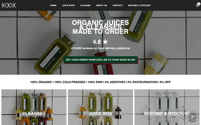
Preview image. Unlock full-res
kitchen laboratory blueprint
Color palette
Primary action button background, representing natural ingredients and brand's organic ethos
Highlight accents for links, badges, and attention-grabbing elements, adding a natural, vibrant pop
Secondary action button background and shadow for key interactive elements, a warm, rich accent
Primary text, navigation links, bold headings, borders, button text on light backgrounds — a stark, graphic black
Content surfaces, card backgrounds, input fields, navigation background. A clean, crisp white that mimics tiled surfaces
Subtle background for varied content sections, secondary card backgrounds, creates a slight elevation from white
Secondary text for headings and content, slightly softer than Midnight Noir but maintaining strong contrast
Subtle borders and dividers for UI elements, less prominent than Midnight Noir borders
Neutral form states, badge text, and quiet UI feedback where color should stay understated. Do not promote it to the primary CTA color
Placeholder text in input fields, softer visibility
Typography
- Weights
- 400, 500, 600, 700, 900
- Sizes
- 14px, 16px, 18px, 20px, 24px, 26px, 30px, 32px, 40px, 46px, 48px
- Line height
- 0.7, 0.8, 0.88, 1, 1.03, 1.1, 1.2, 1.3, 1.38, 1.44, 1.5, 1.57, 1.63, 1.71, 1.75, 1.79, 2.19, 2.5
- Letter spacing
- 0.008em at 14px, 0.012em at 16px, 0.016em at 18px, 0.018em at 20px, 0.020em at 24px, 0.050em at 48px
- Fallback
- Arial
Primary typeface for all text types, from body to large headings. Its clean, sans-serif nature provides a modern, legible base for conveying product information and brand messaging. The wide range of weights supports a clear typographic hierarchy.
Spacing & shape
Components
Filled button with 'Deep Forest' background (#113722), 'Tile White' text, no border radius, 11px vertical padding, 15px horizontal padding. Delivers a bold, grounded aesthetic.
Filled button with 'Berry Rouge' background (#6b1229), 'Tile White' text, no border radius, 11px vertical padding, 15px horizontal padding. A distinct color for different types of actions.
Transparent background, 'Midnight Noir' text, no padding or borders. Used for navigation and less prominent actions.
Transparent background, 0px border radius, no box shadow, 0px padding. Image-driven cards without visual chrome.
Background 'Tile White', text 'Placeholder Gray' (#646464), 'Input Border' (#d7d7d7) 1px solid border, no border radius, 11px vertical padding, 15px horizontal padding.
Guidelines
- Use 'Midnight Noir' (#000000) for all primary text and strong headings to maintain high contrast and graphic clarity.
- Apply 'Deep Forest' (#113722) exclusively to primary call-to-action button backgrounds for immediate visual recognition.
- Maintain a 0px border radius for all buttons and input fields to support the sharp, utilitarian aesthetic.
- Employ 'Spiced Orange' (#d25a24) as a judicious accent for links, special offers, or badges to draw specific attention without overwhelming the design.
- Utilize Helvetica 900 for hero headlines and important section titles to convey authority and directness.
- Ensure all product imagery or visual content is set against a 'Tile White' (#ffffff) background or visual equivalent to maintain the laboratory aesthetic.
- Use a base padding of 15px for horizontal spacing within interactive elements and text blocks.
- Do not use subtle gradients or soft drop shadows, as they contradict the stark and raw visual language.
- Avoid using multiple accent colors in close proximity; the system relies on a single, focused chromatic pop.
- Do not introduce rounded corners for primary UI elements like buttons or cards, as the design emphasizes sharp, clean edges.
- Refrain from using light gray text on light gray backgrounds; prioritize high contrast with 'Midnight Noir' or 'Charcoal Text'.
- Do not use decorative background patterns beyond the implied 'Tile White' base; surfaces should remain clean and uniform.
- Avoid excessive spacing between elements that are functionally related; maintain a comfortable but not overly airy density.
- Do not introduce highly saturated imagery that clashes with the muted, natural tones of the primary brand accents.
About this system
ShowHide
Koox establishes a raw, organic aesthetic through high-contrast typography, distinct dark neutrals, and stark rectangular forms. The design relies on photography of ingredients and products set against a simple white tiled background, creating a kitchen laboratory feel. Accent colors are earthy and bold, used sparingly to highlight primary actions or calls to attention against the dominant monochrome palette.
Reminiscent of Oatly, Daily Harvest, Soylent, Huel.
# Koox — Style Reference
> kitchen laboratory blueprint

**Theme:** light

**Site:** https://koox.co.uk

Koox establishes a raw, organic aesthetic through high-contrast typography, distinct dark neutrals, and stark rectangular forms. The design relies on photography of ingredients and products set against a simple white tiled background, creating a kitchen laboratory feel. Accent colors are earthy and bold, used sparingly to highlight primary actions or calls to attention against the dominant monochrome palette.

## Tokens — Colors

| Name | Value | Token | Role |
|------|------|------|------|
| Deep Forest | `#113722` | `--color-deep-forest` | Primary action button background, representing natural ingredients and brand's organic ethos |
| Spiced Orange | `#d25a24` | `--color-spiced-orange` | Highlight accents for links, badges, and attention-grabbing elements, adding a natural, vibrant pop |
| Berry Rouge | `#6b1229` | `--color-berry-rouge` | Secondary action button background and shadow for key interactive elements, a warm, rich accent |
| Midnight Noir | `#000000` | `--color-midnight-noir` | Primary text, navigation links, bold headings, borders, button text on light backgrounds — a stark, graphic black |
| Tile White | `#ffffff` | `--color-tile-white` | Content surfaces, card backgrounds, input fields, navigation background. A clean, crisp white that mimics tiled surfaces |
| Laboratory Gray | `#efefef` | `--color-laboratory-gray` | Subtle background for varied content sections, secondary card backgrounds, creates a slight elevation from white |
| Charcoal Text | `#232323` | `--color-charcoal-text` | Secondary text for headings and content, slightly softer than Midnight Noir but maintaining strong contrast |
| Border Gray | `#cccccc` | `--color-border-gray` | Subtle borders and dividers for UI elements, less prominent than Midnight Noir borders |
| Input Border | `#d7d7d7` | `--color-input-border` | Neutral form states, badge text, and quiet UI feedback where color should stay understated. Do not promote it to the primary CTA color |
| Placeholder Gray | `#646464` | `--color-placeholder-gray` | Placeholder text in input fields, softer visibility |

## Tokens — Typography

### Helvetica
- **Substitute:** Arial
- **Weights:** 400, 500, 600, 700, 900
- **Sizes:** 14px, 16px, 18px, 20px, 24px, 26px, 30px, 32px, 40px, 46px, 48px
- **Line height:** 0.7, 0.8, 0.88, 1, 1.03, 1.1, 1.2, 1.3, 1.38, 1.44, 1.5, 1.57, 1.63, 1.71, 1.75, 1.79, 2.19, 2.5
- **Letter spacing:** 0.008em at 14px, 0.012em at 16px, 0.016em at 18px, 0.018em at 20px, 0.020em at 24px, 0.050em at 48px
- **Role:** Primary typeface for all text types, from body to large headings. Its clean, sans-serif nature provides a modern, legible base for conveying product information and brand messaging. The wide range of weights supports a clear typographic hierarchy.

## Tokens — Type Scale

| Role | Size | Line height | Letter spacing |
|------|------|------|------|
| caption | 14px | 1.44 | — |
| body-sm | 16px | 1.44 | — |
| body | 20px | 1.44 | — |
| body-lg | 24px | 1.3 | — |
| heading-sm | 26px | 1.3 | — |
| heading | 30px | 1.3 | — |
| heading-lg | 40px | 1.3 | — |
| display-sm | 46px | 1.3 | — |
| display | 48px | 1.3 | — |

## Tokens — Spacing

- **Max width:** 1800px
- **Section gap:** 27px
- **Card padding:** 20px
- **Element gap:** 20px

## Tokens — Radius

- **Buttons:** 0px
- **Inputs:** 0px
- **Cards:** 5px
- **links:** 5px
- **lists:** 5px

## Components

### Primary Action Button
*Main call-to-action button, directing users to core functions.*

Filled button with 'Deep Forest' background (#113722), 'Tile White' text, no border radius, 11px vertical padding, 15px horizontal padding. Delivers a bold, grounded aesthetic.

### Secondary Action Button
*Alternative call-to-action, visually distinct but still impactful.*

Filled button with 'Berry Rouge' background (#6b1229), 'Tile White' text, no border radius, 11px vertical padding, 15px horizontal padding. A distinct color for different types of actions.

### Text Link Button
*Minimal interactive element, appearing as simple text.*

Transparent background, 'Midnight Noir' text, no padding or borders. Used for navigation and less prominent actions.

### Product Card
*Container for product listings or category previews.*

Transparent background, 0px border radius, no box shadow, 0px padding. Image-driven cards without visual chrome.

### Input Field
*Standard form input element.*

Background 'Tile White', text 'Placeholder Gray' (#646464), 'Input Border' (#d7d7d7) 1px solid border, no border radius, 11px vertical padding, 15px horizontal padding.

## Guidelines

### Do

- Use 'Midnight Noir' (#000000) for all primary text and strong headings to maintain high contrast and graphic clarity.
- Apply 'Deep Forest' (#113722) exclusively to primary call-to-action button backgrounds for immediate visual recognition.
- Maintain a 0px border radius for all buttons and input fields to support the sharp, utilitarian aesthetic.
- Employ 'Spiced Orange' (#d25a24) as a judicious accent for links, special offers, or badges to draw specific attention without overwhelming the design.
- Utilize Helvetica 900 for hero headlines and important section titles to convey authority and directness.
- Ensure all product imagery or visual content is set against a 'Tile White' (#ffffff) background or visual equivalent to maintain the laboratory aesthetic.
- Use a base padding of 15px for horizontal spacing within interactive elements and text blocks.

### Don't

- Do not use subtle gradients or soft drop shadows, as they contradict the stark and raw visual language.
- Avoid using multiple accent colors in close proximity; the system relies on a single, focused chromatic pop.
- Do not introduce rounded corners for primary UI elements like buttons or cards, as the design emphasizes sharp, clean edges.
- Refrain from using light gray text on light gray backgrounds; prioritize high contrast with 'Midnight Noir' or 'Charcoal Text'.
- Do not use decorative background patterns beyond the implied 'Tile White' base; surfaces should remain clean and uniform.
- Avoid excessive spacing between elements that are functionally related; maintain a comfortable but not overly airy density.
- Do not introduce highly saturated imagery that clashes with the muted, natural tones of the primary brand accents.

## Agent Prompt Guide

Quick Color Reference:
text: #000000
background: #ffffff
border: #cccccc
accent: #d25a24
primary action: #6b1229 (filled action)

Example Component Prompts:
1. Create a Primary Action Button: #6b1229 background, #ffffff text, 9999px radius, compact pill padding. Use this filled treatment for the main CTA.
2. Create a Product Card: Transparent background, 5px radius, no shadow, 0px padding, with a 'Midnight Noir' (#000000) heading (Helvetica 700, 24px) for the product name.
3. Create an Input Field: 'Tile White' background, 'Input Border' (#d7d7d7) 1px solid border, 0px radius, 'Placeholder Gray' (#646464) text, Helvetica 400 16px, 11px vertical padding, 15px horizontal padding.
4. Create a Section Heading: 'Midnight Noir' (#000000) text, Helvetica 900, 48px, line-height 1.03, letter-spacing 0.05em, centered on a Laboratory Gray (#efefef) background with 27px top and bottom section padding.
More like this









Keep what you find
A free account saves references to boards and can send you a weekly email of picks based on what you save.
To see every result, go Pro.