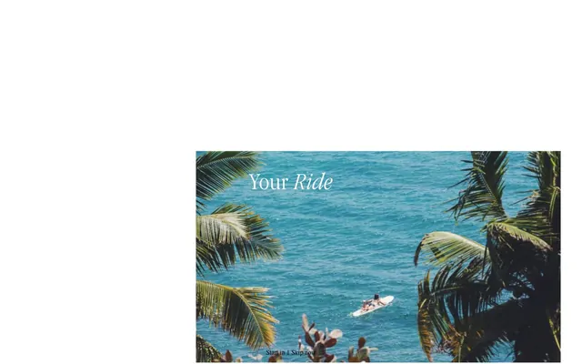
Preview image. Unlock full-res
Editorial adventurer's journal
Color palette
Decorative heading accents, striking visual highlights on dark UI
Highlight elements, icon accents
Decorative heading accents, secondary calls to attention
Decorative heading accents, vivid callouts
Decorative heading accents
Decorative heading accents, earthy visual elements
Page backgrounds, primary text, dark mode surfaces, text button borders
Content surfaces, light mode backgrounds, primary text on dark, ghost button borders
Subtle background for content sections, ghost button backgrounds
Muted secondary text, subtle accent on dark backgrounds
Input placeholder text, inactive elements
Badge accents, error states, attention-grabbing headings
Typography
- Weights
- 400
- Sizes
- 16px
- Line height
- 1
- Letter spacing
- normal
- Fallback
- Times New Roman
Foundational text for general content, navigation links, and subtle details. Its classic serif evokes a print aesthetic.
- Weights
- 100, 300, 400
- Sizes
- 16px, 18px, 20px, 22px, 24px, 48px, 60px, 72px
- Line height
- 1, 1.1, 1.2, 1.4
- Letter spacing
- 0.01em
- Fallback
- Garamond
Used for headlines and subheadings, offering an elegant, condensed serif contrast to the body text. Its range of weights and sizes provides clear hierarchy and visual appeal.
- Weights
- 400, 500, 600
- Sizes
- 14px, 16px, 20px, 22px
- Line height
- 1
- Letter spacing
- -0.02em
- Fallback
- Franklin Gothic Condensed
A workhorse sans-serif for body text, badges, and smaller headings. The condensed form maintains efficiency while the slight negative letter-spacing keeps it compact and legible.
- Weights
- 400, 500, 600
- Sizes
- 13px, 14px, 15px, 16px
- Line height
- 1, 1.2
- Letter spacing
- 0.01em
- Fallback
- Franklin Gothic
Used for input fields, navigation, and detailed body content. Its straightforward sans-serif form ensures clarity for functional elements.
- Weights
- 400
- Sizes
- 18px, 19px, 20px, 23px, 29px
- Line height
- 0.9, 1
- Letter spacing
- 0.01em
- Fallback
- Garamond
Introduces visual variation for navigation and body text, maintaining a refined serif character at smaller sizes.
- Weights
- 400
- Sizes
- 24px, 30px, 59px, 77px
- Line height
- 0.8, 1
- Letter spacing
- -0.025em
- Fallback
- Neue Haas Grotesk Display
Used for larger headings and calls to action, providing a distinctive display sans-serif with tighter tracking for impact. The generous line height complements its scale.
- Weights
- 500
- Sizes
- 88px, 92px, 154px
- Line height
- 1
- Letter spacing
- normal
- Fallback
- Garamond Premier Pro
Dominant display serif for hero headlines, commanding attention with classic elegance.
- Weights
- 400
- Sizes
- 48px, 79px, 92px
- Line height
- 0.8, 0.9
- Letter spacing
- -0.025em
- Fallback
- Kabel Std
A geometric sans-serif for striking headings, offering a modernist contrast to the serifs. Its tight tracking enhances its presence.
- Weights
- 300, 400
- Sizes
- 46px, 92px
- Line height
- 0.9
- Letter spacing
- -0.139em
- Fallback
- Didot
Highly stylized, condensed serif for exceptional display headings, providing a unique personality through extremely tight letter spacing and a slender visual profile.
- Weights
- 400
- Sizes
- 92px
- Line height
- 1
- Letter spacing
- -0.005em
- Fallback
- Abril Display
Distinctive display font for specific, impactful headings, leveraging a unique character for brand moments.
- Weights
- 300
- Sizes
- 46px, 92px
- Line height
- 1
- Letter spacing
- normal
- Fallback
- Playfair Display
Elegant display font for prominent headings, chosen for its delicate yet assertive presence.
- Weights
- 400
- Sizes
- 88px
- Line height
- 1.8
- Letter spacing
- normal
- Fallback
- Source Serif Pro
Display font used for large, isolated text, with ample line height to suggest generosity and openness.
Spacing & shape
Elevation
Components
Background transparent, text 'Canvas White' (#ffffff), border 'Canvas White' (#ffffff), 0px radius, 0px padding.
Background transparent, text 'Midnight Ink' (#000000), border 'Midnight Ink' (#000000), 0px radius, 0px padding.
Background 'Ash Gray' (#f5f5f5), text 'Midnight Ink' (#000000), 50% border radius (effectively pill-shaped), 0px padding. Used for categorical choices.
Background transparent, text 'Midnight Ink' (#000000), bottom border 'Midnight Ink' (#000000), 0px radius, 8px vertical padding. Placeholder text uses 'Placeholder Gray' (#767676).
Background transparent, text 'Canvas White' (#ffffff), bottom border 'Canvas White' (#ffffff), 0px radius, 8px vertical padding.
Background 'Canvas White' (#ffffff), text 'Midnight Ink' (#000000), border 'Placeholder Gray' (#767676), 0px radius, 0px padding.
Background transparent, text 'Sunset Orange' (#ec542d), 0px radius, 0px padding. Used for short, informative labels.
Guidelines
- Prioritize photography as the leading visual element, treating text as an overlay or complementary detail.
- Use 'Midnight Ink' (#000000) for distinct section backgrounds to create high contrast with 'Canvas White' (#ffffff) content.
- Apply 'Garamond' or 'Sequel' for large, impactful headlines, ensuring generous vertical spacing around them.
- Utilize ghost buttons with either 'Midnight Ink' (#000000) or 'Canvas White' (#ffffff) borders and text for all primary actions.
- Employ the 'Sunset Orange' (#ec542d) for badges and error states to bring a consistent, vivid call to attention.
- Maintain a 0px border radius for most interactive elements and inputs, preserving a crisp, structured aesthetic.
- Use 'Ash Gray' (#f5f5f5) as a subtle background distinction for secondary content blocks within light themes.
- Avoid using filled primary buttons; stick to ghost outlines to keep attention on imagery and content.
- Do not introduce additional decorative gradients; the system relies on solid colors and high-contrast photography.
- Refrain from using strong shadows on general elements; reserve for subtle elevation of navigation or specific actions.
- Do not clump content; prioritize generous 'elementGap' (22px) and 'sectionGap' (115px) for a spacious feel.
- Avoid mixing display fonts excessively on a single screen; ensure a clear hierarchy with 1-2 primary display choices and 1-2 functional families.
- Do not use highly saturated colors for large text blocks; they are reserved for accents and small functional elements.
- Never compromise on high text contrast; always ensure 'Midnight Ink' (#000000) on 'Canvas White' (#ffffff) or vice versa for optimal readability.
About this system
ShowHide
Land of Ride evokes an adventurous, editorial spirit with a high-contrast dark theme punctuated by vivid, energetic accents. Typography is a rich blend of elegant serifs for headlines and navigation, grounded by clear sans-serifs for body text, creating a layered, magazine-like feel. Components are lean and functional, often using ghost styling and thin borders, allowing striking photography to take center stage. The interplay of deep blacks and sharp whites with a spectrum of dynamic colors makes interactive elements feel distinct and alive.
The page primarily uses a full-bleed layout for hero sections, often with captivating imagery. Content sections are typically max-width constrained, creating a focused reading area on wide screens, but the overall page model uses both full-bleed and contained sections fluidly. The hero pattern displays a large image with text overlaid at the center. Section rhythm alternates between text-dominant blocks and image-heavy showcases. Content is often arranged in grid formats for community content, typically 3-4 columns of image-text pairs. A standard top navigation bar (often transparent over the hero, then sticky) is present, with secondary navigation sometimes appearing as stacked links. The layout is spacious, with considerable breathing room between elements and sections.
The site uses high-quality, full-bleed photography featuring extreme sports (surf, ski, snowboard, motorbike) and vast landscapes. Images are often raw and natural, with vibrant colors emphasizing the adventure. They serve as atmospheric backdrops and aspirational content rather than product showcases. There's a strong focus on action shots and scenic views. Icons, when present, are minimal and conceptual, lacking distinct stroke weight in the provided context (no specific icon data). The density is image-heavy, with photography often occupying large viewport areas, creating an immersive experience.
Reminiscent of Open Space, Airbnb, VSCO, The New York Times (digital).
# Land of Ride — Style Reference
> Editorial adventurer's journal

**Theme:** dark

**Site:** https://www.landofride.com

Land of Ride evokes an adventurous, editorial spirit with a high-contrast dark theme punctuated by vivid, energetic accents. Typography is a rich blend of elegant serifs for headlines and navigation, grounded by clear sans-serifs for body text, creating a layered, magazine-like feel. Components are lean and functional, often using ghost styling and thin borders, allowing striking photography to take center stage. The interplay of deep blacks and sharp whites with a spectrum of dynamic colors makes interactive elements feel distinct and alive.

## Tokens — Colors

| Name | Value | Token | Role |
|------|------|------|------|
| Flamingo Pink | `#ffc2f7` | `--color-flamingo-pink` | Decorative heading accents, striking visual highlights on dark UI |
| Goldenrod | `#ebb70b` | `--color-goldenrod` | Highlight elements, icon accents |
| Passion Red | `#fe5c5d` | `--color-passion-red` | Decorative heading accents, secondary calls to attention |
| Blaze Orange | `#f77408` | `--color-blaze-orange` | Decorative heading accents, vivid callouts |
| Ocean Blue | `#0b50b8` | `--color-ocean-blue` | Decorative heading accents |
| Forest Sage | `#8c988b` | `--color-forest-sage` | Decorative heading accents, earthy visual elements |
| Midnight Ink | `#000000` | `--color-midnight-ink` | Page backgrounds, primary text, dark mode surfaces, text button borders |
| Canvas White | `#ffffff` | `--color-canvas-white` | Content surfaces, light mode backgrounds, primary text on dark, ghost button borders |
| Ash Gray | `#f5f5f5` | `--color-ash-gray` | Subtle background for content sections, ghost button backgrounds |
| Ghostly Mist | `#eee7e7` | `--color-ghostly-mist` | Muted secondary text, subtle accent on dark backgrounds |
| Placeholder Gray | `#767676` | `--color-placeholder-gray` | Input placeholder text, inactive elements |
| Sunset Orange | `#ec542d` | `--color-sunset-orange` | Badge accents, error states, attention-grabbing headings |

## Tokens — Typography

### Times
- **Substitute:** Times New Roman
- **Weights:** 400
- **Sizes:** 16px
- **Line height:** 1
- **Letter spacing:** normal
- **Role:** Foundational text for general content, navigation links, and subtle details. Its classic serif evokes a print aesthetic.

### GaramondNarrow
- **Substitute:** Garamond
- **Weights:** 100, 300, 400
- **Sizes:** 16px, 18px, 20px, 22px, 24px, 48px, 60px, 72px
- **Line height:** 1, 1.1, 1.2, 1.4
- **Letter spacing:** 0.01em
- **Role:** Used for headlines and subheadings, offering an elegant, condensed serif contrast to the body text. Its range of weights and sizes provides clear hierarchy and visual appeal.

### FranklinGothicCondensed
- **Substitute:** Franklin Gothic Condensed
- **Weights:** 400, 500, 600
- **Sizes:** 14px, 16px, 20px, 22px
- **Line height:** 1
- **Letter spacing:** -0.02em
- **Role:** A workhorse sans-serif for body text, badges, and smaller headings. The condensed form maintains efficiency while the slight negative letter-spacing keeps it compact and legible.

### FranklinGothic
- **Substitute:** Franklin Gothic
- **Weights:** 400, 500, 600
- **Sizes:** 13px, 14px, 15px, 16px
- **Line height:** 1, 1.2
- **Letter spacing:** 0.01em
- **Role:** Used for input fields, navigation, and detailed body content. Its straightforward sans-serif form ensures clarity for functional elements.

### GaramondCondensed
- **Substitute:** Garamond
- **Weights:** 400
- **Sizes:** 18px, 19px, 20px, 23px, 29px
- **Line height:** 0.9, 1
- **Letter spacing:** 0.01em
- **Role:** Introduces visual variation for navigation and body text, maintaining a refined serif character at smaller sizes.

### Sequel
- **Substitute:** Neue Haas Grotesk Display
- **Weights:** 400
- **Sizes:** 24px, 30px, 59px, 77px
- **Line height:** 0.8, 1
- **Letter spacing:** -0.025em
- **Role:** Used for larger headings and calls to action, providing a distinctive display sans-serif with tighter tracking for impact. The generous line height complements its scale.

### Garamond
- **Substitute:** Garamond Premier Pro
- **Weights:** 500
- **Sizes:** 88px, 92px, 154px
- **Line height:** 1
- **Letter spacing:** normal
- **Role:** Dominant display serif for hero headlines, commanding attention with classic elegance.

### Kabel
- **Substitute:** Kabel Std
- **Weights:** 400
- **Sizes:** 48px, 79px, 92px
- **Line height:** 0.8, 0.9
- **Letter spacing:** -0.025em
- **Role:** A geometric sans-serif for striking headings, offering a modernist contrast to the serifs. Its tight tracking enhances its presence.

### LookingGlass
- **Substitute:** Didot
- **Weights:** 300, 400
- **Sizes:** 46px, 92px
- **Line height:** 0.9
- **Letter spacing:** -0.139em
- **Role:** Highly stylized, condensed serif for exceptional display headings, providing a unique personality through extremely tight letter spacing and a slender visual profile.

### CheapsMan
- **Substitute:** Abril Display
- **Weights:** 400
- **Sizes:** 92px
- **Line height:** 1
- **Letter spacing:** -0.005em
- **Role:** Distinctive display font for specific, impactful headings, leveraging a unique character for brand moments.

### Amarante
- **Substitute:** Playfair Display
- **Weights:** 300
- **Sizes:** 46px, 92px
- **Line height:** 1
- **Letter spacing:** normal
- **Role:** Elegant display font for prominent headings, chosen for its delicate yet assertive presence.

### VeryPopular
- **Substitute:** Source Serif Pro
- **Weights:** 400
- **Sizes:** 88px
- **Line height:** 1.8
- **Letter spacing:** normal
- **Role:** Display font used for large, isolated text, with ample line height to suggest generosity and openness.

## Tokens — Type Scale

Perfect Fifth (1.5) from 16px base.

| Role | Size | Line height | Letter spacing |
|------|------|------|------|
| caption | 13px | 1.2 | — |
| body | 16px | 1 | 0.16px |
| subheading | 22px | 1 | -0.44px |
| heading-sm | 24px | 1.1 | 0.24px |
| heading | 48px | 0.9 | -1.44px |
| heading-lg | 77px | 0.8 | -2.31px |
| display | 154px | 1 | — |

## Tokens — Spacing

- **Section gap:** 115px
- **Card padding:** 29px
- **Element gap:** 22px

## Tokens — Radius

- **Buttons:** 0px
- **Inputs:** 0px
- **nav:** 3px
- **other:** 3px

## Tokens — Elevation

- **Navigation Bar:** `rgba(0, 0, 0, 0.25) 0px 4px 10px 0px`
- **Button Shadow:** `rgba(0, 0, 0, 0.32) 3px 3px 8px 0px`

## Layout

The page primarily uses a full-bleed layout for hero sections, often with captivating imagery. Content sections are typically max-width constrained, creating a focused reading area on wide screens, but the overall page model uses both full-bleed and contained sections fluidly. The hero pattern displays a large image with text overlaid at the center. Section rhythm alternates between text-dominant blocks and image-heavy showcases. Content is often arranged in grid formats for community content, typically 3-4 columns of image-text pairs. A standard top navigation bar (often transparent over the hero, then sticky) is present, with secondary navigation sometimes appearing as stacked links. The layout is spacious, with considerable breathing room between elements and sections.

## Imagery

The site uses high-quality, full-bleed photography featuring extreme sports (surf, ski, snowboard, motorbike) and vast landscapes. Images are often raw and natural, with vibrant colors emphasizing the adventure. They serve as atmospheric backdrops and aspirational content rather than product showcases. There's a strong focus on action shots and scenic views. Icons, when present, are minimal and conceptual, lacking distinct stroke weight in the provided context (no specific icon data). The density is image-heavy, with photography often occupying large viewport areas, creating an immersive experience.

## Components

### Ghost Button Inverse
*Primary action button on dark backgrounds*

Background transparent, text 'Canvas White' (#ffffff), border 'Canvas White' (#ffffff), 0px radius, 0px padding.

### Ghost Button Default
*Primary action button on light backgrounds*

Background transparent, text 'Midnight Ink' (#000000), border 'Midnight Ink' (#000000), 0px radius, 0px padding.

### Pill Button Light
*Secondary action button for filtering or specific selections*

Background 'Ash Gray' (#f5f5f5), text 'Midnight Ink' (#000000), 50% border radius (effectively pill-shaped), 0px padding. Used for categorical choices.

### Standard Input Light
*Text input field on light backgrounds*

Background transparent, text 'Midnight Ink' (#000000), bottom border 'Midnight Ink' (#000000), 0px radius, 8px vertical padding. Placeholder text uses 'Placeholder Gray' (#767676).

### Standard Input Dark
*Text input field on dark backgrounds*

Background transparent, text 'Canvas White' (#ffffff), bottom border 'Canvas White' (#ffffff), 0px radius, 8px vertical padding.

### Filled Input Light
*Text input field with clear background on light themes*

Background 'Canvas White' (#ffffff), text 'Midnight Ink' (#000000), border 'Placeholder Gray' (#767676), 0px radius, 0px padding.

### Accent Badge
*Highlighting tags or categories*

Background transparent, text 'Sunset Orange' (#ec542d), 0px radius, 0px padding. Used for short, informative labels.

## Guidelines

### Do

- Prioritize photography as the leading visual element, treating text as an overlay or complementary detail.
- Use 'Midnight Ink' (#000000) for distinct section backgrounds to create high contrast with 'Canvas White' (#ffffff) content.
- Apply 'Garamond' or 'Sequel' for large, impactful headlines, ensuring generous vertical spacing around them.
- Utilize ghost buttons with either 'Midnight Ink' (#000000) or 'Canvas White' (#ffffff) borders and text for all primary actions.
- Employ the 'Sunset Orange' (#ec542d) for badges and error states to bring a consistent, vivid call to attention.
- Maintain a 0px border radius for most interactive elements and inputs, preserving a crisp, structured aesthetic.
- Use 'Ash Gray' (#f5f5f5) as a subtle background distinction for secondary content blocks within light themes.

### Don't

- Avoid using filled primary buttons; stick to ghost outlines to keep attention on imagery and content.
- Do not introduce additional decorative gradients; the system relies on solid colors and high-contrast photography.
- Refrain from using strong shadows on general elements; reserve for subtle elevation of navigation or specific actions.
- Do not clump content; prioritize generous 'elementGap' (22px) and 'sectionGap' (115px) for a spacious feel.
- Avoid mixing display fonts excessively on a single screen; ensure a clear hierarchy with 1-2 primary display choices and 1-2 functional families.
- Do not use highly saturated colors for large text blocks; they are reserved for accents and small functional elements.
- Never compromise on high text contrast; always ensure 'Midnight Ink' (#000000) on 'Canvas White' (#ffffff) or vice versa for optimal readability.

## Agent Prompt Guide

Quick Color Reference:
text: #000000
background: #000000
border: #000000
accent: #ffc2f7
primary action: no distinct CTA color

Example Component Prompts:
1. Create a hero section: full-bleed image with an overlay. Headline 'Your Next Ride' in Garamond 92px, weight 500, #ffffff. Subtitle 'Discover new horizons' in Times 16px, weight 400, #ffffff. A ghost button below: background transparent, text 'Explore Adventures' #ffffff, border #ffffff, 0px radius, 0px padding.
2. Create a content card for 'Community': Background 'Canvas White' (#ffffff), 3px radius. Body text 'Previously riding' in GaramondNarrow 22px, weight 400, #000000. Underneath, a smaller text 'KYRGYZSTAN 2022' in FranklinGothicCondensed 14px, weight 400, #000000. Add a small 'Accent Badge' with text '#travelresolutions' in 'Sunset Orange' (#ec542d).
No distinct primary action color was observed; use the extracted neutral button treatments instead of inventing a filled CTA color.
More like this









Keep what you find
A free account saves references to boards and can send you a weekly email of picks based on what you save.
To see every result, go Pro.