Preview image. Unlock full-res
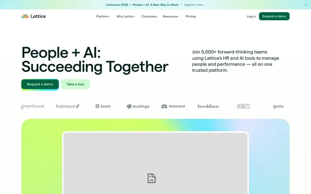
Gradient-kissed productivity palette: an orderly white canvas brought to life by vibrant, organic color washes and structured forms.
Color palette
Primary action button background, success indicators, and secondary accent fills. A soft, approachable green that signals positivity
Primary action button text, borders for success states and accents. A robust green that provides strong contrast against Pale Green
Key textual links, decorative highlights, and borders for specific interactive states. A deep teal for functional elements
Emphasis text, bordered elements within cards, and decorative icons. A muted teal used for subtle highlights
Decorative elements, card borders, and icon accents, establishing a secondary brand accent
Decorative card borders and subtle icon accents, another variation of green in the accent palette
Decorative card borders, icon accents, and visual points of interest. A vibrant, distinct accent color
Decorative card borders, icon accents, and highlights that need visual warmth
Card backgrounds, providing a striking visual contrast to the neutral palette that highlights specific content
Subtle background for specific card sections, adding a cool, muted tone
Hero section background, large graphical elements – combines refreshing green and blue hues for a dynamic visual
Page background, card surfaces, UI elements requiring a stark contrast against darker text
Primary text, prominent headings, borders for interactive elements, and icon fills. Serves as the primary dark neutral
Subtle background for UI sections and elevated cards, providing gentle visual separation from the Canvas White
Secondary text, muted links, and less prominent borders. Offers a softer alternative to Matter Black for detailed information
Tertiary text, navigation items, and default body text. A dark gray that maintains readability while being less stark than Matter Black
Typography
- Weights
- 400, 500
- Sizes
- 11px, 13px, 14px, 16px, 17px, 18px, 19px, 22px, 47px, 72px
- Line height
- 0.9, 1, 1.1, 1.2, 1.3
- Letter spacing
- -0.0240em, 0.0800em
- Fallback
- Inter
Primary typeface for all textual content, from headings to body text. Its crisp, modern lines establish a professional yet approachable tone. The tight letter tracking at larger sizes maintains visual density, while its consistent presence underpins the brand's direct communication style.
Spacing & shape
Elevation
Components
A button with 'Pale Green' (#cdface) background and 'Matter Black' (#001f1f) text, featuring a large border radius of 28.8768px and padding of 8.66304px top/bottom and 17.3261px left/right. Used for primary calls to action like 'Request a demo'.
A transparent button with 'Ash Gray' (#6a7878) text and no background fill, featuring a medium border radius of 11.5507px and padding of 10.1069px top/bottom and 11.5507px left/right. Used for secondary actions like 'Take a tour'.
A very compact button with 'Matter Black' (#001f1f) text on a transparent background, used specifically within navigation menus. Features a border radius of 28.8768px and minimal padding.
A large card with a 'Lime Spritz Gradient' background, showcasing key information or featured content. Has a distinct border radius of 43.3152px and generous padding of 57.7536px on all sides.
A card with a 'Violet Echo' (#624ee5) or 'Faded Pink' (#e1e1fa) background, used to highlight testimonials or key statistics. Features a border radius of 21.6576px and a pronounced shadow for elevation. Padding is minimal at 7.2192px.
A small badge with 'Pale Green' (#cdface) background and 'Forest Green' (#366625) text, used for categories or short labels. Features a border radius of 21.6576px and padding of 4.33152px top/bottom and 8.66304px left/right.
Guidelines
- Use 'Matter Black' (#001f1f) for all primary headings and body text, ensuring strong readability.
- Apply a border-radius of 28.8768px for all primary action buttons for a consistent soft, approachable feel.
- Employ 'Canvas White' (#ffffff) as the default background for most page sections and card surfaces.
- Utilize 'Pale Green' (#cdface) as the background for primary call-to-action buttons, accompanied by 'Forest Green' (#366625) text.
- Provide ample vertical separation between major page sections with a default `sectionGap` of 72px.
- Maintain a compact button style with `elementGap` of 7px for tight UI element alignments.
- Apply `Matter` font at 500 weight for headings for confident visual hierarchy.
- Avoid using harsh, saturated colors for large background areas; reserve them for small accents or carefully crafted gradients.
- Do not deviate from the Matter typeface; maintain its consistent use across all text elements.
- Refrain from using square corners on interactive elements; apply radii of at least 11.5507px for a softer, more inviting touch.
- Do not introduce new shadow styles beyond the defined subtle stack for elevated cards; maintain visual lightness.
- Avoid using multiple font weights within a single text block to preserve the confident and direct typographic voice.
- Do not overuse bold text; rely on size and context for emphasis rather than increased visual weight.
- Do not combine multiple colored gradients arbitrarily; use them purposefully for distinct sections, following the established 'Lime Spritz Gradient' pattern.
About this system
ShowHide
Lattice presents a vibrant, modular productivity system: a predominantly clean white canvas punctuated by distinct gradient-filled containers and brightly colored brand accents. Typography is compact and confident, primarily in a single sans-serif weight, ensuring clarity. Functional elements like buttons and badges embrace rounded forms and an array of muted yet distinct brand hues, creating a visually organized and accessible experience.
The page primarily uses a max-width contained layout of 1299px, centered within the viewport. The hero section is a full-bleed gradient background ('Lime Spritz Gradient') with a prominent centered headline and two call-to-action buttons. Following the hero, sections alternate between white and 'Sandstone' (#f7f6f2) backgrounds, creating a clear vertical rhythm. Content is arranged in alternating two-column layouts (text beside imagery/card) and three-column card grids for features and testimonials. The layout density is spacious, ensuring readability and visual breathing room between content blocks. A persistent top navigation bar provides access to key sections.
This site features a mix of conceptual illustrations and product screenshots. Illustrations are often abstract and geometric, using brand gradient colors to create a sense of dynamism and modernism. Product screenshots are typically presented as contained elements within card-like structures, sometimes with a subtle backdrop blur or shadow, emphasizing the software's functionality over realistic context. Icons are outlined, mono-color, and functional. Imagery generally plays an explanatory and decorative role, balancing an image-dominant hero section with text-dominant content sections later on.
Reminiscent of Asana, Notion, Webflow, Gusto.
# Lattice — Style Reference
> Gradient-kissed productivity palette: an orderly white canvas brought to life by vibrant, organic color washes and structured forms.

**Theme:** light

**Site:** https://lattice.com

Lattice presents a vibrant, modular productivity system: a predominantly clean white canvas punctuated by distinct gradient-filled containers and brightly colored brand accents. Typography is compact and confident, primarily in a single sans-serif weight, ensuring clarity. Functional elements like buttons and badges embrace rounded forms and an array of muted yet distinct brand hues, creating a visually organized and accessible experience.

## Tokens — Colors

| Name | Value | Token | Role |
|------|------|------|------|
| Pale Green | `#cdface` | `--color-pale-green` | Primary action button background, success indicators, and secondary accent fills. A soft, approachable green that signals positivity |
| Forest Green | `#366625` | `--color-forest-green` | Primary action button text, borders for success states and accents. A robust green that provides strong contrast against Pale Green |
| Teal Ink | `#006666` | `--color-teal-ink` | Key textual links, decorative highlights, and borders for specific interactive states. A deep teal for functional elements |
| Oceanic Teal | `#003d3d` | `--color-oceanic-teal` | Emphasis text, bordered elements within cards, and decorative icons. A muted teal used for subtle highlights |
| Moss Green | `#515c0b` | `--color-moss-green` | Decorative elements, card borders, and icon accents, establishing a secondary brand accent |
| Deep Jade | `#2a4e1c` | `--color-deep-jade` | Decorative card borders and subtle icon accents, another variation of green in the accent palette |
| Magenta Bloom | `#7a2251` | `--color-magenta-bloom` | Decorative card borders, icon accents, and visual points of interest. A vibrant, distinct accent color |
| Golden Ochre | `#a36a14` | `--color-golden-ochre` | Decorative card borders, icon accents, and highlights that need visual warmth |
| Violet Echo | `#624ee5` | `--color-violet-echo` | Card backgrounds, providing a striking visual contrast to the neutral palette that highlights specific content |
| Sky Mist | `#e4f7f9` | `--color-sky-mist` | Subtle background for specific card sections, adding a cool, muted tone |
| Lime Spritz Gradient | `#67e2eb` | `--color-lime-spritz-gradient` | Hero section background, large graphical elements – combines refreshing green and blue hues for a dynamic visual |
| Canvas White | `#ffffff` | `--color-canvas-white` | Page background, card surfaces, UI elements requiring a stark contrast against darker text |
| Matter Black | `#001f1f` | `--color-matter-black` | Primary text, prominent headings, borders for interactive elements, and icon fills. Serves as the primary dark neutral |
| Sandstone | `#f7f6f2` | `--color-sandstone` | Subtle background for UI sections and elevated cards, providing gentle visual separation from the Canvas White |
| Ash Gray | `#6a7878` | `--color-ash-gray` | Secondary text, muted links, and less prominent borders. Offers a softer alternative to Matter Black for detailed information |
| Slate Gray | `#455252` | `--color-slate-gray` | Tertiary text, navigation items, and default body text. A dark gray that maintains readability while being less stark than Matter Black |

## Tokens — Typography

### Matter
- **Substitute:** Inter
- **Weights:** 400, 500
- **Sizes:** 11px, 13px, 14px, 16px, 17px, 18px, 19px, 22px, 47px, 72px
- **Line height:** 0.9, 1, 1.1, 1.2, 1.3
- **Letter spacing:** -0.0240em, 0.0800em
- **Role:** Primary typeface for all textual content, from headings to body text. Its crisp, modern lines establish a professional yet approachable tone. The tight letter tracking at larger sizes maintains visual density, while its consistent presence underpins the brand's direct communication style.

## Tokens — Type Scale

| Role | Size | Line height | Letter spacing |
|------|------|------|------|
| caption | 11px | 1.3 | 0.88px |
| subheading | 18px | 1.2 | -0.43px |
| heading | 47px | 1.1 | -1.13px |
| display | 72px | 0.9 | -1.73px |

## Tokens — Spacing

- **Max width:** 1299px
- **Section gap:** 72px
- **Card padding:** 58px
- **Element gap:** 7px

## Tokens — Radius

- **Default:** 14.4384px
- **Buttons:** 28.8768px
- **Cards:** 21.6576px
- **badges:** 21.6576px
- **pill:** 9999px

## Tokens — Elevation

- **Card:** `rgba(0, 31, 31, 0.04) 0px 12px 12px -6px, rgba(0, 31, 31, 0.04) 0px 6px 6px -3px, rgba(0, 31, 31, 0.04) 0px 3px 3px -1.5px, rgba(0, 31, 31, 0.08) 0px 1px 1px -0.5px, rgba(0, 31, 31, 0.04) 0px 0px 0px 1px`

## Layout

The page primarily uses a max-width contained layout of 1299px, centered within the viewport. The hero section is a full-bleed gradient background ('Lime Spritz Gradient') with a prominent centered headline and two call-to-action buttons. Following the hero, sections alternate between white and 'Sandstone' (#f7f6f2) backgrounds, creating a clear vertical rhythm. Content is arranged in alternating two-column layouts (text beside imagery/card) and three-column card grids for features and testimonials. The layout density is spacious, ensuring readability and visual breathing room between content blocks. A persistent top navigation bar provides access to key sections.

## Imagery

This site features a mix of conceptual illustrations and product screenshots. Illustrations are often abstract and geometric, using brand gradient colors to create a sense of dynamism and modernism. Product screenshots are typically presented as contained elements within card-like structures, sometimes with a subtle backdrop blur or shadow, emphasizing the software's functionality over realistic context. Icons are outlined, mono-color, and functional. Imagery generally plays an explanatory and decorative role, balancing an image-dominant hero section with text-dominant content sections later on.

## Components

### Primary Filled Button
*Call to Action*

A button with 'Pale Green' (#cdface) background and 'Matter Black' (#001f1f) text, featuring a large border radius of 28.8768px and padding of 8.66304px top/bottom and 17.3261px left/right. Used for primary calls to action like 'Request a demo'.

### Ghost Button
*Secondary Action*

A transparent button with 'Ash Gray' (#6a7878) text and no background fill, featuring a medium border radius of 11.5507px and padding of 10.1069px top/bottom and 11.5507px left/right. Used for secondary actions like 'Take a tour'.

### Navigation Link Button
*Navigation Item*

A very compact button with 'Matter Black' (#001f1f) text on a transparent background, used specifically within navigation menus. Features a border radius of 28.8768px and minimal padding.

### Accent Gradient Hero Card
*Showcase Card*

A large card with a 'Lime Spritz Gradient' background, showcasing key information or featured content. Has a distinct border radius of 43.3152px and generous padding of 57.7536px on all sides.

### Testimonial Card
*Content Showcase*

A card with a 'Violet Echo' (#624ee5) or 'Faded Pink' (#e1e1fa) background, used to highlight testimonials or key statistics. Features a border radius of 21.6576px and a pronounced shadow for elevation. Padding is minimal at 7.2192px.

### Informational Badge
*Categorization/Meta*

A small badge with 'Pale Green' (#cdface) background and 'Forest Green' (#366625) text, used for categories or short labels. Features a border radius of 21.6576px and padding of 4.33152px top/bottom and 8.66304px left/right.

## Guidelines

### Do

- Use 'Matter Black' (#001f1f) for all primary headings and body text, ensuring strong readability.
- Apply a border-radius of 28.8768px for all primary action buttons for a consistent soft, approachable feel.
- Employ 'Canvas White' (#ffffff) as the default background for most page sections and card surfaces.
- Utilize 'Pale Green' (#cdface) as the background for primary call-to-action buttons, accompanied by 'Forest Green' (#366625) text.
- Provide ample vertical separation between major page sections with a default `sectionGap` of 72px.
- Maintain a compact button style with `elementGap` of 7px for tight UI element alignments.
- Apply `Matter` font at 500 weight for headings for confident visual hierarchy.

### Don't

- Avoid using harsh, saturated colors for large background areas; reserve them for small accents or carefully crafted gradients.
- Do not deviate from the Matter typeface; maintain its consistent use across all text elements.
- Refrain from using square corners on interactive elements; apply radii of at least 11.5507px for a softer, more inviting touch.
- Do not introduce new shadow styles beyond the defined subtle stack for elevated cards; maintain visual lightness.
- Avoid using multiple font weights within a single text block to preserve the confident and direct typographic voice.
- Do not overuse bold text; rely on size and context for emphasis rather than increased visual weight.
- Do not combine multiple colored gradients arbitrarily; use them purposefully for distinct sections, following the established 'Lime Spritz Gradient' pattern.

## Agent Prompt Guide

Quick Color Reference:
text: #001f1f
background: #ffffff
border: #001f1f
accent: #cdface
primary action: #cdface (filled action)

Example Component Prompts:
1. Create a Primary Filled Button: background #cdface, text #001f1f, border-radius 28.8768px, padding 8.66304px vertically and 17.3261px horizontally, using Matter 400 at 16px.
2. Design a Ghost Button: background transparent, text #6a7878, border-radius 11.5507px, padding 10.1069px vertically and 11.5507px horizontally, using Matter 400 at 16px.
3. Implement a Testimonial Card: background #624ee5, border-radius 21.6576px, shadow rgba(0, 31, 31, 0.04) 0px 12px 12px -6px, rgba(0, 31, 31, 0.04) 0px 6px 6px -3px, rgba(0, 31, 31, 0.04) 0px 3px 3px -1.5px, rgba(0, 31, 31, 0.08) 0px 1px 1px -0.5px, rgba(0, 31, 31, 0.04) 0px 0px 0px 1px, padding 7.2192px.
4. Generate an Informational Badge: background #cdface, text #366625, border-radius 21.6576px, padding 4.33152px vertically and 8.66304px horizontally, using Matter 400 at 13px.
More like this









Keep what you find
A free account saves references to boards and can send you a weekly email of picks based on what you save.
To see every result, go Pro.