Preview image. Unlock full-res
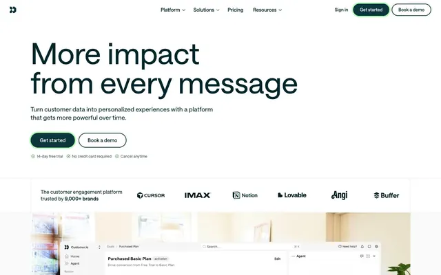
Architectural Blueprint on Frosted Glass
Color palette
Interactive button borders (e.g., ghost buttons), subtle highlights for active elements. A vivid, almost neon green-yellow that indicates interactive states
Highlight text within body copy, decorative indicators. A vivid orange that draws attention to specific words
Highlight text within body copy, decorative indicators. A vivid violet that draws attention to specific words
Link text, decorative icon fills. A muted teal for functional, clickable elements
Numerical highlights (e.g., percentages), bold accents in headlines. A vivid blue for numerical and impactful data display
Primary text, prominent headings, dark button backgrounds, navigation text. This near-black provides strong contrast against light surfaces
Secondary text, active navigation elements, button outlines, subtle borders. A deep, cool gray that maintains readability
Decorative background accents, subtle borders on cards and images. A very light, cool gray with a hint of blue
Muted text, less prominent body copy, icon fills. A medium-dark gray for secondary information
Subtle text for secondary buttons or helper text. A mid-tone gray that recedes
Lightest secondary text, faint borders, inactive states. A very light gray for tertiary information
Primary page canvas and white card surfaces
Page background, main content area canvas. A light, neutral gray base for the entire interface
Card backgrounds, navigation bar, interactive element fills. Provides a clean, bright layer above the canvas
Subtly elevated card backgrounds, inner panel sections. A very light gray, barely distinct from white
Decorative background accents, subtle borders on cards and images. A very light, warm gray with a hint of warm tint
Typography
- Weights
- 475, 500, 600, 700
- Sizes
- 12px, 14px, 16px, 18px, 20px, 24px, 30px, 36px, 40px, 48px, 96px
- Line height
- 1, 1.25, 1.38
- Letter spacing
- 0.017, 0.014, 0.013, 0.011, 0.01, 0.008, 0.007, 0.006, 0.005, 0.004, 0.002
- Fallback
- Inter
The primary typeface for all content. Its precise letter-spacing and varied weights allow for clear hierarchy and detail, from headings to small functional text. The custom font contributes to a sharp, modern feel, prioritizing readability at all scales.
Spacing & shape
Elevation
Components
Background: Midnight Ink (#00262b), Text: Surface White (#ffffff), Padding: 8px vertical, 20px horizontal, Border Radius: 1.67772e+07px (effectively pill-shaped).
Background: Surface White (#ffffff), Text: Oceanic Deep (#0b363b), Padding: 8px vertical, 20px horizontal, Border: 1px solid Spring Leaf (#abffae), Border Radius: 1.67772e+07px (pill-shaped).
Background: transparent, Text: Oceanic Deep (#0b363b), Padding: 0px vertical, 8-16px horizontal, No visible border. Only appears on specific interface elements with distinct padding, usually for internal navigation links.
Background: Surface White (#ffffff), Padding: 32px all sides, No explicit border or shadow, sharp corners (0px radius).
Text: Midnight Ink (#00262b), Active state shows underline or color change to Oceanic Deep (#0b363b).
Guidelines
- Prioritize Midnight Ink (#00262b) for all primary text and headings to ensure strong contrast and readability.
- Use Oceanic Deep (#0b363b) for essential interface elements like borders, secondary text, and active navigation indicators.
- Employ the pill-shaped radius (1.67772e+07px) exclusively for buttons and interactive tags to provide a consistent, user-friendly affordance.
- Utilize Surface White (#ffffff) for card backgrounds and elevated content areas to create visual separation from the Canvas (#ebebeb).
- Apply Spring Leaf (#abffae) sparingly for interactive button outlines or subtle highlights, leveraging its vividness as an accent.
- Maintain a clear visual hierarchy by adjusting font weight and size according to the defined type scale, ensuring proper letter-spacing for each role.
- Separate content sections with clear vertical spacing using the defined sectionGap of 96px for visual breathing room.
- Do not introduce new saturated primary colors; limit the palette to the defined brand and accent colors.
- Avoid heavy shadow effects; rely on subtle borders or background color shifts for elevation.
- Do not use highly decorative fonts; stick to the clean, functional 'saansFont' for all typography.
- Do not apply excessive padding or margins; follow the comfortable density established by the elementGap and cardPadding.
- Avoid arbitrary border radii; adhere to 2px for general elements, 6px for specific images, and the pill-shape for buttons.
- Do not use Electric Blue (#006af2) as a primary button background; reserve it for numerical highlights and specific headline accents.
- Do not introduce complex gradients; the system relies on solid colors and subtle achromatic shifts for surfaces.
About this system
ShowHide
Customer.io employs a crisp, data-driven interface characterized by clean segmentation and a dominant light theme. The visual system features achromatic surfaces with a cool-tinted dark primary text, accented by a single vivid blue-green for interactive elements and brand signaling. Layouts are structured and functional, using subtle borders and a deliberate lack of heavy shadows to maintain a lightweight feel, allowing data visualizations and key information to stand out. Typography is distinct, utilizing a custom sans-serif with a wide range of weights and precise letter-spacing to convey clarity and precision.
The page uses a maximum-width contained model, centered on the screen. The hero section is full-width with a prominent centered headline and descriptive text, followed by clear call-to-action buttons. Subsequent sections often feature alternating two-column layouts with text and visual elements, or multi-column card grids for features. Vertical spacing between major sections is generous and consistent, creating a comfortable rhythm. The navigation is a sticky top bar, providing persistent access to key sections.
The site predominantly uses product screenshots and abstract graphic elements. Product screenshots are often contained within clean frames or directly embedded into the UI, showcasing the software interface without additional context. Illustrations are minimal, tending towards flat, clean icons that represent features or concepts. There is a strong visual emphasis on product utility over lifestyle or decorative imagery. Imagery serves primarily to explain content or showcase the product, not for atmospheric decoration.
Reminiscent of Linear, Figma, Supabase, Notion.
# customer.io — Style Reference
> Architectural Blueprint on Frosted Glass

**Theme:** light

**Site:** https://customer.io

Customer.io employs a crisp, data-driven interface characterized by clean segmentation and a dominant light theme. The visual system features achromatic surfaces with a cool-tinted dark primary text, accented by a single vivid blue-green for interactive elements and brand signaling. Layouts are structured and functional, using subtle borders and a deliberate lack of heavy shadows to maintain a lightweight feel, allowing data visualizations and key information to stand out. Typography is distinct, utilizing a custom sans-serif with a wide range of weights and precise letter-spacing to convey clarity and precision.

## Tokens — Colors

| Name | Value | Token | Role |
|------|------|------|------|
| Spring Leaf | `#abffae` | `--color-spring-leaf` | Interactive button borders (e.g., ghost buttons), subtle highlights for active elements. A vivid, almost neon green-yellow that indicates interactive states |
| Amber Pop | `#8b3911` | `--color-amber-pop` | Highlight text within body copy, decorative indicators. A vivid orange that draws attention to specific words |
| Indigo Pop | `#0a3890` | `--color-indigo-pop` | Highlight text within body copy, decorative indicators. A vivid violet that draws attention to specific words |
| Deep Teal | `#437278` | `--color-deep-teal` | Link text, decorative icon fills. A muted teal for functional, clickable elements |
| Electric Blue | `#006af2` | `--color-electric-blue` | Numerical highlights (e.g., percentages), bold accents in headlines. A vivid blue for numerical and impactful data display |
| Midnight Ink | `#00262b` | `--color-midnight-ink` | Primary text, prominent headings, dark button backgrounds, navigation text. This near-black provides strong contrast against light surfaces |
| Oceanic Deep | `#0b363b` | `--color-oceanic-deep` | Secondary text, active navigation elements, button outlines, subtle borders. A deep, cool gray that maintains readability |
| Sky Mist | `#e0f4ff` | `--color-sky-mist` | Decorative background accents, subtle borders on cards and images. A very light, cool gray with a hint of blue |
| Slate Grille | `#354d51` | `--color-slate-grille` | Muted text, less prominent body copy, icon fills. A medium-dark gray for secondary information |
| Stone Whisper | `#4f6466` | `--color-stone-whisper` | Subtle text for secondary buttons or helper text. A mid-tone gray that recedes |
| Ash Cloud | `#a1c2c6` | `--color-ash-cloud` | Lightest secondary text, faint borders, inactive states. A very light gray for tertiary information |
| Pale Mint | `#eafde8` | `--color-pale-mint` | Primary page canvas and white card surfaces |
| Canvas | `#ebebeb` | `--color-canvas` | Page background, main content area canvas. A light, neutral gray base for the entire interface |
| Surface White | `#ffffff` | `--color-surface-white` | Card backgrounds, navigation bar, interactive element fills. Provides a clean, bright layer above the canvas |
| Fog Gray | `#fafafa` | `--color-fog-gray` | Subtly elevated card backgrounds, inner panel sections. A very light gray, barely distinct from white |
| Warm Mist | `#feefe8` | `--color-warm-mist` | Decorative background accents, subtle borders on cards and images. A very light, warm gray with a hint of warm tint |

## Tokens — Typography

### saansFont
- **Substitute:** Inter
- **Weights:** 475, 500, 600, 700
- **Sizes:** 12px, 14px, 16px, 18px, 20px, 24px, 30px, 36px, 40px, 48px, 96px
- **Line height:** 1, 1.25, 1.38
- **Letter spacing:** 0.017, 0.014, 0.013, 0.011, 0.01, 0.008, 0.007, 0.006, 0.005, 0.004, 0.002
- **Role:** The primary typeface for all content. Its precise letter-spacing and varied weights allow for clear hierarchy and detail, from headings to small functional text. The custom font contributes to a sharp, modern feel, prioritizing readability at all scales.

## Tokens — Type Scale

Perfect Fourth (1.333) from 16px base.

| Role | Size | Line height | Letter spacing |
|------|------|------|------|
| caption | 12px | 1.38 | 0.017em |
| body-sm | 14px | 1.38 | 0.014em |
| body | 16px | 1.38 | 0.013em |
| subheading | 20px | 1.25 | 0.01em |
| heading-sm | 24px | 1.25 | 0.008em |
| heading | 36px | 1.25 | 0.006em |
| heading-lg | 48px | 1.25 | 0.004em |
| display | 96px | 1 | 0.002em |

## Tokens — Spacing

- **Section gap:** 96px
- **Card padding:** 32px
- **Element gap:** 8px

## Tokens — Radius

- **Default:** 2px
- **Buttons:** 1.67772e+07px
- **Images:** 6px

## Tokens — Elevation

- **Button focus ring:** `0px 0px 0px 4px oklch(0.9263 0.136 145.2)`
- **Button focus ring (secondary):** `0px 0px 0px 4px oklch(0.97 0 0)`
- **Primary Filled Button focus ring:** `0px 0px 0px 4px oklch(0.3068 0.046 206.34)`

## Layout

The page uses a maximum-width contained model, centered on the screen. The hero section is full-width with a prominent centered headline and descriptive text, followed by clear call-to-action buttons. Subsequent sections often feature alternating two-column layouts with text and visual elements, or multi-column card grids for features. Vertical spacing between major sections is generous and consistent, creating a comfortable rhythm. The navigation is a sticky top bar, providing persistent access to key sections.

## Imagery

The site predominantly uses product screenshots and abstract graphic elements. Product screenshots are often contained within clean frames or directly embedded into the UI, showcasing the software interface without additional context. Illustrations are minimal, tending towards flat, clean icons that represent features or concepts. There is a strong visual emphasis on product utility over lifestyle or decorative imagery. Imagery serves primarily to explain content or showcase the product, not for atmospheric decoration.

## Components

### Primary Filled Button
*Primary calls to action.*

Background: Midnight Ink (#00262b), Text: Surface White (#ffffff), Padding: 8px vertical, 20px horizontal, Border Radius: 1.67772e+07px (effectively pill-shaped).

### Outline Accent Button
*Secondary calls to action, or actions requiring less visual weight.*

Background: Surface White (#ffffff), Text: Oceanic Deep (#0b363b), Padding: 8px vertical, 20px horizontal, Border: 1px solid Spring Leaf (#abffae), Border Radius: 1.67772e+07px (pill-shaped).

### Ghost Inner Button
*Tertiary actions, often within content blocks or secondary navigation.*

Background: transparent, Text: Oceanic Deep (#0b363b), Padding: 0px vertical, 8-16px horizontal, No visible border. Only appears on specific interface elements with distinct padding, usually for internal navigation links.

### Clean Content Card
*Container for distinct content blocks, features.*

Background: Surface White (#ffffff), Padding: 32px all sides, No explicit border or shadow, sharp corners (0px radius).

### Navigation Link
*Navigation items in header or footer.*

Text: Midnight Ink (#00262b), Active state shows underline or color change to Oceanic Deep (#0b363b).

## Guidelines

### Do

- Prioritize Midnight Ink (#00262b) for all primary text and headings to ensure strong contrast and readability.
- Use Oceanic Deep (#0b363b) for essential interface elements like borders, secondary text, and active navigation indicators.
- Employ the pill-shaped radius (1.67772e+07px) exclusively for buttons and interactive tags to provide a consistent, user-friendly affordance.
- Utilize Surface White (#ffffff) for card backgrounds and elevated content areas to create visual separation from the Canvas (#ebebeb).
- Apply Spring Leaf (#abffae) sparingly for interactive button outlines or subtle highlights, leveraging its vividness as an accent.
- Maintain a clear visual hierarchy by adjusting font weight and size according to the defined type scale, ensuring proper letter-spacing for each role.
- Separate content sections with clear vertical spacing using the defined sectionGap of 96px for visual breathing room.

### Don't

- Do not introduce new saturated primary colors; limit the palette to the defined brand and accent colors.
- Avoid heavy shadow effects; rely on subtle borders or background color shifts for elevation.
- Do not use highly decorative fonts; stick to the clean, functional 'saansFont' for all typography.
- Do not apply excessive padding or margins; follow the comfortable density established by the elementGap and cardPadding.
- Avoid arbitrary border radii; adhere to 2px for general elements, 6px for specific images, and the pill-shape for buttons.
- Do not use Electric Blue (#006af2) as a primary button background; reserve it for numerical highlights and specific headline accents.
- Do not introduce complex gradients; the system relies on solid colors and subtle achromatic shifts for surfaces.

## Agent Prompt Guide

Quick Color Reference:
- text: #00262b
- background: #ebebeb
- border: #0b363b
- accent: #abffae
- primary action: #0b363b (filled action)

Example Component Prompts:
- Create a Primary Action Button: #0b363b background, #ffffff text, 9999px radius, compact pill padding. Use this filled treatment for the main CTA.
- Create a feature card: Surface White background (#ffffff), 32px padding on all sides. Headline at 24px saansFont weight 600 (#00262b), letter-spacing 0.0080. Body text at 16px saansFont weight 475 (#354d51), letter-spacing 0.0130.
More like this









Keep what you find
A free account saves references to boards and can send you a weekly email of picks based on what you save.
To see every result, go Pro.