Preview image. Unlock full-res
Playful Pop-Art Canvas
Color palette
Primary brand accent, button backgrounds, interactive elements, header and footer backgrounds — creates a cheerful, energetic foundation that makes UI elements pop
Primary text, deep neutral accents, button text, icon fills — a strong, graphic dark almost-black that offers high contrast against the yellow
Neutral form states, badge text, and quiet UI feedback where color should stay understated. Do not promote it to the primary CTA color
Page backgrounds, subtle dividing lines — a light, cool gray providing a neutral canvas that allows other colors to stand out
Informational badges, muted UI components — a medium gray for secondary status indicators
Hairline borders, subtle background tints — a very light gray for minimal separation
Typography
- Weights
- 400
- Sizes
- 16px
- Line height
- 1.15
- Letter spacing
- normal
- Fallback
- Times
Primary body text, informational snippets, general content where traditional readability is key. Its classic serif form provides a contrast to the brand's playful nature.
- Weights
- 100, 400
- Sizes
- 11px
- Line height
- 1.15, 2.27
- Letter spacing
- 0.073em
- Fallback
- Arial
Compact labels, badges, and smaller interactive elements. The narrow letter spacing keeps text dense and contained.
- Weights
- 100, 300, 400
- Sizes
- 11px, 13px, 14px, 16px, 40px
- Line height
- 0.9, 1.15, 1.38, 1.56, 2.63
- Letter spacing
- 0.063em at 11px, 0.077em at 13px, 0.091em at 14px
- Fallback
- Arial
Navigational elements, subheadings, and larger display text. The varied weights and tracking give flexibility for hierarchical emphasis, especially the wider tracking on larger sizes for a more airy feel.
- Weights
- 100, 400
- Sizes
- 16px, 23px, 27px, 47px
- Line height
- 0.87, 0.9, 1.15, 1.56, 1.93
- Letter spacing
- normal
- Fallback
- Times New Roman
Decorative headlines and attention-grabbing statements. The low line-height and often all-caps styling create a dense, impactful visual block that feels 'funky' and distinctive, especially at larger sizes like 47px.
Spacing & shape
Components
Solid Sunshine Yellow background (#ffd931), Midnight Ink text (#231f20). Corner radius is 12px for standard and 25px for pill-shaped. Padding is 0px vertical and 15-20px horizontal. Employs classic all-caps Helvetica Neue often at 11px with 0.073em letter spacing.
Transparent background with Coal Black text (#000000) and 0px radius. Used sparingly for minimal, text-based actions. Padding is 1px vertical and 6px horizontal.
Transparent background with 0px border radius and no box shadow. Relies heavily on image and type for visual presence. Image corners are also sharp (0px radius), allowing visual content to define the shape.
Badge Gray background (#a6a8aa), Coal Black text (#000000), with a 10px border radius. No internal padding is specified; text fills the badge.
Uses Helvetica, 11px, with bold letter-spacing (0.091em). Text color is Midnight Ink (#231f20) and links have a strong Coal Black (#000000) bottom border for active states.
Transparent background with Coal Black text (#000000) or Midnight Ink (#231f20) and a 0px border radius. Padding is minimal at 1px vertical and 2px horizontal.
Guidelines
- Use Sunshine Yellow (#ffd931) for all primary interactive elements, ensuring high contrast with Midnight Ink (#231f20) text.
- Employ Times New Roman (or Times) for longer body text and traditional content to provide classic readability.
- Utilize Helvetica (or Arial) for UI elements, labels, and navigation, varying weight for hierarchy and applying generous letter spacing for distinctive impact at larger sizes.
- Set the page background to Soft Stone (#c8cbcd) and header/footer areas to Sunshine Yellow (#ffd931) for consistent brand framing.
- Apply 0px border radius to most cards, images, and inputs, reserving 12px and 25px for buttons and 10px for badges.
- Maintain an element gap of 15px to create a comfortable, structured rhythm without feeling too sparse.
- Use Times Now (or Times New Roman) with low line-height for bold, impactful headlines that capture the brand's 'whimsical' tone.
- Avoid soft shadows or subtle gradients; emphasize sharp, well-defined blocks of color and strong outlines.
- Do not use generic system fonts without specific letter-spacing adjustments for labels and navigation, as this will dilute the brand's typographic character.
- Never introduce new primary background or accent colors that deviate from the core Sunshine Yellow, Soft Stone, and dark neutrals.
- Steer clear of rounded corners on images or content cards; the aesthetic prioritizes clean, square edges for content display.
- Do not break the clear division between yellow and gray background sections in the primary content flow.
- Avoid using light text on light backgrounds; always ensure strong contrast, leveraging Midnight Ink or Coal Black against Sunshine Yellow or Soft Stone.
About this system
ShowHide
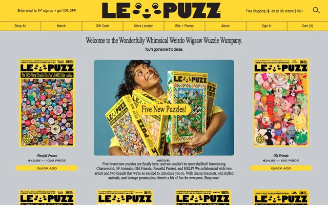
Le Puzz employs a vibrant, playful, and slightly retro aesthetic, using a high-contrast palette dominated by a luminous yellow and stark black and white. The layout is structured yet whimsical, featuring a distinctive mix of classic serif and modern sans-serif typography, often in all-caps, that gives a friendly, almost shouty, character. Surfaces are largely flat and unadorned, relying on the bold color blocks and strong typographic treatments to convey energy and direct attention. Sharp outlines and contained shapes are preferred over soft shadows or gradients.
The page structure follows a max-width contained model, centered on the screen, but the header and footer extend full-bleed with the brand's signature Sunshine Yellow background. The hero section features a prominent, often image-led, centered headline using the Times Now font. Content sections alternate between the Soft Stone background and areas of strong Sunshine Yellow. Images are often placed side-by-side with text sections, or in a three-column grid for product listings. Vertical rhythm is established through consistent element and section gaps (15px and 30px respectively), ensuring a comfortable density. Navigation is a sticky top bar with clearly segmented links.
The visual language relies heavily on product photography featuring jigsaw puzzles, often shown in their packaging. Photography is primarily product-focused, featuring tight crops of the puzzles or people interacting with them in an upbeat, candid style that conveys fun and engagement. Imagery is mostly contained within sharp, unrounded frames, presenting content as distinct blocks. There are no consistent illustration styles, tending towards product images and bold typography. Icons are minimal, typically solid black silhouettes.
Reminiscent of Glossier, Baggu, Warby Parker.
# Le Puzz — Style Reference
> Playful Pop-Art Canvas

**Theme:** light

**Site:** https://lepuzz.com

Le Puzz employs a vibrant, playful, and slightly retro aesthetic, using a high-contrast palette dominated by a luminous yellow and stark black and white. The layout is structured yet whimsical, featuring a distinctive mix of classic serif and modern sans-serif typography, often in all-caps, that gives a friendly, almost shouty, character. Surfaces are largely flat and unadorned, relying on the bold color blocks and strong typographic treatments to convey energy and direct attention. Sharp outlines and contained shapes are preferred over soft shadows or gradients.

## Tokens — Colors

| Name | Value | Token | Role |
|------|------|------|------|
| Sunshine Yellow | `#ffd931` | `--color-sunshine-yellow` | Primary brand accent, button backgrounds, interactive elements, header and footer backgrounds — creates a cheerful, energetic foundation that makes UI elements pop |
| Midnight Ink | `#231f20` | `--color-midnight-ink` | Primary text, deep neutral accents, button text, icon fills — a strong, graphic dark almost-black that offers high contrast against the yellow |
| Coal Black | `#000000` | `--color-coal-black` | Neutral form states, badge text, and quiet UI feedback where color should stay understated. Do not promote it to the primary CTA color |
| Soft Stone | `#c8cbcd` | `--color-soft-stone` | Page backgrounds, subtle dividing lines — a light, cool gray providing a neutral canvas that allows other colors to stand out |
| Badge Gray | `#a6a8aa` | `--color-badge-gray` | Informational badges, muted UI components — a medium gray for secondary status indicators |
| Whisper White | `#d6d6d6` | `--color-whisper-white` | Hairline borders, subtle background tints — a very light gray for minimal separation |

## Tokens — Typography

### Times New Roman
- **Substitute:** Times
- **Weights:** 400
- **Sizes:** 16px
- **Line height:** 1.15
- **Letter spacing:** normal
- **Role:** Primary body text, informational snippets, general content where traditional readability is key. Its classic serif form provides a contrast to the brand's playful nature.

### Helvetica Neue
- **Substitute:** Arial
- **Weights:** 100, 400
- **Sizes:** 11px
- **Line height:** 1.15, 2.27
- **Letter spacing:** 0.073em
- **Role:** Compact labels, badges, and smaller interactive elements. The narrow letter spacing keeps text dense and contained.

### Helvetica
- **Substitute:** Arial
- **Weights:** 100, 300, 400
- **Sizes:** 11px, 13px, 14px, 16px, 40px
- **Line height:** 0.9, 1.15, 1.38, 1.56, 2.63
- **Letter spacing:** 0.063em at 11px, 0.077em at 13px, 0.091em at 14px
- **Role:** Navigational elements, subheadings, and larger display text. The varied weights and tracking give flexibility for hierarchical emphasis, especially the wider tracking on larger sizes for a more airy feel.

### Times Now
- **Substitute:** Times New Roman
- **Weights:** 100, 400
- **Sizes:** 16px, 23px, 27px, 47px
- **Line height:** 0.87, 0.9, 1.15, 1.56, 1.93
- **Letter spacing:** normal
- **Role:** Decorative headlines and attention-grabbing statements. The low line-height and often all-caps styling create a dense, impactful visual block that feels 'funky' and distinctive, especially at larger sizes like 47px.

## Tokens — Type Scale

Augmented Fourth (1.414) from 16px base.

| Role | Size | Line height | Letter spacing |
|------|------|------|------|
| caption | 11px | 1.15 | 0.073em |
| body | 16px | 1.15 | — |
| subheading | 23px | 1.15 | — |
| heading | 27px | 0.9 | — |
| display | 47px | 0.87 | — |

## Tokens — Spacing

- **Section gap:** 30px
- **Card padding:** 15px
- **Element gap:** 15px

## Tokens — Radius

- **Buttons:** 12px
- **Cards:** 0px
- **Images:** 0px
- **badges:** 10px
- **pillButtons:** 25px

## Layout

The page structure follows a max-width contained model, centered on the screen, but the header and footer extend full-bleed with the brand's signature Sunshine Yellow background. The hero section features a prominent, often image-led, centered headline using the Times Now font. Content sections alternate between the Soft Stone background and areas of strong Sunshine Yellow. Images are often placed side-by-side with text sections, or in a three-column grid for product listings. Vertical rhythm is established through consistent element and section gaps (15px and 30px respectively), ensuring a comfortable density. Navigation is a sticky top bar with clearly segmented links.

## Imagery

The visual language relies heavily on product photography featuring jigsaw puzzles, often shown in their packaging. Photography is primarily product-focused, featuring tight crops of the puzzles or people interacting with them in an upbeat, candid style that conveys fun and engagement. Imagery is mostly contained within sharp, unrounded frames, presenting content as distinct blocks. There are no consistent illustration styles, tending towards product images and bold typography. Icons are minimal, typically solid black silhouettes.

## Components

### Primary Filled Button
*Call to action, primary interaction*

Solid Sunshine Yellow background (#ffd931), Midnight Ink text (#231f20). Corner radius is 12px for standard and 25px for pill-shaped. Padding is 0px vertical and 15-20px horizontal. Employs classic all-caps Helvetica Neue often at 11px with 0.073em letter spacing.

### Ghost Button
*Secondary action in a neutral context*

Transparent background with Coal Black text (#000000) and 0px radius. Used sparingly for minimal, text-based actions. Padding is 1px vertical and 6px horizontal.

### Product Card
*Product display with minimal styling*

Transparent background with 0px border radius and no box shadow. Relies heavily on image and type for visual presence. Image corners are also sharp (0px radius), allowing visual content to define the shape.

### Shop Badge - Sold
*Status indicator for product availability*

Badge Gray background (#a6a8aa), Coal Black text (#000000), with a 10px border radius. No internal padding is specified; text fills the badge.

### Header Navigation Link
*Top-level navigation*

Uses Helvetica, 11px, with bold letter-spacing (0.091em). Text color is Midnight Ink (#231f20) and links have a strong Coal Black (#000000) bottom border for active states.

### Input Field
*User data entry*

Transparent background with Coal Black text (#000000) or Midnight Ink (#231f20) and a 0px border radius. Padding is minimal at 1px vertical and 2px horizontal.

## Guidelines

### Do

- Use Sunshine Yellow (#ffd931) for all primary interactive elements, ensuring high contrast with Midnight Ink (#231f20) text.
- Employ Times New Roman (or Times) for longer body text and traditional content to provide classic readability.
- Utilize Helvetica (or Arial) for UI elements, labels, and navigation, varying weight for hierarchy and applying generous letter spacing for distinctive impact at larger sizes.
- Set the page background to Soft Stone (#c8cbcd) and header/footer areas to Sunshine Yellow (#ffd931) for consistent brand framing.
- Apply 0px border radius to most cards, images, and inputs, reserving 12px and 25px for buttons and 10px for badges.
- Maintain an element gap of 15px to create a comfortable, structured rhythm without feeling too sparse.
- Use Times Now (or Times New Roman) with low line-height for bold, impactful headlines that capture the brand's 'whimsical' tone.

### Don't

- Avoid soft shadows or subtle gradients; emphasize sharp, well-defined blocks of color and strong outlines.
- Do not use generic system fonts without specific letter-spacing adjustments for labels and navigation, as this will dilute the brand's typographic character.
- Never introduce new primary background or accent colors that deviate from the core Sunshine Yellow, Soft Stone, and dark neutrals.
- Steer clear of rounded corners on images or content cards; the aesthetic prioritizes clean, square edges for content display.
- Do not break the clear division between yellow and gray background sections in the primary content flow.
- Avoid using light text on light backgrounds; always ensure strong contrast, leveraging Midnight Ink or Coal Black against Sunshine Yellow or Soft Stone.

## Agent Prompt Guide

### Quick Color Reference
- text: #231f20
- background: #c8cbcd
- border: #000000
- accent: #ffd931
- primary action: #ffd931 (filled action)

### 3-5 Example Component Prompts
- Create a primary navigation item: Text 'Shop All' in Helvetica, weight 400, size 11px, letter-spacing 0.091em, color Midnight Ink #231f20. Item has a Coal Black #000000 1px solid bottom border on hover/active.
- Generate a 'Quick Add' button: Background Sunshine Yellow #ffd931, text 'Quick Add' in Helvetica Neue, weight 400, size 11px, letter-spacing 0.073em, color Midnight Ink #231f20, border radius 12px, 0px vertical padding and 15px horizontal padding. The button itself has a 1px Coal Black border.
- Design a main section headline: Text 'Welcome to the Wonderfully Whimsical Weirdo Wigsaw Wuzzle Wumpany.' in Times Now, weight 400, size 47px, color Coal Black #000000, line-height 0.87. Set on a Soft Stone #c8cbcd background section with 30px vertical padding.
More like this









Keep what you find
A free account saves references to boards and can send you a weekly email of picks based on what you save.
To see every result, go Pro.