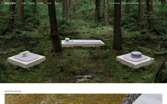
Preview image. Unlock full-res
Forest floor stillness
Color palette
Primary text, informational body copy, general UI elements, icon fill
Page backgrounds, card surfaces, ghost button text on dark backgrounds, primary navigation text
Medium-contrast borders, control outlines, and structural separators. Do not promote it to the primary CTA color
Action button backgrounds, strong borders for interactive elements, primary navigation text on light backgrounds
Dark borders and separators for elevated surfaces and inverted UI. Do not promote it to the primary CTA color
Lightest border lines, dividers
Typography
- Weights
- 400, 600
- Sizes
- 10px, 12px, 14px, 16px, 18px, 20px
- Line height
- 1, 1.1, 1.2, 1.3, 1.4, 1.67
- Letter spacing
- normal
- Fallback
- system-ui, sans-serif
Primary typeface for all text content: body, headings, navigation, and input fields. Its clean, geometric form maintains the minimal aesthetic.
- Weights
- 400
- Sizes
- 14px
- Line height
- 1, 1.1, 1.2, 1.4
- Letter spacing
- normal
- Fallback
- monospace
Used for specific interactive elements and labels, providing a distinct, slightly more technical feel while maintaining legibility.
- Weights
- 400
- Sizes
- 14px
- Line height
- 1.5
- Letter spacing
- normal
- Fallback
- monospace
A distinct serif-like typeface employed for specialized content or decorative text elements, enhancing perceived craftsmanship and quality.
Spacing & shape
Elevation
Components
Transparent background with Canvas White text, no padding, and no border. Used for top navigation and subtle calls to action.
Transparent background with Canvas White text, 2px border-radius, 16px vertical padding, 4px horizontal padding. Border appears in white on hover.
True Black background with Canvas White text. Has a 2px border-radius, 16px vertical padding, and 24px horizontal padding. The border is explicitly white on render.
Transparent background with True Black text, 8px horizontal padding, no vertical padding. Has a 1px True Black border on the bottom. No explicit border-radius (0px).
Transparent background with True Black text. Features 12px vertical padding. Bottom border is 1px thick in True Black. A 1px inset shadow in Earth Stone appears on focus.
Guidelines
- Prioritize product imagery and natural backgrounds; frame them as the primary visual focus.
- Use Forest Shadow (#3f3f3f) for primary text and Canvas White (#ffffff) for backgrounds to maintain a high contrast, minimal reading experience.
- Apply True Black (#030302) as the background for primary action buttons or as a strong border for interactive elements.
- Maintain minimal border radii: 2px for buttons and 16px for cards, reinforcing a subtle, structured aesthetic.
- Ensure generous vertical spacing between sections, using the sectionGap of '64px' to create a breathable layout.
- Utilize 1px borders in Earth Stone (#d3cec5) or True Black (#030302) for UI separation rather than heavy shadows or fills.
- Use Graphik (sans-serif) for all primary text content; reserve Geist and GTStandard-M for specific utility or decorative instances.
- Avoid vivid or highly saturated colors for UI elements; color should be sparingly applied and mostly achromatic.
- Do not use heavy drop shadows or complex gradients; rely on subtle inset shadows and single-color fills.
- Do not introduce decorative elements that distract from product photography or natural imagery.
- Avoid dense, information-heavy blocks of text; break content into manageable, well-spaced segments.
- Do not use generic system fonts; stick to Graphik, Geist, and GTStandard-M to preserve brand distinctiveness.
- Avoid radius values outside of 2px for buttons and 16px for larger cards.
- Do not introduce gratuitous motion or animations; transitions should be subtle and functional.
About this system
ShowHide
Walden cultivates a serene, contemplative aesthetic, grounding product presentation in an almost stark, naturalistic minimalism. The visual language centers on muted, earthy neutrals with high contrast for text, creating a sense of understated luxury. Typography is functional and refined, ensuring clarity while blending into the quiet composition. Components are lightweight and largely border-driven, minimizing visual noise to allow product imagery and natural backgrounds to dominate.
The page model is full-bleed, allowing large-scale imagery to extend to the viewport edges, creating an immersive experience. The hero sections feature large, atmospheric photography with centered text overlays for headings and calls to action. Section rhythm is predominantly defined by large photographic blocks alternating fluidly, connected by minimal UI. Content arrangement often juxtaposes large hero images with smaller, descriptive text blocks or product grids. Navigation is a persistent, minimal top bar with left-aligned brand and right-aligned utility links, maintaining overall content visibility.
The visual language for imagery is characterized by high-quality, deliberately composed product photography set within natural, minimalist environments (forests, mossy landscapes, raw wood). Photography often features products isolated or in serene contexts, emphasizing their form and materiality. Treatment is typically full-bleed or large-scale, dominating sections of the page. There are also stark product shots on clean, abstract backgrounds. Icons, when present, are simple, outlined, and monochromatic, used for functional navigation cues. The density is image-heavy, with large visuals serving as atmosphere and product showcase, allowing text to act as supporting detail.
Reminiscent of Aēsop, MUJI, The Future Kept.
# Walden — Style Reference
> Forest floor stillness

**Theme:** light

**Site:** https://walden.us

Walden cultivates a serene, contemplative aesthetic, grounding product presentation in an almost stark, naturalistic minimalism. The visual language centers on muted, earthy neutrals with high contrast for text, creating a sense of understated luxury. Typography is functional and refined, ensuring clarity while blending into the quiet composition. Components are lightweight and largely border-driven, minimizing visual noise to allow product imagery and natural backgrounds to dominate.

## Tokens — Colors

| Name | Value | Token | Role |
|------|------|------|------|
| Forest Shadow | `#3f3f3f` | `--color-forest-shadow` | Primary text, informational body copy, general UI elements, icon fill |
| Canvas White | `#ffffff` | `--color-canvas-white` | Page backgrounds, card surfaces, ghost button text on dark backgrounds, primary navigation text |
| Earth Stone | `#d3cec5` | `--color-earth-stone` | Medium-contrast borders, control outlines, and structural separators. Do not promote it to the primary CTA color |
| True Black | `#030302` | `--color-true-black` | Action button backgrounds, strong borders for interactive elements, primary navigation text on light backgrounds |
| Muted Grey | `#686867` | `--color-muted-grey` | Dark borders and separators for elevated surfaces and inverted UI. Do not promote it to the primary CTA color |
| Light Stone | `#acacac` | `--color-light-stone` | Lightest border lines, dividers |

## Tokens — Typography

### Graphik
- **Substitute:** system-ui, sans-serif
- **Weights:** 400, 600
- **Sizes:** 10px, 12px, 14px, 16px, 18px, 20px
- **Line height:** 1, 1.1, 1.2, 1.3, 1.4, 1.67
- **Letter spacing:** normal
- **Role:** Primary typeface for all text content: body, headings, navigation, and input fields. Its clean, geometric form maintains the minimal aesthetic.

### Geist
- **Substitute:** monospace
- **Weights:** 400
- **Sizes:** 14px
- **Line height:** 1, 1.1, 1.2, 1.4
- **Letter spacing:** normal
- **Role:** Used for specific interactive elements and labels, providing a distinct, slightly more technical feel while maintaining legibility.

### GTStandard-M
- **Substitute:** monospace
- **Weights:** 400
- **Sizes:** 14px
- **Line height:** 1.5
- **Letter spacing:** normal
- **Role:** A distinct serif-like typeface employed for specialized content or decorative text elements, enhancing perceived craftsmanship and quality.

## Tokens — Type Scale

Major Third (1.25) from 14px base.

| Role | Size | Line height | Letter spacing |
|------|------|------|------|
| caption | 10px | 1 | — |
| body | 14px | 1.2 | — |
| heading | 18px | 1.1 | — |
| display | 20px | 1.1 | — |

## Tokens — Spacing

- **Section gap:** 64px
- **Card padding:** 12px
- **Element gap:** 12px

## Tokens — Radius

- **Buttons:** 2px
- **Cards:** 16px

## Tokens — Elevation

- **Interactive Link Border:** `inset 0px 0px 0px 1px rgb(211, 206, 197)`
- **Primary Button Border (Focus/Hover):** `inset 0px 0px 0px 1px rgb(3, 3, 2)`
- **Input Field Inset Shadow:** `0px 1px 0px 0px rgb(211, 206, 197)`

## Layout

The page model is full-bleed, allowing large-scale imagery to extend to the viewport edges, creating an immersive experience. The hero sections feature large, atmospheric photography with centered text overlays for headings and calls to action. Section rhythm is predominantly defined by large photographic blocks alternating fluidly, connected by minimal UI. Content arrangement often juxtaposes large hero images with smaller, descriptive text blocks or product grids. Navigation is a persistent, minimal top bar with left-aligned brand and right-aligned utility links, maintaining overall content visibility.

## Imagery

The visual language for imagery is characterized by high-quality, deliberately composed product photography set within natural, minimalist environments (forests, mossy landscapes, raw wood). Photography often features products isolated or in serene contexts, emphasizing their form and materiality. Treatment is typically full-bleed or large-scale, dominating sections of the page. There are also stark product shots on clean, abstract backgrounds. Icons, when present, are simple, outlined, and monochromatic, used for functional navigation cues. The density is image-heavy, with large visuals serving as atmosphere and product showcase, allowing text to act as supporting detail.

## Components

### Ghost Navigation Button (Light)
*Navigation links and secondary actions within light UI sections.*

Transparent background with Canvas White text, no padding, and no border. Used for top navigation and subtle calls to action.

### Contained Footer Button
*Interactive elements within the footer or compact UI sections.*

Transparent background with Canvas White text, 2px border-radius, 16px vertical padding, 4px horizontal padding. Border appears in white on hover.

### Filled Primary Button
*Main calls to action requiring emphasis.*

True Black background with Canvas White text. Has a 2px border-radius, 16px vertical padding, and 24px horizontal padding. The border is explicitly white on render.

### Outlined Text Link
*Links and actions in text-heavy areas, often within product details.*

Transparent background with True Black text, 8px horizontal padding, no vertical padding. Has a 1px True Black border on the bottom. No explicit border-radius (0px).

### Search/Input Field
*Text input areas for search or forms.*

Transparent background with True Black text. Features 12px vertical padding. Bottom border is 1px thick in True Black. A 1px inset shadow in Earth Stone appears on focus.

## Guidelines

### Do

- Prioritize product imagery and natural backgrounds; frame them as the primary visual focus.
- Use Forest Shadow (#3f3f3f) for primary text and Canvas White (#ffffff) for backgrounds to maintain a high contrast, minimal reading experience.
- Apply True Black (#030302) as the background for primary action buttons or as a strong border for interactive elements.
- Maintain minimal border radii: 2px for buttons and 16px for cards, reinforcing a subtle, structured aesthetic.
- Ensure generous vertical spacing between sections, using the sectionGap of '64px' to create a breathable layout.
- Utilize 1px borders in Earth Stone (#d3cec5) or True Black (#030302) for UI separation rather than heavy shadows or fills.
- Use Graphik (sans-serif) for all primary text content; reserve Geist and GTStandard-M for specific utility or decorative instances.

### Don't

- Avoid vivid or highly saturated colors for UI elements; color should be sparingly applied and mostly achromatic.
- Do not use heavy drop shadows or complex gradients; rely on subtle inset shadows and single-color fills.
- Do not introduce decorative elements that distract from product photography or natural imagery.
- Avoid dense, information-heavy blocks of text; break content into manageable, well-spaced segments.
- Do not use generic system fonts; stick to Graphik, Geist, and GTStandard-M to preserve brand distinctiveness.
- Avoid radius values outside of 2px for buttons and 16px for larger cards.
- Do not introduce gratuitous motion or animations; transitions should be subtle and functional.

## Agent Prompt Guide

Quick Color Reference:
text: #3f3f3f
background: #ffffff
border: #d3cec5
accent: no distinct accent color
primary action: no distinct CTA color

Example Component Prompts:
Create a hero section with 'Space for the Self.' as the heading, 'Shop Best Sellers' as the link, using a full-width immersive nature photo. Heading text: Graphik, size 20px, weight 400, color #3f3f3f. Link text: Graphik, size 14px, weight 400, color #3f3f3f, with a 1px #3f3f3f bottom border.

No distinct primary action color was observed; use the extracted neutral button treatments instead of inventing a filled CTA color.

Create a navigation link for 'Shop'. Use Graphik, size 16px, weight 400, color #3f3f3f. The link should have no background and no explicit borders.
More like this









Keep what you find
A free account saves references to boards and can send you a weekly email of picks based on what you save.
To see every result, go Pro.