Preview image. Unlock full-res
Sublime Depth, Minimal Interface
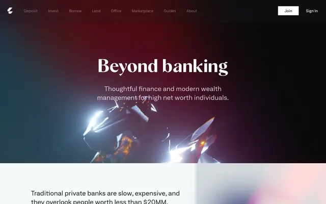
Letter employs a 'dark academia meets finance' aesthetic, characterized by dramatic, almost painterly dark backgrounds with glowing abstract forms that provide depth and visual interest. Over this, a minimalist, high-contrast typography system ensures clarity and seriousness. Components are unfussy, with sharp corners and subtle borders, allowing the rich backgrounds to take center stage, creating an atmosphere of understated luxury and technological sophistication. The overall impression is one of grounded authority with a hint of digital mystique.
Prioritize Neufile Grotesk Extended for all body text, buttons, and navigation, maintaining normal letter-spacing for high legibility.
Use Albra Sans with 0.0200em letter-spacing for all headings and display text (h1-h3) to convey sophistication and impact.
Apply a consistent 2px border radius to all interactive elements like buttons and links to maintain a sharp, deliberate feel.
Employ Midnight (#000000) for hero section backgrounds and large textual content over them, creating a dramatic, immersive experience.
Use Ghost Gray (#f6f9f9) as a subtle background for content sections or light cards, contrasting with the dramatic dark hero.
Reserve Deep Teal (#186f64) for primary calls to action, ensuring attention is drawn to key interactive elements.
Maintain maximum content width at 1440px, centering all major content blocks to ensure consistent presentation.
Avoid using curved or soft shapes; all radii should be sharp and minimal (2px) or absent (0px).
Do not introduce strong drop shadows; the design relies on background gradients and subtle surface changes for depth, not elevation.
Steer clear of overly saturated, single-color backgrounds for main content areas; maintain the subdued, high-contrast palette.
Do not use generic system fonts; stick to Neufile Grotesk Extended and Albra Sans for brand continuity.
Refrain from using thin weights for body or navigation text; Neufile Grotesk Extended should be used at 400 or 500 weight.
Do not deviate from the established 12px vertical and 27.2px horizontal padding for primary actions; consistency is key.
Avoid overly dense information layouts; utilize the 16px element gap and ample section gaps to create a sense of breathing room and exclusivity.