Preview image. Unlock full-res
Precision on parchment: a financial platform that feels like an architect's blueprint, meticulously detailed on a bright white surface, with interactive elements highlighted in stark, electric blue.
Color palette
Violet text accent for links, tags, and emphasized short phrases. Do not promote it to the primary CTA color
Primary action button background, selected states
Primary text, darker borders, icon fill, active states for ghost buttons
Page backgrounds, card surfaces, button backgrounds, primary text on dark accents
Navigation text, strong button backgrounds, bold iconography
Muted text, subtle borders, secondary labels
Hairline separators, subtle background accents
Subheading text, descriptive content
Auxiliary text, granular data labels
Typography
- Weights
- 400
- Sizes
- 9px, 10px, 12px, 14px, 16px, 18px, 22px, 26px, 32px, 42px, 56px
- Line height
- 1
- Letter spacing
- -0.0500em at 56px, -0.0380em at 42px, -0.0360em at 32px, -0.0290em at 26px, 0.0250em at 9px
- Fallback
- Inter
Primary UI font for all textual content, from headings to body text and interactive elements. Its custom nature provides a distinct, clean aesthetic that feels tailored.
- Weights
- 500
- Sizes
- 9px, 10px, 12px, 14px, 16px, 18px, 22px, 26px, 32px, 42px, 56px
- Line height
- 1
- Letter spacing
- -0.0500em at 56px, -0.0380em at 42px, -0.0360em at 32px, -0.0290em at 26px, 0.0250em at 9px
- Fallback
- Inter Medium
Used for emphasizing key information and interactive labels, providing a subtle boost in visual weight without feeling heavy. It maintains the same crispness as 400 weight for a consistent system.
- Weights
- 600
- Sizes
- 9px, 10px, 12px, 14px, 16px, 18px, 22px, 26px, 32px, 42px, 56px
- Line height
- 1
- Letter spacing
- -0.0500em at 56px, -0.0380em at 42px, -0.0360em at 32px, -0.0290em at 26px, 0.0250em at 9px
- Fallback
- Inter SemiBold
Reserved for headlines and critical action text, providing a strong visual hierarchy while retaining the modern character of the font. The robust weight signifies importance.
Spacing & shape
Elevation
Components
Filled button with a Sky Tint background (#c9e0ff), Electric Blue text (#005ff9), and a full pill-shaped radius (1000px). Padding is 0px top/bottom and 32px left/right for a compact appearance.
Transparent background (rgba(0, 0, 0, 0)), Ink Black text (#010304). No explicit padding in its smallest variant, relying on text size for click area, used for navigation items.
White background (#ffffff), Ink Black text (#010304), subtle border of rgba(0, 0, 0, 0.1), and a 1000px pill-shaped radius. Padding of 1px top/bottom and 16px left/right.
Solid Deep Graphite background (#000000), Paper White text (#ffffff), and a 1000px pill-shaped radius. Padding of 0px top/bottom and 16px left/right.
Paper White background (#ffffff), 20px border radius, and a subtle shadow (rgba(0, 0, 0, 0.08) 0px 8px 32px 0px). Internal padding of 24px on all sides.
Paper White background (#ffffff), 16px border radius, and a larger shadow (rgba(0, 0, 0, 0.08) 0px 16px 64px 0px). Internal padding of 12px on all sides.
Light gray background (oklab(0 0 0 / 0.05)), 12px border radius, no shadow. Padding of 0px top/bottom and 16px left/right.
Paper White background (#ffffff), 16px border radius, and a subtle shadow (rgba(0, 0, 0, 0.08) 0px 8px 32px 0px). Internal padding of 16px top, 20px right, 16px bottom, 16px left.
Transparent background (rgba(0, 0, 0, 0)), Paper White text (#ffffff), with a Steel Gray border (#767676). Padding of 10px top/bottom and 16px left/right.
Guidelines
- Prioritize Paper White (#ffffff) as the dominant background for all content cards and primary page surfaces.
- Use Ink Black (#010304) for primary text and Deep Graphite (#000000) for navigation and prominent button text to ensure high contrast.
- Apply a 1000px border-radius to all primary action buttons for a distinctly pill-shaped aesthetic.
- Employ the Sky Tint (#c9e0ff) background with Electric Blue (#005ff9) text for clear, functional primary call-to-actions.
- Maintain a compact information density using Geist typeface with precise letter-spacing, particularly tighter tracking for larger display text.
- Utilize a consistent element gap of 8px for spacing elements within components and small clusters.
- Elevate cards with a subtle shadow (rgba(0, 0, 0, 0.08) 0px 8px 32px 0px) and a radius of 20px to differentiate content blocks.
- Avoid using highly saturated, non-brand colors; restrict the palette primarily to neutrals with the defined Electric Blue and Sky Tint accents.
- Do not deviate from the Geist typeface; its specific weights and letter-spacing define the brand's typographic tone.
- Refrain from using hard-edged or overly sharp corners on interactive or grouped elements; prefer radii of 12px to 1000px.
- Do not introduce heavy gradients or complex background patterns; maintain a clean, flat surface treatment for most UI elements.
- Avoid excessive use of elevation; reserve shadows for distinct interactive cards and key UI elements to guide attention.
- Do not use generic system fonts; the custom Geist font is critical to the brand's visual identity.
- Do not introduce large, decorative imagery that distracts from functional UI; focus on product-showcasing or abstract graphics when necessary.
About this system
ShowHide
Gemini's design system offers a crisp, compact, and confident interface for financial markets. It balances extensive negative space with information-dense cards, punctuated by a vibrant blue accent for interactive elements. The typography is modern and precise, contributing to an atmosphere of focused functionality rather than elaborate decoration, where every element serves a clear purpose.
The page primarily uses a full-bleed structure, with key content areas constrained to a central column (implied max-width around 1200px from overall screenshot analysis). The hero section is characterized by a central headline and subtext, often over a clean white background, framed by functional navigation. Section rhythm is provided by distinct content blocks and cards on a uniform white canvas. Content is arranged in flexible patterns, including centered stacks for key messages, simple left-aligned text with right-aligned card interactions, and grids for showcasing features or data. The layout avoids visual dividers between sections, relying on consistent vertical spacing for flow. Navigation is a sticky top bar, providing immediate access to key brand links and calls to action.
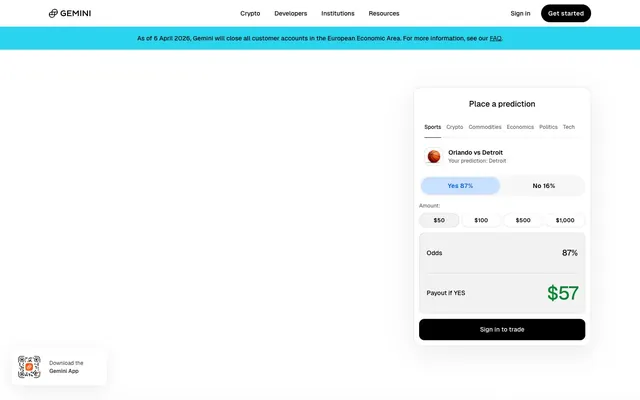
The site's imagery is sparse, prioritizing UI and functionality over abstract visuals. When present, it features tight, product-focused illustrations like the rounded-rectangle app icon, or simplified graphic elements such as the basketball icon in the prediction interface. Icons are line-drawn and monochrome (often Deep Graphite or Ink Black), maintaining a clean, technical feel. Photography is notably absent, reinforcing a sense of precise, data-driven interaction. Imagery serves an explanatory or functional role, never purely decorative, and occupies minimal space relative to text and data.
Reminiscent of Coinbase, Revolut, Stripe.
# Trade Crypto — Style Reference
> Precision on parchment: a financial platform that feels like an architect's blueprint, meticulously detailed on a bright white surface, with interactive elements highlighted in stark, electric blue.

**Theme:** light

**Site:** https://www.gemini.com

Gemini's design system offers a crisp, compact, and confident interface for financial markets. It balances extensive negative space with information-dense cards, punctuated by a vibrant blue accent for interactive elements. The typography is modern and precise, contributing to an atmosphere of focused functionality rather than elaborate decoration, where every element serves a clear purpose.

## Tokens — Colors

| Name | Value | Token | Role |
|------|------|------|------|
| Electric Blue | `#005ff9` | `--color-electric-blue` | Violet text accent for links, tags, and emphasized short phrases. Do not promote it to the primary CTA color |
| Sky Tint | `#c9e0ff` | `--color-sky-tint` | Primary action button background, selected states |
| Ink Black | `#010304` | `--color-ink-black` | Primary text, darker borders, icon fill, active states for ghost buttons |
| Paper White | `#ffffff` | `--color-paper-white` | Page backgrounds, card surfaces, button backgrounds, primary text on dark accents |
| Deep Graphite | `#000000` | `--color-deep-graphite` | Navigation text, strong button backgrounds, bold iconography |
| Steel Gray | `#999a9b` | `--color-steel-gray` | Muted text, subtle borders, secondary labels |
| Light Cloud | `#e6e6e6` | `--color-light-cloud` | Hairline separators, subtle background accents |
| Soft Fog | `#676868` | `--color-soft-fog` | Subheading text, descriptive content |
| Pale Mist | `#808181` | `--color-pale-mist` | Auxiliary text, granular data labels |

## Tokens — Typography

### Geist
- **Substitute:** Inter
- **Weights:** 400
- **Sizes:** 9px, 10px, 12px, 14px, 16px, 18px, 22px, 26px, 32px, 42px, 56px
- **Line height:** 1
- **Letter spacing:** -0.0500em at 56px, -0.0380em at 42px, -0.0360em at 32px, -0.0290em at 26px, 0.0250em at 9px
- **Role:** Primary UI font for all textual content, from headings to body text and interactive elements. Its custom nature provides a distinct, clean aesthetic that feels tailored.

### Geist
- **Substitute:** Inter Medium
- **Weights:** 500
- **Sizes:** 9px, 10px, 12px, 14px, 16px, 18px, 22px, 26px, 32px, 42px, 56px
- **Line height:** 1
- **Letter spacing:** -0.0500em at 56px, -0.0380em at 42px, -0.0360em at 32px, -0.0290em at 26px, 0.0250em at 9px
- **Role:** Used for emphasizing key information and interactive labels, providing a subtle boost in visual weight without feeling heavy. It maintains the same crispness as 400 weight for a consistent system.

### Geist
- **Substitute:** Inter SemiBold
- **Weights:** 600
- **Sizes:** 9px, 10px, 12px, 14px, 16px, 18px, 22px, 26px, 32px, 42px, 56px
- **Line height:** 1
- **Letter spacing:** -0.0500em at 56px, -0.0380em at 42px, -0.0360em at 32px, -0.0290em at 26px, 0.0250em at 9px
- **Role:** Reserved for headlines and critical action text, providing a strong visual hierarchy while retaining the modern character of the font. The robust weight signifies importance.

## Tokens — Type Scale

Augmented Fourth (1.414) from 14px base.

| Role | Size | Line height | Letter spacing |
|------|------|------|------|
| body | 14px | 1.35 | -0.08em |
| subheading | 18px | 1.33 | -0.04em |
| heading-sm | 22px | 1.16 | -0.04em |
| heading | 32px | 1.15 | -0.12px |
| display | 56px | 1.07 | -0.2px |

## Tokens — Spacing

- **Section gap:** 40px
- **Card padding:** 24px
- **Element gap:** 8px

## Tokens — Radius

- **Buttons:** 1000px
- **Inputs:** 12px
- **Cards:** 20px
- **tags:** 12px

## Tokens — Elevation

- **Information Card:** `rgba(0, 0, 0, 0.08) 0px 8px 32px 0px`
- **QR Code Card:** `rgba(0, 0, 0, 0.08) 0px 16px 64px 0px`
- **Prediction Input Card:** `rgba(0, 0, 0, 0.08) 0px 8px 32px 0px`

## Layout

The page primarily uses a full-bleed structure, with key content areas constrained to a central column (implied max-width around 1200px from overall screenshot analysis). The hero section is characterized by a central headline and subtext, often over a clean white background, framed by functional navigation. Section rhythm is provided by distinct content blocks and cards on a uniform white canvas. Content is arranged in flexible patterns, including centered stacks for key messages, simple left-aligned text with right-aligned card interactions, and grids for showcasing features or data. The layout avoids visual dividers between sections, relying on consistent vertical spacing for flow. Navigation is a sticky top bar, providing immediate access to key brand links and calls to action.

## Imagery

The site's imagery is sparse, prioritizing UI and functionality over abstract visuals. When present, it features tight, product-focused illustrations like the rounded-rectangle app icon, or simplified graphic elements such as the basketball icon in the prediction interface. Icons are line-drawn and monochrome (often Deep Graphite or Ink Black), maintaining a clean, technical feel. Photography is notably absent, reinforcing a sense of precise, data-driven interaction. Imagery serves an explanatory or functional role, never purely decorative, and occupies minimal space relative to text and data.

## Components

### Primary Action Button
*Main call-to-action*

Filled button with a Sky Tint background (#c9e0ff), Electric Blue text (#005ff9), and a full pill-shaped radius (1000px). Padding is 0px top/bottom and 32px left/right for a compact appearance.

### Ghost Button
*Secondary action / Navigation*

Transparent background (rgba(0, 0, 0, 0)), Ink Black text (#010304). No explicit padding in its smallest variant, relying on text size for click area, used for navigation items.

### Outlined Button
*Tertiary action*

White background (#ffffff), Ink Black text (#010304), subtle border of rgba(0, 0, 0, 0.1), and a 1000px pill-shaped radius. Padding of 1px top/bottom and 16px left/right.

### Dark Primary Button
*Hero or prominent action*

Solid Deep Graphite background (#000000), Paper White text (#ffffff), and a 1000px pill-shaped radius. Padding of 0px top/bottom and 16px left/right.

### Information Card
*Content container*

Paper White background (#ffffff), 20px border radius, and a subtle shadow (rgba(0, 0, 0, 0.08) 0px 8px 32px 0px). Internal padding of 24px on all sides.

### QR Code Card
*Unique interactive element*

Paper White background (#ffffff), 16px border radius, and a larger shadow (rgba(0, 0, 0, 0.08) 0px 16px 64px 0px). Internal padding of 12px on all sides.

### Minimal Card
*Compact grouped information*

Light gray background (oklab(0 0 0 / 0.05)), 12px border radius, no shadow. Padding of 0px top/bottom and 16px left/right.

### Prediction Input Card
*Interactive prediction logic*

Paper White background (#ffffff), 16px border radius, and a subtle shadow (rgba(0, 0, 0, 0.08) 0px 8px 32px 0px). Internal padding of 16px top, 20px right, 16px bottom, 16px left.

### Text Input
*User entry field*

Transparent background (rgba(0, 0, 0, 0)), Paper White text (#ffffff), with a Steel Gray border (#767676). Padding of 10px top/bottom and 16px left/right.

## Guidelines

### Do

- Prioritize Paper White (#ffffff) as the dominant background for all content cards and primary page surfaces.
- Use Ink Black (#010304) for primary text and Deep Graphite (#000000) for navigation and prominent button text to ensure high contrast.
- Apply a 1000px border-radius to all primary action buttons for a distinctly pill-shaped aesthetic.
- Employ the Sky Tint (#c9e0ff) background with Electric Blue (#005ff9) text for clear, functional primary call-to-actions.
- Maintain a compact information density using Geist typeface with precise letter-spacing, particularly tighter tracking for larger display text.
- Utilize a consistent element gap of 8px for spacing elements within components and small clusters.
- Elevate cards with a subtle shadow (rgba(0, 0, 0, 0.08) 0px 8px 32px 0px) and a radius of 20px to differentiate content blocks.

### Don't

- Avoid using highly saturated, non-brand colors; restrict the palette primarily to neutrals with the defined Electric Blue and Sky Tint accents.
- Do not deviate from the Geist typeface; its specific weights and letter-spacing define the brand's typographic tone.
- Refrain from using hard-edged or overly sharp corners on interactive or grouped elements; prefer radii of 12px to 1000px.
- Do not introduce heavy gradients or complex background patterns; maintain a clean, flat surface treatment for most UI elements.
- Avoid excessive use of elevation; reserve shadows for distinct interactive cards and key UI elements to guide attention.
- Do not use generic system fonts; the custom Geist font is critical to the brand's visual identity.
- Do not introduce large, decorative imagery that distracts from functional UI; focus on product-showcasing or abstract graphics when necessary.

## Agent Prompt Guide

### Quick Color Reference
text: #010304
background: #ffffff
border: #e6e6e6
accent: #005ff9
primary action: #c9e0ff (filled action)

### 3-5 Example Component Prompts
1. Create a Primary Action Button: #c9e0ff background, #000000 text, 9999px radius, compact pill padding. Use this filled treatment for the main CTA.
2. Design a `Prediction Input Card` showing 'Orlando vs Detroit': Paper White background (#ffffff), 16px radius, rgba(0, 0, 0, 0.08) 0px 8px 32px 0px shadow. Internal padding 16px top, 20px right, 16px bottom, 16px left. Headline 'Place a prediction' in Ink Black (#010304), Geist weight 600 at 22px, letter-spacing -0.04em.
3. Build a navigation bar item: Ghost Button style, Ink Black text (#010304), Geist weight 500 at 14px, letter-spacing -0.0290em. No background, no border, no padding. Hover state shifts text to Electric Blue (#005ff9).
4. Create a `Minimal Card` to display data: oklab(0 0 0 / 0.05) background, 12px radius, no shadow. Internal padding 0px vertical, 16px horizontal. Text in Deep Graphite (#000000), Geist weight 500 at 16px, letter-spacing -0.0290em.
More like this









Keep what you find
A free account saves references to boards and can send you a weekly email of picks based on what you save.
To see every result, go Pro.