Preview image. Unlock full-res
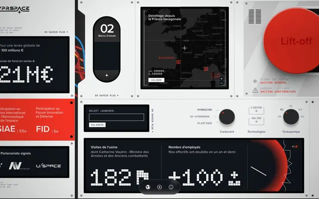
Aircraft control panel — high-contrast modular interfaces on a rigid, light-grey chassis with urgent red signals.
Color palette
Primary call-to-action buttons, warning indicators, critical states
Strong, urgent gradients for prominent visual elements or critical interaction areas
Interactive links, specific highlights
Decorative background gradient used in some sections, suggesting cosmic or distant elements
Page canvas, primary panel background, borders, input backgrounds
Interface display backgrounds, interactive card backgrounds, dense information blocks
Primary text on light backgrounds, shadows, critical text on dark backgrounds
Text on dark backgrounds, active elements, subtle card shadows
Secondary borders, subtle background tints
Muted text, icon fills, inactive states
Secondary text, subtle details, some icon fills
Typography
- Weights
- 400, 600, 700, 800
- Sizes
- 11px, 12px, 14px, 15px, 16px, 18px, 36px, 40px, 48px, 56px
- Line height
- 1, 1.1, 1.16, 1.25, 1.5
- Letter spacing
- -0.0710em, 0.0110em, 0.0130em, 0.0140em, 0.0200em, 0.0250em, 0.0280em, 0.0330em
- Fallback
- system-ui
Primary sans-serif for most UI text, headings, and buttons. Its varied weights support clear hierarchy without excessive stylistic flair.
- Weights
- 400, 500
- Sizes
- 10px, 11px, 12px
- Line height
- 0.8, 1.1, 1.2, 1.5
- Letter spacing
- 0.0420em, 0.0450em, 0.0500em
- Fallback
- monospace
Monospaced font used for data readouts, code snippets, and technical labels, reinforcing the control panel aesthetic.
- Weights
- 400
- Sizes
- 11px
- Line height
- 1.5
- Letter spacing
- normal
- Fallback
- system-ui
Secondary sans-serif for minor body text sections, providing a clean, recognizable base for small text.
- Weights
- 900
- Sizes
- 106px
- Line height
- 1
- Letter spacing
- normal
- Fallback
- Press Start 2P
Custom display font for large numerical values and impactful headlines, providing a distinctive pixelated, digital read-out feel.
Spacing & shape
Elevation
Components
Background #f43325 with white #ffffff text, minimal padding like 2px vertical and 8px horizontal, with a 270.89px border-radius creating a rounded pill shape. No outline.
Transparent background with #000000 text and a 0px border-radius. Minimal padding like 0px.
Background #11161c, white #ffffff text. Features a rounded 127.397px border-radius for an industrial-chic look. Padding is 8px vertical and 6px horizontal.
Background #11161c with a 9999px border-radius. White #ffffff boxShadow of 0px 0px 4.269px 0px. No padding.
Transparent background with #ffffff text and a #ffffff 1px border. 0px border-radius. Padding is 8px on all sides. Placeholder text is #575c75.
Full-bleed circular button with a large #f43325 background and white #ffffff text. This is a very prominent component designed to attract immediate attention. Has a gradient based on `Gradient Combustion`.
Small text using #f43325 for warnings and gray tones for waiting. Accompanied by small triangle or dot icons. Uses SF Mono or proxima-nova at 11-12px.
Uses the custom 'Doto' font at 106px weight 900 for a pixelated, digital display effect on a #11161c background, with #ffffff text. This is typically used for stats or counts.
Guidelines
- Use Control Panel Grey #e5e7eb as the primary canvas for all page backgrounds and top-level panels.
- Apply Urgency Red #f43325 exclusively for critical action buttons and warning states, ensuring strong visual signaling.
- Implement Display Black #11161c for all interactive data displays and information cards to maintain the control panel aesthetic.
- For large numerical data, use the Doto font at 106px font size with Digital White #ffffff color against a Display Black #11161c background.
- Utilize border-radius 270.89px for primary buttons and 9999px for small, contained elements like pill buttons or tags, while using 127.397px for cards.
- Maintain high contrast text: Obsidian Grey #000000 on Control Panel Grey #e5e7eb, and Digital White #ffffff on Display Black #11161c.
- Use SF Mono for any small, technical or data-driven text elements to reinforce the retro-futuristic theme.
- Do not use gradients or colored backgrounds on general text or informational sections, as they are reserved for prominent elements like the Lift-off button.
- Avoid applying Urgency Red #f43325 for decorative purposes or non-critical text; its impact must be preserved for alerts and main calls to action.
- Do not use generic square radius for buttons; leverage the defined 270.89px or 9999px for consistent button styling.
- Refrain from using heavily saturated colors beyond Urgency Red #f43325 or Active Blue #0078a8; the color palette is intentionally restrained.
- Do not introduce drop shadows on every element; elevation is minimal, reserving white shadows for subtle card lifts and dark shadow for deeper interaction states.
- Avoid excessive spacing between elements; maintain a compact information density typical of control interfaces, using 8px as the primary element gap.
- Do not deviate from the specified font families; their distinct characteristics are crucial for maintaining the thematic integrity.
About this system
ShowHide
This design evokes a retro-futuristic mission control panel, blending a stark, industrial realism with an urgent, high-stakes atmosphere. The dominance of a light grey canvas punctuated by sharp, dark-grey interfaces creates a sense of mechanical precision. Visual urgency is delivered through vibrant, almost alarm-like red accents, sparingly used on critical elements like "Lift-off" buttons and warning indicators, contrasting with the otherwise monochromatic scene.
The page model is a full-bleed, multi-panel interface, resembling a grid of modular embedded screens rather than a traditional web page. The hero section is not distinct but rather the 'Lift-off' panel, a circular, urgent red button embedded within one of the lighter sections. Section rhythm is driven by the clear borders and distinct backgrounds of each 'panel' or module, arranged in an asymmetric, dense composition. There isn't a strict grid for content arrangement but rather a collection of rectangular and circular modules nested within the larger light-grey 'chassis'. Navigation is minimal, implied through in-panel links and small interactive elements, with no visible global navigation bar.
The visual language is characterized by a complete absence of photography or illustration in the traditional sense. Instead, the design relies heavily on technical UI elements: pixelated fonts for impactful numbers, grid lines on maps, simple geometric icons, and monochrome charts. Any 'imagery' serves a functional, data-driven purpose, mimicking readouts from a mission control system or engineering schematics. Icons are simple, outlined, and monochromatic, integrated seamlessly into the panel aesthetic. The density is high, with imagery and technical graphics embedded within text-dominant sections, purely for informative or functional visual flair rather than aesthetic decoration.
Reminiscent of Kerbal Space Program (UI), Terminal.com, Factorio (Game UI), NASA Mission Control archival footage.
# Lift-off challenge — Style Reference
> Aircraft control panel — high-contrast modular interfaces on a rigid, light-grey chassis with urgent red signals.

**Theme:** light

**Site:** https://liftoffchallenge.hypr-space.com

This design evokes a retro-futuristic mission control panel, blending a stark, industrial realism with an urgent, high-stakes atmosphere. The dominance of a light grey canvas punctuated by sharp, dark-grey interfaces creates a sense of mechanical precision. Visual urgency is delivered through vibrant, almost alarm-like red accents, sparingly used on critical elements like "Lift-off" buttons and warning indicators, contrasting with the otherwise monochromatic scene.

## Tokens — Colors

| Name | Value | Token | Role |
|------|------|------|------|
| Urgency Red | `#f43325` | `--color-urgency-red` | Primary call-to-action buttons, warning indicators, critical states |
| Gradient Combustion | `#f43325` | `--color-gradient-combustion` | Strong, urgent gradients for prominent visual elements or critical interaction areas |
| Active Blue | `#0078a8` | `--color-active-blue` | Interactive links, specific highlights |
| Gradient Night | `#c9cbe4` | `--color-gradient-night` | Decorative background gradient used in some sections, suggesting cosmic or distant elements |
| Control Panel Grey | `#e5e7eb` | `--color-control-panel-grey` | Page canvas, primary panel background, borders, input backgrounds |
| Display Black | `#11161c` | `--color-display-black` | Interface display backgrounds, interactive card backgrounds, dense information blocks |
| Obsidian Grey | `#000000` | `--color-obsidian-grey` | Primary text on light backgrounds, shadows, critical text on dark backgrounds |
| Digital White | `#ffffff` | `--color-digital-white` | Text on dark backgrounds, active elements, subtle card shadows |
| Graphite | `#bbbbbb` | `--color-graphite` | Secondary borders, subtle background tints |
| Steel Grey | `#a3a3a3` | `--color-steel-grey` | Muted text, icon fills, inactive states |
| Slate Blue | `#575c75` | `--color-slate-blue` | Secondary text, subtle details, some icon fills |

## Tokens — Typography

### proxima-nova
- **Substitute:** system-ui
- **Weights:** 400, 600, 700, 800
- **Sizes:** 11px, 12px, 14px, 15px, 16px, 18px, 36px, 40px, 48px, 56px
- **Line height:** 1, 1.1, 1.16, 1.25, 1.5
- **Letter spacing:** -0.0710em, 0.0110em, 0.0130em, 0.0140em, 0.0200em, 0.0250em, 0.0280em, 0.0330em
- **Role:** Primary sans-serif for most UI text, headings, and buttons. Its varied weights support clear hierarchy without excessive stylistic flair.

### SF Mono
- **Substitute:** monospace
- **Weights:** 400, 500
- **Sizes:** 10px, 11px, 12px
- **Line height:** 0.8, 1.1, 1.2, 1.5
- **Letter spacing:** 0.0420em, 0.0450em, 0.0500em
- **Role:** Monospaced font used for data readouts, code snippets, and technical labels, reinforcing the control panel aesthetic.

### Helvetica Neue
- **Substitute:** system-ui
- **Weights:** 400
- **Sizes:** 11px
- **Line height:** 1.5
- **Letter spacing:** normal
- **Role:** Secondary sans-serif for minor body text sections, providing a clean, recognizable base for small text.

### Doto
- **Substitute:** Press Start 2P
- **Weights:** 900
- **Sizes:** 106px
- **Line height:** 1
- **Letter spacing:** normal
- **Role:** Custom display font for large numerical values and impactful headlines, providing a distinctive pixelated, digital read-out feel.

## Tokens — Type Scale

Golden Ratio (1.618) from 14px base.

| Role | Size | Line height | Letter spacing |
|------|------|------|------|
| caption | 10px | 0.8 | 0.5px |
| body | 14px | 1.5 | 0.013em |
| subheading | 18px | 1.25 | 0.014em |
| heading | 36px | 1.16 | -0.071em |
| heading-lg | 48px | 1.1 | -0.071em |
| display | 106px | 1 | — |

## Tokens — Spacing

- **Section gap:** 48px
- **Card padding:** 8px
- **Element gap:** 8px

## Tokens — Radius

- **Default:** 4px
- **Buttons:** 270.89px
- **Cards:** 127.397px
- **pills:** 9999px

## Tokens — Elevation

- **Card (subtle elevation):** `rgba(255, 255, 255, 0.95) 0px 0px 2.719px 0px`
- **Button (interactive press):** `rgba(255, 255, 255, 0.5) 0px 0px 2px 0px`
- **Other interactive (pressed state):** `rgba(0, 0, 0, 0.8) 0px 0px 2px 0px`

## Layout

The page model is a full-bleed, multi-panel interface, resembling a grid of modular embedded screens rather than a traditional web page. The hero section is not distinct but rather the 'Lift-off' panel, a circular, urgent red button embedded within one of the lighter sections. Section rhythm is driven by the clear borders and distinct backgrounds of each 'panel' or module, arranged in an asymmetric, dense composition. There isn't a strict grid for content arrangement but rather a collection of rectangular and circular modules nested within the larger light-grey 'chassis'. Navigation is minimal, implied through in-panel links and small interactive elements, with no visible global navigation bar.

## Imagery

The visual language is characterized by a complete absence of photography or illustration in the traditional sense. Instead, the design relies heavily on technical UI elements: pixelated fonts for impactful numbers, grid lines on maps, simple geometric icons, and monochrome charts. Any 'imagery' serves a functional, data-driven purpose, mimicking readouts from a mission control system or engineering schematics. Icons are simple, outlined, and monochromatic, integrated seamlessly into the panel aesthetic. The density is high, with imagery and technical graphics embedded within text-dominant sections, purely for informative or functional visual flair rather than aesthetic decoration.

## Components

### Primary Action Button
*Main call-to-action*

Background #f43325 with white #ffffff text, minimal padding like 2px vertical and 8px horizontal, with a 270.89px border-radius creating a rounded pill shape. No outline.

### Ghost Button
*Secondary or tertiary actions*

Transparent background with #000000 text and a 0px border-radius. Minimal padding like 0px.

### Dark Interface Card
*Content presentation within a dark display area*

Background #11161c, white #ffffff text. Features a rounded 127.397px border-radius for an industrial-chic look. Padding is 8px vertical and 6px horizontal.

### Pill Card
*Small, contained information units or selectors*

Background #11161c with a 9999px border-radius. White #ffffff boxShadow of 0px 0px 4.269px 0px. No padding.

### Input Field
*Data entry*

Transparent background with #ffffff text and a #ffffff 1px border. 0px border-radius. Padding is 8px on all sides. Placeholder text is #575c75.

### Lift-off Button
*Critical, visually dominant interaction*

Full-bleed circular button with a large #f43325 background and white #ffffff text. This is a very prominent component designed to attract immediate attention. Has a gradient based on `Gradient Combustion`.

### Status Indicator
*Visual feedback for states (waiting, warning)*

Small text using #f43325 for warnings and gray tones for waiting. Accompanied by small triangle or dot icons. Uses SF Mono or proxima-nova at 11-12px.

### Doto Number Display
*Large, eye-catching numerical readouts*

Uses the custom 'Doto' font at 106px weight 900 for a pixelated, digital display effect on a #11161c background, with #ffffff text. This is typically used for stats or counts.

## Guidelines

### Do

- Use Control Panel Grey #e5e7eb as the primary canvas for all page backgrounds and top-level panels.
- Apply Urgency Red #f43325 exclusively for critical action buttons and warning states, ensuring strong visual signaling.
- Implement Display Black #11161c for all interactive data displays and information cards to maintain the control panel aesthetic.
- For large numerical data, use the Doto font at 106px font size with Digital White #ffffff color against a Display Black #11161c background.
- Utilize border-radius 270.89px for primary buttons and 9999px for small, contained elements like pill buttons or tags, while using 127.397px for cards.
- Maintain high contrast text: Obsidian Grey #000000 on Control Panel Grey #e5e7eb, and Digital White #ffffff on Display Black #11161c.
- Use SF Mono for any small, technical or data-driven text elements to reinforce the retro-futuristic theme.

### Don't

- Do not use gradients or colored backgrounds on general text or informational sections, as they are reserved for prominent elements like the Lift-off button.
- Avoid applying Urgency Red #f43325 for decorative purposes or non-critical text; its impact must be preserved for alerts and main calls to action.
- Do not use generic square radius for buttons; leverage the defined 270.89px or 9999px for consistent button styling.
- Refrain from using heavily saturated colors beyond Urgency Red #f43325 or Active Blue #0078a8; the color palette is intentionally restrained.
- Do not introduce drop shadows on every element; elevation is minimal, reserving white shadows for subtle card lifts and dark shadow for deeper interaction states.
- Avoid excessive spacing between elements; maintain a compact information density typical of control interfaces, using 8px as the primary element gap.
- Do not deviate from the specified font families; their distinct characteristics are crucial for maintaining the thematic integrity.

## Agent Prompt Guide

### Quick Color Reference
- Text (dark): #000000
- Text (light): #ffffff
- Background (canvas): #e5e7eb
- Background (display): #11161c
- CTA (primary): #f43325
- Border (default): #e5e7eb

### 3-5 Example Component Prompts
1. **Create a 'Display Black' information card:** Use #11161c for the background, #ffffff for heading, and #575c75 for body text. Apply a 127.397px border-radius, and 8px padding. Headline with 'proxima-nova' weight 700 at 18px and body with 'proxima-nova' weight 400 at 14px.
2. **Generate an 'Urgency Red' Call-to-Action button:** Use #f43325 for the background, #ffffff for text. Set border-radius to 270.89px. Text 'proxima-nova' weight 600 at 16px with 2px vertical and 8px horizontal padding.
3. **Design a 'Doto Number Display' module:** Use #11161c as the background color, #ffffff for the primary number. Display number '182' using the 'Doto' font at 106px weight 900. Place a small 'proxima-nova' caption below it in #575c75 at 12px with 8px top padding.
4. **Build an Input Field:** Background transparent, with a 1px solid #ffffff border. Text color #ffffff. 8px padding all around. Placeholder text in #575c75 using 'proxima-nova' at 14px.
More like this









Keep what you find
A free account saves references to boards and can send you a weekly email of picks based on what you save.
To see every result, go Pro.