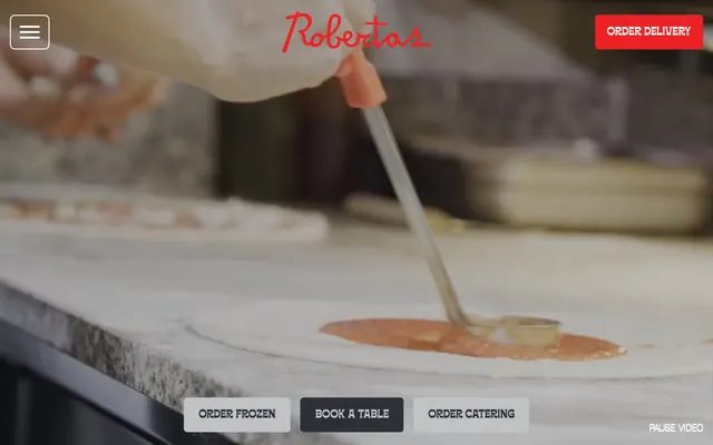
Preview image. Unlock full-res
Vivid Red & Industrial Grit – a raw, energetic palette with no-nonsense type for an unpretentious, bold brand.
Color palette
Primary accent, CTA backgrounds, critical calls to action, section backgrounds — a vivid, in-your-face red demanding attention and conveying brand energy
Primary text, dark surface backgrounds, button backgrounds, borders — a deep, almost black charcoal that provides strong contrast and grounding
Page backgrounds, card surfaces, button backgrounds, primary text on dark backgrounds — the clean canvas for content and high-contrast element
Input borders, deep shadows, subtle background patterns — a pure black reserved for definitive structural elements
Subtle link shadows on hover, secondary borders — a light, almost invisible gray that hints at interaction without drawing focus
Typography
- Weights
- 400
- Sizes
- 14px, 22px, 26px, 80px, 120px
- Line height
- 0.88, 1.25, 1.36, 1.38, 2.14
- Letter spacing
- -0.02
- Fallback
- Brush Script MT
Brand script for headlines and high-impact messaging — its compressed, slightly italicized form gives a distinctive, informal voice. Used for large display text and brand moments.
- Weights
- 400
- Sizes
- 20px, 22px, 24px, 34px, 54px, 80px
- Line height
- 1, 1.11, 1.25, 1.3, 1.36, 1.43, 1.5
- Letter spacing
- 0.04
- Fallback
- Inter
Workhorse sans-serif for body text, button labels, and navigation. Its slightly wider tracking ensures readability at smaller sizes while maintaining a utilitarian feel.
Spacing & shape
Elevation
Components
Filled button with Pizza Red (#ed2023) background and Crisp White (#ffffff) text. Features 7.2px border radius and 20px vertical, 24px horizontal padding.
White (#ffffff) background with Ink Black (#2b2f36) text and a 1px Ink Black border. Uses 7.2px border radius and 20px vertical, 30px horizontal padding.
Ink Black (#2b2f36) background with Crisp White (#ffffff) text. Adopts 7.2px border radius and 20px vertical, 30px horizontal padding.
Crisp White (#ffffff) background, Ink Black (#2b2f36) text, and a 1px Pitch Black (#000000) bottom border. No border radius, 28px vertical and 18px horizontal padding.
Crisp White (#ffffff) background and text, using a 100% border radius to form a perfect circle. No padding, designed for compact elements.
Transparent background with no border radius or box shadow. Minimal 5px top padding for content alignment.
Guidelines
- Prioritize Pizza Red (#ed2023) for primary actions and key brand highlights, ensuring high visibility and energy.
- Use Ink Black (#2b2f36) for all primary body text and darker surface elements, creating strong contrast against Crisp White (#ffffff) backgrounds.
- Apply a consistent 7.2px border radius to all interactive buttons for a subtly softened yet modern feel.
- Maintain generous spacing between sections (40px) and elements (16px) to keep content breathable and prevent visual clutter.
- Employ the Borensa script font for all primary headlines, leveraging its unique character to establish brand personality.
- Ensure input fields have a distinct Pitch Black (#000000) bottom border to clearly delineate interactive areas.
- Use Subtle Hover Gray (#bfbfbf) exclusively for subtle box-shadows on interactive link elements, avoiding heavy drop shadows.
- Avoid using multiple chromatic colors; Pizza Red (#ed2023) should remain the sole saturated brand accent.
- Do not introduce light gray backgrounds; stick to Crisp White (#ffffff) or Ink Black (#2b2f36) for dominant surfaces.
- Refrain from using border radii on cards or input fields; maintain sharp, defined edges for content blocks.
- Do not letter-space `Offset TM` text below 20px; its default letterSpacing of 0.04em is crucial for readability at smaller sizes.
- Avoid generic button shapes; buttons should either have a 7.2px radius or be fully circular with a 100% radius.
- Do not use box-shadows on cards or standard interface elements; visual depth should be achieved primarily through color contrast.
- Do not use Borensa for body text or small labels; reserve it for large display sizes where its unique characteristics are legible.
About this system
ShowHide
Roberta's Pizza brand identity is a playful fusion of classic diner aesthetic and rebellious punk rock energy. It centers on stark contrast, featuring bold red punctuated by deep charcoal and crisp white, creating a high-energy environment. Typography couples a quirky, custom script with a strong, industrial sans-serif. Visual elements are direct and impactful, with minimal decorative ornamentation, prioritizing clear communication and a distinctive personality.
The page primarily uses a full-bleed layout, with hero sections spanning 100% width. Content is generally centered and stacked vertically. The hero pattern features a full-screen video background with brand logo and navigation overlaid. Sections often alternate between full-bleed Pizza Red (#ed2023) and Crisp White (#ffffff) backgrounds, creating a clear visual rhythm. Content within sections is typically contained with a max-width, using centered text blocks or asymmetric image + text compositions. Navigation is a sticky top bar with a hamburger menu for mobile and key call-to-action buttons for desktop.
Photography is full-bleed or contained within irregularly angled frames, often overlapping. Images capture candid, dynamic moments of people interacting with food or the brand, mixed with stylized product shots (e.g., pizza making). The photography style is generally vibrant and natural, focusing on the sensory experience. Icons are bold, filled, and represent illustrative elements like skull & crossbones or skateboards, reinforcing the rebellious brand identity. Visuals serve as both decorative atmosphere and explanatory content, creating an image-heavy, immersive experience.
Reminiscent of Gopuff, Sweetgreen, Shake Shack, Dewey's Pizza.
# Roberta's Pizza — Style Reference
> Vivid Red & Industrial Grit – a raw, energetic palette with no-nonsense type for an unpretentious, bold brand.

**Theme:** light

**Site:** https://www.robertaspizza.com

Roberta's Pizza brand identity is a playful fusion of classic diner aesthetic and rebellious punk rock energy. It centers on stark contrast, featuring bold red punctuated by deep charcoal and crisp white, creating a high-energy environment. Typography couples a quirky, custom script with a strong, industrial sans-serif. Visual elements are direct and impactful, with minimal decorative ornamentation, prioritizing clear communication and a distinctive personality.

## Tokens — Colors

| Name | Value | Token | Role |
|------|------|------|------|
| Pizza Red | `#ed2023` | `--color-pizza-red` | Primary accent, CTA backgrounds, critical calls to action, section backgrounds — a vivid, in-your-face red demanding attention and conveying brand energy |
| Ink Black | `#2b2f36` | `--color-ink-black` | Primary text, dark surface backgrounds, button backgrounds, borders — a deep, almost black charcoal that provides strong contrast and grounding |
| Crisp White | `#ffffff` | `--color-crisp-white` | Page backgrounds, card surfaces, button backgrounds, primary text on dark backgrounds — the clean canvas for content and high-contrast element |
| Pitch Black | `#000000` | `--color-pitch-black` | Input borders, deep shadows, subtle background patterns — a pure black reserved for definitive structural elements |
| Hover Gray | `#bfbfbf` | `--color-hover-gray` | Subtle link shadows on hover, secondary borders — a light, almost invisible gray that hints at interaction without drawing focus |

## Tokens — Typography

### Borensa
- **Substitute:** Brush Script MT
- **Weights:** 400
- **Sizes:** 14px, 22px, 26px, 80px, 120px
- **Line height:** 0.88, 1.25, 1.36, 1.38, 2.14
- **Letter spacing:** -0.02
- **Role:** Brand script for headlines and high-impact messaging — its compressed, slightly italicized form gives a distinctive, informal voice. Used for large display text and brand moments.

### Offset TM
- **Substitute:** Inter
- **Weights:** 400
- **Sizes:** 20px, 22px, 24px, 34px, 54px, 80px
- **Line height:** 1, 1.11, 1.25, 1.3, 1.36, 1.43, 1.5
- **Letter spacing:** 0.04
- **Role:** Workhorse sans-serif for body text, button labels, and navigation. Its slightly wider tracking ensures readability at smaller sizes while maintaining a utilitarian feel.

## Tokens — Type Scale

Perfect Fifth (1.5) from 20px base.

| Role | Size | Line height | Letter spacing |
|------|------|------|------|
| caption | 14px | 1.25 | 0.04em |
| body | 20px | 1.43 | 0.04em |
| subheading | 22px | 1.43 | -0.02em |
| heading | 26px | 1.36 | -0.02em |
| heading-lg | 54px | 1.3 | 0.04em |
| display | 120px | 0.88 | -0.02em |

## Tokens — Spacing

- **Section gap:** 40px
- **Card padding:** 20px
- **Element gap:** 16px

## Tokens — Radius

- **Buttons:** 7.2px
- **callToAction:** 7.2px
- **circular:** 100%
- **tags:** 16000px

## Tokens — Elevation

- **Interactive Links:** `rgba(0, 0, 0, 0.25) 0px 4px 4px 0px`

## Layout

The page primarily uses a full-bleed layout, with hero sections spanning 100% width. Content is generally centered and stacked vertically. The hero pattern features a full-screen video background with brand logo and navigation overlaid. Sections often alternate between full-bleed Pizza Red (#ed2023) and Crisp White (#ffffff) backgrounds, creating a clear visual rhythm. Content within sections is typically contained with a max-width, using centered text blocks or asymmetric image + text compositions. Navigation is a sticky top bar with a hamburger menu for mobile and key call-to-action buttons for desktop.

## Imagery

Photography is full-bleed or contained within irregularly angled frames, often overlapping. Images capture candid, dynamic moments of people interacting with food or the brand, mixed with stylized product shots (e.g., pizza making). The photography style is generally vibrant and natural, focusing on the sensory experience. Icons are bold, filled, and represent illustrative elements like skull & crossbones or skateboards, reinforcing the rebellious brand identity. Visuals serve as both decorative atmosphere and explanatory content, creating an image-heavy, immersive experience.

## Components

### Primary Action Button
*Critical call to action*

Filled button with Pizza Red (#ed2023) background and Crisp White (#ffffff) text. Features 7.2px border radius and 20px vertical, 24px horizontal padding.

### Secondary Outline Button
*Alternative or less prominent actions*

White (#ffffff) background with Ink Black (#2b2f36) text and a 1px Ink Black border. Uses 7.2px border radius and 20px vertical, 30px horizontal padding.

### Dark Inverse Button
*Actions on light backgrounds that require strong visual weight*

Ink Black (#2b2f36) background with Crisp White (#ffffff) text. Adopts 7.2px border radius and 20px vertical, 30px horizontal padding.

### Input Field
*Data entry*

Crisp White (#ffffff) background, Ink Black (#2b2f36) text, and a 1px Pitch Black (#000000) bottom border. No border radius, 28px vertical and 18px horizontal padding.

### Small Circular Button
*Icon-only actions or minimal interactive elements*

Crisp White (#ffffff) background and text, using a 100% border radius to form a perfect circle. No padding, designed for compact elements.

### Image Card (No Background)
*Visual content display, often within image galleries*

Transparent background with no border radius or box shadow. Minimal 5px top padding for content alignment.

## Guidelines

### Do

- Prioritize Pizza Red (#ed2023) for primary actions and key brand highlights, ensuring high visibility and energy.
- Use Ink Black (#2b2f36) for all primary body text and darker surface elements, creating strong contrast against Crisp White (#ffffff) backgrounds.
- Apply a consistent 7.2px border radius to all interactive buttons for a subtly softened yet modern feel.
- Maintain generous spacing between sections (40px) and elements (16px) to keep content breathable and prevent visual clutter.
- Employ the Borensa script font for all primary headlines, leveraging its unique character to establish brand personality.
- Ensure input fields have a distinct Pitch Black (#000000) bottom border to clearly delineate interactive areas.
- Use Subtle Hover Gray (#bfbfbf) exclusively for subtle box-shadows on interactive link elements, avoiding heavy drop shadows.

### Don't

- Avoid using multiple chromatic colors; Pizza Red (#ed2023) should remain the sole saturated brand accent.
- Do not introduce light gray backgrounds; stick to Crisp White (#ffffff) or Ink Black (#2b2f36) for dominant surfaces.
- Refrain from using border radii on cards or input fields; maintain sharp, defined edges for content blocks.
- Do not letter-space `Offset TM` text below 20px; its default letterSpacing of 0.04em is crucial for readability at smaller sizes.
- Avoid generic button shapes; buttons should either have a 7.2px radius or be fully circular with a 100% radius.
- Do not use box-shadows on cards or standard interface elements; visual depth should be achieved primarily through color contrast.
- Do not use Borensa for body text or small labels; reserve it for large display sizes where its unique characteristics are legible.

## Agent Prompt Guide

Quick Color Reference:
text: #2b2f36
background: #ffffff
border: #2b2f36
accent: #ed2023
primary action: #ed2023 (filled action)

Example Component Prompts:
1. Create a hero section: Full-bleed background video. Overlay a large 'Borensa' font headline at 120px, #ffffff, letter-spacing -0.02em. Position a Primary Action Button ('ORDER NOW') at the bottom of the section, background #ed2023, text #ffffff, 7.2px radius, 20px vertical / 24px horizontal padding.
2. Design a feature section: Dominant Pizza Red (#ed2023) background. Headline in 'Offset TM' font at 54px, #ffffff, letter-spacing 0.04em. Below, display a grid of three Image Cards (transparent, no radius, 5px top padding), each containing an image with a Ink Black (#2b2f36) 1px border. Below the cards, a Secondary Outline Button: #ffffff background, #2b2f36 text, 1px #2b2f36 border, 7.2px radius, 20px vertical / 30px horizontal padding.
3. Build a contact form: Crisp White (#ffffff) background. Text labels in 'Offset TM' font at 20px, #2b2f36, letter-spacing 0.04em. Use Input Fields: #ffffff background, #2b2f36 text, 1px Pitch Black (#000000) bottom border, 28px vertical / 18px horizontal padding. Conclude with a Dark Inverse Button ('SUBMIT'): #2b2f36 background, #ffffff text, 7.2px radius, 20px vertical / 30px horizontal padding.
More like this









Keep what you find
A free account saves references to boards and can send you a weekly email of picks based on what you save.
To see every result, go Pro.