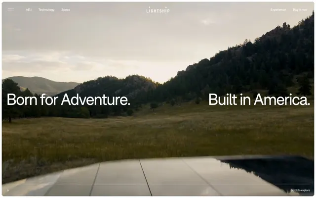
Preview image. Unlock full-res
Black & White Canvas: a crisp, high-contrast visual journey on a warm, earthy canvas.
Color palette
Decorative background accents, notably for visual emphasis in content areas
Primary text, strong borders, dark surface backgrounds, monochrome icons. Used for high-emphasis elements against light backgrounds
Hairline borders, dividers, input outlines, and card edges on light surfaces. Do not promote it to the primary CTA color
Secondary background surfaces and card fills – a warm, muted off-white providing depth to the primary Canvas
Muted text, secondary borders, subtle dividers. Offers reduced contrast for less critical information
Hairline borders and separators, providing minimal visual interruption
Supporting text, decorative elements, and lower-priority informational text
Typography
- Weights
- 400, 700
- Sizes
- 12px, 14px, 16px, 20px, 22px, 24px, 34px, 48px, 64px, 72px, 75px
- Line height
- 1, 1.2, 1.25
- Letter spacing
- -0.0500em, -0.0300em
- Fallback
- Inter
Primary brand typeface for all text content, from body to display headlines. Its compact, confident demeanor supports both functional clarity and bold statements.
Spacing & shape
Components
Text in Pure Black, no background or border, used for navigation and secondary actions on light backgrounds. No padding. Border radius 0px.
Text in Canvas white, no background or border, primarily for navigation and secondary actions on dark backgrounds. No padding. Border radius 0px.
Text in Canvas white with a Canvas white border (1px). Used for high-contrast actions on dark backgrounds. Border radius 20px. No padding.
Text in Pure Black with a Pure Black border (1px). Used for high-contrast actions on light backgrounds. Border radius 20px. No padding.
Cards maintain the flat aesthetic with `0px` border-radius and `0px` padding, adapting their background to either Canvas or Paper White, and carrying no shadow.
Transparent background with Pure Black text and border, featuring `100px` border-radius for a pill shape. Text is centered. Padding of `24px` on left/right edges.
Guidelines
- Prioritize F37Bolton weight 400 for body text at 16px with Pure Black (#000000) for high readability.
- Use Canvas white (#ffffff) for all primary page backgrounds and component surfaces to maintain a clean, bright aesthetic.
- Apply a 20px border radius to all interactive links and buttons where a radius is needed, ensuring a consistent softened edge.
- Utilize Pure Black (#000000) for all significant borders, including interactive states and menu outlines.
- Maintain minimal padding values like 8px or 16px for comfortable density in elements like list items and small components.
- Ensure all card elements have a border radius of 0px to preserve the sharp, modern edge of content blocks.
- Leverage F37Bolton weight 700 with generous sizes (48px, 64px, 75px) for headlines, using a line-height of 1.0 to 1.2 for compact impact.
- Avoid using multiple chromatic colors; limit vibrant accents to the Action Orange (#fa5c40) for specific decorative purposes not as interactive states.
- Do not introduce shadows or artificial elevation, as the design system relies on flat surfaces and high-contrast outlines.
- Do not use highly saturated colors for text or primary UI elements; reserve them for decorative highlights only.
- Avoid large horizontal padding on content sections; the design uses full-bleed imagery and minimal margins for key content.
- Do not use generic system fonts; F37Bolton is core to the brand's typographic identity.
- Resist using gradients or complex background patterns; the design is characterized by solid colors and photographic content contrasting with clean UI.
About this system
ShowHide
Lightship embraces a rugged, understated aesthetic, emphasizing content through a play of stark black and white interrupted by natural textures. Typography is compact and precise, maintaining clarity across varied scales. Interactive elements are either subtly integrated or appear as stark, high-contrast outlines against the dominant photographic or canvas backgrounds. The design prioritizes visual storytelling and a confident, unembellished presentation, using a warm off-white canvas and pure black to define primary surfaces and text.
The page primarily uses a full-bleed layout for hero sections, featuring large photography with overlaying text. Subsequent sections tend towards a more constrained, centered content approach, often arranging content in asymmetric compositions or overlapping elements that break a rigid grid. Section gaps are generous, notably 100px, creating ample whitespace. Navigation is a sticky top bar with minimal links, becoming a floating, semi-transparent bar upon scroll. There are no strict card grids, but rather artfully arranged images that create dynamic visual flow.
The imagery features high-resolution lifestyle and product photography of outdoor adventures and the Lightship travel trailer. Photos are often full-bleed or large, contained rectangles with subtly rounded corners (sometimes 20px radius). They are primarily natural, candid, and aspirational, showcasing the product in its intended use context. The overall tone is authentic and rugged, with a focus on immersive scenes and direct product views. Icons are monochrome, simple, and outlined, used functionally within the UI.
Reminiscent of Rivian, Tesla, Aer.
# Lightship — Style Reference
> Black & White Canvas: a crisp, high-contrast visual journey on a warm, earthy canvas.

**Theme:** light

**Site:** https://lightshiprv.com

Lightship embraces a rugged, understated aesthetic, emphasizing content through a play of stark black and white interrupted by natural textures. Typography is compact and precise, maintaining clarity across varied scales. Interactive elements are either subtly integrated or appear as stark, high-contrast outlines against the dominant photographic or canvas backgrounds. The design prioritizes visual storytelling and a confident, unembellished presentation, using a warm off-white canvas and pure black to define primary surfaces and text.

## Tokens — Colors

| Name | Value | Token | Role |
|------|------|------|------|
| Action Orange | `#fa5c40` | `--color-action-orange` | Decorative background accents, notably for visual emphasis in content areas |
| Pure Black | `#000000` | `--color-pure-black` | Primary text, strong borders, dark surface backgrounds, monochrome icons. Used for high-emphasis elements against light backgrounds |
| Canvas | `#ffffff` | `--color-canvas` | Hairline borders, dividers, input outlines, and card edges on light surfaces. Do not promote it to the primary CTA color |
| Paper White | `#faf6ef` | `--color-paper-white` | Secondary background surfaces and card fills – a warm, muted off-white providing depth to the primary Canvas |
| Subtle Gray | `#999999` | `--color-subtle-gray` | Muted text, secondary borders, subtle dividers. Offers reduced contrast for less critical information |
| Outline Gray | `#d9d9d9` | `--color-outline-gray` | Hairline borders and separators, providing minimal visual interruption |
| Medium Gray | `#a1a1a1` | `--color-medium-gray` | Supporting text, decorative elements, and lower-priority informational text |

## Tokens — Typography

### F37Bolton
- **Substitute:** Inter
- **Weights:** 400, 700
- **Sizes:** 12px, 14px, 16px, 20px, 22px, 24px, 34px, 48px, 64px, 72px, 75px
- **Line height:** 1, 1.2, 1.25
- **Letter spacing:** -0.0500em, -0.0300em
- **Role:** Primary brand typeface for all text content, from body to display headlines. Its compact, confident demeanor supports both functional clarity and bold statements.

## Tokens — Type Scale

| Role | Size | Line height | Letter spacing |
|------|------|------|------|
| caption | 12px | 1.25 | — |
| body-sm | 14px | 1.25 | — |
| body | 16px | 1.25 | — |
| subheading | 20px | 1.25 | — |
| heading-sm | 24px | 1.25 | -0.48px |
| heading | 34px | 1.2 | — |
| heading-lg | 48px | 1.2 | -1.44px |
| display | 75px | 1 | -2.25px |

## Tokens — Spacing

- **Section gap:** 100px
- **Card padding:** 24px
- **Element gap:** 16px

## Tokens — Radius

- **Buttons:** 20px
- **Inputs:** 100px
- **Cards:** 0px
- **links:** 20px

## Layout

The page primarily uses a full-bleed layout for hero sections, featuring large photography with overlaying text. Subsequent sections tend towards a more constrained, centered content approach, often arranging content in asymmetric compositions or overlapping elements that break a rigid grid. Section gaps are generous, notably 100px, creating ample whitespace. Navigation is a sticky top bar with minimal links, becoming a floating, semi-transparent bar upon scroll. There are no strict card grids, but rather artfully arranged images that create dynamic visual flow.

## Imagery

The imagery features high-resolution lifestyle and product photography of outdoor adventures and the Lightship travel trailer. Photos are often full-bleed or large, contained rectangles with subtly rounded corners (sometimes 20px radius). They are primarily natural, candid, and aspirational, showcasing the product in its intended use context. The overall tone is authentic and rugged, with a focus on immersive scenes and direct product views. Icons are monochrome, simple, and outlined, used functionally within the UI.

## Components

### Text Button - Dark
*Ghost*

Text in Pure Black, no background or border, used for navigation and secondary actions on light backgrounds. No padding. Border radius 0px.

### Text Button - Light
*Ghost*

Text in Canvas white, no background or border, primarily for navigation and secondary actions on dark backgrounds. No padding. Border radius 0px.

### Outlined Button - Light
*Ghost*

Text in Canvas white with a Canvas white border (1px). Used for high-contrast actions on dark backgrounds. Border radius 20px. No padding.

### Outlined Button - Dark
*Ghost*

Text in Pure Black with a Pure Black border (1px). Used for high-contrast actions on light backgrounds. Border radius 20px. No padding.

### Default Card
*Content Container*

Cards maintain the flat aesthetic with `0px` border-radius and `0px` padding, adapting their background to either Canvas or Paper White, and carrying no shadow.

### Circular Input
*Text Input*

Transparent background with Pure Black text and border, featuring `100px` border-radius for a pill shape. Text is centered. Padding of `24px` on left/right edges.

## Guidelines

### Do

- Prioritize F37Bolton weight 400 for body text at 16px with Pure Black (#000000) for high readability.
- Use Canvas white (#ffffff) for all primary page backgrounds and component surfaces to maintain a clean, bright aesthetic.
- Apply a 20px border radius to all interactive links and buttons where a radius is needed, ensuring a consistent softened edge.
- Utilize Pure Black (#000000) for all significant borders, including interactive states and menu outlines.
- Maintain minimal padding values like 8px or 16px for comfortable density in elements like list items and small components.
- Ensure all card elements have a border radius of 0px to preserve the sharp, modern edge of content blocks.
- Leverage F37Bolton weight 700 with generous sizes (48px, 64px, 75px) for headlines, using a line-height of 1.0 to 1.2 for compact impact.

### Don't

- Avoid using multiple chromatic colors; limit vibrant accents to the Action Orange (#fa5c40) for specific decorative purposes not as interactive states.
- Do not introduce shadows or artificial elevation, as the design system relies on flat surfaces and high-contrast outlines.
- Do not use highly saturated colors for text or primary UI elements; reserve them for decorative highlights only.
- Avoid large horizontal padding on content sections; the design uses full-bleed imagery and minimal margins for key content.
- Do not use generic system fonts; F37Bolton is core to the brand's typographic identity.
- Resist using gradients or complex background patterns; the design is characterized by solid colors and photographic content contrasting with clean UI.

## Agent Prompt Guide

Quick Color Reference:
- text: #000000
- background: #ffffff
- border: #000000
- accent: #fa5c40
- primary action: no distinct CTA color

Example Component Prompts:
- Create a hero section: full-bleed dark photographic background. Headline 'Born for Adventure.' F37Bolton 75px, weight 700, #ffffff, line-height 1.0, letter-spacing -2.25px. Subtext 'Built in America.' F37Bolton 75px, weight 700, #ffffff, line-height 1.0, letter-spacing -2.25px.
- Create a navigation menu item: Text 'AE.1' F37Bolton 16px, weight 400, #000000. No background, no border. Border radius 0px.
- Create an outlined action button for a dark background: Text 'Register' F37Bolton 16px, weight 400, #ffffff. Background rgba(0, 0, 0, 0). Border 1px solid #ffffff. Border radius 20px. No padding.
- Create a testimonial card: Background Paper White (#faf6ef). Content heading F37Bolton 34px, weight 400, #000000, line-height 1.2. Body text F37Bolton 16px, weight 400, #000000. No border, border radius 0px, padding 24px.
More like this









Keep what you find
A free account saves references to boards and can send you a weekly email of picks based on what you save.
To see every result, go Pro.