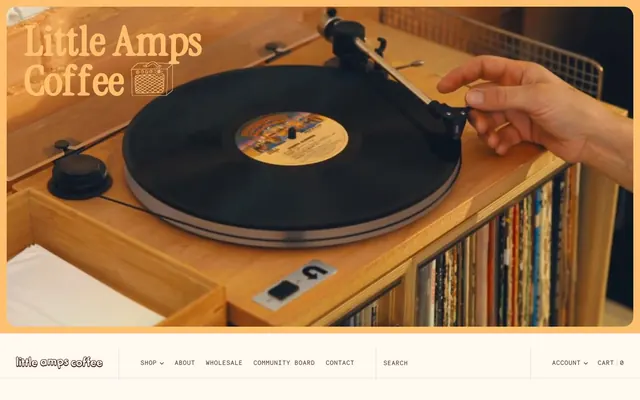
Preview image. Unlock full-res
Warm vinyl cafe
Color palette
Primary text, form input text, base border color, strong contrast against lighter backgrounds — evokes coffee and warm wood
Primary action background, prominent accent color for links, highlight elements — adds a punchy, warm accent
Accent for certain buttons, secondary interactive states
Accent buttons, specific interactive elements — a soft, cool counterpoint to the warm browns
Accent buttons, highlights for specific content blocks or links
Page backgrounds, card surfaces, button text in darker states — sets a warm, inviting canvas
Secondary card backgrounds, section dividers, subtle background distinction
Hairline borders, subtle separators and decorative lines
Muted text, secondary link states where lower contrast is desired
Subtle card backgrounds, low-prominence surface elements
Typography
- Weights
- 400
- Sizes
- 12px, 13px, 14px, 15px, 16px
- Line height
- 1, 1.1, 1.2, 1.6
- Letter spacing
- 0.0500em
- Fallback
- Open Sans
Versatile body text and general interface elements, offering a readable yet distinct character through its slightly wider tracking.
- Weights
- 400, 500
- Sizes
- 10px, 12px, 13px, 14px, 16px
- Line height
- 0.8, 0.85, 1, 1.1, 1.2
- Letter spacing
- 0.0500em
- Fallback
- Space Mono
Used for smaller text, labels, and secondary information, infusing a retro, structured feel due to its monospace nature.
- Weights
- 500
- Sizes
- 20px, 22px, 41px, 45px, 50px, 51px
- Line height
- 0.8, 1
- Letter spacing
- -0.1000em
- Fallback
- League Spartan
Signature display font for headings and brand messaging, its tight kerning and unique character define the brand's playful, vintage-inspired voice.
- Weights
- 400
- Sizes
- 14px, 16px
- Line height
- 1.1
- Letter spacing
- -0.02, 0.05
Roboto Mono — detected in extracted data but not described by AI
- Weights
- 400
- Sizes
- 16px
- Line height
- 1.5
GTStandard-M — detected in extracted data but not described by AI
Spacing & shape
Components
Background: Roast Red (#c03001), Text: Cream Canvas (#fff9f2), Border: 1px transparent, Radius: 3px, Padding: 3px 6px. Uses Necto Mono font.
Background: Mellow Ochre (#c46500), Text: Cream Canvas (#fff9f2), Border: 1px transparent, Radius: 3px, Padding: 3px 6px. Uses Necto Mono font.
Background: Community Blue (#89b4ca), Text: Vinyl Brown (#522c25), Border: 1px transparent, Radius: 3px, Padding: 3px 6px. Uses Necto Mono font.
Background: rgba(0, 0, 0, 0) (transparent), Text: Vinyl Brown (#522c25), Border: 1px Vinyl Brown (#522c25), Radius: 0px, Padding: 0px. Uses Necto Mono font.
Background: Warm Beige (#f6ede3), Border: none, Shadow: none, Radius: 8px, Padding: 0px.
Background: rgba(0, 0, 0, 0) (transparent), Border: none, Shadow: none, Radius: 0px, Padding: 0px.
Background: rgba(82, 44, 37, 0.3) (semi-transparent Vinyl Brown), Border: none, Shadow: none, Radius: 0px, Padding: 0px.
Background: rgba(0, 0, 0, 0) (transparent), Text: Vinyl Brown (#522c25), Border: 1px Vinyl Brown (#522c25), Radius: 3px, Padding: 0px.
Background: Roast Red (#c03001), Text: Vinyl Brown (#522c25), Radius: 0px, Padding: 0px 22px 0px 42px.
Guidelines
- Always use Cream Canvas (#fff9f2) as the default page background to maintain the warm base.
- Apply Vinyl Brown (#522c25) for all primary text elements to ensure high contrast and brand consistency.
- Utilize the `Little Amps` font family for all main headings and brand statements with a letter-spacing of -0.1000em to capture its distinctive character.
- Implement `Roast Red` (#c03001) for primary action backgrounds, enhancing visibility and interaction.
- Use a border-radius of 8px for standard cards and a tighter 3px for buttons and inputs, creating a consistent level of softness.
- Maintain an `elementGap` of 6px for consistent spacing between interactive and inline elements.
- Incorporate `Warm Beige` (#f6ede3) for secondary surface differentiation, such as subtly distinct card backgrounds or alternating section colors.
- Do not use highly saturated primary colors for large background areas; maintain a subdued and warm palette for surfaces.
- Avoid generic system fonts for headings or prominent text; always prioritize the custom `Little Amps` font to preserve brand identity.
- Do not use sharp 0px radii for main interactive elements like buttons or cards; maintain the slight rounding for approachability.
- Refrain from using strong drop shadows or complex elevation effects; the design relies on subtle background shifts and minimal borders for depth.
- Do not introduce strong blues or greens outside of the defined `Community Blue` (#89b4ca) to avoid clashing with the dominant warm palette.
- Avoid wide letter-spacing on display headings; the `Little Amps` font requires tight kerning (-0.1000em) to be legible and on-brand.
- Do not place body text directly on highly saturated backgrounds; ensure sufficient contrast by using Cream Canvas or Warm Beige surfaces.
About this system
ShowHide
Little Amps Coffee cultivates a warm, handcrafted aesthetic, blending vintage record store charm with modern specialty coffee branding. The pervasive use of earthy caramel tones and muted blues, alongside a playful custom typography, creates a cozy, inviting atmosphere. Components often feature minimal borders and gentle rounding, feeling approachable rather than slick. Typography choices emphasize personality and subtle tracking, contributing to a unique brand voice that prioritizes character over stark functionality.
The page primarily uses a contained layout with some sections extending full-width, particularly for hero areas or decorative backgrounds. The hero section often features large, immersive photography with brand text overlaid. Content sections typically alternate between centered stacks of text and visual elements, and two-column layouts with text and images, sometimes reversed for rhythm. Card grids are used to display features or community posts, maintaining consistent vertical spacing. Navigation is a clear, top-fixed bar that transforms between a darker initial state and a lighter state. The overall density is comfortable, allowing elements to breathe with consistent section and element gaps.
The site employs a mix of lifestyle photography, product photography, and custom illustrations. Photography is generally warm-toned, often featuring candid shots of people interacting in a cafe setting or close-ups of coffee beans and equipment, conveying authenticity and craft. Product imagery for coffee bags is typically crisp and contained, showcasing the custom labels. Illustrations are whimsical, outlined, and often in complementary brand colors, used decoratively alongside text or as small icons to add personality and visual interest, such as the person on the bike or the swan. Imagery serves both to build atmosphere and explain content, maintaining a relatively high density in certain sections but leaving ample whitespace.
Reminiscent of Verve Coffee Roasters, Heart Coffee Roasters, Counter Culture Coffee, Record Store Day.
# Little Amps — Style Reference
> Warm vinyl cafe

**Theme:** light

**Site:** https://littleampscoffee.com

Little Amps Coffee cultivates a warm, handcrafted aesthetic, blending vintage record store charm with modern specialty coffee branding. The pervasive use of earthy caramel tones and muted blues, alongside a playful custom typography, creates a cozy, inviting atmosphere. Components often feature minimal borders and gentle rounding, feeling approachable rather than slick. Typography choices emphasize personality and subtle tracking, contributing to a unique brand voice that prioritizes character over stark functionality.

## Tokens — Colors

| Name | Value | Token | Role |
|------|------|------|------|
| Vinyl Brown | `#522c25` | `--color-vinyl-brown` | Primary text, form input text, base border color, strong contrast against lighter backgrounds — evokes coffee and warm wood |
| Roast Red | `#c03001` | `--color-roast-red` | Primary action background, prominent accent color for links, highlight elements — adds a punchy, warm accent |
| Mellow Ochre | `#c46500` | `--color-mellow-ochre` | Accent for certain buttons, secondary interactive states |
| Community Blue | `#89b4ca` | `--color-community-blue` | Accent buttons, specific interactive elements — a soft, cool counterpoint to the warm browns |
| Sunbeam Yellow | `#febf6f` | `--color-sunbeam-yellow` | Accent buttons, highlights for specific content blocks or links |
| Cream Canvas | `#fff9f2` | `--color-cream-canvas` | Page backgrounds, card surfaces, button text in darker states — sets a warm, inviting canvas |
| Warm Beige | `#f6ede3` | `--color-warm-beige` | Secondary card backgrounds, section dividers, subtle background distinction |
| Smoky Ash | `#e6dad4` | `--color-smoky-ash` | Hairline borders, subtle separators and decorative lines |
| Muted Taupe | `#977e77` | `--color-muted-taupe` | Muted text, secondary link states where lower contrast is desired |
| Fawn Gray | `#cbbbb4` | `--color-fawn-gray` | Subtle card backgrounds, low-prominence surface elements |

## Tokens — Typography

### Inclusive Sans
- **Substitute:** Open Sans
- **Weights:** 400
- **Sizes:** 12px, 13px, 14px, 15px, 16px
- **Line height:** 1, 1.1, 1.2, 1.6
- **Letter spacing:** 0.0500em
- **Role:** Versatile body text and general interface elements, offering a readable yet distinct character through its slightly wider tracking.

### Necto Mono
- **Substitute:** Space Mono
- **Weights:** 400, 500
- **Sizes:** 10px, 12px, 13px, 14px, 16px
- **Line height:** 0.8, 0.85, 1, 1.1, 1.2
- **Letter spacing:** 0.0500em
- **Role:** Used for smaller text, labels, and secondary information, infusing a retro, structured feel due to its monospace nature.

### Little Amps
- **Substitute:** League Spartan
- **Weights:** 500
- **Sizes:** 20px, 22px, 41px, 45px, 50px, 51px
- **Line height:** 0.8, 1
- **Letter spacing:** -0.1000em
- **Role:** Signature display font for headings and brand messaging, its tight kerning and unique character define the brand's playful, vintage-inspired voice.

### Roboto Mono
- **Weights:** 400
- **Sizes:** 14px, 16px
- **Line height:** 1.1
- **Letter spacing:** -0.02, 0.05
- **Role:** Roboto Mono — detected in extracted data but not described by AI

### GTStandard-M
- **Weights:** 400
- **Sizes:** 16px
- **Line height:** 1.5
- **Role:** GTStandard-M — detected in extracted data but not described by AI

## Tokens — Type Scale

Perfect Fourth (1.333) from 16px base.

| Role | Size | Line height | Letter spacing |
|------|------|------|------|
| body-lg | 16px | 1.6 | — |
| subheading | 20px | 1 | — |
| heading | 22px | 1 | — |
| heading-lg | 41px | 0.8 | -4.1px |
| display | 51px | 0.8 | -5.1px |

## Tokens — Spacing

- **Section gap:** 40px
- **Card padding:** 36px
- **Element gap:** 6px

## Tokens — Radius

- **Buttons:** 3px
- **Inputs:** 3px
- **Cards:** 8px
- **Images:** 3px
- **badges:** 3px
- **largeCards:** 22px

## Layout

The page primarily uses a contained layout with some sections extending full-width, particularly for hero areas or decorative backgrounds. The hero section often features large, immersive photography with brand text overlaid. Content sections typically alternate between centered stacks of text and visual elements, and two-column layouts with text and images, sometimes reversed for rhythm. Card grids are used to display features or community posts, maintaining consistent vertical spacing. Navigation is a clear, top-fixed bar that transforms between a darker initial state and a lighter state. The overall density is comfortable, allowing elements to breathe with consistent section and element gaps.

## Imagery

The site employs a mix of lifestyle photography, product photography, and custom illustrations. Photography is generally warm-toned, often featuring candid shots of people interacting in a cafe setting or close-ups of coffee beans and equipment, conveying authenticity and craft. Product imagery for coffee bags is typically crisp and contained, showcasing the custom labels. Illustrations are whimsical, outlined, and often in complementary brand colors, used decoratively alongside text or as small icons to add personality and visual interest, such as the person on the bike or the swan. Imagery serves both to build atmosphere and explain content, maintaining a relatively high density in certain sections but leaving ample whitespace.

## Components

### Primary Action Button
*Filled button indicating the primary action.*

Background: Roast Red (#c03001), Text: Cream Canvas (#fff9f2), Border: 1px transparent, Radius: 3px, Padding: 3px 6px. Uses Necto Mono font.

### Mellow Action Button
*Alternative action button, visually softer than the primary.*

Background: Mellow Ochre (#c46500), Text: Cream Canvas (#fff9f2), Border: 1px transparent, Radius: 3px, Padding: 3px 6px. Uses Necto Mono font.

### Community Action Button
*Accent button for specific calls to action, often related to community content.*

Background: Community Blue (#89b4ca), Text: Vinyl Brown (#522c25), Border: 1px transparent, Radius: 3px, Padding: 3px 6px. Uses Necto Mono font.

### Ghost Link Button
*Minimalist button for secondary or navigational actions.*

Background: rgba(0, 0, 0, 0) (transparent), Text: Vinyl Brown (#522c25), Border: 1px Vinyl Brown (#522c25), Radius: 0px, Padding: 0px. Uses Necto Mono font.

### Product Card
*Container for product listings or content blocks.*

Background: Warm Beige (#f6ede3), Border: none, Shadow: none, Radius: 8px, Padding: 0px.

### Transparent Card
*Card with no background for layered content or minimal visual separation.*

Background: rgba(0, 0, 0, 0) (transparent), Border: none, Shadow: none, Radius: 0px, Padding: 0px.

### Community Highlight Card
*Decorative card for showcasing community content, with a subtle accent overlay.*

Background: rgba(82, 44, 37, 0.3) (semi-transparent Vinyl Brown), Border: none, Shadow: none, Radius: 0px, Padding: 0px.

### Input Field
*Standard input for user data entry.*

Background: rgba(0, 0, 0, 0) (transparent), Text: Vinyl Brown (#522c25), Border: 1px Vinyl Brown (#522c25), Radius: 3px, Padding: 0px.

### Info Badge
*Small, functional tag for categorization or status, with specific background color.*

Background: Roast Red (#c03001), Text: Vinyl Brown (#522c25), Radius: 0px, Padding: 0px 22px 0px 42px.

## Guidelines

### Do

- Always use Cream Canvas (#fff9f2) as the default page background to maintain the warm base.
- Apply Vinyl Brown (#522c25) for all primary text elements to ensure high contrast and brand consistency.
- Utilize the `Little Amps` font family for all main headings and brand statements with a letter-spacing of -0.1000em to capture its distinctive character.
- Implement `Roast Red` (#c03001) for primary action backgrounds, enhancing visibility and interaction.
- Use a border-radius of 8px for standard cards and a tighter 3px for buttons and inputs, creating a consistent level of softness.
- Maintain an `elementGap` of 6px for consistent spacing between interactive and inline elements.
- Incorporate `Warm Beige` (#f6ede3) for secondary surface differentiation, such as subtly distinct card backgrounds or alternating section colors.

### Don't

- Do not use highly saturated primary colors for large background areas; maintain a subdued and warm palette for surfaces.
- Avoid generic system fonts for headings or prominent text; always prioritize the custom `Little Amps` font to preserve brand identity.
- Do not use sharp 0px radii for main interactive elements like buttons or cards; maintain the slight rounding for approachability.
- Refrain from using strong drop shadows or complex elevation effects; the design relies on subtle background shifts and minimal borders for depth.
- Do not introduce strong blues or greens outside of the defined `Community Blue` (#89b4ca) to avoid clashing with the dominant warm palette.
- Avoid wide letter-spacing on display headings; the `Little Amps` font requires tight kerning (-0.1000em) to be legible and on-brand.
- Do not place body text directly on highly saturated backgrounds; ensure sufficient contrast by using Cream Canvas or Warm Beige surfaces.

## Agent Prompt Guide

Quick Color Reference:
text: #522c25
background: #fff9f2
border: #e6dad4
accent: #89b4ca
primary action: #c03001 (filled action)

Example Component Prompts:
1. Create a Hero Section: Background a full-bleed lifestyle image with an overlay of 30% Vinyl Brown (#522c25). Overlay a centered headline 'Tasty Coffee and Chill Vibes.' using Little Amps font, size 51px, Roast Red (#c03001) color, letter-spacing -5.1px, and a 'Shop All' button using Roast Red (#c03001) background, Cream Canvas (#fff9f2) text, 3px radius, 3px 6px padding.
2. Design a Product Listing Component: Use a Product Card background (Warm Beige #f6ede3, 8px radius). Inside, place a product image (3px radius), a product title 'Friend Blend' in Vinyl Brown (#522c25) using Necto Mono font size 16px, and a 'Quick View' button using Community Blue (#89b4ca) background, Vinyl Brown (#522c25) text, 3px radius, 3px 6px padding. Maintain an elementGap of 6px between elements.
3. Build a Community Post Card: Use a Transparent Card background with a Community Highlight Card overlay. Display an image on top of the card. Below the image, include a date (Necto Mono, 12px, Vinyl Brown #522c25), a heading 'Producer Highlight' (Little Amps, 20px, Vinyl Brown #522c25), and a 'Read More' link button using Mellow Ochre (#c46500) background, Cream Canvas (#fff9f2) text, 3px radius, 3px 6px padding. Ensure adequate cardPadding of 36px and the 8px radius for the base card.
More like this









Keep what you find
A free account saves references to boards and can send you a weekly email of picks based on what you save.
To see every result, go Pro.