Preview image. Unlock full-res
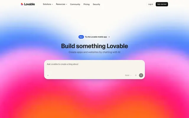
Shifting gradient nebula
Color palette
Violet wash for highlight backgrounds, decorative bands, and soft emphasis behind content. Do not promote it to the primary CTA color
Page backgrounds, card surfaces, ghost button backgrounds, default icon fill
Primary text, navigation links, bold headings, primary icon fill
Subtle borders, dividers, subtle button outlines
Muted text, helper text, input placeholders, secondary icon fill
Ghost button text, subtle link text, tertiary icon fill
Key text highlights, button text on dark backgrounds
Medium-contrast borders, control outlines, and structural separators. Do not promote it to the primary CTA color
Typography
- Weights
- 400, 480, 600
- Sizes
- 12px, 14px, 15px, 16px, 18px, 20px, 36px, 48px, 60px
- Line height
- 1, 1.1, 1.25, 1.38, 1.5, 1.6
- Letter spacing
- -0.0250em
- Fallback
- Inter, Arial, sans-serif
The primary typeface for all text content. Its variable nature allows for precise weight control, delivering compact, high-density information without feeling cluttered. The slight negative letter-spacing (-0.0250em) throughout reinforces this compact aesthetic.
Spacing & shape
Elevation
Components
Text Primary (#1c1c1c), Camera Plain Variable, weight 400 at 16px, line height 1.5. Uses Border Light (#eceae4) as a subtle bottom border hint on hover. Padding is 6px left/right, 4px top/bottom.
Background transparent, Text Primary (#1c1c1c), Camera Plain Variable, weight 400 at 16px, line height 1.5. Subtle border of Border Light (#eceae4). Default radius of 9999px. Padding of 4px top/bottom, 6px left/right. Examples: 'Log in', 'Get started'.
Text Primary (#1c1c1c), on rgba(0, 0, 0, 0) background with Border Light (#eceae4) border. Uses 9999px border-radius, 6px top/bottom, 10px left/right padding. Example: 'New Try the Lovable mobile app'.
Canvas White (#fcfbf8) background, Text Secondary (#5f5f5d) for placeholder. Camera Plain Variable, weight 400 at 18px. Features a 28px border-radius. Padding 24px top/bottom, 24px left/right. Subtle inset shadow on interaction: rgba(0,0,0,0.08) 0px 0.5px inset, rgba(0,0,0,0.16) 0px -0.5px inset, rgb(0,0,0) 0px 0px 0px 0.5px inset, rgba(255,255,255,0.24) 0px 1px inset, rgba(255,255,255,0.16) 0px -1px inset, rgba(0,0,0,0.12) 0px 2px 2px -1px, rgba(0,0,0,0.12) 0px 4px 4px -2px.
Canvas White (#fcfbf8) background with 16px border-radius. Padding is 24px top/bottom for content, with no horizontal padding internally. Examples: 'Personal portfolio', 'Lovable slides'.
Canvas White (#fcfbf8) background with a large 24px border-radius. Internal padding is 24px top/bottom, 20px left/right. No shadow, creating a flat, embedded surface appearance.
Guidelines
- Prioritize Canvas White (#fcfbf8) for backgrounds and main surfaces, maintaining a bright, open aesthetic.
- Use Text Primary (#1c1c1c) for all primary text content and main navigational elements.
- Apply Camera Plain Variable with a global letter-spacing of -0.0250em for a compact typographic feel.
- Always use a 9999px border-radius for 'pill' shaped buttons and tags.
- Reserve the Accent Gradient for hero sections or significant atmospheric backgrounds to highlight key content.
- Maintain a clear visual hierarchy by differentiating text sizes and weights, making key information bold without sacrificing the compact feel.
- Use a default element spacing of 6px to create consistent but dense information blocks.
- Avoid applying strong box-shadows; prefer minimal elevation with soft inset shadows or no shadows to maintain a flat, modern surface design.
- Do not introduce new saturated accent colors outside of the defined Accent Gradient, as the system relies on a predominantly neutral palette.
- Refrain from using excessively large padding or margins that break the compact information density of the layout.
- Do not deviate from the specified border radii; 16px for cards, 8px for buttons, and 28px for prominent input fields are design signatures.
- Avoid decorative imagery that competes with the subtle UI; visuals should support content without overwhelming it.
- Do not use generic system fonts; always implement Camera Plain Variable for brand consistency.
- Avoid heavy borders; prefer the subtle Border Light (#eceae4) or no border to keep elements lightweight.
About this system
ShowHide
Lovable’s design system conveys a dynamic, creative energy using a predominantly light theme accented by a striking, evolving gradient for hero sections and interactive prompts. Typography is clean and compact, emphasizing content clarity within a contained layout. UI elements are subtly refined with medium border radii and minimal, soft shadows, creating an approachable yet modern aesthetic. Color manifests as functional cues and atmospheric backdrops, rather than heavy branding.
The page primarily follows a max-width contained layout set at 1280px, with content centered. The hero section, however, breaks this pattern by featuring a full-bleed, vibrant gradient background with a centered headline and interactive input field. Subsequent sections typically alternate between a clear Canvas White (#fcfbf8) background and slightly off-white (Canvas White equivalent as the main page canvas). Content is arranged in flexible patterns, including centered text stacks, and multi-column grids for feature lists (e.g., text adjacent to a blank area) and template showcases (3-column card grid). Vertical spacing between sections is generally consistent with a 32px section gap.
Imagery primarily consists of contained product screenshots and template previews, often presented within rounded rectangles. There's also use of abstract gradients as backgrounds. Photography is absent from the core UI, deferring to the colorful 'Accent Gradient' for visual flair. Icons are minimal, either filled or outlined, appearing primarily in a monochromatic Text Primary or Text Secondary color, without multicolor applications.
Reminiscent of Framer, Vercel, Linear, Raycast.
# Lovable — Style Reference
> Shifting gradient nebula

**Theme:** light

**Site:** https://lovable.dev

Lovable’s design system conveys a dynamic, creative energy using a predominantly light theme accented by a striking, evolving gradient for hero sections and interactive prompts. Typography is clean and compact, emphasizing content clarity within a contained layout. UI elements are subtly refined with medium border radii and minimal, soft shadows, creating an approachable yet modern aesthetic. Color manifests as functional cues and atmospheric backdrops, rather than heavy branding.

## Tokens — Colors

| Name | Value | Token | Role |
|------|------|------|------|
| Accent Gradient | `#1f55f1` | `--color-accent-gradient` | Violet wash for highlight backgrounds, decorative bands, and soft emphasis behind content. Do not promote it to the primary CTA color |
| Canvas White | `#fcfbf8` | `--color-canvas-white` | Page backgrounds, card surfaces, ghost button backgrounds, default icon fill |
| Text Primary | `#1c1c1c` | `--color-text-primary` | Primary text, navigation links, bold headings, primary icon fill |
| Border Light | `#eceae4` | `--color-border-light` | Subtle borders, dividers, subtle button outlines |
| Text Secondary | `#5f5f5d` | `--color-text-secondary` | Muted text, helper text, input placeholders, secondary icon fill |
| Text Ghost | `#2e2e2d` | `--color-text-ghost` | Ghost button text, subtle link text, tertiary icon fill |
| Text Callout | `#030303` | `--color-text-callout` | Key text highlights, button text on dark backgrounds |
| Focus Border | `#c5c4c2` | `--color-focus-border` | Medium-contrast borders, control outlines, and structural separators. Do not promote it to the primary CTA color |

## Tokens — Typography

### Camera Plain Variable
- **Substitute:** Inter, Arial, sans-serif
- **Weights:** 400, 480, 600
- **Sizes:** 12px, 14px, 15px, 16px, 18px, 20px, 36px, 48px, 60px
- **Line height:** 1, 1.1, 1.25, 1.38, 1.5, 1.6
- **Letter spacing:** -0.0250em
- **Role:** The primary typeface for all text content. Its variable nature allows for precise weight control, delivering compact, high-density information without feeling cluttered. The slight negative letter-spacing (-0.0250em) throughout reinforces this compact aesthetic.

## Tokens — Type Scale

Perfect Fifth (1.5) from 16px base.

| Role | Size | Line height | Letter spacing |
|------|------|------|------|
| caption | 12px | 1.5 | -0.3px |
| body | 16px | 1.5 | -0.4px |
| subheading | 20px | 1.38 | -0.5px |
| heading | 36px | 1.25 | -0.9px |
| display | 60px | 1.1 | -1.5px |

## Tokens — Spacing

- **Max width:** 1280px
- **Section gap:** 32px
- **Card padding:** 20px
- **Element gap:** 6px

## Tokens — Radius

- **Buttons:** 8px
- **Cards:** 16px
- **inputField:** 28px
- **links:** 12px

## Tokens — Elevation

- **Input Field:** `rgba(0, 0, 0, 0.08) 0px 0.5px 0px 0px inset, rgba(0, 0, 0, 0.16) 0px -0.5px 0px 0px inset, rgb(0, 0, 0) 0px 0px 0px 0.5px inset, rgba(255, 255, 255, 0.24) 0px 1px 0px 0px inset, rgba(255, 255, 255, 0.16) 0px -1px 0px 0px inset, rgba(0, 0, 0, 0.12) 0px 2px 2px -1px, rgba(0, 0, 0, 0.12) 0px 4px 4px -2px`
- **Hovered Card:** `oklab(0 0 0 / 0.08) 0px 0px 0px 1px, rgba(0, 0, 0, 0.1) 0px 20px 25px -5px, rgba(0, 0, 0, 0.1) 0px 8px 10px -6px`

## Layout

The page primarily follows a max-width contained layout set at 1280px, with content centered. The hero section, however, breaks this pattern by featuring a full-bleed, vibrant gradient background with a centered headline and interactive input field. Subsequent sections typically alternate between a clear Canvas White (#fcfbf8) background and slightly off-white (Canvas White equivalent as the main page canvas). Content is arranged in flexible patterns, including centered text stacks, and multi-column grids for feature lists (e.g., text adjacent to a blank area) and template showcases (3-column card grid). Vertical spacing between sections is generally consistent with a 32px section gap.

## Imagery

Imagery primarily consists of contained product screenshots and template previews, often presented within rounded rectangles. There's also use of abstract gradients as backgrounds. Photography is absent from the core UI, deferring to the colorful 'Accent Gradient' for visual flair. Icons are minimal, either filled or outlined, appearing primarily in a monochromatic Text Primary or Text Secondary color, without multicolor applications.

## Components

### Primary Navigation Link
*Top navigation items and footer links that guide users through the site structure.*

Text Primary (#1c1c1c), Camera Plain Variable, weight 400 at 16px, line height 1.5. Uses Border Light (#eceae4) as a subtle bottom border hint on hover. Padding is 6px left/right, 4px top/bottom.

### Ghost Header Button
*Call to action buttons in the header, encouraging login or getting started.*

Background transparent, Text Primary (#1c1c1c), Camera Plain Variable, weight 400 at 16px, line height 1.5. Subtle border of Border Light (#eceae4). Default radius of 9999px. Padding of 4px top/bottom, 6px left/right. Examples: 'Log in', 'Get started'.

### Pill Accent Button
*Small, informational buttons or tags with a rounded 'pill' shape.*

Text Primary (#1c1c1c), on rgba(0, 0, 0, 0) background with Border Light (#eceae4) border. Uses 9999px border-radius, 6px top/bottom, 10px left/right padding.  Example: 'New Try the Lovable mobile app'.

### Hero Input Field
*Prominent text input for primary action on the hero section.*

Canvas White (#fcfbf8) background, Text Secondary (#5f5f5d) for placeholder. Camera Plain Variable, weight 400 at 18px. Features a 28px border-radius. Padding 24px top/bottom, 24px left/right. Subtle inset shadow on interaction: rgba(0,0,0,0.08) 0px 0.5px inset, rgba(0,0,0,0.16) 0px -0.5px inset, rgb(0,0,0) 0px 0px 0px 0.5px inset, rgba(255,255,255,0.24) 0px 1px inset, rgba(255,255,255,0.16) 0px -1px inset, rgba(0,0,0,0.12) 0px 2px 2px -1px, rgba(0,0,0,0.12) 0px 4px 4px -2px.

### Feature Card
*Displays featured content or product examples in a grid layout.*

Canvas White (#fcfbf8) background with 16px border-radius. Padding is 24px top/bottom for content, with no horizontal padding internally. Examples: 'Personal portfolio', 'Lovable slides'.

### Content Block Card
*Container for descriptive content, like feature explanations or testimonials.*

Canvas White (#fcfbf8) background with a large 24px border-radius. Internal padding is 24px top/bottom, 20px left/right. No shadow, creating a flat, embedded surface appearance.

## Guidelines

### Do

- Prioritize Canvas White (#fcfbf8) for backgrounds and main surfaces, maintaining a bright, open aesthetic.
- Use Text Primary (#1c1c1c) for all primary text content and main navigational elements.
- Apply Camera Plain Variable with a global letter-spacing of -0.0250em for a compact typographic feel.
- Always use a 9999px border-radius for 'pill' shaped buttons and tags.
- Reserve the Accent Gradient for hero sections or significant atmospheric backgrounds to highlight key content.
- Maintain a clear visual hierarchy by differentiating text sizes and weights, making key information bold without sacrificing the compact feel.
- Use a default element spacing of 6px to create consistent but dense information blocks.

### Don't

- Avoid applying strong box-shadows; prefer minimal elevation with soft inset shadows or no shadows to maintain a flat, modern surface design.
- Do not introduce new saturated accent colors outside of the defined Accent Gradient, as the system relies on a predominantly neutral palette.
- Refrain from using excessively large padding or margins that break the compact information density of the layout.
- Do not deviate from the specified border radii; 16px for cards, 8px for buttons, and 28px for prominent input fields are design signatures.
- Avoid decorative imagery that competes with the subtle UI; visuals should support content without overwhelming it.
- Do not use generic system fonts; always implement Camera Plain Variable for brand consistency.
- Avoid heavy borders; prefer the subtle Border Light (#eceae4) or no border to keep elements lightweight.

## Agent Prompt Guide

Quick Color Reference:
text: #1c1c1c
background: #fcfbf8
border: #eceae4
accent: #1f55f1
primary action: no distinct CTA color

Example Component Prompts:
1. Create a header with 'Log in' and 'Get started' ghost buttons. Both buttons should have Text Primary (#1c1c1c) text, a transparent background, 9999px radius, 4px vertical and 6px horizontal padding, and a subtle Border Light (#eceae4) border.
2. Design a hero section headline: 'Build something Lovable' in Text Primary (#1c1c1c), Camera Plain Variable, weight 600, 60px size, line height 1.1, letter-spacing -1.5px. Below it, a sub-headline: 'Create apps and websites by chatting with AI' in Text Primary (#1c1c1c), Camera Plain Variable, weight 400, 20px size, line height 1.38, letter-spacing -0.5px. The background should be the Accent Gradient (#1f55f1).
3. Create a prominent interactive input field: 'Ask Lovable to create a blog about...' using Canvas White (#fcfbf8) background, Text Secondary (#5f5f5d) placeholder, Camera Plain Variable, weight 400, 18px size, 28px border-radius, with 24px padding on all sides. Include the prescribed inset shadow.
4. Design a 'Pill Accent Button': 'New Try the Lovable mobile app' with Text Primary (#1c1c1c), Camera Plain Variable, weight 400 at 16px, background transparent, a Border Light (#eceae4) border, and 9999px border-radius with 6px vertical and 10px horizontal padding.
More like this










Keep what you find
A free account saves references to boards and can send you a weekly email of picks based on what you save.
To see every result, go Pro.